Forest is the defining surface on the supplied 2025 White County map. It covers 73.86% of the county, while agriculture accounts for 12.84% and developed land for 11.72%. The map is not uniform, however. The north is dominated by a broad, nearly continuous forest block, while developed and agricultural colors become much more frequent through the middle and southern parts of the county and around a second concentration in the northeast. That contrast makes White County especially useful for showing how a heavily forested mountain county can still contain distinct settled corridors.
This page compares four views: 2025 land cover, forest and farmland, fractional impervious surface with developed land, and 1985–2025 class differences. The WebP versions can be studied directly with the discussion, and the four original 2480 × 1754-pixel JPG maps are packaged together in one ZIP below. They work best when each map is matched to a specific question, such as overall cover, working land, hard-surface concentration, or where classifications differ between the two endpoints.
Table of Contents
A countywide view dominated by forest rather than one continuous developed corridor
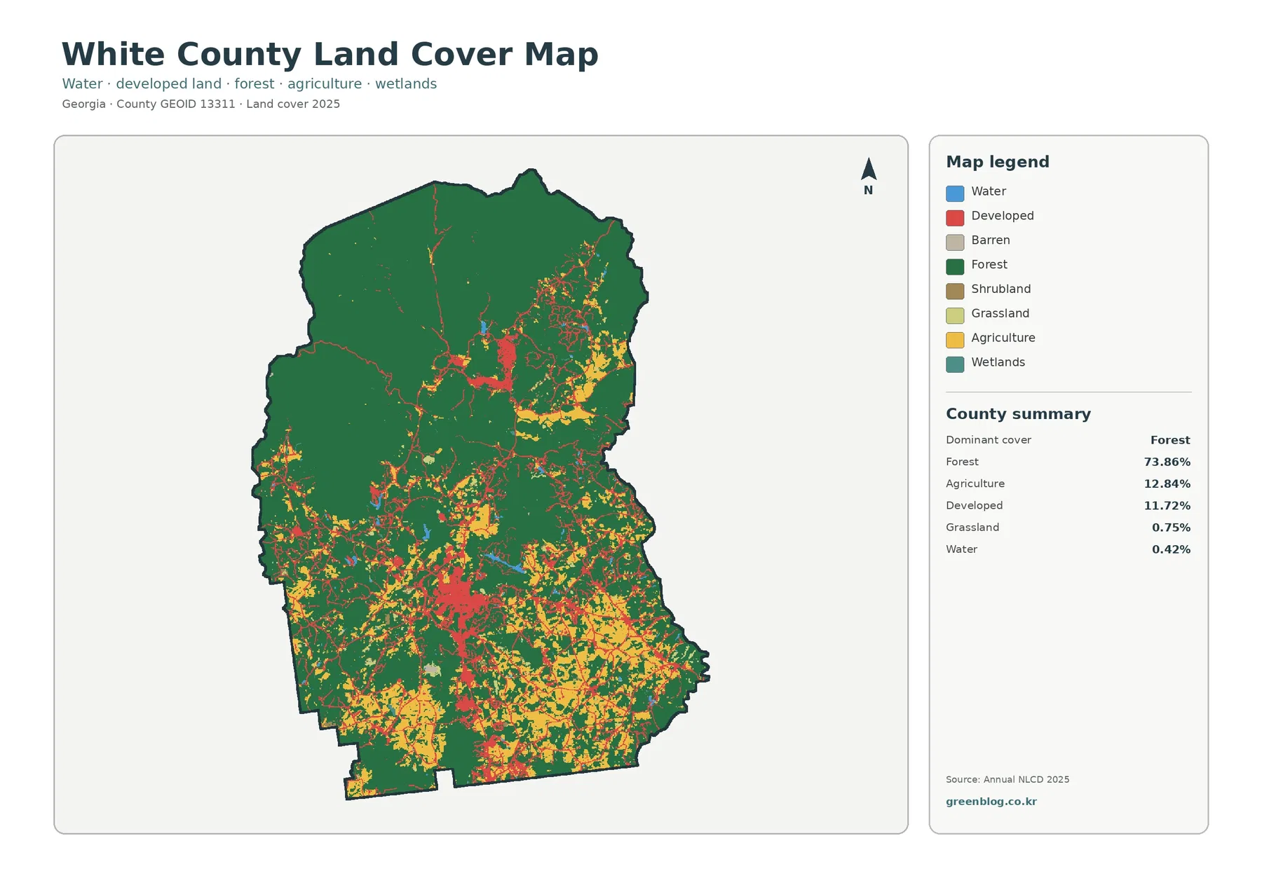
The general map gives the clearest first impression of how unevenly the county’s land-cover classes are distributed. Dark green forest fills most of the northern half and remains widespread elsewhere. Red developed areas are much more concentrated, forming larger clusters in the central-southern portion and another noticeable group toward the northeast. Yellow agricultural patches are interwoven with development and forest, especially outside the most heavily forested northern block. The pattern is therefore not a simple north-south split, but it is clear that the northern part has fewer breaks in forest continuity than the lower half.
The supplied summary lists forest at 73.86%, agriculture at 12.84%, developed land at 11.72%, grassland at 0.75%, and water at 0.42%. Shrubland and wetlands are present in the legend but occupy very small shares. These classes describe the physical cover detected at the surface; they are not zoning, ownership, parcel boundaries, or legal land-use designations. A residential parcel, for example, can include trees, lawn, a house, pavement, and other surfaces while still being represented by one predominant land-cover class at the source resolution.
The mountain setting helps explain why the northern forest remains so visually dominant
White County’s official geography page places the county in northeast Georgia between the Appalachian Mountains and the headwaters of the upper Chattahoochee River. That local context is useful when reading the land-cover image because the map itself does not contain elevation shading or contour lines. The large forest mass in the north is consistent with the county’s mountain setting, while the more fragmented center and south contain more visible development, fields, and open land. The map should not be used to infer slope at an individual location, but the official geographic description explains why a large forested northern landscape is an important part of the county’s character.
The county government identifies Cleveland as the county seat and its local information pages also feature Helen. The maps in this package do not draw municipal boundaries or label city names, so a particular red patch should not be treated as the exact outline of either place. Even without those labels, two developed concentrations stand out: a stronger central-southern cluster and a separate northeastern concentration. When a city-level explanation is needed, these land-cover images are best paired with an official municipal or road layer so the surface pattern can be discussed without turning generalized raster cells into assumed city limits.
Forest and working land become easier to separate when developed classes are simplified
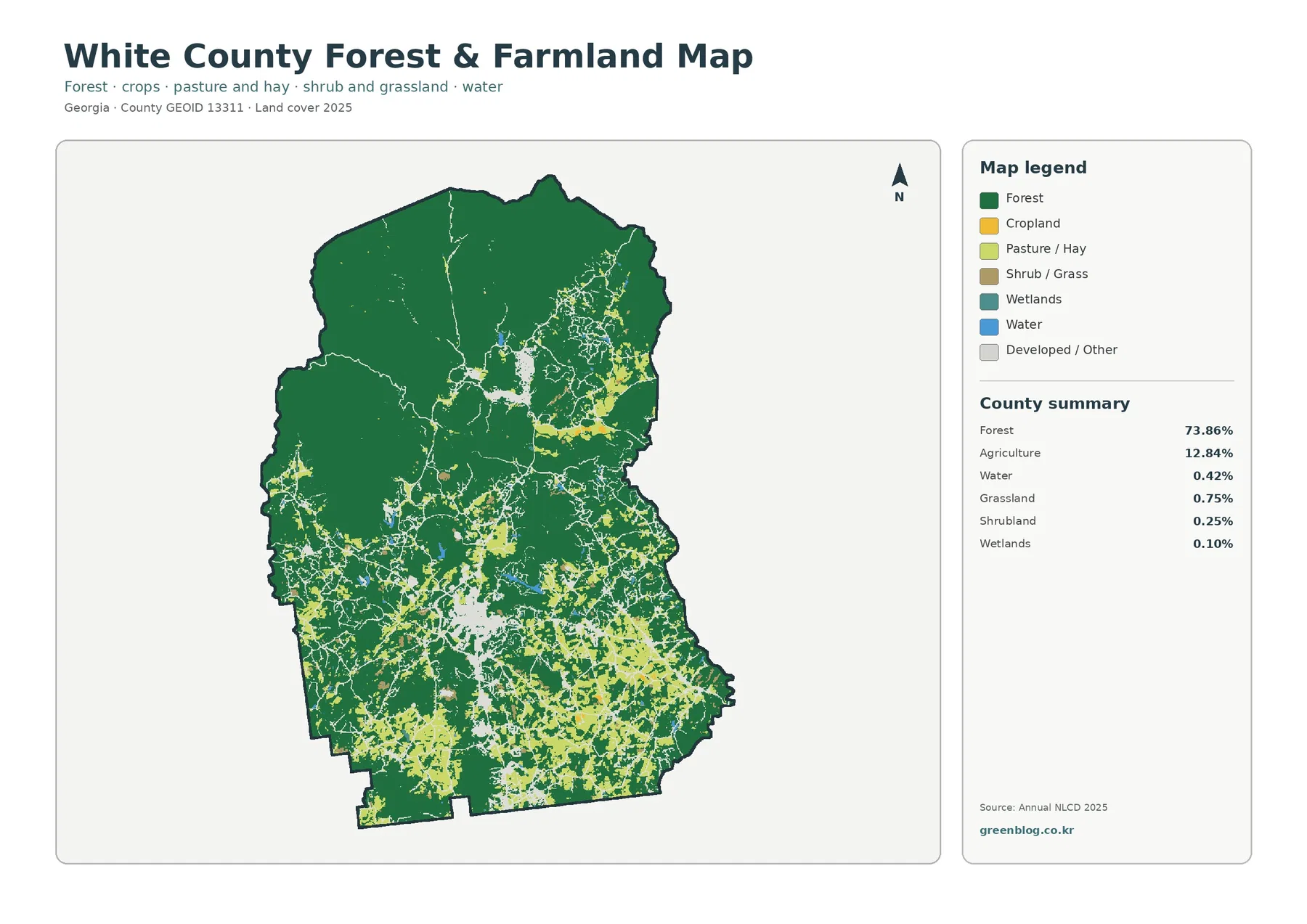
The vegetation-focused map removes much of the color competition from the general view. Forest stays dark green, cropland is yellow, pasture and hay are light green, shrub and grass are brown, and developed or other surfaces are reduced to a pale neutral color. This makes the scale difference between forest and agriculture immediately visible. The northern and northwestern parts of White County are dominated by large connected forest areas, while the central, southeastern, and southwestern portions contain many smaller openings for cropland and pasture.
Agriculture is 12.84% of the county, so it is substantial enough to shape the lower half of the map without challenging forest as the dominant class. The fields are generally broken into many patches rather than one broad continuous agricultural belt. Several clusters sit close to developed areas, and other openings occur as isolated pockets within forest. For classroom or regional-comparison use, this view is especially effective because it shows that “mostly forested” does not mean agriculture is absent; instead, working land is distributed through openings and valleys within a much larger wooded landscape.
Open water accounts for only 0.42% in the summary, and several small blue features are visible. That low percentage should not be interpreted as a measure of hydrologic importance. Annual NLCD uses 30-meter cells and assigns a predominant class to each one, so narrow streams and small water features may be generalized. White County’s official geography description emphasizes the upper Chattahoochee headwaters, which is a reminder that a land-cover percentage and a stream-network map answer different questions. Water-focused work should use dedicated hydrography alongside these images.
Hard surfaces occupy a small countywide share but form unmistakable local concentrations
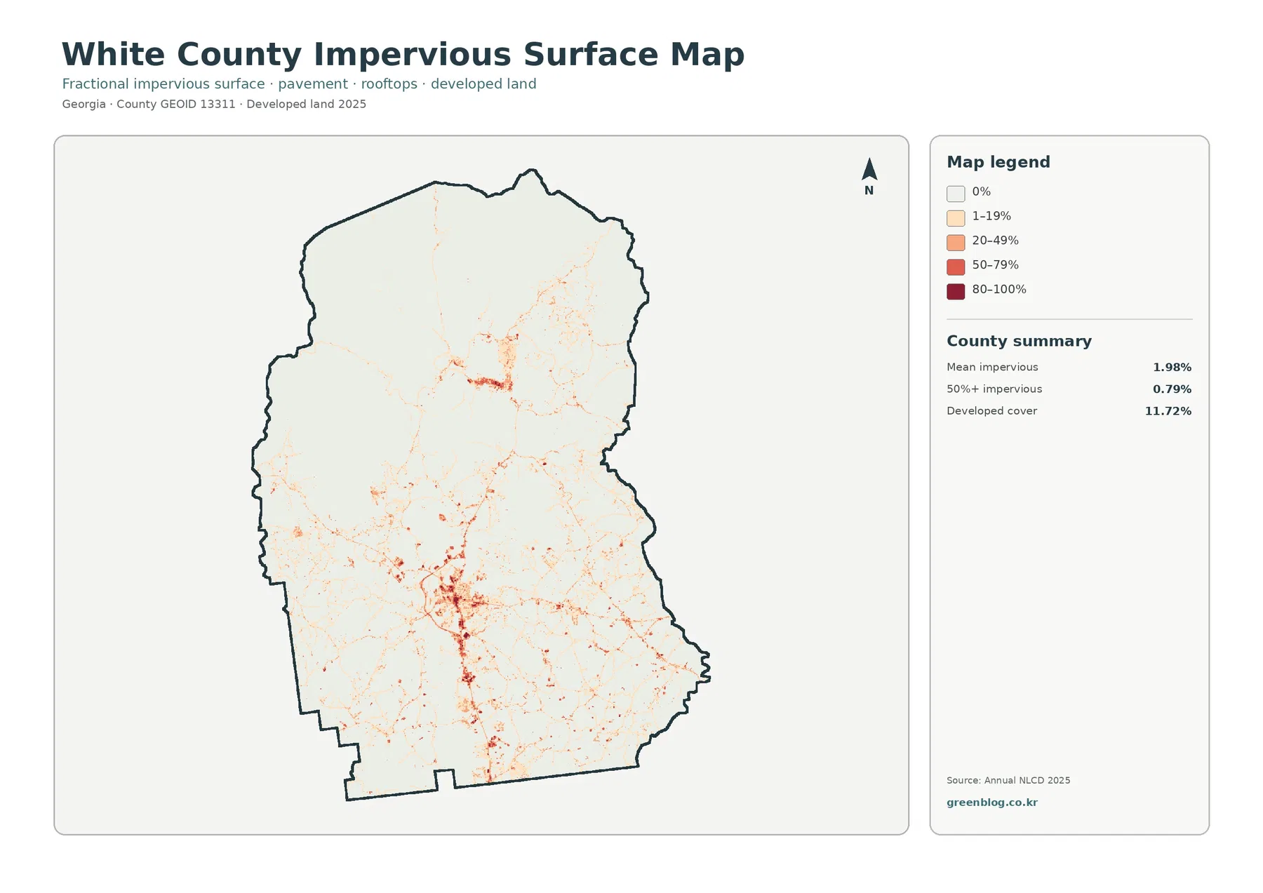
The impervious-surface map makes the contrast between developed cover and hard surfaces much easier to understand. Developed land totals 11.72%, but mean impervious cover is only 1.98%, and just 0.79% of the county lies in cells with 50% or more impervious surface. The numbers differ because a developed land class can contain lawns, trees, bare ground, and other permeable surfaces around buildings and streets. Fractional impervious data isolates the share of rooftops, pavement, parking areas, and similar hard materials within each cell.
The strongest dark orange and red values form a compact concentration in the central-southern part of the county. A second concentration appears in the northeast, while thinner pale lines extend along the road network between and beyond these clusters. Most of the large forested north and northwest remains in the lowest impervious categories. This distribution is more informative than the countywide mean alone: an average of 1.98% does not mean every part of White County has a similar amount of pavement. Hard surfaces are concentrated in relatively small settled areas and transportation corridors.
This image is useful for discussing the physical footprint of development, but it is not a drainage model, flood map, zoning map, or development-permit layer. A dark cell tells the reader that a larger share of that cell is covered by hard material; it does not show whether drainage is adequate, whether a building is permitted, or whether a parcel can be redeveloped. Site-specific decisions require current local records, higher-resolution imagery, and engineering or regulatory data designed for those questions.
The 1985–2025 comparison highlights settled areas without turning every difference into a development story
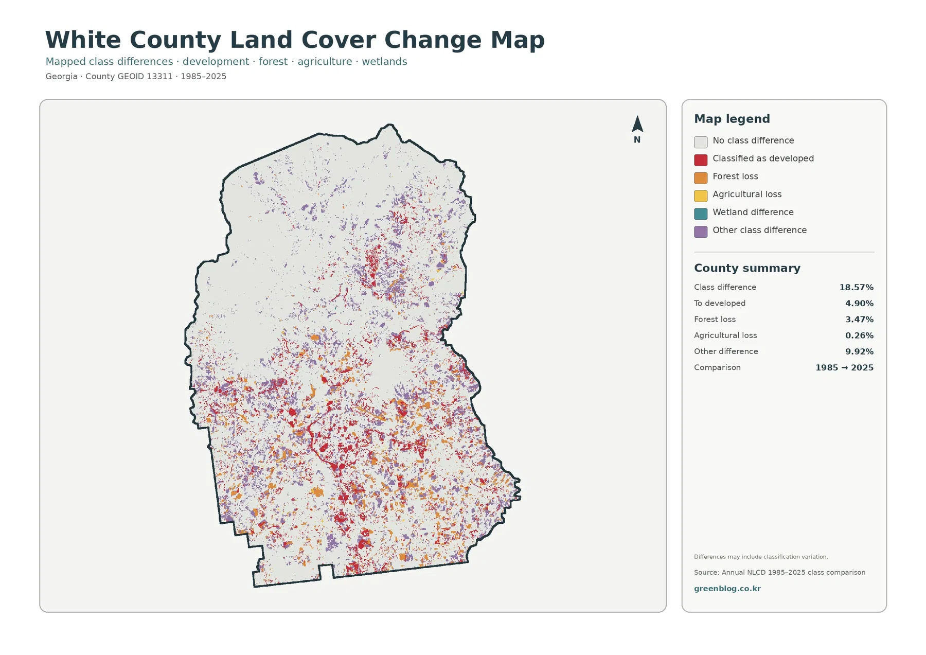
The 1985–2025 layer reports a total class difference of 18.57%. Of that total, 4.90% is classified as developed at the 2025 endpoint, 3.47% is shown as forest loss, 0.26% as agricultural loss, and 9.92% as other class difference. The map is mostly gray in places where the endpoint classifications match, while red, orange, yellow, teal, and purple mark different categories of difference. Colored cells are much denser through the central and southern half and around the northeastern developed area than across the largest northern forest block.
The 18.57% figure should not be described as the share of White County that was damaged, cleared, or newly urbanized. It simply measures cells assigned different classes at the two endpoints. A location could have changed more than once between 1985 and 2025 and still end with a class similar to its starting condition, while some mapped differences can also reflect classification variation. Determining the timing or cause of a specific change requires intermediate imagery, development records, forest-management information, or other evidence beyond this two-date comparison.
Even with that limitation, the change image is valuable as a screening tool. Red areas frequently appear near the current developed concentrations, while orange forest-loss patches occur in scattered blocks around the more fragmented lower half. Purple “other difference” is also widespread and accounts for the largest single part of the total difference. In contrast, large portions of the north retain the same endpoint classification. Comparing this map with the current-cover image helps separate two ideas that are easy to confuse: what the surface is classified as in 2025 and whether that classification differs from 1985.
Cleveland and Helen provide useful geographic context, but the raster does not draw their boundaries
Readers familiar with White County may naturally connect the main developed clusters with Cleveland and Helen. That is useful as broad geographic context, but the map itself contains no city labels and no municipal boundary layer. The safest interpretation is that White County has a strong central-southern concentration of developed and impervious surfaces plus a separate northeastern concentration, with forest remaining close to both. Exact statements about what lies inside Cleveland or Helen should be made only after checking an authoritative city-boundary or road map.
That distinction matters because land-cover cells describe surfaces, not administrative identity. A forest cell can lie inside a city limit, and a developed cell can lie outside one. For a tourism, planning, or community profile, the most useful workflow is to locate the settlement with a boundary or street map first, then use these land-cover views to describe the nearby mix of forest, fields, water, and hard surfaces. The result is more accurate than forcing an unlabeled raster image to answer a municipal-boundary question it was not designed to answer.
Choose the map by the question instead of shrinking all four into one figure
For a county profile, the general 2025 map is the best starting point because it shows every major cover class together and makes the 73.86% forest share easy to understand visually. For a forest-versus-working-land discussion, the second map reduces distractions and gives fields and pasture more contrast. When the question is about the physical concentration of buildings and pavement, the impervious view is more direct than the developed class alone. The change map belongs after the current condition has been explained so its endpoint-difference colors are not mistaken for current land-cover classes.
In a classroom, students can first identify the uninterrupted northern forest and then trace where agriculture becomes more frequent in the lower half. In a presentation about settlement, the impervious map can follow the general map to show that the strongest hard-surface concentration occupies a much smaller footprint than the entire developed class. In a long-term comparison, current cover and the 1985–2025 image work well side by side because one answers “what is here now?” while the other answers “where did the endpoint classification differ?” Keeping those purposes separate makes the maps easier to read.
Thirty-meter cells, observation dates, and JPG size set practical limits
Annual NLCD is a 30-meter raster product. Each square cell receives one predominant class even when trees, grass, pavement, a building, and a narrow stream all share the same ground area. That means small landscape features can disappear, thin corridors can look wider or narrower than they are on the ground, and a sharp color edge should not be treated as a surveyed property line. Enlarging the image makes the symbols easier to see, but it cannot recover detail that was not present in the source cells.
The current maps represent the supplied 2025 observation year. Construction, logging, vegetation recovery, farm changes, or road work after that observation may not appear. The comparison map is also a two-date endpoint product rather than a year-by-year history. Current parcel, building-permit, wetland-jurisdiction, flood, engineering, ownership, and zoning questions require newer and more specialized sources. These county-scale maps are strongest for broad pattern comparison, education, presentation, and selecting areas that deserve closer study.
Each downloadable JPG is 2480 × 1754 pixels. That size is suitable for web use, reports, slides, and many ordinary print layouts, but the supplied asset manifest does not identify the files as meeting an A3 high-resolution reference. If a large poster is planned, make a proof print first and preserve the original aspect ratio. The JPG package is most useful when the goal is to retain the original downloadable images rather than rely on the smaller WebP versions displayed in the article.
What is included in the White County JPG download
The ZIP contains the four original JPG maps discussed on this page: 2025 land cover, forest and farmland, impervious surface and developed land, and 1985–2025 land-cover class differences. Keeping them together makes it easy to build a sequence from current countywide cover to vegetation, hard surfaces, and long-term endpoint comparison without searching for separate files. Use the map that directly supports the point being explained, and add a second image only when a side-by-side comparison adds information.
Frequently Asked Questions
What is the dominant land-cover class in White County?
Forest is dominant at 73.86% in the supplied 2025 summary. Agriculture follows at 12.84% and developed land at 11.72%. The visual pattern matches those numbers: the north is covered by a broad forest block, while agriculture and development become more frequent in the central and southern portions.
Why is developed cover 11.72% when mean impervious cover is only 1.98%?
Developed land can include lawns, trees, open ground, and other permeable surfaces around buildings and roads. Fractional impervious data focuses on hard surfaces such as rooftops, pavement, and parking areas. Because the two measures describe different aspects of development, the countywide impervious average can be much lower than the developed-land share.
Does the 18.57% class difference mean that 18.57% of White County was developed or cleared?
No. The 18.57% value is the total share of cells with different classifications at the 1985 and 2025 endpoints. The summary identifies 4.90% as classified to developed, 3.47% as forest loss, 0.26% as agricultural loss, and 9.92% as other difference. The timing and cause of a particular change require additional evidence.
Sources and Reference Data
- MRLC Annual NLCD Data – official access point for the 2025 land-cover and annual comparison products
- USGS Annual NLCD Land Cover Classification – class definitions for forest, agriculture, developed land, water, wetlands, and other surfaces
- White County, Georgia – Geography – official county background on its northeast Georgia location, mountain setting, and upper Chattahoochee headwaters
Map File Information
The ZIP contains four original JPG maps for comparing White County's forest-dominated landscape, agriculture, concentrated developed areas, impervious surfaces, and 1985–2025 class differences.
- Included Files: Use only the versions confirmed in the article and supplied images
- File Type: Use the confirmed download contents
- Intended Use: Printing, education, presentations, and map-based projects
Related Maps
- Appling County Georgia Land Cover Map
- Atkinson County Georgia Land Cover Map
- Bacon County Georgia Land Cover Map
Green Map creates custom-edited map images using open geographic data sources such as geoBoundaries, Natural Earth, OpenStreetMap, and government open data.
These maps are edited visual materials, not raw data files, and are provided for education, documents, presentations, and graphic reference.