Wetlands are the largest mapped cover in Jenkins County at 35.05% in the supplied 2025 summary. Agriculture follows at 26.08% and forest at 21.94%, producing a county where wet ground, farm blocks, and wooded areas repeatedly meet instead of falling into a single dominant zone. This Jenkins County Georgia Land Cover Map set separates that countywide pattern from hard-surface intensity and the class differences mapped between 1985 and 2025.
Four WebP previews appear with the discussion, and the four original 2480 × 1754-pixel JPG maps are available together in one ZIP. The set is useful when a county profile needs a broad land-cover image first, then a closer look at vegetation, impervious surfaces, or long-term endpoint differences without treating those four subjects as the same measure.
Table of Contents
A small hard-surface core stands out inside a mostly rural county
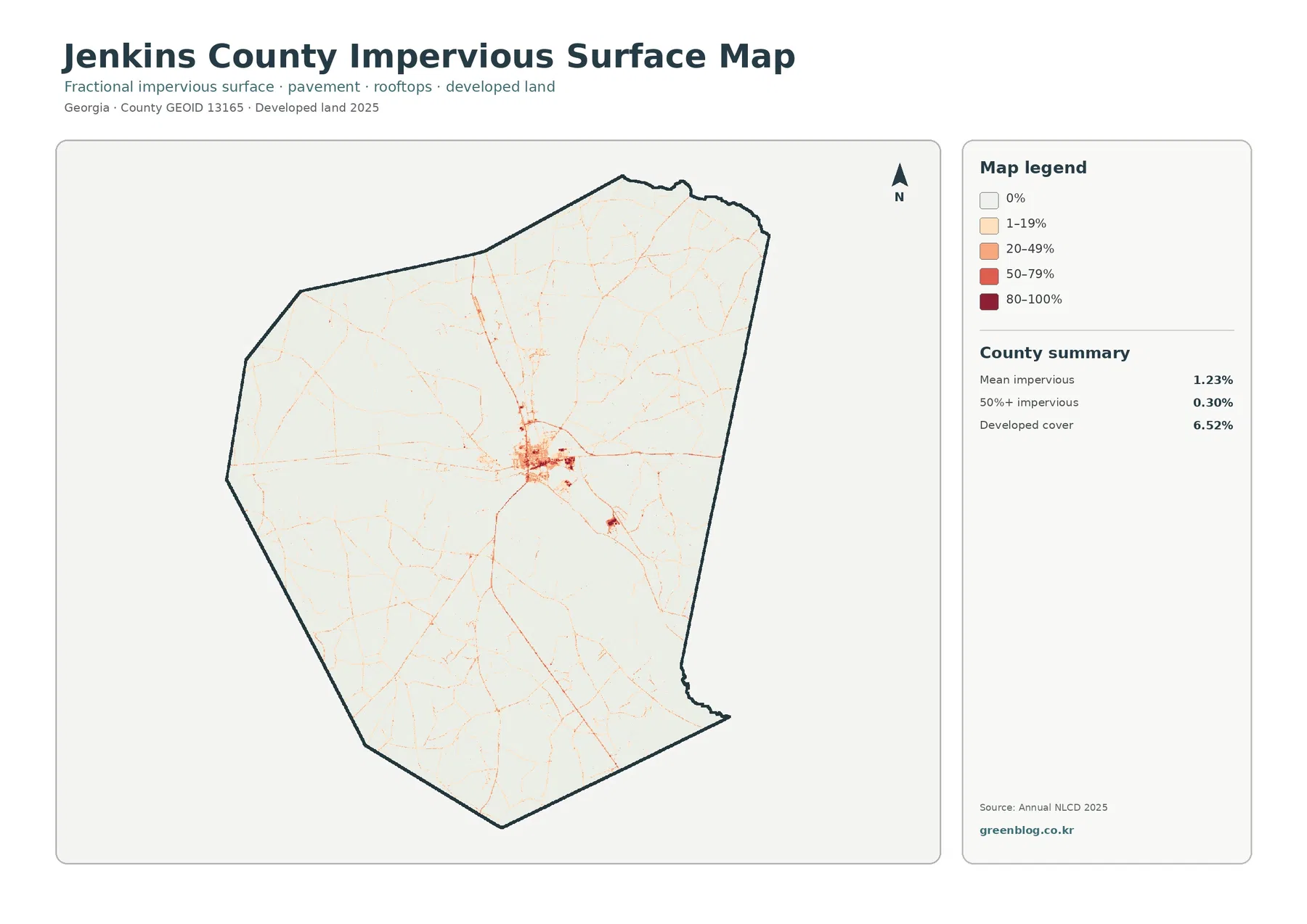
The impervious map has a very different visual balance from the general land-cover image. Most of the county is pale, while a compact cluster of orange and red appears near the center. Thin traces extend outward in several directions, and a smaller dark spot appears to the southeast. The supplied image does not label streets or municipalities, so those lines should not be assigned road names or town boundaries from appearance alone. What the map does establish is concentration: hard surfaces occupy a limited number of locations rather than forming a broad urban field.
Mean impervious cover is only 1.23% countywide, and 0.30% of the county is mapped at 50% or greater impervious surface. Both figures are well below the 6.52% developed share. That difference matters because developed land can include lawns, trees, bare soil, and other permeable surfaces around buildings and roads. The impervious layer isolates the parts that are harder for water to pass through, such as pavement and rooftops.
A low county average can hide a sharp local contrast. The central cluster contains much stronger values than the surrounding agricultural, forested, and wet areas, while large outer sections have little visible hard-surface shading. For a presentation, showing both the 6.52% developed cover and the 1.23% mean impervious value helps explain why a built center can look prominent on the map without making Jenkins County highly impervious overall.
Impervious cover is relevant to drainage studies because water moves differently across roofs and pavement than across soil or vegetation, but this image is not a flood-risk map. Rainfall, elevation, drainage infrastructure, soils, streams, and wetlands all matter. Use the impervious layer to identify where hard surfaces are concentrated, then consult current hydrologic and engineering sources if the question concerns flooding or site design.
Wetlands form the largest cover, with farms and forest interwoven around them
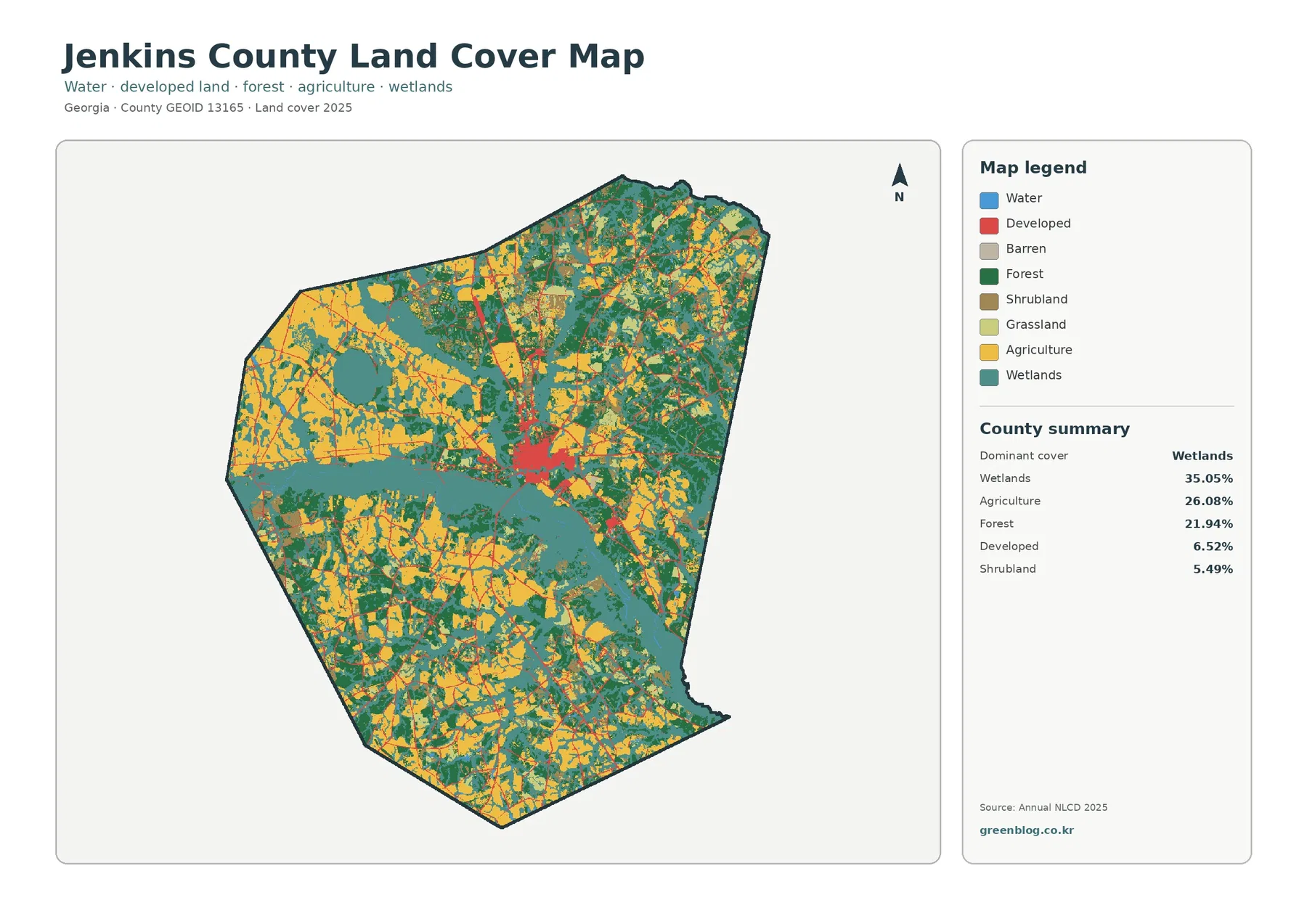
Teal wetland cells cover 35.05% of Jenkins County and create the strongest continuous visual feature. A broad wetland belt crosses the middle of the county, with additional large areas toward the east and southeast. Smaller wet patches also appear farther north and west. Yellow agricultural areas meet those wetlands frequently, especially across the western half and in the south, so field and wetland edges are an important part of the countywide pattern.
Agriculture accounts for 26.08%. Large yellow blocks are especially noticeable in the west and northwest, with another substantial set of fields across southern sections. They are not arranged as one unbroken farm belt. Wetlands, forest, shrubland, and smaller developed traces divide the agricultural cover into many blocks of different sizes. That patchwork is more informative than simply calling the county agricultural, because nearly three quarters of the surface belongs to other mapped classes.
Forest makes up 21.94% and appears in broad patches through the north, east, and south as well as between farm areas. Shrubland contributes 5.49% and grassland 4.27%, usually in smaller pieces rather than large uninterrupted fields. Open water is only 0.60%, which is much smaller than the wetland share. A teal wetland cell therefore should not be described automatically as a lake, pond, or river.
Land cover is a surface classification, not a legal land-use map. It describes what the ground most closely resembles in the imagery, such as forest, crops, wetland, water, grass, or developed cover. It does not show ownership, zoning, parcel limits, building rights, or jurisdictional wetland boundaries. A property-level decision requires the corresponding official records and, when appropriate, field verification.
The vegetation view makes farm-wetland boundaries easier to follow
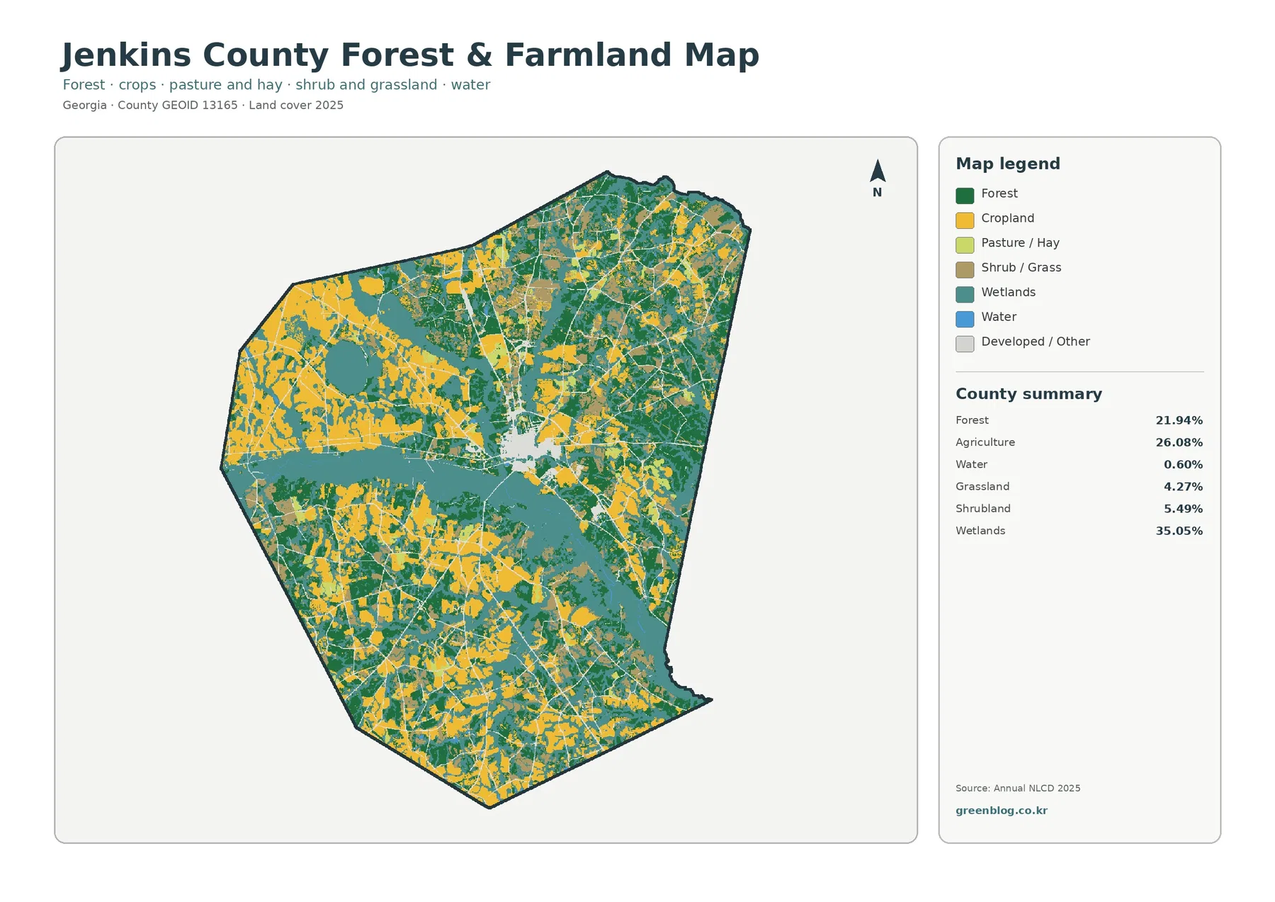
Removing much of the visual emphasis from developed and miscellaneous classes makes the county’s vegetation pattern easier to compare. Agriculture is strong across the western side, while forest is more frequent across northern and eastern sections. Wetlands cut through both. In the middle of the county, a broad teal area separates or narrows several farm and forest patches, and similar contacts repeat farther south.
The map’s 35.05% wetland share exceeds both agriculture and forest, yet the view does not look like one solid wetland block because farms and woods break it into many connected and disconnected shapes. That distinction is useful in environmental education. A percentage tells how much area belongs to a class, while the image shows whether that class is concentrated, scattered, narrow, broad, or repeatedly interrupted by another cover.
Grassland at 4.27% and shrubland at 5.49% occupy smaller transition areas. Some pieces lie along the edges of farm and forest patches, while others sit near developed or wet areas. The 30-meter raster cannot resolve every hedgerow, drainage ditch, narrow tree line, or field margin. A cell containing several surfaces still receives one predominant class, so small transitions can look simpler than they are on the ground.
Open water covers 0.60%, a useful reminder that wetland and water are different categories. Wetlands can include vegetated or seasonally saturated ground, while open-water classes represent exposed water surfaces. The broad teal areas therefore indicate wetland cover, not a network of blue lakes. That distinction should remain clear when the map is reused in a report or classroom slide.
The 1985–2025 comparison marks endpoint differences across about one quarter of the county
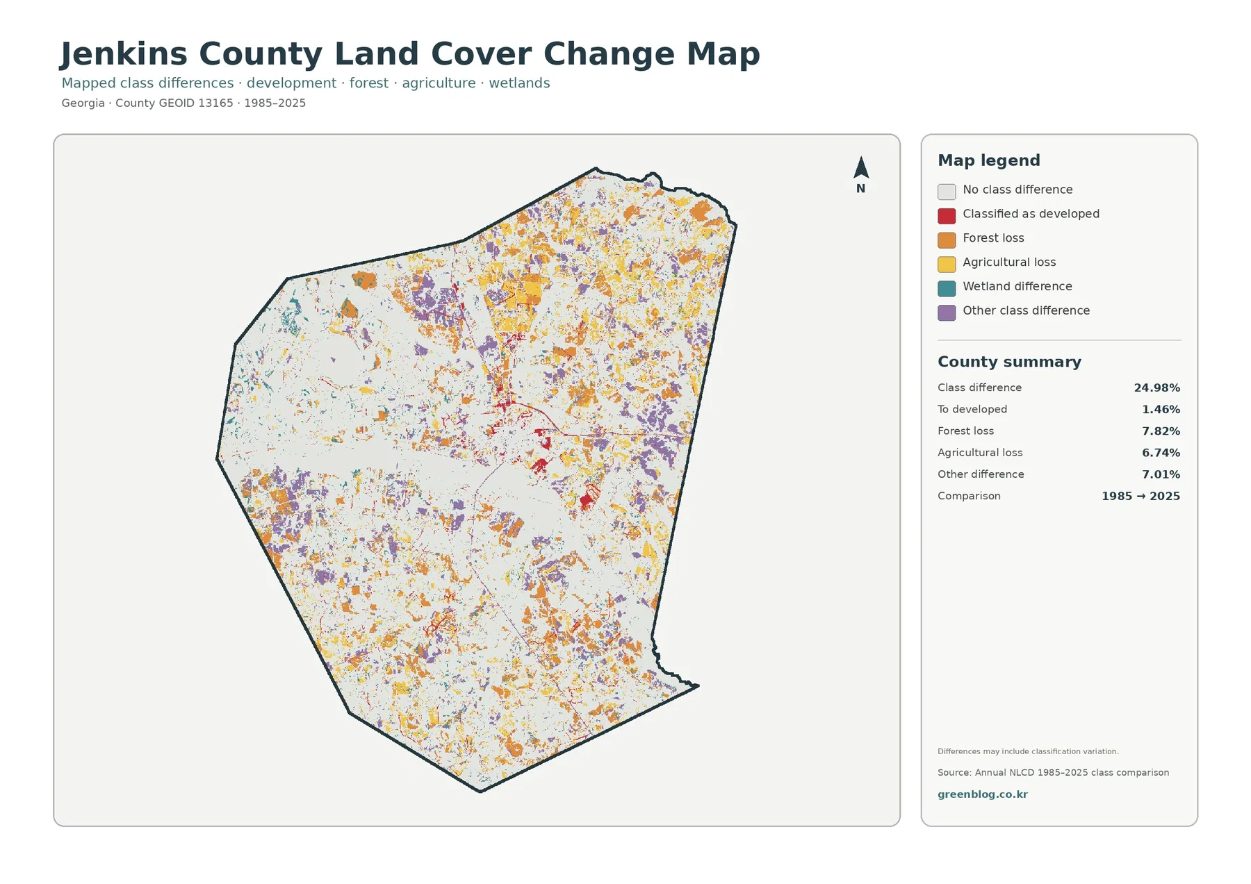
The supplied change summary reports a 24.98% class difference between 1985 and 2025. That number is the share of cells with different endpoint classifications. It is not a statement that 24.98% of Jenkins County was damaged, cleared, or permanently transformed. The map itself notes that classification variation may be included, which is important when image timing, seasonal conditions, or mixed pixels differ between observations.
The listed categories include 1.46% classified as developed, 7.82% forest loss, 6.74% agricultural loss, and 7.01% other difference. Orange forest-loss cells and yellow agricultural-loss cells occur in many parts of the county rather than in a single concentrated zone. Purple other-difference areas are also scattered widely. Red developed-change cells are more localized and are especially noticeable near the central hard-surface cluster and around the smaller southeastern built feature.
Wetland difference appears in the legend, but the map does not print a separate percentage for that category. It would be misleading to calculate a remainder from the other numbers and present it as an official wetland-change rate. The teal difference cells can be located visually, but exact numeric reporting should stop at the values explicitly supplied by the map.
“Forest loss” and “agricultural loss” describe a change in endpoint class, not a proven cause. A forest cell in 1985 may receive another class in 2025 for many reasons, including real land-cover change or classification variation. The same caution applies to agricultural loss. To explain when and why a large cluster changed, compare intermediate-year imagery and local records rather than assigning a cause from this two-date image alone.
Read the four maps as related layers, not interchangeable pictures
The 2025 countywide map is the best starting image because it puts the 35.05% wetland share, 26.08% agriculture, 21.94% forest, and 6.52% developed cover in one frame. The vegetation map then clarifies how farms, woods, wet areas, grassland, and shrubland meet when built surfaces receive less visual emphasis. That sequence works well for county profiles and lessons where the first question is simply what covers the land now.
When the topic changes to buildings, roads, or paved intensity, the impervious map is more precise than the developed class alone. Its 1.23% mean and 0.30% area above 50% impervious surface reveal how concentrated the hard surfaces are. Using only the developed percentage would miss that intensity difference, while using only the impervious map would hide lawns, trees, and other permeable cover inside developed areas.
The 1985–2025 image belongs after the current maps because its colors describe endpoint differences rather than present cover. A red cell there should not be read as every developed cell that exists in 2025. Likewise, the 24.98% total should be labeled “class difference” rather than “land loss” or “damage.” Keeping those terms separate prevents a change graphic from being mistaken for a current land-use map.
Scale, observation year, and file size set practical limits
Annual NLCD uses 30-meter raster cells, which means each square represents a generalized dominant cover. Narrow roads, small ponds, drainage channels, tree lines, and field boundaries may look wider, narrower, or less continuous than they are on the ground. Enlarging the JPG can make the colors easier to inspect, but it cannot create parcel detail that the source grid does not contain.
The current land-cover and impervious maps use the supplied 2025 observation year. Construction, clearing, vegetation recovery, farm conversion, or changes in standing water after that year may not appear. For a current site-specific question, compare the map with newer aerial imagery and the appropriate local or regulatory source.
Each downloadable JPG measures 2480 × 1754 pixels at the original resolution supplied in the package. That size is practical for screens, reports, handouts, and many presentation layouts, but the asset manifest does not identify the files as meeting an A3 high-resolution reference. Test a proof before making a large poster, preserve the image proportions, and use official survey, parcel, permit, wetland, or flood documents for legal or engineering decisions.
Download the four original Jenkins County JPG maps
The ZIP contains one original JPG for each view discussed above: 2025 land cover, forest and farmland, impervious surface and developed land, and 1985–2025 land-cover change. Start with the countywide map, then add the vegetation, hard-surface, or endpoint-difference image that directly supports the point you want to explain.
Frequently Asked Questions
What is the largest land-cover class in Jenkins County?
Wetlands are the largest class in the supplied 2025 summary at 35.05%. Agriculture follows at 26.08% and forest at 21.94%, so the county combines three major covers rather than being dominated by a single uniform surface.
Why does developed land cover 6.52% while mean impervious cover is only 1.23%?
Developed classes can include lawns, trees, bare soil, and other permeable surfaces around buildings and roads. The impervious layer measures hard surfaces more directly, such as rooftops and pavement. In Jenkins County those stronger values are concentrated in the central built cluster and a few smaller features.
Does the 24.98% class difference mean one quarter of the county was damaged?
No. It is the share of cells with different classifications at the 1985 and 2025 endpoints, and the map warns that classification variation may be included. The listed categories are 1.46% classified as developed, 7.82% forest loss, 6.74% agricultural loss, and 7.01% other difference. Timing and cause require intermediate imagery and local evidence.
Sources and Reference Data
- MRLC Annual NLCD Data – official access point for annual land-cover and class-comparison products
- USGS Annual NLCD Land Cover Classification – official definitions for forest, agriculture, wetlands, developed land, and related classes
- U.S. Census Bureau TIGER/Line Shapefiles – official county-boundary reference used for geographic identification
Map File Information
The ZIP contains four original JPG maps for comparing Jenkins County's wetlands, agriculture, forest, compact developed core, impervious surfaces, and 1985–2025 class differences.
- Included Files: Use only the versions confirmed in the article and supplied images
- File Type: Use the confirmed download contents
- Intended Use: Printing, education, presentations, and map-based projects
Related Maps
- Appling County Georgia Land Cover Map
- Atkinson County Georgia Land Cover Map
- Bacon County Georgia Land Cover Map
Green Map creates custom-edited map images using open geographic data sources such as geoBoundaries, Natural Earth, OpenStreetMap, and government open data.
These maps are edited visual materials, not raw data files, and are provided for education, documents, presentations, and graphic reference.