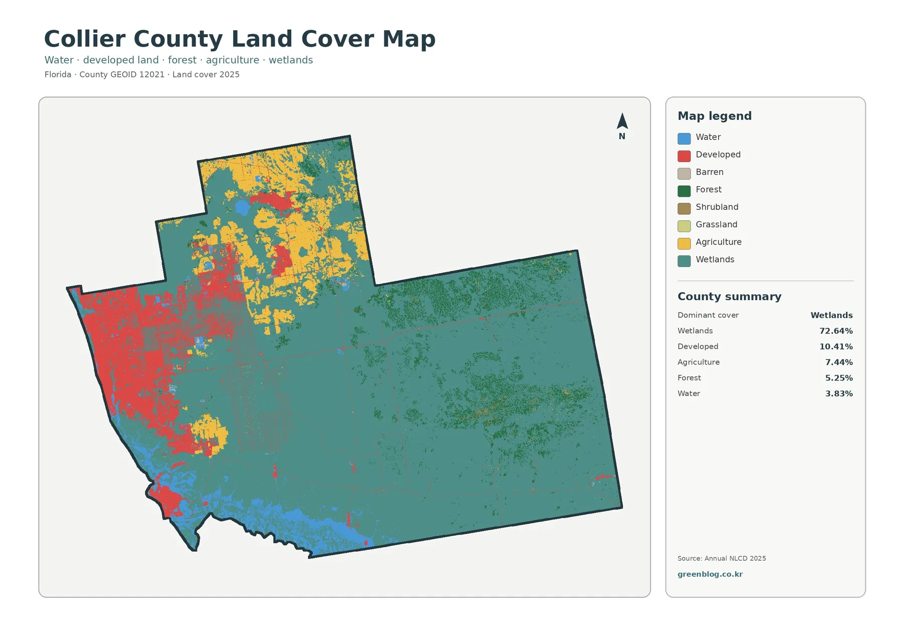
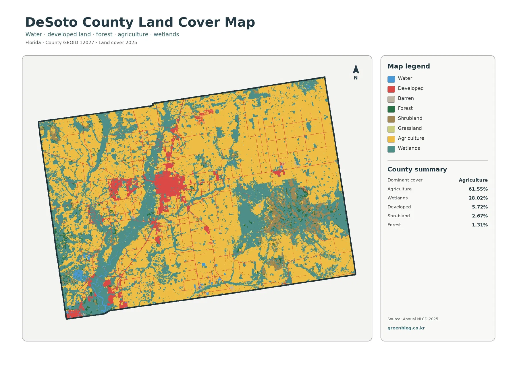
Osceola County Florida Land Cover Map data for 2025 presents a county split among broad wetlands and agricultural land, numerous lakes, and a clearly concentrated developed area in the northwest. Wetlands are the largest class at 35.62%, but agriculture is close behind at 32.37%. Developed land accounts for 11.14%, water 8.54%, forest 6.82%, shrubland 5.18%, and grassland 0.21%. The percentages matter, but their locations are what make the county especially useful for comparison.
This page pairs the 2025 overview with a forest-and-farmland view, an impervious-surface map, and a 1985–2025 class-difference map. The WebP images are convenient for on-page comparison, while the four original JPG maps are available together in one download below. They can be used for county profiles, lessons, presentations, and first-pass comparisons of development, wetlands, agriculture, water, and long-term mapped differences.
Table of Contents
Northwest development stands apart from the wet and agricultural interior
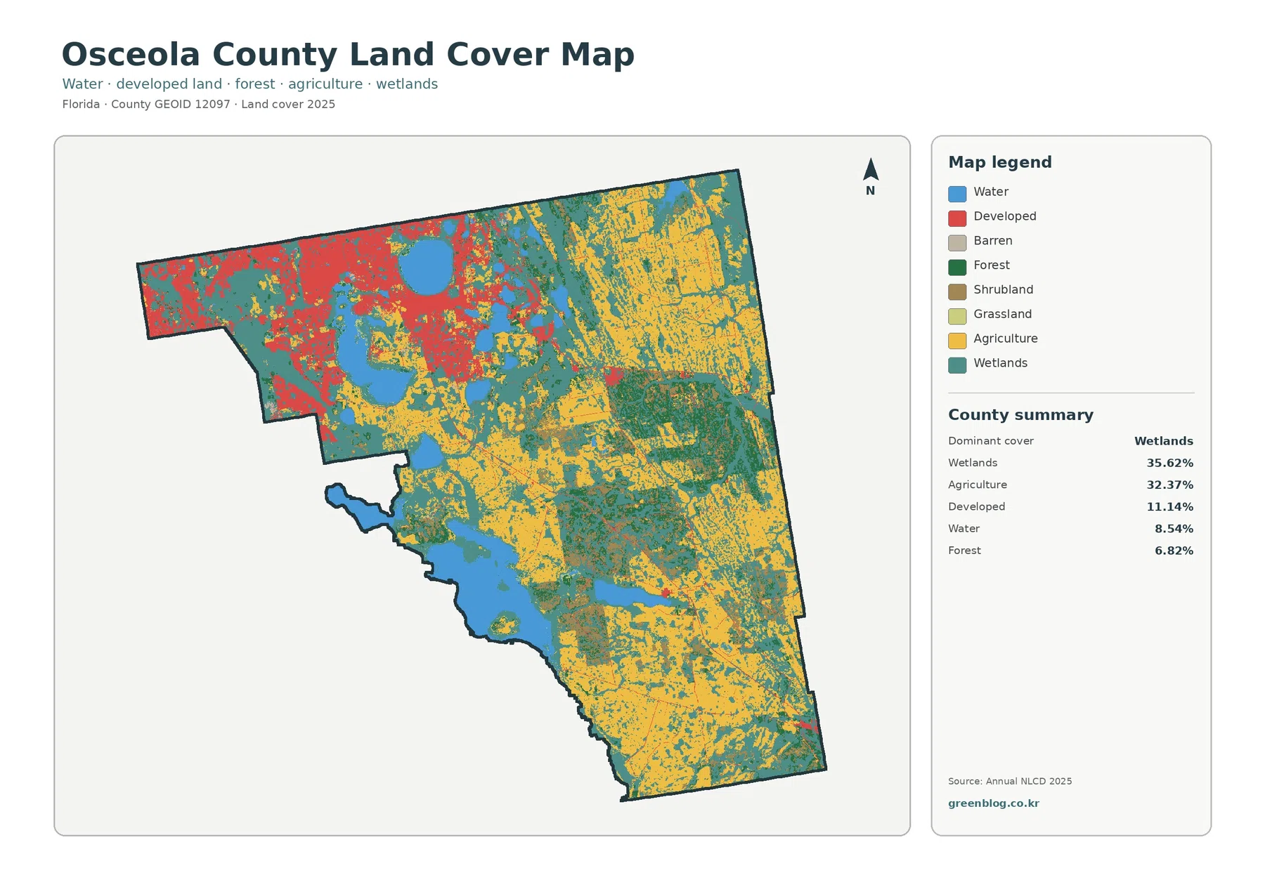
The first feature to notice is not simply the largest percentage. It is the geographic split. Red developed cover forms a broad concentration in the northwest, where the Kissimmee and St. Cloud urban area is located, while the eastern and southern portions of the county contain far more wetland and agricultural colors. Smaller developed marks extend away from the northwest, but they do not become a countywide blanket.
Wetlands cover 35.62% and appear through much of the center and south, around several water bodies, and in broad parts of the east and northeast. Agriculture at 32.37% is especially prominent across the northeast, east, and southeast, with additional areas near the center. Because the two shares are separated by only 3.25 percentage points, neither class can be treated as a minor background to the other. Both are essential to the countywide picture.
Water contributes 8.54%, and the map contains many blue lakes of different sizes. Some lie inside or close to the developed northwest, while others are surrounded by wetlands and agricultural land farther into the county. A large water area in the south-central to southwestern part of the mapped outline is especially easy to use as a reference point. Looking at the cover around each lake makes the map more informative than reading the water percentage by itself.
Forest is 6.82% and is most conspicuous in several darker green areas east of the county center, with smaller wooded areas elsewhere. Shrubland accounts for 5.18%, while grassland is only 0.21% in the supplied summary. Barren land appears in the legend, but the package does not supply a separate verified county percentage for it. That is a useful reminder not to estimate statistics from colored pixels when a precise value is not provided.
Land cover is a description of the surface, not a statement about ownership, zoning, or legal land use. A developed cell can include lawns, trees, and other permeable surfaces along with buildings and pavement. An agricultural cell does not identify a crop, farm operator, or parcel boundary. The overview is best used to compare broad county conditions and to decide where a more detailed source is needed.
Hard surfaces make the northwest concentration even easier to see
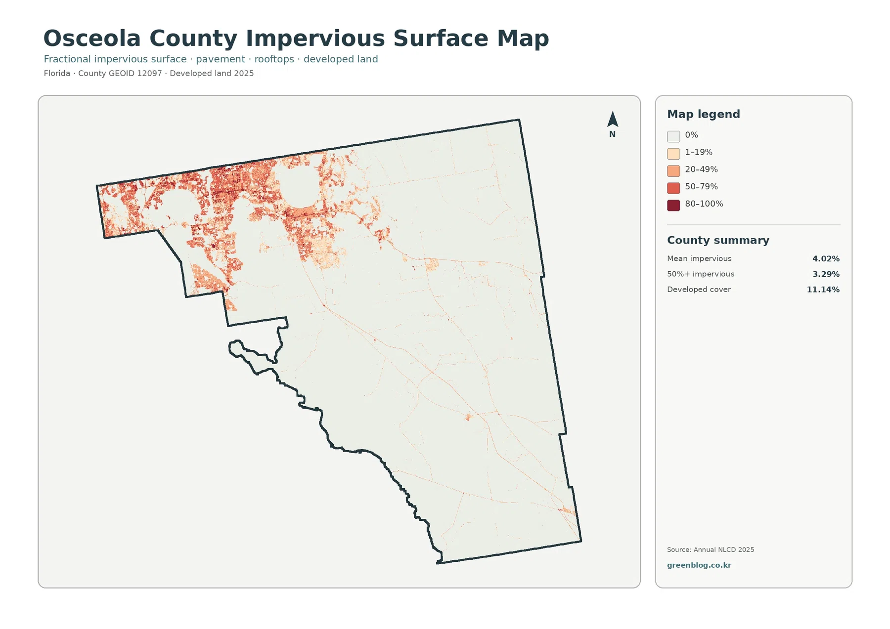
The impervious map strips away most of the land-cover colors and makes the development contrast much sharper. Mean impervious cover is 4.02%, and 3.29% of the county is mapped at 50% or greater impervious surface. Those countywide numbers are modest, yet the orange and red values are heavily concentrated in the northwest. The rest of the county is dominated by the lightest categories, with only thin lines and small isolated concentrations.
Impervious surface means ground covered by materials that do not readily absorb water, such as roofs, paved roads, and parking areas. It is not the same as the broader developed class. Osceola County has 11.14% developed land but only a 4.02% mean impervious value because developed cells can contain grass, trees, bare soil, ponds, and open areas. Keeping those measures separate avoids describing every developed cell as fully paved or intensely urban.
The strongest hard-surface area corresponds broadly with the county’s northwestern urban zone. Osceola County planning materials separately address growth, future land use, transportation, and urban areas around Kissimmee and St. Cloud. That official planning context helps identify why the northwest is an important area to study, but the impervious map should not be used to assign a specific development project or road as the cause of any individual colored cell.
Thin reddish lines elsewhere may resemble roads, but this product is not a transportation map. It does not provide route names, traffic volumes, pavement condition, or lane counts. The same caution applies to flooding: a low impervious value does not prove low flood risk. Rainfall, drainage, soils, elevation, lakes, wetlands, and water-control systems all matter independently of the hard-surface percentage.
Lakes and wetlands give the county a water-rich setting that development percentages do not capture
Osceola County’s own water-planning documents describe numerous lakes and lake chains within the Kissimmee River Basin. They also describe the eastern Alligator Chain of Lakes watershed as a large area containing lakes and wetlands, agricultural lands, and scattered residential development. That description is useful context for the 2025 map, where water, wetland, and agricultural colors repeatedly appear together across much of the eastern county.
The official context should not be turned into a one-to-one label for every map cell. A teal wetland area is not automatically a county conservation parcel, and a blue water cell does not identify water quality, depth, shoreline ownership, or flood regulation. The land-cover product answers a simpler question: what surface class was assigned to the cell in the supplied classification. Regulatory and management boundaries require their own maps.
Osceola County’s Environment and Public Lands Department manages programs involving parks, conservation lands, lakes, waterways, stormwater, and water resources. For a classroom or county profile, this provides a useful local reason to look closely at the 35.62% wetland share and the many water bodies. For a permitting or conservation-boundary question, however, the department’s detailed resources should be consulted directly rather than treating the land-cover image as an official jurisdictional map.
One effective way to read the overview is to choose a large lake as a visual anchor and compare the surrounding cover. In the northwest, water often sits close to developed land. Farther east and south, many water bodies are surrounded more heavily by wetlands and agricultural surfaces. The blue color is the same, but its surrounding landscape differs, which makes the lake locations valuable reference points when explaining the county.
The vegetation-focused view separates farm country from smaller forest areas
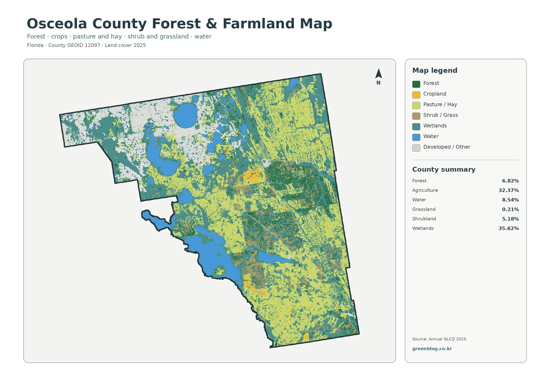
Agriculture becomes easier to follow when the broad developed colors are muted. Large working-land areas occupy much of the northeast and east, and agricultural colors continue through the southeast and parts of the center. The legend separates cropland from pasture or hay, but the supplied county statistic combines them into one 32.37% agricultural share. The map is appropriate for comparing location, not for inventing separate county percentages for those two subcategories.
Wetlands remain extensive even in this focused view. They interrupt or border agricultural areas in many parts of the center, east, and south, while lakes add another layer of water-related cover. The result is not a single uninterrupted farm district. Instead, working land repeatedly meets wet surfaces and open water. That relationship matters for environmental education and watershed discussions because it shows why agriculture should be described in its local water setting.
Forest is much smaller at 6.82%, although several dark green areas east of the county center stand out clearly. Shrubland is 5.18% and appears with other natural vegetation, while grassland is only 0.21% in the county summary. The focused map helps locate these classes without implying that a sharp color edge is a surveyed vegetation boundary. Real field conditions can be more gradual and mixed than the raster image suggests.
Rectangular or straight-edged agricultural shapes should not be read as property lines. Annual land-cover products classify raster cells, and a cell may contain trees, drainage ditches, soil, water, or a road along with the dominant agricultural surface. Parcel ownership, zoning, crop type, and permitted land use all require different records. This distinction is especially important when a map is enlarged for presentations or printed reference.
The 1985–2025 comparison highlights development change without explaining its cause
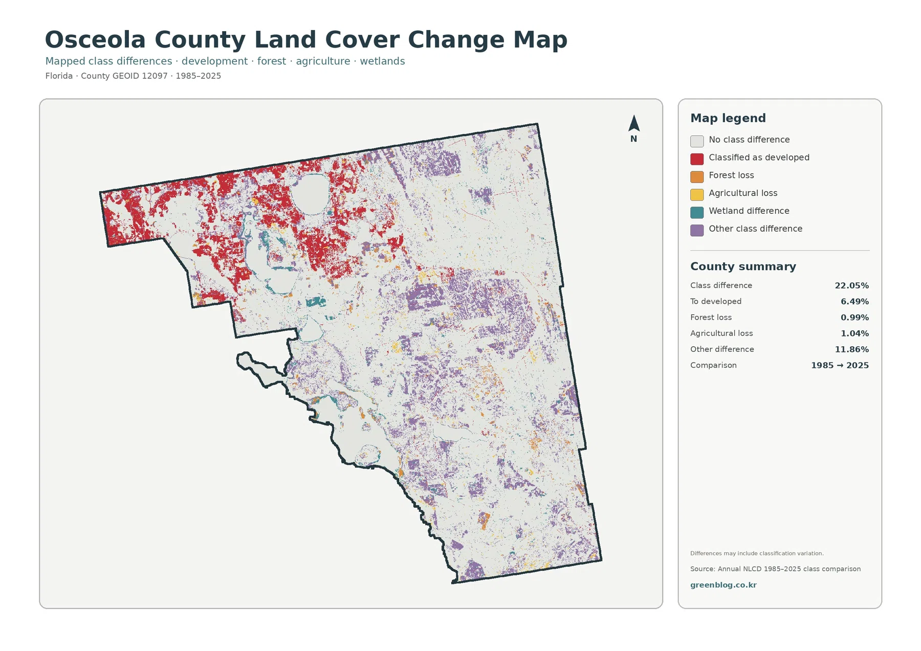
The total class difference between 1985 and 2025 is 22.05%. That value should not be rewritten as a physical destruction rate or as proof that exactly 22.05% of the county permanently changed use. It measures cells assigned to different classes in the two supplied years. Real land-cover change may be part of the result, but classification variation, imagery, seasonal conditions, and mixed pixels can also influence a two-date comparison.
The most visually concentrated highlighted category is change classified to developed, summarized at 6.49%. Red marks are broadest in the northwest, where the current land-cover and impervious maps also show the strongest developed concentration. Smaller red areas occur farther into the county, but the northwest remains the main focus. The agreement among the three views makes this a useful area for closer study without establishing the reason or timing of each change.
Forest loss is listed at 0.99% and agricultural loss at 1.04%. Both are small compared with the developed-change category. Other class difference is much larger at 11.86% and appears widely, particularly across central and eastern portions of the county. Wetland difference is present in the legend and visible in places, but the package does not supply a separate wetland-difference percentage, so a precise value should not be estimated from the image.
A cell colored as a difference does not explain why it differs. Clearing, development, agricultural management, vegetation recovery, water conditions, or changes in classification can produce different outcomes. A responsible workflow starts with this map to identify candidate areas, then checks intermediate-year imagery, local planning documents, permits, agricultural information, or water records before assigning a specific cause.
Pairing the comparison with the 2025 overview is particularly useful. Red differences can be checked against current developed land, while purple or teal differences can be compared with today’s agricultural and wetland areas. This prevents a common mistake: treating a change symbol as if it were a present-day land-cover category. One map describes current classification, while the other marks disagreement between two dates.
Three comparisons make the four-map set more useful than a single percentage table
The first comparison is wetlands versus agriculture. Their shares, 35.62% and 32.37%, are close, and the maps show them meeting repeatedly rather than occupying two completely separate halves. Water bodies are often nearby as well. Describing Osceola County as both wet and agricultural is therefore more faithful to the supplied evidence than choosing only one of those labels.
The second comparison is developed land versus impervious surface. Developed cover is 11.14%, but mean impervious cover is 4.02%. The difference shows that developed classification is broader than pavement and rooftops. The northwest can still look strongly urbanized because its hard surfaces are concentrated, even though much of the county consists of agricultural, wetland, and water surfaces with very low impervious values.
The third comparison is present condition versus long-term class difference. The 2025 maps show where each class is currently mapped, while the 1985–2025 product shows where two dates disagree. The northwest is notable in both current development and development-related difference, but other change categories appear across the interior. Viewing the products together helps separate today’s surface from historical comparison.
A fourth useful comparison involves forest and agriculture. Forest is only 6.82%, far below the 32.37% agricultural share, yet several wooded areas remain visually distinct in the east-central county. The focused vegetation map makes that difference much easier to explain than the general map. It also helps show that a smaller countywide category can still be locally prominent in a particular part of the map.
Use each map for the question it is best equipped to answer
For a general county profile, the 2025 overview is the logical starting point. It places the wetland, agricultural, developed, water, and forest shares into one frame and immediately shows the northwest-to-interior contrast. A presentation can then add the impervious map when development intensity matters, or the vegetation view when the audience needs to focus on agriculture and natural cover.
The change map works best when it is displayed beside a current map rather than by itself. That arrangement lets an audience see whether a highlighted difference lies in today’s developed, agricultural, wetland, forest, or water setting. For environmental education, the same pair can be used to discuss why a classified difference is evidence for further investigation rather than proof of a particular cause.
The four original JPG files are 2480×1754 pixels each. They can be used in ordinary documents, slides, and digital reference work, but the package does not mark them as meeting its A3 high-resolution reference. Enlarging the image does not create new source detail. Projects that depend on parcel boundaries, narrow roads, small drainage features, or individual buildings need more detailed geographic data.
Osceola County’s Comprehensive Plan page provides separate official maps for future land use, wetlands, floodplain areas, transportation, and other planning topics. Those maps should be used for legal or policy questions. The land-cover set is better for describing the physical surface and for selecting areas that deserve more detailed review. Keeping those roles separate prevents a current surface classification from being mistaken for a zoning or development-rights map.
Raster cells and observation dates define what the maps can prove
Annual NLCD is a raster product, meaning the landscape is divided into cells and each cell is assigned a dominant class. A real cell can contain pavement, grass, trees, soil, water, and buildings at the same time. The map simplifies that mixture. Boundaries between wetlands and agriculture or between developed land and open surfaces can therefore appear cleaner on the image than they are on the ground.
The current overview represents the supplied 2025 classification. Construction, changes in farming, vegetation recovery, water-level variation, or other events after that observation period may not be represented. The 1985–2025 map is also a two-date comparison rather than a year-by-year history. A location may have changed multiple times between those years and still end in a class similar to where it began.
These limits do not reduce the value of the maps when they are used at the right scale. They are well suited to countywide comparison, classroom explanation, presentation graphics, and identifying areas for additional research. They are not substitutes for surveys, jurisdictional wetland determinations, parcel records, engineering plans, or current site inspections.
For Osceola County, the strongest use is comparative: the maps make it easy to see where the developed northwest gives way to a county dominated by wetland, agricultural, and water surfaces; where hard surface is actually concentrated; and where two-date classification differences are most common. Those are broad geographic questions that the supplied data can answer without overstating its precision.
Frequently Asked Questions
What are the two largest land-cover classes in Osceola County?
Wetlands are largest at 35.62%, followed closely by agriculture at 32.37% in the supplied 2025 summary. Together they account for more than two-thirds of the county. The maps also show that these classes are interspersed across much of the center, east, and south rather than forming two simple, isolated zones.
Why does the northwest look highly developed if mean impervious cover is only 4.02%?
Hard surfaces are strongly concentrated in the northwest, while large parts of the county have very low impervious values. A countywide average combines both conditions. Developed land is also broader than hard surface: the 11.14% developed class can include lawns, trees, soil, and open areas, whereas impervious cover isolates pavement, roofs, and similar surfaces.
Does the 22.05% class difference mean that 22.05% of Osceola County physically changed?
No. The value measures cells assigned to different classes in the 1985 and 2025 comparison. Actual change can be part of that result, but imagery, seasonal conditions, mixed pixels, and classification variation may also contribute. The map is best used to select locations for closer study with intermediate imagery and local records.
Sources and Reference Data
- MRLC Annual NLCD Data – source information for the 2025 land-cover and 1985–2025 comparison products.
- USGS Annual NLCD Land Cover Classification – official descriptions of developed, forest, agricultural, wetland, and other classes.
- U.S. Census Bureau TIGER/Line Shapefiles – official geographic boundary reference for Osceola County.
- Osceola County Environment and Public Lands Department – local context for lakes, waterways, conservation lands, and water-resource programs.
- Osceola County Comprehensive Plan – official maps and planning resources for future land use, wetlands, floodplains, transportation, and related topics.
- Osceola County Water Supply Facilities Work Plan – county context for the Kissimmee River Basin, lake chains, and the eastern Alligator Chain of Lakes watershed.
Map File Information
The ZIP contains the four original JPG land-cover maps used in this Osceola County article.
- Included Files: Use only the versions confirmed in the article and supplied images
- File Type: Use the confirmed download contents
- Intended Use: Printing, education, presentations, and map-based projects
Related Maps
- Alachua County Florida Land Cover Map
- Baker County Florida Land Cover Map
- Bay County Florida Land Cover Map
Green Map creates custom-edited map images using open geographic data sources such as geoBoundaries, Natural Earth, OpenStreetMap, and government open data.
These maps are edited visual materials, not raw data files, and are provided for education, documents, presentations, and graphic reference.