Hendry County is a working-land county in the 2025 land-cover data. Agriculture accounts for 54.81% of the mapped area and wetlands add another 33.61%, so those two classes shape most of the countywide view. Developed land is much smaller at 5.96%. The four maps on this page separate those broad cover classes from forest-and-farmland detail, impervious surfaces, and mapped differences between 1985 and 2025.
The web images are designed for on-page viewing, while the four original JPG maps are available together in one download below. They can be used for classroom comparisons, presentations, countywide environmental context, and preliminary map review. Land cover is not the same as zoning, ownership, permitted use, or a parcel boundary; it is a classification of what covers the ground at the mapped observation date.
Table of Contents
Agriculture dominates the 2025 countywide view
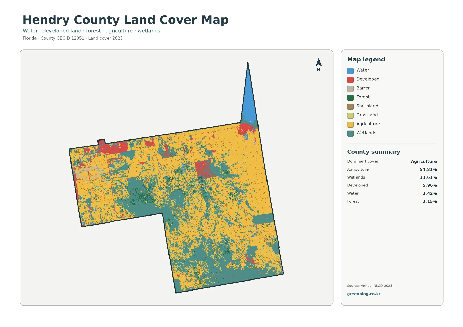
Agriculture is the dominant class at 54.81%. It covers large portions of the northern, eastern, and western parts of the county, but it does not form one uninterrupted field. Wetlands break up the agricultural areas in many places and become especially broad across the central and southern portions of the county. Reading the percentage together with the map prevents a common mistake: Hendry County is agriculture-heavy, but the landscape is not uniformly agricultural.
Wetlands make up 33.61%, the second-largest share. Their mapped presence is substantial enough that agriculture and wetlands together account for roughly 88% of the county. That balance is useful for environmental education because it shows why a simple urban-versus-rural description would miss much of the county. A clearer countywide picture is a combination of extensive working land and extensive wet ground, with smaller developed areas set within that larger setting.
Developed land accounts for 5.96%, water 2.42%, and forest 2.15%. The strongest developed concentrations appear in the northwest and northeast. When the land-cover map is compared with the Census Bureau’s Hendry County reference map, those concentrations line up with the LaBelle area in the northwest and the Clewiston area near Lake Okeechobee in the northeast. Smaller developed traces are scattered elsewhere, but they occupy far less of the county than agriculture or wetlands.
Water has a modest countywide percentage, yet location matters. The narrow northeastern extension of Hendry County reaches Lake Okeechobee, where the blue water class is easy to see. A 2.42% county average therefore does not mean water is unimportant everywhere. Percentages summarize the county; the map shows where each class actually occurs.
Impervious surfaces are sparse outside the main settled areas
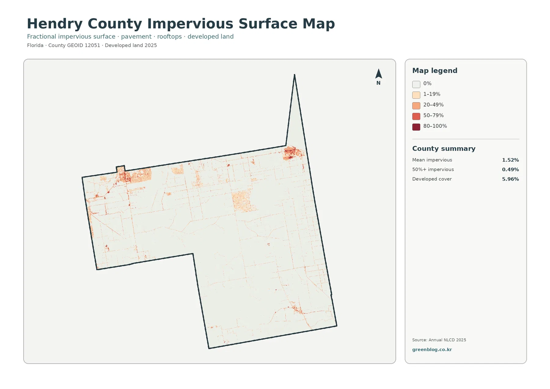
Impervious surface means pavement, rooftops, parking areas, and similar surfaces that do not readily absorb rainfall. Hendry County’s mean impervious value is 1.52%, and only 0.49% of the county is mapped at 50% impervious or higher. Those values fit the visual impression of a county where most land is agricultural or wetland rather than densely built.
The stronger impervious colors are concentrated around the same broad northwest and northeast settled areas that stand out on the developed-land map. Fine lines and isolated spots also appear along transportation and built features, but the countywide background remains very light. This makes the map useful for showing the contrast between compact developed areas and the much larger stretches of permeable ground.
Developed cover and impervious percentage should not be treated as interchangeable statistics. Developed classes can contain lawns, trees, bare soil, and other surfaces that still absorb water, while the impervious layer focuses on the fraction occupied by hard surfaces. That is why the developed share can be 5.96% while the county mean impervious value is only 1.52%.
A low county average also does not answer site-level drainage questions. Flooding and runoff depend on elevation, rainfall, soils, canals, drainage infrastructure, and the arrangement of built surfaces. This map is appropriate for broad comparison and screening, not for engineering design or property-level stormwater decisions.
The forest-and-farmland view simplifies a strongly agricultural landscape
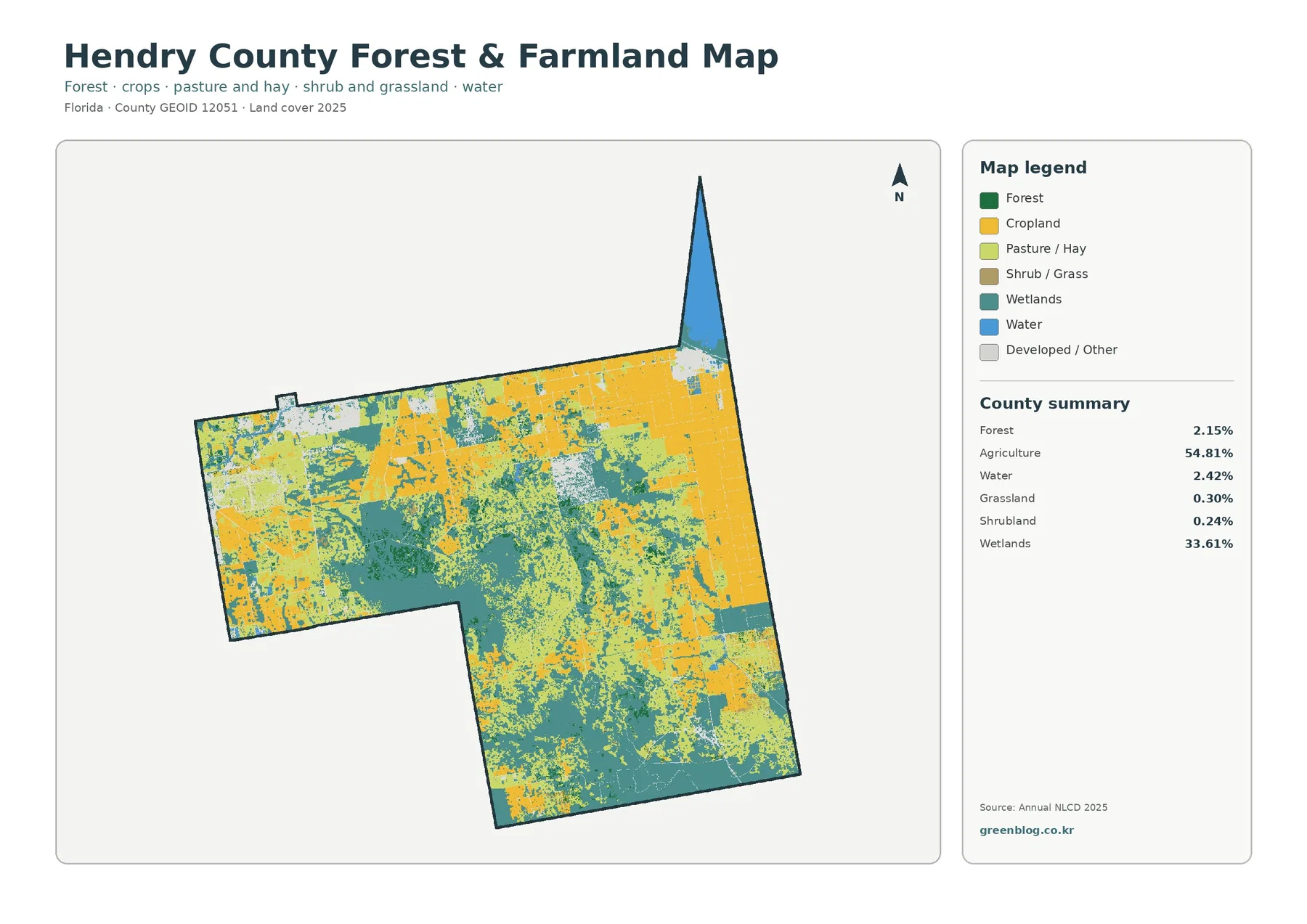
The forest-and-farmland map removes some of the visual complexity of the full land-cover legend. Agriculture remains 54.81%, wetlands remain 33.61%, and forest is 2.15%. Grassland is 0.30% and shrubland 0.24%. With the smaller classes grouped more simply, the dominance of agriculture and wetlands becomes even easier to see.
The county’s agricultural importance is also reflected in the local UF/IFAS Extension program, which serves Hendry County residents and the agricultural community with research-based information. Crop types and farm ownership are not identified here, but the agricultural layer still provides a useful geographic backdrop because working land occupies more than half of the mapped county.
Forest is present in scattered areas rather than as a countywide dominant cover. A 2.15% share should not be read as ‘no forest’; it means forest occupies a much smaller portion of the county than agriculture and wetlands. Small wooded areas may also be difficult to distinguish at a countywide scale, especially where a 30-meter land-cover cell contains several different surface types.
The raster format is important when the map is used in a report. Each grid cell receives a mapped class even though the real ground inside that cell may contain a mixture of vegetation, road edges, water, or structures. The product is therefore good for countywide patterns and comparisons, but it is not a substitute for a parcel survey, field visit, or detailed aerial-image review.
Mapped differences from 1985 to 2025 require cautious interpretation
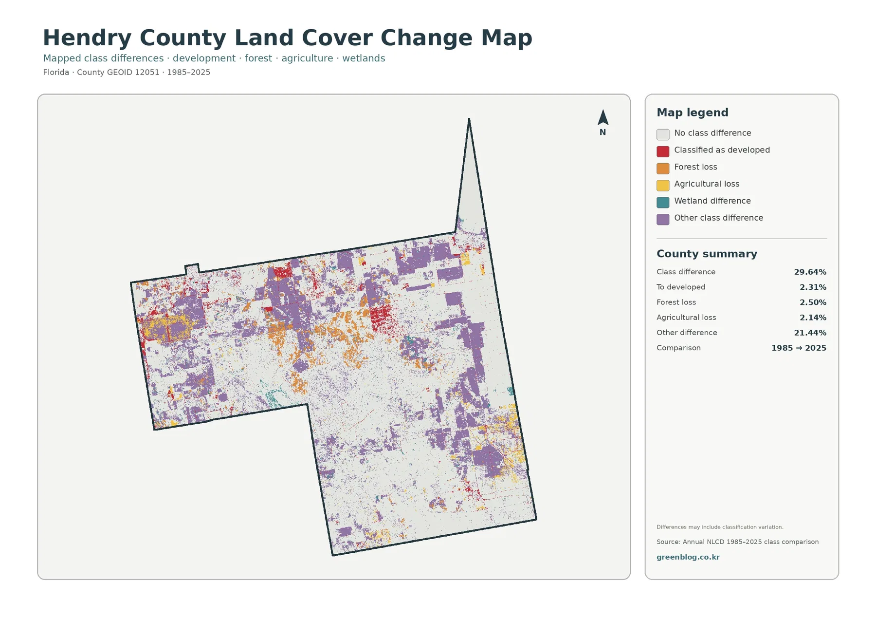
Between 1985 and 2025, the change layer reports a class difference across 29.64% of the county. The summary separates 2.31% classified to developed, 2.50% forest loss, 2.14% agricultural loss, and 21.44% other difference. The large ‘other difference’ category is a reminder that the map is not a simple development-loss map.
Differences are especially noticeable across the northern half, with additional areas in the center and south. Red cells that were classified as developed in 2025 occur near some of the present-day developed concentrations. Orange and yellow areas indicate locations where forest or agriculture was classified differently at the later date. Those colors locate differences, but they do not explain why a change occurred.
Its own note warns that classification variation can contribute to the displayed differences. A cell can change class because the land truly changed, because mixed cover was assigned differently, or because the source observations and classification process differed. For that reason, 29.64% should not be presented as a precise statement that nearly one-third of the physical landscape was transformed.
A stronger analysis would use intermediate Annual NLCD years, aerial imagery, and local records. For a first-pass review, this layer works well for deciding where to investigate. It is much less suitable for assigning causes, dating a specific project, or determining whether a particular parcel changed use.
LaBelle, Clewiston, and the Lake Okeechobee edge help orient the maps
County land-cover maps are easier to read when they are paired with a reference map that names places. The Census Bureau’s 2020 Hendry County reference map labels LaBelle, Clewiston, Port LaBelle, Montura, Pioneer, and nearby Lake Okeechobee. Those labels provide a practical frame for the unlabeled land-cover images without changing what the land-cover data represent.
The northwest developed concentration corresponds broadly with the LaBelle area, while the northeast concentration corresponds with Clewiston near Lake Okeechobee. Between and south of those settled areas, agriculture and wetlands occupy much more of the map. That contrast explains why a road or city map and a land-cover map can give very different impressions of the same county.
The Lake Okeechobee edge is also a good example of why area percentages and map location answer different questions. Water represents only 2.42% countywide, yet it is visually important at the northeastern boundary. Wetlands are far more extensive across the county than open water, so blue water and wetland colors should not be combined as though they mean the same surface condition.
Choosing the right map depends on the question
For a general county profile, the full land-cover map is the best starting point because it keeps agriculture, wetlands, developed land, water, forest, and smaller classes in one view. It works well in a presentation where the first goal is to explain the overall 2025 distribution.
The forest-and-farmland map is better when the topic is working land, vegetation, or the relationship between agriculture and wetlands. The impervious map is more focused: it helps show where hard surfaces are concentrated and where they remain uncommon. Use the change layer for comparisons between 1985 and 2025 because its colors describe class differences rather than current cover.
Using all four maps together can be useful as long as each is given a clear role. A current land-cover class, an impervious percentage, and a long-term class difference are three different measurements. Keeping those measurements separate makes the final explanation clearer and prevents a high value on one map from being misread as the same thing on another.
Download the four JPG maps and keep their scale limitations in mind
The download ZIP contains four JPG files: the 2025 land-cover map, the forest-and-farmland map, the impervious/developed-land map, and the 1985–2025 land-cover change map. Each 2480×1754-pixel JPG is convenient for documents, slide decks, classroom handouts, and side-by-side map comparisons.
These files are useful at normal document and presentation sizes, but 2480×1754 pixels is smaller than a full A3 image at 300 dpi. Very large printing can soften small labels and fine boundaries, particularly on the change map. A test print is sensible when the legend or small colored cells need to remain easy to read.
No map in this set should be used to establish legal parcel boundaries, ownership, zoning, or a development right. The county outline and land-cover cells are generalized for mapping and statistical use. Property decisions require the appropriate county records, survey information, and current regulatory sources.
Frequently Asked Questions
What is the largest 2025 land-cover class in Hendry County?
Agriculture is the largest at 54.81%, followed by wetlands at 33.61%. Together they account for roughly 88% of the county. Developed land is 5.96%, water is 2.42%, and forest is 2.15%.
Why is developed cover 5.96% while mean impervious cover is only 1.52%?
The measurements describe different things. A developed land-cover class can include lawns, trees, soil, and other permeable surfaces around buildings and roads. The impervious layer focuses on hard surfaces such as pavement and rooftops, so its countywide mean can be much lower.
Does the 29.64% class difference mean 29.64% of Hendry County physically changed?
No. The change product compares mapped classes from two dates, and the map notes that classification variation may be included. It is best used to locate areas for further review with intermediate land-cover years, aerial imagery, and local records. Map File Information Download the four Hendry County land-cover JPG maps together in one ZIP file.
Map File Information
Download the map files associated with this page for reference, printing, and compatible visual projects.
- Included Files: Use only the versions confirmed in the article and supplied images
- File Type: Use the confirmed download contents
- Intended Use: Printing, education, presentations, and map-based projects
Related Maps
- Alachua County Florida Land Cover Map
- Baker County Florida Land Cover Map
- Bay County Florida Land Cover Map
Sources and References
- MRLC Annual NLCD Data – official access to Annual NLCD land-cover and related datasets.
- USGS Annual NLCD Land Cover Classification – official descriptions of the land-cover classes used in the dataset.
- U.S. Census Bureau TIGER/Line Shapefiles – official geographic boundary data used for county reference.
- U.S. Census Bureau 2020 Hendry County Census Tract Reference Map – reference map for LaBelle, Clewiston, Lake Okeechobee, and other named places.
- UF/IFAS Extension Hendry County – county-specific agriculture and natural-resources information from the University of Florida Extension program.
Green Map creates custom-edited map images using open geographic data sources such as geoBoundaries, Natural Earth, OpenStreetMap, and government open data.
These maps are edited visual materials, not raw data files, and are provided for education, documents, presentations, and graphic reference.