This page provides four Limestone County Alabama land cover maps, and the four matching original JPG maps are available together in one ZIP download. Agriculture is the dominant 2025 class at 52.12 percent, followed by forest at 18.00 percent, developed cover at 14.56 percent, wetlands at 8.68 percent, and water at 6.08 percent. The strongest contrasts are the broad farm landscape, the developed concentration around Athens, wooded areas toward the northwest, and large water features along the southern and western sides of the county.
The four maps cover general land cover, forest and farmland, impervious surface and developed land, and change from 1985 to 2025. The WebP images below are lighter previews, while the downloadable set contains four 2480×1754-pixel original JPG maps for printing, classroom work, presentations, and county comparisons. These products describe surface cover at county scale; they are not parcel surveys and do not establish ownership, zoning, building rights, flood status, or regulatory wetland boundaries.
Table of Contents
The county-wide pattern in 2025
Limestone County does not look like a uniformly agricultural rectangle even though farming covers more than half of the mapped area. Large yellow agricultural blocks spread across the center, south, and northeast, while forest becomes more noticeable in the northwest and along several drainage corridors. Developed cover forms a large central cluster and smaller concentrations to the east and southeast. Water is concentrated rather than evenly scattered, so its 6.08 percent share has a much stronger visual presence along the county edge than the percentage alone suggests.
| Dataset view | Annual NLCD 2025 |
|---|---|
| Agriculture | 52.12% |
| Forest | 18.00% |
| Developed | 14.56% |
| Wetlands | 8.68% |
| Water | 6.08% |
| Grassland | 0.31% |
| Shrubland | 0.21% |
| Mean impervious | 3.73% |
| 50%+ impervious | 2.18% |
| 1985→2025 class difference | 22.35% |
The county summary is useful for ranking the broad classes, but the image explains where those classes occur. Agriculture is the clear county-wide leader, yet the central developed area breaks up the farm pattern and the northwest contains larger patches of forest. Along the south, blue water and adjacent wetland colors create a distinct edge. Reading the percentages and the distribution together avoids the common mistake of describing every part of Limestone County as though it had the same landscape.
The county government describes Limestone County as part of the Tennessee Valley, with the Tennessee River along its southern end and the Elk River on the western side. It also identifies Athens as the county seat. Those official geographic references match the broad positions of the southern water body, the winding western water corridor, and the large central developed concentration seen in the supplied images. They provide location context without turning individual raster cells into surveyed boundaries.
Agriculture dominates, but forest still shapes the northwest
At 52.12 percent, agriculture is the strongest single class in the 2025 summary. The mapped farm pattern is especially broad through the middle and southern parts of the county, where many fields have straight edges and block-like shapes. A similar pattern continues into the northeast. Forest is more fragmented through much of this farm country, but larger green areas remain toward the northwest and across the northern side. The result is a landscape where farming sets the overall tone while wooded corridors and patches continue to divide the open ground.
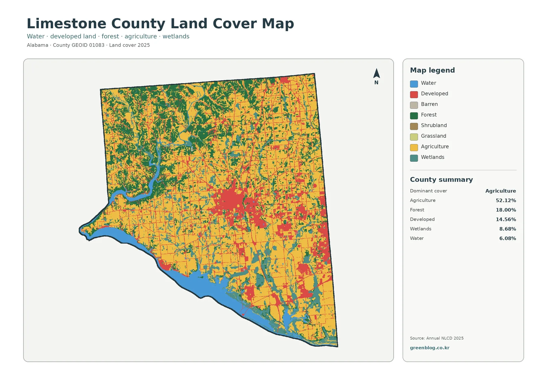
The southern edge is easy to locate because the water surface forms a wide, continuous band. Limestone County’s official history discusses the Tennessee River and the creation of Wheeler Lake as major parts of the local landscape. That context helps explain why water is so visually prominent along the south, but the land-cover image should not be treated as a lake-management or navigation boundary. Shoreline ownership, flood zones, reservoir operations, and public access require separate sources.
The western water corridor bends through a more wooded setting before reaching the broad water at the southwest. The county’s official description identifies the Elk River on the western side, which is useful geographic context for that part of the image. The map itself is best used to note that forest and wetlands are more common around the winding western corridor than in many of the large farm blocks farther east. Identifying individual tributaries or exact wetland limits requires more detailed hydrography and regulatory data.
A closer look at forest and farmland
The forest-and-farmland view removes much of the visual competition from developed classes and makes the rural pattern easier to compare. Cropland occupies large pieces of the center, south, and northeast. Forest stands out more clearly in the northwest and along irregular strips that follow drainage and field edges. Areas shown as developed or other cover appear pale, which also makes the central Athens area easier to distinguish from the surrounding agricultural ground without confusing it with farmland.
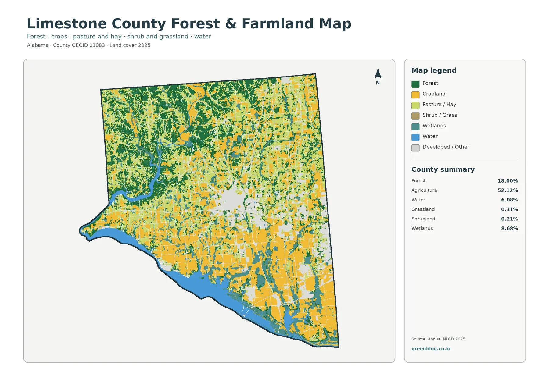
Forest represents 18.00 percent of the county. That is far below agriculture in the summary, but the location of the forest matters. Broad patches in the northwest provide a different visual character from the smaller wooded strips embedded in farm country. In the center and south, field boundaries often meet narrow forest or wetland bands, producing a more mixed edge than a percentage table can show. This view is therefore useful when the question is not simply “how much forest?” but “where does forest remain continuous and where is it broken into smaller pieces?”
Grassland and shrubland are minor summary classes at 0.31 and 0.21 percent. Their small shares mean they should not be given the same weight as agriculture, forest, or developed cover when describing the county. They can still appear as small pieces around farms, development, or transitional ground. The map does not identify crop type, ownership, farm size, grazing practice, timber age, or tree species, so those topics need agricultural or forestry records rather than land-cover color alone.
Limestone County’s official history describes fertile agricultural land as a long-standing local feature. That statement and the 2025 map point in the same broad direction: agriculture remains a major part of the county’s landscape. They should not be treated as the same kind of evidence, however. One is local historical and geographic context; the other is a modern satellite-derived classification. Used together, they support a clear description without claiming that the historical record directly caused the present-day pattern.
Athens and the concentration of impervious surfaces
Impervious surface means pavement, rooftops, parking areas, and other surfaces that allow little rainfall to soak into the ground. Limestone County has a mean impervious value of 3.73 percent, while 2.18 percent of the county is mapped at 50 percent impervious or higher. Developed land covers 14.56 percent. Those numbers are not expected to match because a developed cell may contain lawns, trees, bare soil, and other permeable surfaces in addition to buildings and pavement.
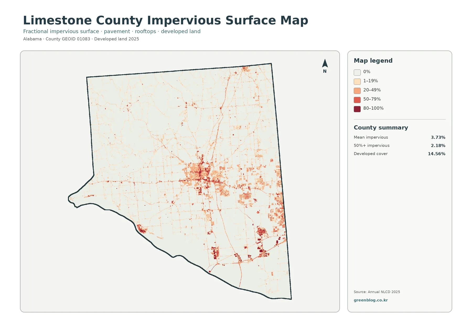
The largest dark concentration sits near the center of the county. Limestone County identifies Athens as its county seat and notes that the city lies about 1.5 miles west of Interstate 65. That official reference is useful when orienting the central cluster and the strong north–south line nearby. It would be an overreach, however, to label every thin line in the raster image as a specific highway or to argue that the road caused nearby development. The map supports a spatial association between built surfaces, settlements, and transportation corridors, not a causal history.
Additional impervious clusters appear east and southeast of the central area. They are separated by broad stretches of lighter agricultural land, so the developed surface is better described as a set of concentrated centers and corridors than as continuous urban cover across the county. This distinction matters when using the map in planning or education. A county-wide developed percentage can sound large, yet the image shows that much of the land between the main developed areas remains farmed or otherwise lightly covered by impervious surfaces.
The three development measures can be used together in a classroom exercise. Students can compare 14.56 percent developed cover with a 3.73 percent mean impervious value and a 2.18 percent share above 50 percent impervious. The difference illustrates why “developed” is a land-cover class while “impervious” measures the fraction of hard surface within each location. Neither measure, by itself, gives stormwater flow, flood risk, drainage capacity, or engineering design values.
Water and wetlands form a strong southern and western edge
Water accounts for 6.08 percent and wetlands for 8.68 percent, but both classes are more noticeable on the image than their percentages might suggest. The broad southern water body creates a continuous edge, while wetlands cluster along parts of that shoreline and through several interior drainage areas. On the west, a winding water corridor is accompanied by forest and wetland colors. These patterns interrupt the otherwise extensive agricultural cover and give the county a more varied surface than the dominant farm percentage implies.
Water and wetlands should not be merged into a single category. Open water represents the water surface itself, while wetland classes can include vegetated areas where water or saturated soils strongly influence the surface. That distinction is useful for watershed lessons because a river, a reservoir edge, and a wetland corridor can sit next to one another but still represent different classes. It is also important legally: an NLCD wetland class is not a regulatory wetland determination and cannot replace agency review or field delineation.
A practical way to use this view is to start at the southern water boundary and move inland. The viewer can compare the blue water, adjacent wetland colors, then the agricultural fields beyond them. On the western side, the same exercise adds larger forest patches to the sequence. The map cannot provide water quality, habitat condition, seasonal flooding, or species information, but it is effective for identifying broad places where those topics could be investigated with more specialized data.
What the 1985–2025 comparison does—and does not—measure
The change product compares the class assigned to each cell in 1985 with the class assigned in 2025. Limestone County has a 22.35 percent overall class difference. That is not the same as saying 22.35 percent of the county was developed during the period. The map separately summarizes 5.90 percent as change classified to developed, 2.20 percent as forest loss, 0.67 percent as agricultural loss, and 12.86 percent as other class difference. Wetland difference is also shown as its own legend category.
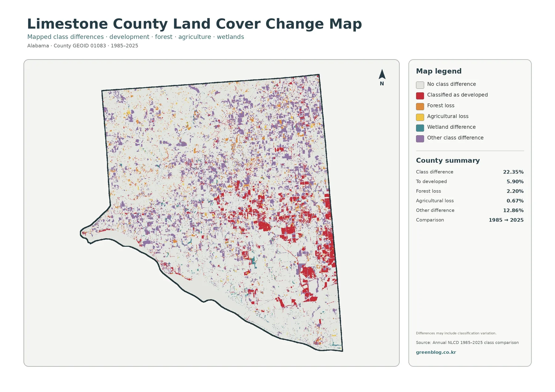
Red change-to-developed cells are especially noticeable around the central and eastern portions of the county, with additional patches toward the southeast. Some of those areas line up broadly with current impervious concentrations, which makes the two products useful to compare side by side. The overlap does not identify the year in which development occurred, nor does it explain why it occurred. Intermediate annual data or historical imagery is needed to determine timing and sequence.
Purple “other class difference” covers a much larger share than the named forest- or agriculture-loss categories. It appears in scattered patches, especially across the north and northeast. The legend itself warns that differences may include classification variation. Satellite observations, classification methods, mixed pixels, and the fact that a 30-meter-scale cell can contain several surface types all make a two-date comparison more complicated than a simple before-and-after photograph.
The forest-loss value of 2.20 percent and agricultural-loss value of 0.67 percent should also be described carefully. They represent cells that changed away from those classes in the two-date comparison, not a complete accounting of net forest or farm acreage over four decades. A location could have changed more than once between 1985 and 2025, and those intermediate steps are not visible here. For that reason, the change product works best as a screening layer that points to areas worth checking in a longer time series.
Using the four files for print, teaching, and comparison
For a general introduction to Limestone County, the full land-cover view is the most efficient first image because it places agriculture, forest, development, wetlands, and water in the same frame. The forest-and-farmland view is better when the discussion centers on rural land patterns. The impervious product works well for settlement and built-surface comparisons, while the 1985–2025 product should be reserved for questions about where classifications differ across time. Using each image for a distinct question keeps the set from feeling repetitive.
- Overall pattern: use the general land-cover view to compare the five major classes and their locations.
- Rural landscape: use the forest-and-farmland view to see broad cropland blocks, wooded patches, and wet corridors more clearly.
- Built surfaces: use the impervious view to compare the Athens area with smaller eastern and southeastern concentrations.
- Water context: trace the southern Tennessee River/Wheeler Lake setting and the western river corridor against adjacent wetlands and farms.
- Long-term screening: use the 1985–2025 comparison to locate changed cells, then verify them with intermediate years or imagery.
The original JPGs are better than the smaller WebP previews when the image will be printed or placed into a slide deck. Each file is 2480×1754 pixels, and the four products use the same county outline, so the viewer can return to the same place in each version. The resolution is useful for ordinary documents and educational graphics, but it should not be mistaken for a survey-grade or engineering-scale product. Small roads, narrow streams, and parcel boundaries require more detailed layers.
Comparisons with other counties should use matching years and similar definitions. A 2025 percentage for Limestone County should not be ranked casually against an older county summary if the goal is to describe current differences. Shape also matters. Two counties can have the same developed percentage while one has a single compact center and the other has several scattered corridors. Looking at both the statistics and the geographic arrangement gives a more useful comparison than a percentage table alone.
Important limits before using the data
Annual NLCD is a raster classification, which means the landscape is divided into grid cells and each cell is assigned a representative class. Real boundaries rarely follow those cells perfectly. A field edge, narrow road, tree line, or stream may share a cell with another surface, creating a mixed pixel. This generalization is acceptable for county-scale interpretation but is one reason the images should not be used to draw parcel lines or make site-specific regulatory decisions.
Land cover is also different from land use. A red developed class describes a surface pattern associated with development; it does not tell whether the legal use is residential, commercial, industrial, or something else. Likewise, an agricultural class does not prove that a parcel is legally restricted to farming, and a wetland class does not establish jurisdiction. Ownership, zoning, permits, property boundaries, and regulatory status all come from other records and agencies.
The 2025 views describe the supplied classification year. Construction, clearing, crop rotation, reforestation, shoreline work, or other changes that happened later may not appear. Anyone using the images for a current project should compare them with recent aerial photography and the appropriate county, state, or federal source. That is especially important for real estate, permitting, wetland work, drainage design, flood questions, and boundary disputes.
Color interpretation can also change with screen brightness or printing. Similar greens may be difficult to distinguish when the legend is removed, and pale developed classes can blend visually with some agricultural areas. Keeping the legend, north arrow, and county outline with the image helps preserve the intended reading. For presentations, it is better to crop extra white space than to crop away the legend or the geographic frame.
Download the four JPG files
The ZIP below contains the four original JPGs that correspond to the WebP previews in this article: general land cover, forest and farmland, impervious surface and developed land, and the 1985–2025 class comparison. Each JPG is 2480×1754 pixels. The set is convenient when you want to print one view, place several views on a presentation slide, or compare the same location across all four products.
Frequently Asked Questions
What is the largest land-cover class in Limestone County?
Agriculture is the largest 2025 class at 52.12 percent. Forest follows at 18.00 percent, developed cover at 14.56 percent, wetlands at 8.68 percent, and water at 6.08 percent. The agricultural share is broad, but the map still shows strong local contrasts around Athens, the northwest forest patches, and the southern water edge.
Why is developed cover 14.56 percent while mean impervious cover is only 3.73 percent?
A developed class can include lawns, trees, bare soil, and other permeable surfaces along with buildings and pavement. Impervious cover measures the harder surfaces that resist infiltration. Because low-density developed areas contain substantial vegetation or soil, the county-wide impervious percentage can be much lower than the developed land-cover share.
Does the 22.35 percent class difference mean that much of the county was developed?
No. The 22.35 percent figure combines all cells whose 1985 and 2025 classes differ. Change classified to developed is 5.90 percent, while forest loss is 2.20 percent, agricultural loss 0.67 percent, and other class difference 12.86 percent. Wetland differences are also mapped separately.
What is included in the download?
The ZIP contains four 2480×1754-pixel JPG files: general land cover, forest and farmland, impervious surface and developed land, and the 1985–2025 class comparison. The article uses smaller WebP versions of the same four views for faster on-page viewing.
Map File Information
Limestone County land cover — 4 JPG files
- Included Files: Use only the versions confirmed in the article and supplied images
- File Type: Use the confirmed download contents
- Intended Use: Printing, education, presentations, and map-based projects
Related Maps
- Autauga County Alabama Land Cover Map
- Baldwin County Alabama Land Cover Map
- Barbour County Alabama Land Cover Map
Data and reference sources
Percentages and change values in this article come from the supplied Annual NLCD 2025 and 1985–2025 comparison graphics. Local geographic context for Athens, the Tennessee River, the Elk River, and Wheeler Lake comes from Limestone County’s official About and History pages. The following official sources provide the underlying land-cover classifications, boundary data, and county context.
- MRLC Annual NLCD Data
- USGS Annual NLCD Land Cover Classification
- U.S. Census Bureau TIGER/Line Shapefiles
- Limestone County official About page
- Limestone County official History page
Green Map creates custom-edited map images using open geographic data sources such as geoBoundaries, Natural Earth, OpenStreetMap, and government open data.
These maps are edited visual materials, not raw data files, and are provided for education, documents, presentations, and graphic reference.