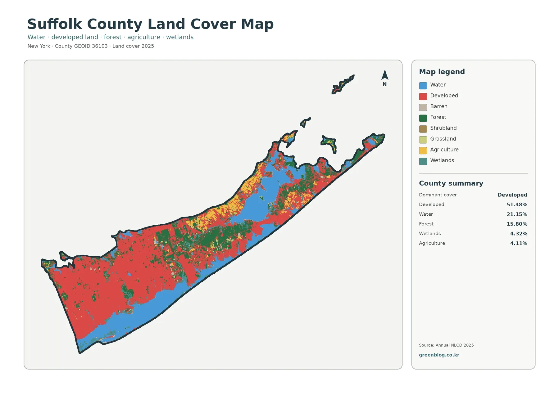
DeKalb County Alabama Land Cover Map presents four ways to examine the same northeastern Alabama county: 2025 land cover, forest and farmland, fractional impervious surface, and mapped class differences from 1985 to 2025. The most important result is the near tie between agriculture at 42.91% and forest at 42.29%. Broad farmed areas dominate much of the western side, while wooded belts become stronger toward the east and along several long, parallel ridges.
The page also provides the four original 2480 × 1754 JPG maps in a single ZIP. The WebP images below are convenient for online reading, while the JPG files preserve the supplied original resolution for reports, classroom handouts, presentation slides, and printed reference work.
Table of Contents
Why DeKalb County looks divided between working land and wooded ridges
Agriculture is the largest 2025 class in the supplied summary, but only narrowly. Its 42.91% share is followed by forest at 42.29%, so together the two classes cover 85.20% of the county. Developed land accounts for 11.19%. Grassland is 1.42% and shrubland 1.38%, while the forest-and-farmland summary lists water at 0.42% and wetlands at 0.20%. Those numbers explain why yellow agricultural areas and dark green forest dominate the visual impression even when the map is viewed at a small size.
The balance in percentages does not produce an even checkerboard. Agricultural cover spreads across large portions of the west, southwest, and northwestern interior. Forest is more continuous on the eastern side and forms long northeast-to-southwest bands through the middle of the county. Developed classes cut through that rural pattern in a few concentrated corridors rather than creating one continuous urban area. This arrangement makes DeKalb especially useful for comparing a countywide percentage with the actual geography behind that percentage: two classes can be nearly equal in area while occupying very different parts of the landscape.
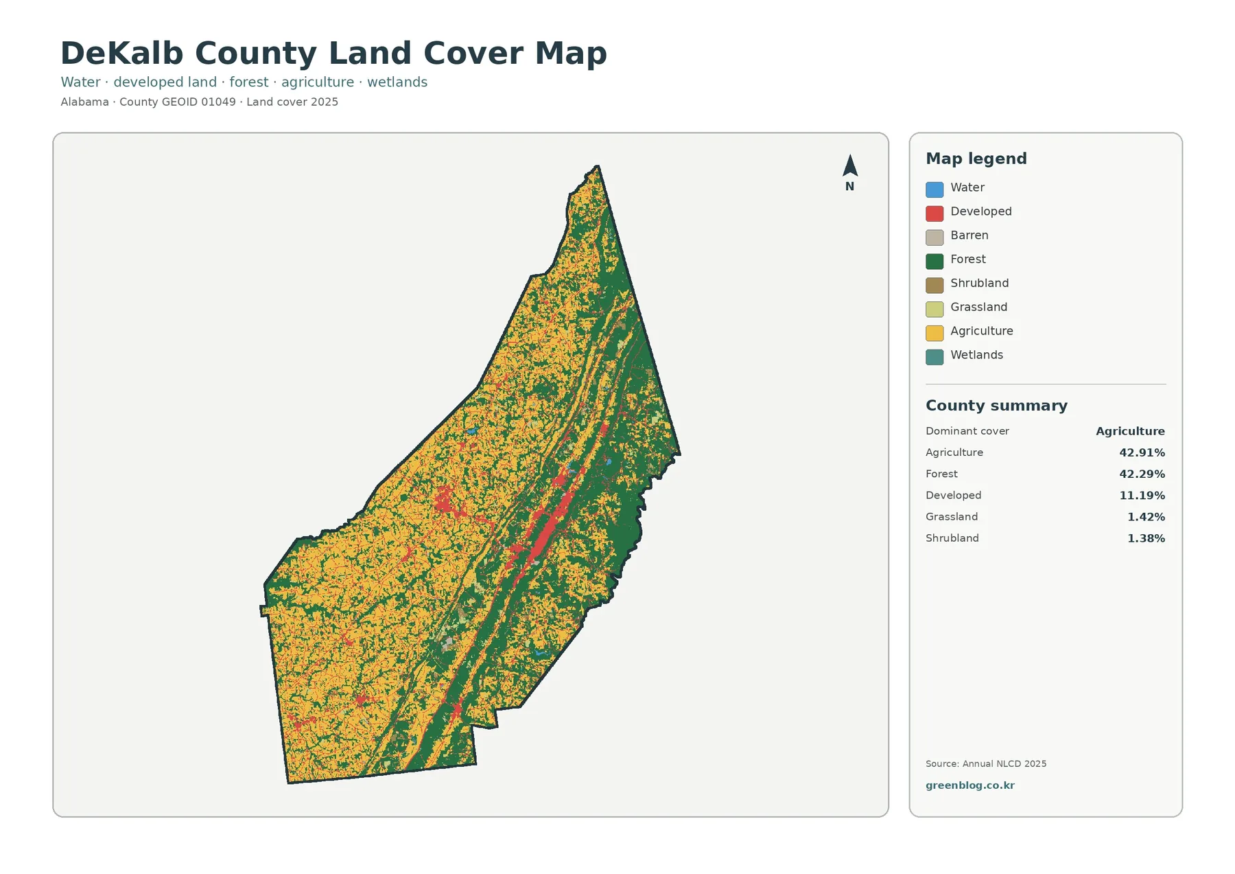
The legend includes water, developed land, barren land, forest, shrubland, grassland, agriculture, and wetlands. It should be read together with the summary rather than as a list of equally important classes. Water and wetlands are present but occupy small shares in this countywide view. Forest and agriculture are the dominant area classes, while developed land is substantial enough to form clearly visible red concentrations. Barren land is part of the legend but is not listed among the leading county percentages, so it should not be described as a defining feature simply because the color exists in the key.
Fort Payne and the eastern landscape provide useful geographic anchors
The eastern half of the county is not just a random block of green pixels. The National Park Service describes Little River Canyon National Preserve, on the DeKalb-Cherokee county boundary, as part of the southern edge of the Cumberland Plateau, with ridges, outcrops, gorges, and a deeply dissected landscape. The supplied map shows extensive forest in the same broader eastern part of DeKalb County and several long wooded bands farther west. That geographic context helps explain what kind of landscape the map is representing, although the land-cover image by itself does not prove why a particular tract remains forested.
Fort Payne gives a second orientation point. The city’s official website emphasizes its setting from the valley to Lookout Mountain, and Fort Payne is the county’s principal urban center. On the impervious map, the strongest elongated concentration lies in the central-eastern part of the county, matching the general location of that urban area. Because these thematic maps do not label municipal limits or road names, it is better to describe the pattern as the Fort Payne-area development corridor rather than identify every red line as a specific street or highway.
The forest-and-farmland view separates the rural landscape into useful parts
The second map reduces the visual weight of urban classes and breaks the rural cover into forest, cropland, pasture and hay, shrub and grassland, wetlands, water, and developed or other land. Agriculture remains widespread across the west, but it is no longer one undifferentiated color. Lighter pasture and hay areas mix with crop fields, and dark forest occupies the eastern edge as well as multiple interior strips. This view is particularly helpful when a project needs to distinguish open agricultural cover from wooded land without losing water and wetland context altogether.
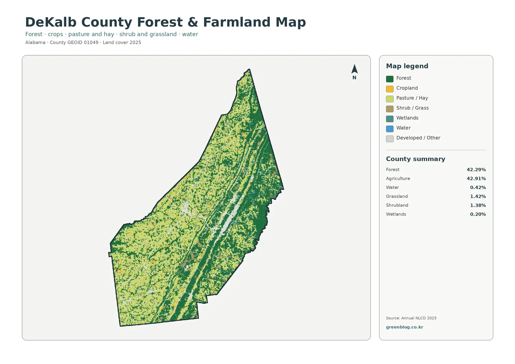
For classroom interpretation, the map is a good reminder that “agriculture” is a land-cover category, not a property record. A cell classified as cropland or pasture tells you what surface type the imagery and classification system assigned there. It does not provide the owner, crop species, farm boundary, zoning status, or legal land use. Forest works the same way: the dark green class does not establish whether the land is publicly owned, privately managed, protected, recently harvested, or available for development. Those questions require different records.
Impervious surface narrows the question from “developed” to “hard-covered”
Impervious surface means ground covered by materials such as pavement and rooftops that do not readily absorb rainfall. Most of DeKalb County is nearly white on this map, indicating zero or low impervious percentages. A pronounced orange-red concentration appears in the central-east, with another smaller concentration to the west and thin traces scattered elsewhere. The result is much more selective than the general developed-land class. It identifies where built surfaces are most concentrated instead of coloring every cell that has a developed character.
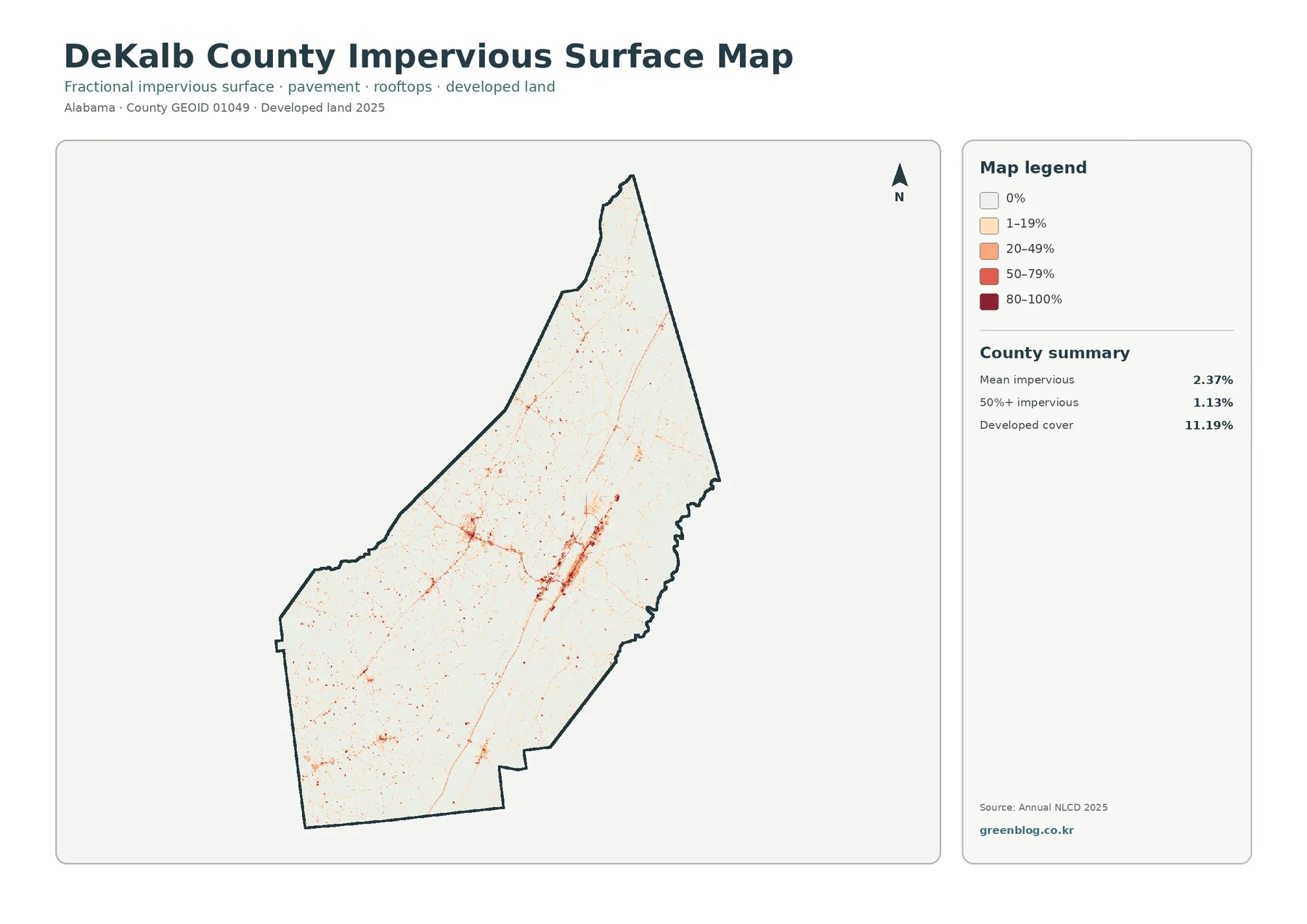
The county summary reports mean imperviousness of 2.37%, and 1.13% of the mapped area is at least 50% impervious. Developed land, by comparison, is 11.19% in the general land-cover summary. The gap is expected because the products answer different questions. A categorical land-cover cell can be called developed even when lawns, trees, soil, or other permeable surfaces occupy much of it. The impervious product instead estimates how much of the cell is actually sealed by hard material. Low-density neighborhoods therefore contribute to developed cover without making the entire cell highly impervious.
This distinction is useful for an environmental presentation about runoff, but the image is not a runoff model. Impervious percentage is only one factor. Rainfall intensity, slope, soil, drainage infrastructure, stream networks, and local grading also matter. Use the map to locate concentrations of hard surface at county scale, then add hydrologic and engineering data if the question concerns flooding, stormwater capacity, or the behavior of a specific site.
The 1985–2025 map is a difference screen, not proof of a single type of change
The change map compares the classification at the two endpoints and reports class differences across 28.37% of the county. Within the displayed summary, 3.01% is marked as classified to developed, 6.68% as forest loss, 1.53% as agricultural loss, and 17.09% as other difference. The “other” category is the largest part of the summary, which immediately shows why the map should not be reduced to a story of urban expansion. Red developed-change pixels are visible near current developed concentrations, while orange and purple differences are distributed much more broadly.
Forest-loss pixels also appear in many scattered patches rather than one single front. Agricultural-loss markings are smaller in the countywide summary, and wetland-related differences occur as another distinct class on the legend. The map is most useful when it directs attention to places that deserve a closer look. A red, orange, yellow, or purple pixel tells you that the mapped class differed between the comparison years; it does not, by itself, explain the land-management decision, natural event, harvest cycle, construction project, or classification uncertainty behind that difference.
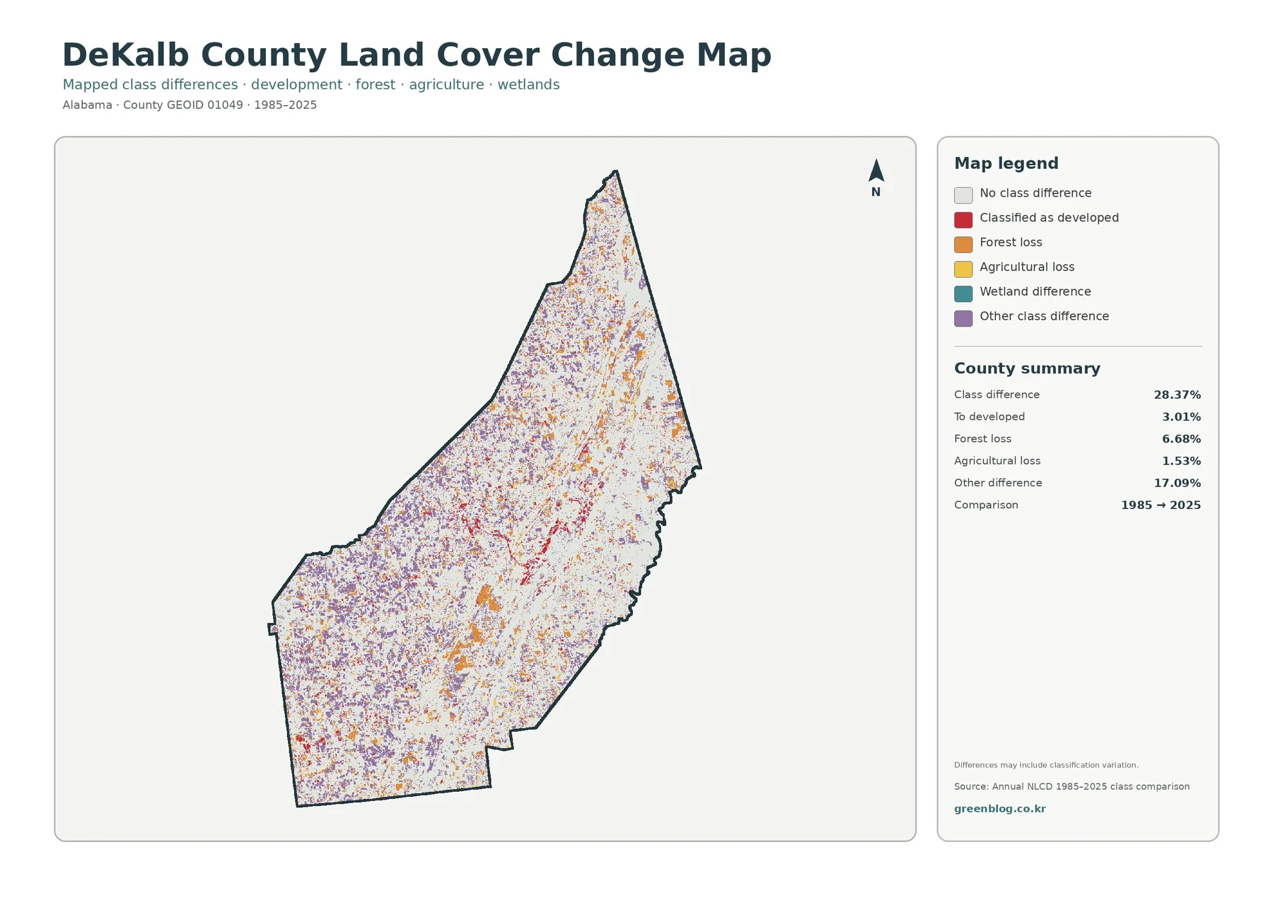
The caution printed on the supplied map is important: differences may include classification variation. Annual NLCD uses 30-meter raster cells, and a raster divides the landscape into a grid. One cell can contain a field edge, trees, a road, and a building at the same time. If the dominant signal changes between years, the assigned class can change even when the real ground transition is more complicated than a simple conversion. For important claims, inspect the annual source data, aerial imagery, and relevant local records rather than treating an endpoint comparison as final evidence.
A practical workflow for reading all four maps
Start with the general land-cover map to establish the countywide pattern: agriculture across much of the west, strong forest in the east and along interior ridges, and developed concentrations cutting through the rural cover. Move to the forest-and-farmland map when the task is to separate cropland and pasture from forest. Use the impervious image only after that broader context is clear, because it answers the more specific question of where hard surfaces are concentrated. Finally, use the change map to ask whether the mapped class at those locations differs between 1985 and 2025.
That sequence also prevents a common interpretation error. A current developed area does not have to appear as “classified to developed” on the change map if it was already developed at the earlier endpoint. Likewise, a forested area can contain scattered change pixels without losing its overall 2025 forest character. The maps are complementary rather than interchangeable. The most reliable description comes from matching each claim to the product designed to show it.
Where this map set is most useful
In a geography class, DeKalb County works well as an example of two dominant cover types with almost equal countywide shares but different spatial patterns. Students can calculate the 0.62-percentage-point difference between agriculture and forest, then use the maps to explain why equal percentages do not mean equal distribution. The impervious map introduces a second lesson: “developed” and “impervious” are related but not identical measurements. The change map then adds time and uncertainty, showing why classification differences need verification.
For reports and presentations, the common county boundary makes the four images easy to place in sequence. A planning-context slide can use the general map, an agriculture or habitat comparison can use the forest-and-farmland view, and a built-surface discussion can switch to impervious percentage. The set is also useful for visual comparison with neighboring counties when the same Annual NLCD year and classification method are used. It should not be used to make parcel-level regulatory, ownership, engineering, or permitting decisions.
Download the four original JPG maps
The online WebP previews measure 1800 × 1273 pixels. The ZIP preserves the supplied 2480 × 1754 JPG originals without artificial enlargement or re-encoding to claim a larger print standard. Keeping the original size protects the actual source detail and avoids suggesting resolution that is not present. For a presentation or ordinary document, the JPGs provide clearer legend text than a browser screenshot. If you plan a large print, test the final physical size first because these source files do not meet the package’s A3 high-resolution reference threshold.
Scale, classification, and legal-use limits
USGS Annual NLCD provides annual land-cover and change products for the conterminous United States at 30-meter spatial resolution. At that scale, narrow streams, small buildings, thin tree lines, field edges, and minor roads may be smaller than a cell or mixed with other cover inside it. The map is designed for broad spatial patterns, not surveyed boundaries. Zooming the JPG does not create additional ground detail, so a crisp pixel edge should not be interpreted as an exact property, wetland, forest, or field boundary.
Land cover is also not zoning, legal land use, or ownership. Agricultural cover does not establish an agricultural zoning designation. Developed cover does not show whether new construction is allowed. A wetland class is not a regulatory wetland determination, and forest does not tell you whether land is protected or available for harvest. Property decisions, permits, engineering studies, and legal boundaries require current authoritative records and, where appropriate, field verification.
Frequently Asked Questions
What is the largest land-cover class in DeKalb County?
Agriculture is the largest class in the supplied 2025 summary at 42.91%, but forest is almost equal at 42.29%. The difference is only 0.62 percentage points. The map is therefore more informative when the two patterns are compared geographically: agriculture is broader in the west, while forest is more continuous in the east and along long interior ridges.
Why is developed cover 11.19% when mean imperviousness is 2.37%?
Developed land is a categorical class, while fractional impervious surface measures the share of a cell covered by hard surfaces such as pavement and rooftops. A low-density developed cell can contain lawns, trees, or bare soil, so it may count as developed without having a high impervious percentage. The two products are related, but they are not designed to produce the same number.
Does every colored pixel on the 1985–2025 map prove that land use changed?
No. The map identifies a difference in mapped land-cover class between the two comparison years. The supplied note explicitly warns that classification variation can be included. Use the colors to find candidate areas for closer study, then verify important claims with annual NLCD data, aerial imagery, local records, or field information.
Map File Information
The download combines four original JPG maps of DeKalb County for comparing 2025 cover, forest and farmland, impervious surface, and mapped change.
- File Type: ZIP containing four JPG images
Related Maps
- Autauga County Alabama Land Cover Map
- Baldwin County Alabama Land Cover Map
- Barbour County Alabama Land Cover Map
Sources and Further Reading
- USGS Annual National Land Cover Database — official overview of Annual NLCD, including 2025 data and 30-meter spatial resolution.
- MRLC Annual NLCD Data — official data access for land cover and related products.
- USGS Annual NLCD Land Cover Classification — definitions for the land-cover classes represented in the map legend.
- National Park Service: Little River Canyon National Preserve — official geographic background on the Cumberland Plateau, ridges, and gorges along the DeKalb-Cherokee county boundary.
- City of Fort Payne — official local context for Fort Payne and its valley-to-Lookout-Mountain setting.
- U.S. Census Bureau TIGER/Line Shapefiles — official county-boundary and geographic-reference data.
Green Map creates custom-edited map images using open geographic data sources such as geoBoundaries, Natural Earth, OpenStreetMap, and government open data.
These maps are edited visual materials, not raw data files, and are provided for education, documents, presentations, and graphic reference.