Colbert County sits in northwestern Alabama, and its 2025 land-cover pattern changes noticeably from one side of the county to the other. Forest is the largest class at 44.77%, while agriculture accounts for 29.83%. The broad blue edge of the Tennessee River defines much of the north, extensive forest remains across the south and southwest, and a denser mix of developed and agricultural cover appears toward the northeast.
Four companion maps on this page separate those patterns into an overall land-cover view, a forest-and-farmland view, an impervious-surface view, and a 1985–2025 class-difference view. The WebP images are intended for quick reading on the page. A single download farther down the article contains the four original JPG maps for presentations, classroom use, regional comparison, and other reference work.
Table of Contents
A county split between forested interior, farmland, and a river-facing urban edge
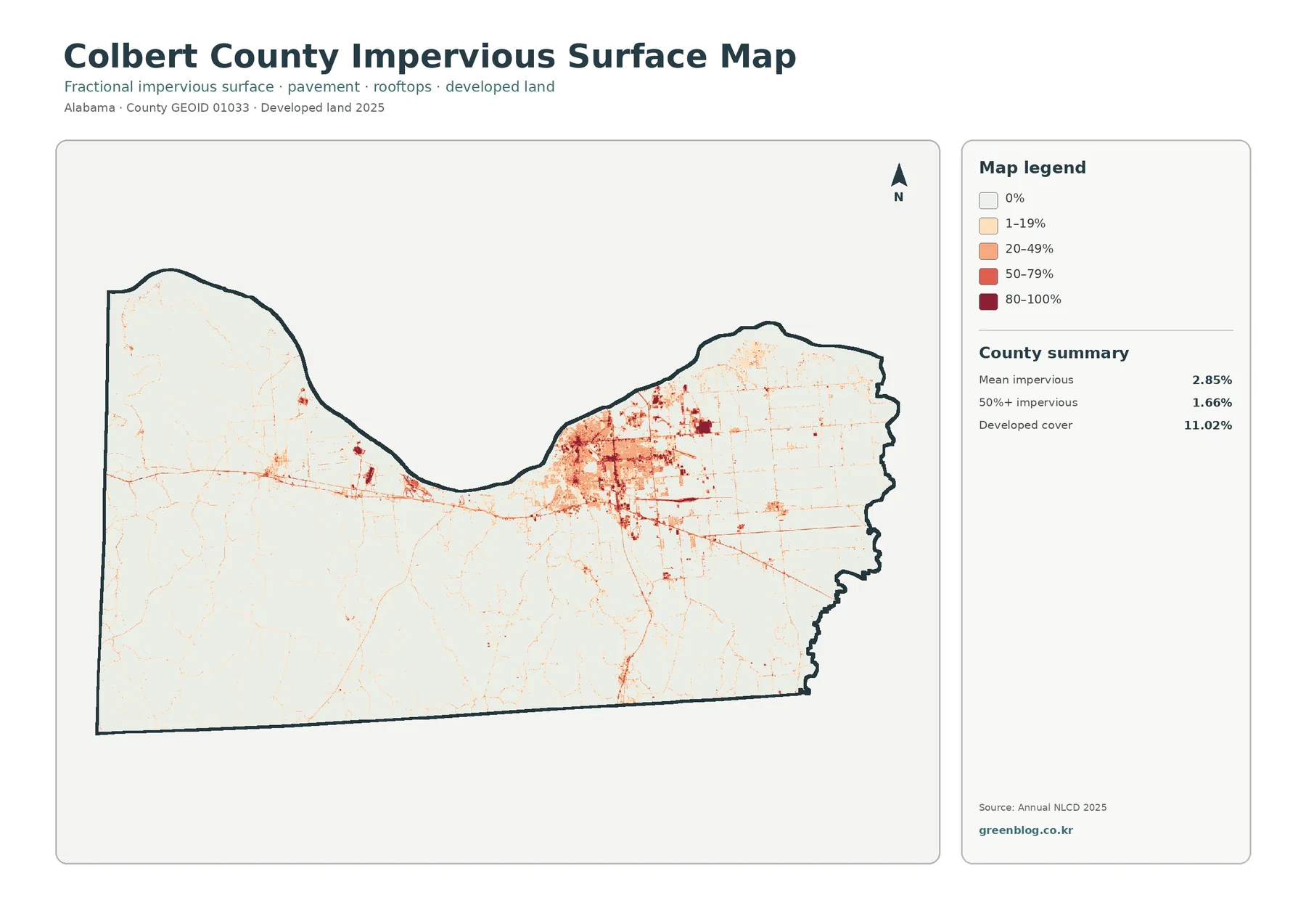
The overall 2025 map gives the clearest summary of Colbert County before any one class is isolated. Forest covers 44.77% of the mapped area, making it the dominant class. Agriculture follows at 29.83%, developed land at 11.02%, open water at 4.65%, wetlands at 4.35%, shrubland at 2.88%, and grassland at 2.14%. Those percentages describe the county as a whole, but their geography matters just as much as the totals.
Forest is most continuous across the southern and southwestern parts of the county. Large green areas occupy much of that half of the map, although agricultural clearings, open vegetation, small developed patches, and wet areas interrupt the forest in places. Moving northeast, the pattern becomes more open. Yellow agricultural cover expands, red developed cover becomes much more common, and forest breaks into smaller pieces around that broader working and settled landscape.
The Tennessee River provides a strong geographic reference along the north. Colbert County’s official history describes the river as a major feature of the county and the Muscle Shoals area, and the map makes that relationship easy to see. Blue water follows the northern boundary and broadens at the western end, while wetland and forest classes appear around parts of the shoreline. The 4.65% water share is therefore more than a small background class; it forms one of the most recognizable edges of the county.
Developed land should not be read as a map of pavement alone. The 11.02% developed class includes land-cover categories associated with built settings, and those cells can still contain grass, trees, or other surfaces that absorb water. The impervious map later in the article measures hard surfaces more directly. Keeping those two ideas separate avoids a common mistake when comparing the red developed areas with the stronger impervious colors.
Impervious surfaces reveal a much smaller footprint than developed land
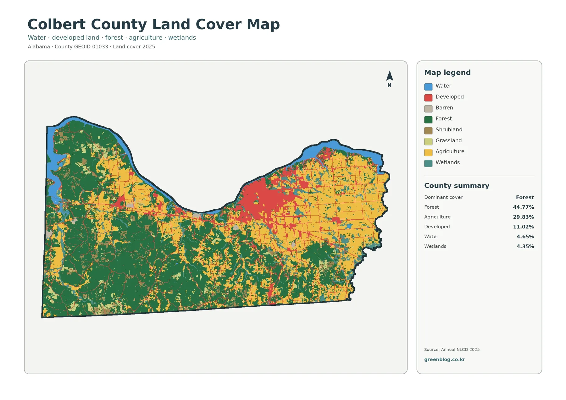
Impervious surface means pavement, rooftops, parking areas, and other hard surfaces that do not readily let rainfall soak into the ground. Colbert County’s mean impervious value is 2.85%. Areas with at least 50% impervious cover account for 1.66% of the county, while the broader developed land-cover class is 11.02%. Those figures are expected to differ because a developed land-cover cell can include both hard surfaces and lawns, trees, or other permeable ground.
Most of the impervious map is pale, reflecting the large amount of forest and agricultural land. The strongest oranges and reds are concentrated in the north-central to northeastern portion of the county, with thin linear features extending away from those clusters. Official county information identifies Tuscumbia as the county seat and lists communities including Muscle Shoals, Sheffield, Leighton, Cherokee, and Littleville. The map itself does not label individual towns, so the safest interpretation is that the principal hard-surface concentration lies in the northern settled part of the county rather than assigning every colored cell to a specific municipality.
Roads appear differently from urban clusters because their hard surfaces are narrow. A highway or local road can form a line that is visually clear on the impervious map while occupying little area in the countywide average. Built-up centers, by contrast, create broader patches where streets, roofs, parking lots, and other surfaces occur close together. Comparing these shapes is more informative than treating 2.85% as a uniform condition across the county.
Impervious cover can be relevant to runoff studies, but this map is not a flood-risk or drainage-capacity map. Rainfall, slopes, soils, stormwater infrastructure, streams, reservoirs, and floodplains all affect where water moves. Colbert County’s Road and Water Departments note that the county water system draws raw water from the Tennessee River, confirming the river’s importance to local water context. That fact does not turn the impervious map into a water-quality assessment; it simply provides useful geographic background.
Farmland becomes more prominent toward the northeast
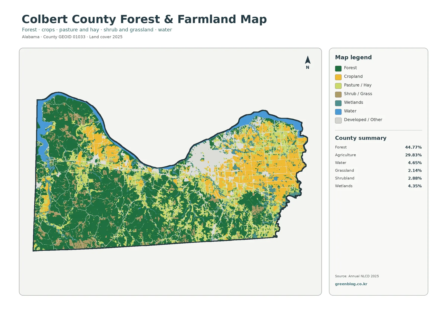
The forest-and-farmland map removes some of the visual competition from the full legend and makes the contrast between the county’s southern forest and northeastern agricultural land easier to follow. Dark green remains broad and connected across the southwest. Farther east and north, cropland and pasture or hay appear more frequently, especially where the full land-cover map already showed a more open landscape.
Agriculture accounts for 29.83% of the county, but that figure should not be treated as a parcel or farm-acreage total. It is a land-cover classification based on what the surface was mapped as in 2025. Cropland and pasture or hay are shown separately in this simplified view, so the map can help a reader distinguish places dominated by cultivated fields from areas with other open agricultural cover. It does not identify ownership, farm boundaries, crop type for every field, or agricultural tax status.
Forest, farmland, and wetlands also meet along many irregular edges. Wetlands make up 4.35% of the county and appear as narrow or patchy features near water and low-lying corridors. Those shapes can be useful when comparing landscape context around the Tennessee River and smaller drainage areas, but they are not legal wetland boundaries. A regulatory or site-specific wetland determination requires different information and, when appropriate, field work.
The forest-and-farmland view is particularly useful for habitat or watershed discussions because it simplifies the surrounding matrix. A large forest block and a small wooded strip may share the same class but have very different ecological roles. Likewise, two agricultural cells do not tell the reader whether the land is actively cropped at the same time of year. This map is best used to locate broad patterns first, then guide a closer look with other sources.
What the 1985–2025 change map does—and does not—measure
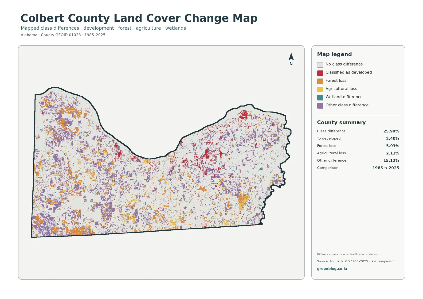
The change map compares land-cover classes at two endpoints, 1985 and 2025. Its county summary reports a class difference across 25.90% of the mapped area. Within that comparison, 2.40% is labeled as changed to developed, 5.93% as forest loss, 2.11% as agricultural loss, and 15.12% as other class difference. Wetland difference is also represented in the legend. The total class-difference percentage must not be described as a development rate.
Purple other-difference areas are scattered widely, and orange forest-loss patches appear in multiple parts of the county. Yellow agricultural-loss cells are present as well. Red areas classified as changed to developed are more noticeable near the northern settled portion, but they represent only part of the total change. This is why the current developed share of 11.02% and the 2.40% ‘to developed’ change figure answer different questions. One describes 2025 cover; the other describes a subset of cells whose class differs from 1985.
Forest loss needs similar caution. A cell counted in the 5.93% forest-loss category was forest in the earlier comparison and a different class in 2025. The map cannot tell the reader whether the cause was timber harvest, regeneration stage, conversion to agriculture, construction, storm effects, image conditions, or classification differences. A causal explanation requires intermediate-year data, aerial imagery, field records, or another source that documents what happened at the location.
The map itself warns that differences may include classification variation. Thirty-meter raster cells generalize complex edges, and a cell containing forest, field, wetland, and a narrow road may receive a different dominant label in another year. For that reason, dense change colors are better treated as places for further review than as proof of rapid development or ecological decline. Using the phrase ‘land-cover class difference’ keeps the interpretation aligned with what the map actually measures.
Use the Tennessee River and the southern forest as map-reading anchors
A practical way to compare all four maps is to begin with two obvious anchors. First, find the Tennessee River along the north. On the full map it is a broad blue boundary feature. On the forest-and-farmland map, the surrounding mix of forest, wetland, agriculture, and developed or other land is easier to separate. The impervious map then shows where hard surfaces cluster near the northern settled area, while the change map reveals which nearby cells received a different class in 2025 than in 1985.
The second anchor is the forested southwest. The full and simplified vegetation maps both show broad forest there, and the impervious surface map stays mostly pale across the same area. Yet the change map still contains forest-loss and other-difference patches. That comparison is important: a place can be predominantly forest in 2025 even if some individual cells changed classes during the forty-year comparison period.
The northeastern part of the county offers a third useful comparison. Agriculture and developed land are both more frequent there, and the impervious map narrows the developed pattern to the harder surfaces. The change map adds a time comparison without explaining the cause. Reading the same area through four views helps separate four questions: what covers the ground now, where forest and agriculture are concentrated, where hard surfaces are strongest, and where the two endpoint classifications differ.
For county-to-county comparison, keep the year and metric consistent. Colbert County’s 44.77% forest share should be compared with another county’s 2025 forest share. The 2.85% mean impervious value belongs with the same impervious product and year. The 25.90% class-difference figure is meaningful only beside maps using the same 1985–2025 endpoints and comparable classification rules. Mixing years or products can make data differences look like geographic differences.
Download the four original JPG maps for reference and presentation
The download ZIP contains four JPG files: the 2025 general land-cover map, forest-and-farmland map, impervious/developed-land map, and the 1985–2025 class-difference map. Each original JPG is 2480×1754 pixels. The on-page WebP previews are 1800 pixels wide, so they load more efficiently for browsing, while the JPG files provide the larger source images included with this package.
The asset manifest does not mark these JPG files as meeting an A3 high-resolution reference. If you plan a large print, test the map first and check whether the legend and small labels remain clear at the intended size. Upscaling the image does not create finer land-cover information. The underlying classification remains generalized at its source raster resolution even if the image itself is displayed or printed larger.
Different uses call for different views. A classroom introduction may begin with the full land-cover map because it shows the complete mix of forest, agriculture, development, water, and wetlands. A conservation or habitat discussion may benefit from the forest-and-farmland map. The impervious map is useful when comparing built surfaces with rural land, and the change map can introduce the difference between present condition and a two-date classification comparison.
Land cover is not zoning, ownership, or a parcel survey
Land cover describes what is mapped on the ground surface, such as forest, agriculture, water, wetland, or developed cover. It does not identify who owns the land, what zoning applies, whether a property can be developed, or where a legal parcel boundary lies. A forest-colored cell can cross more than one property, and an agricultural cell does not by itself establish that a parcel is legally classified as farmland.
Raster generalization is another limitation. Annual NLCD uses cells that represent an area on the ground, and a single cell can contain more than one surface type. At a forest edge, along a shoreline, or beside a narrow road, the dominant class may simplify a mixture that is more complicated in reality. Zooming in makes the cell larger on screen but does not add detail that was not present in the source classification.
The observation year matters as well. The current maps describe 2025 classification, so construction, vegetation recovery, clearing, crop changes, or other surface changes after that observation period will not appear. The change map uses two endpoints rather than a complete history of every year. A site may have changed more than once between 1985 and 2025, and that sequence cannot be reconstructed from a single endpoint-comparison image.
Used with those limits in mind, the four Colbert County maps work well as a first layer of geographic context. They let a reader compare the Tennessee River edge, southern forest blocks, northeastern agricultural and developed areas, hard-surface concentrations, and long-term class differences within the same county outline. More detailed work can then move to parcel GIS, hydrology, elevation, aerial imagery, or field information as the question requires.
Frequently Asked Questions
What is the largest land-cover class in Colbert County in 2025?
Forest is the largest class at 44.77%. Agriculture follows at 29.83%, developed land at 11.02%, open water at 4.65%, and wetlands at 4.35%. The map shows the broadest forest in the south and southwest, while agricultural and developed cover is more frequent toward the northeast.
Why is the Tennessee River important when reading these maps?
The river forms a broad blue feature along the northern edge of the county and provides an easy location reference across all four maps. Colbert County’s official history also identifies the Tennessee River as a major part of the area’s geographic and historical setting. The land-cover maps do not show water depth, flood risk, or water quality.
Why is developed land 11.02% when mean impervious cover is only 2.85%?
Developed land is a broader land-cover classification that can include lawns, trees, and other permeable surfaces within built settings. Impervious cover measures hard surfaces such as pavement and rooftops more directly. Because they measure different things, the countywide percentages are not expected to match.
Does the 25.90% class difference mean that one quarter of the county was developed?
No. The 25.90% figure combines all mapped class differences between 1985 and 2025. Only 2.40% is summarized as changed to developed, while forest loss, agricultural loss, wetland difference, and other class differences make up the rest. The map does not identify the cause of each change.
What is included in the downloadable ZIP?
The ZIP contains four original 2480×1754 JPG maps: 2025 general land cover, forest and farmland, impervious/developed land, and the 1985–2025 class-difference map. The page uses smaller WebP previews for convenient browsing.
Map File Information
Colbert County Land Cover Maps 2025 land cover, forest & farmland, impervious/developed land, and 1985–2025 class-difference maps in four original JPG files
- Included Files: Use only the versions confirmed in the article and supplied images
- File Type: Use the confirmed download contents
- Intended Use: Printing, education, presentations, and map-based projects
Related Maps
- Autauga County Alabama Land Cover Map
- Baldwin County Alabama Land Cover Map
- Barbour County Alabama Land Cover Map
Sources and reference material
- MRLC Annual NLCD Data – official access point for Annual NLCD land-cover products used for year-based comparison.
- USGS Annual NLCD Land Cover Classification – official explanation of the land-cover classification framework and classes.
- U.S. Census Bureau TIGER/Line Shapefiles – official federal boundary data for counties and other geographic units.
- Colbert County History – official county background on Tuscumbia, the Tennessee River, and the development of the county.
- Colbert County Road & Water Departments – official county information on road and water services, including the Tennessee River as the water source.
Green Map creates custom-edited map images using open geographic data sources such as geoBoundaries, Natural Earth, OpenStreetMap, and government open data.
These maps are edited visual materials, not raw data files, and are provided for education, documents, presentations, and graphic reference.