
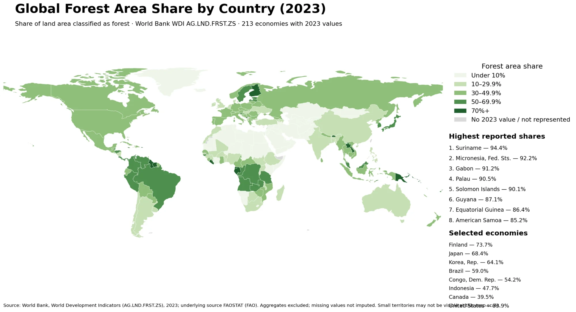
Forest Area Share Map – Country Comparison for 2023
A country-by-country map of forest area as a share of land area reveals a wide spread between economies whose land
Forest Area Share Map – Country Comparison for 2023 Read More »
A country-by-country map of forest area as a share of land area reveals a wide spread between economies whose land
Forest Area Share Map – Country Comparison for 2023 Read More »
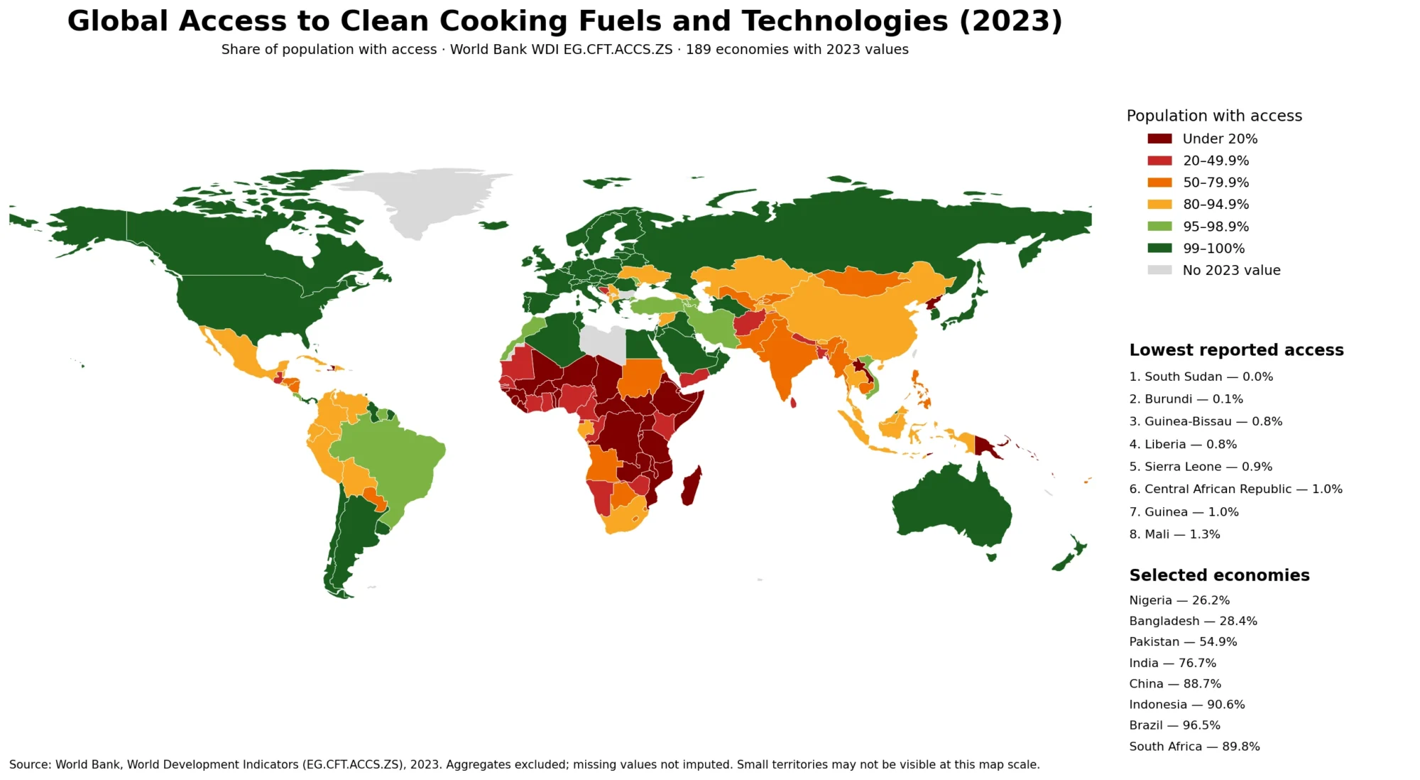
A world map of clean cooking access looks very different from a simple map of electricity, income, or total energy
Clean Cooking Access Map – Country Patterns in 2023 Read More »
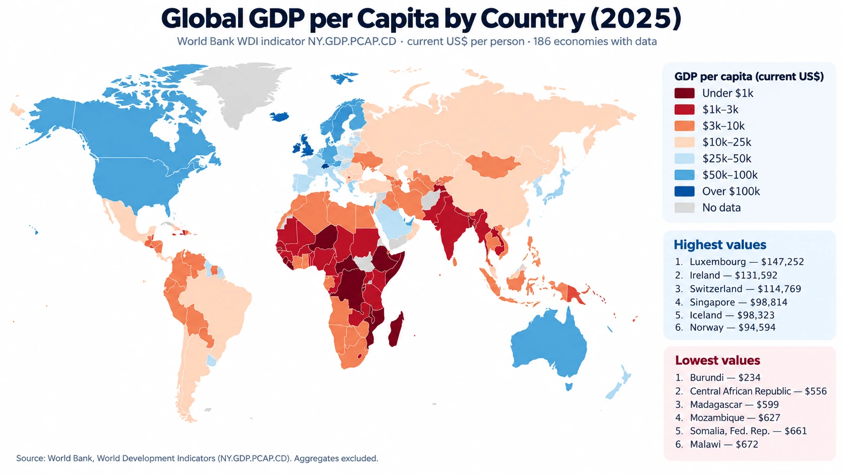
A 2025 global GDP per capita map reveals an unusually wide gap between countries and economies even when every observation
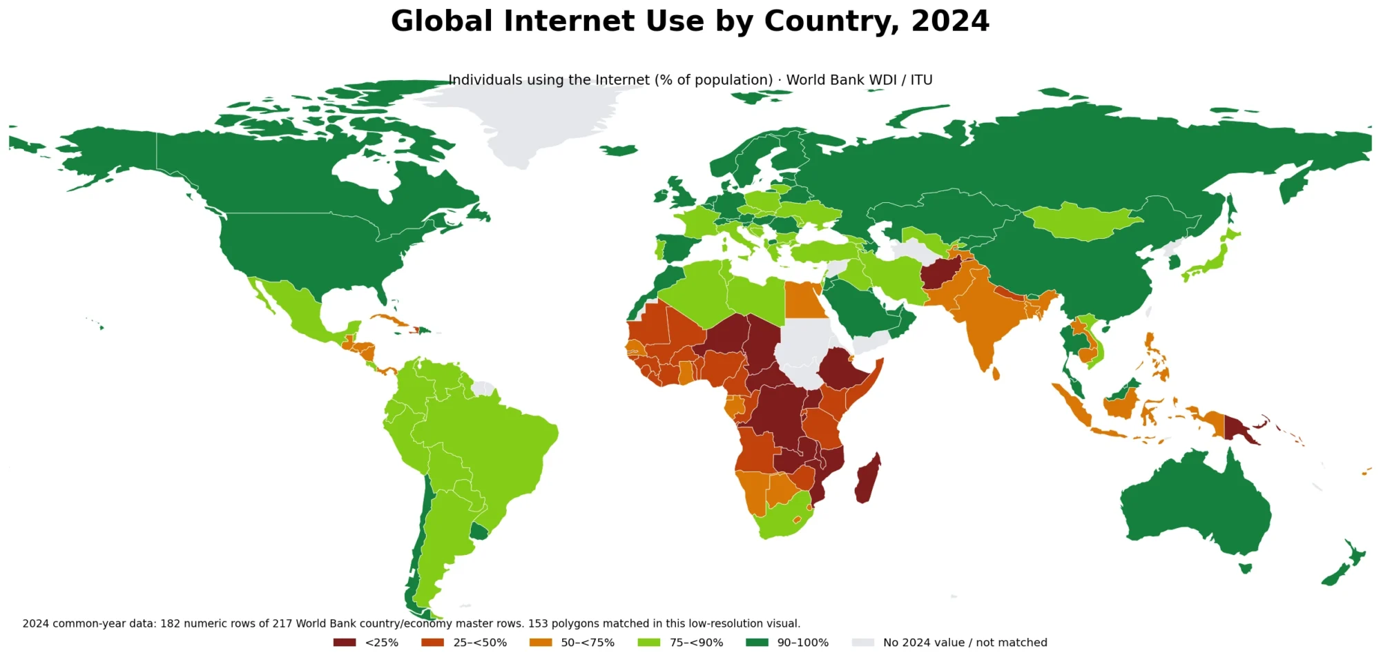
The global Internet use map compares the share of people who actually use the Internet across countries and economies. This
Internet Use Map by Country – 2024 Population Share Online Read More »
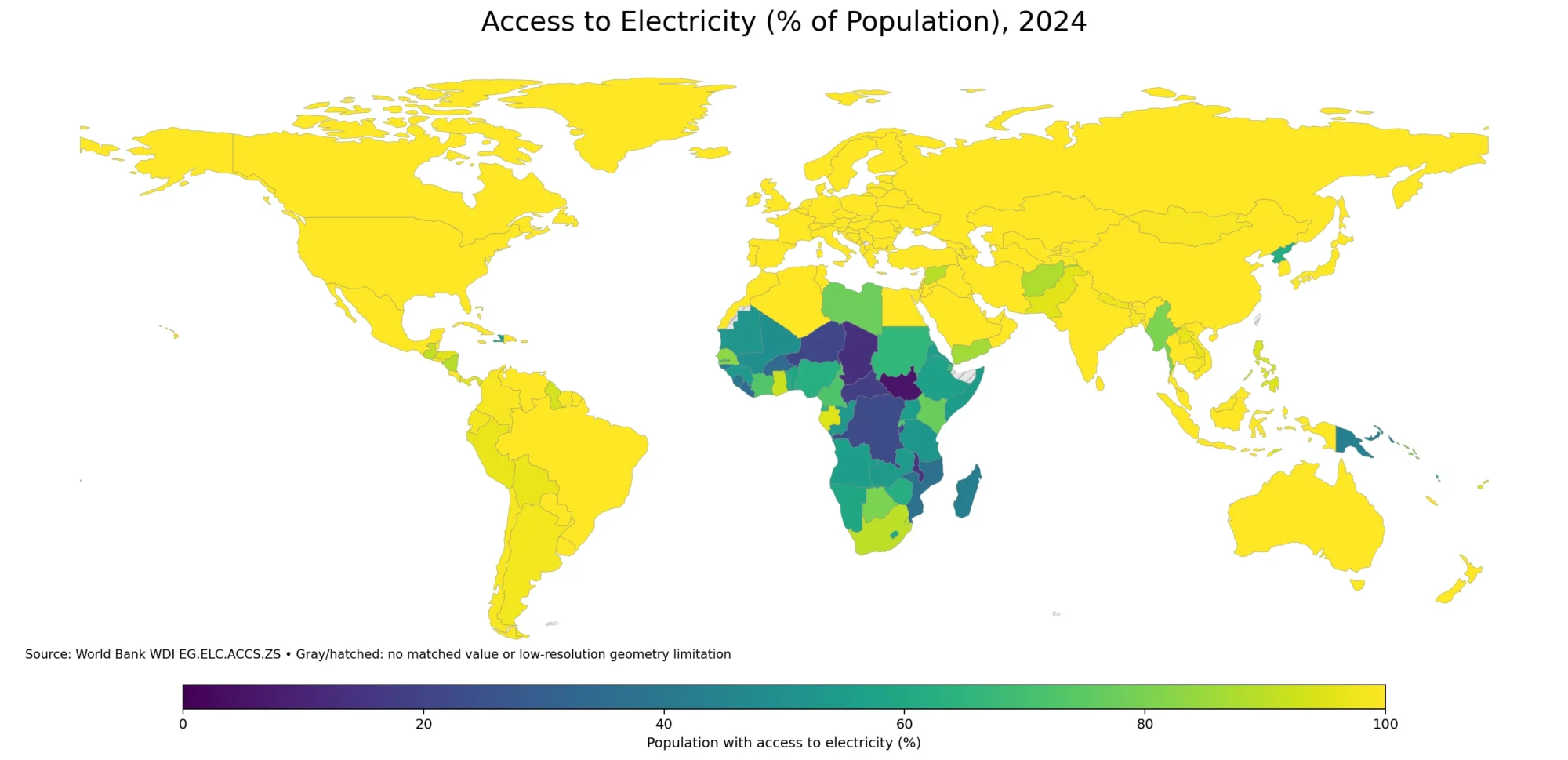
The global electricity access map compares the share of each country or economy’s population that has access to electricity. It
Electricity Access Map – 2024 Population Access by Country Read More »
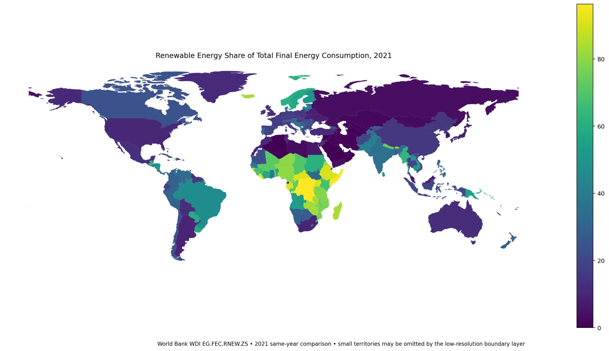
The global renewable energy share map compares the percentage of total final energy consumption (TFEC) supplied by renewable energy across
Renewable Energy Share Map – 2021 Final Energy Consumption by Country Read More »
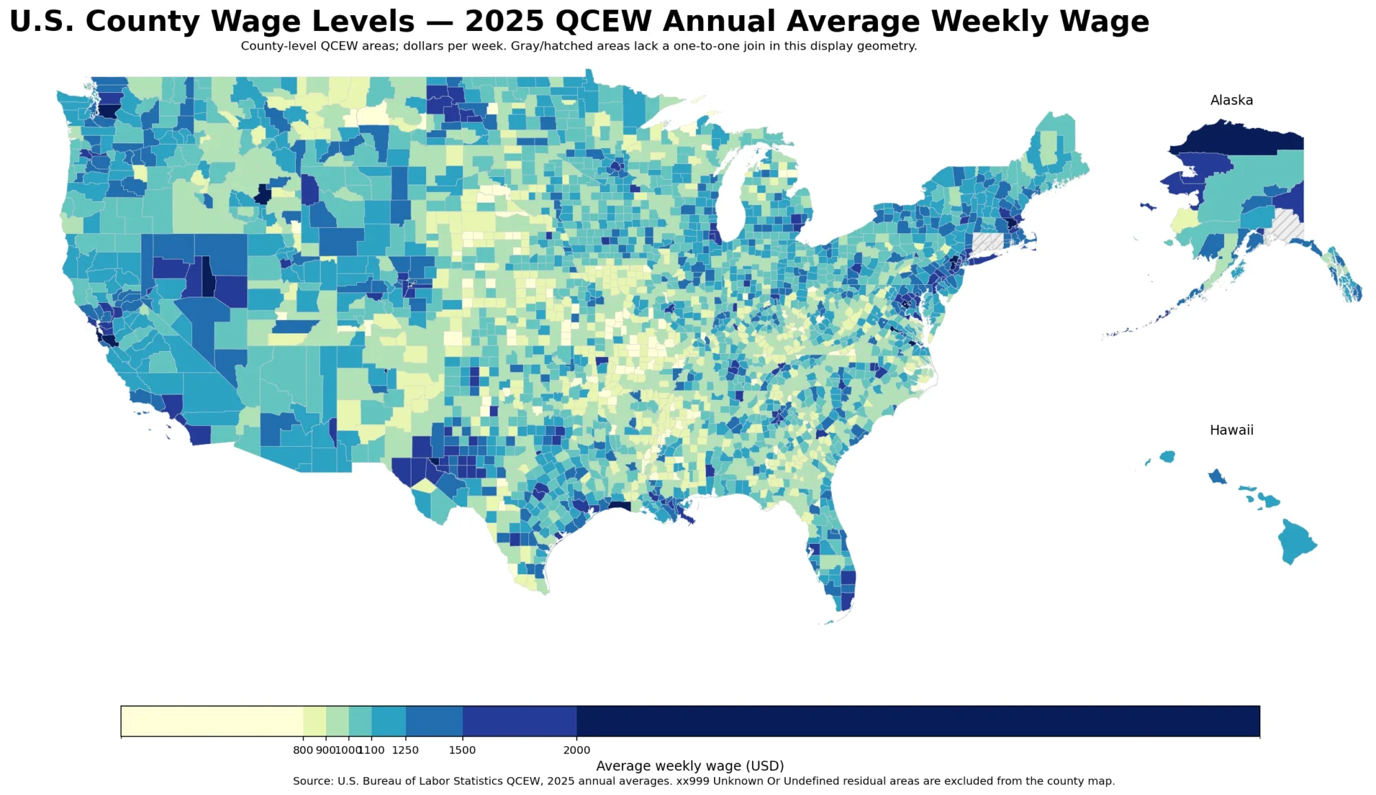
The U.S. County Wage Level Map compares 2025 annual average weekly wages from the Bureau of Labor Statistics Quarterly Census
U.S. County Wage Levels in 2025 – BLS QCEW Average Weekly Wages Read More »
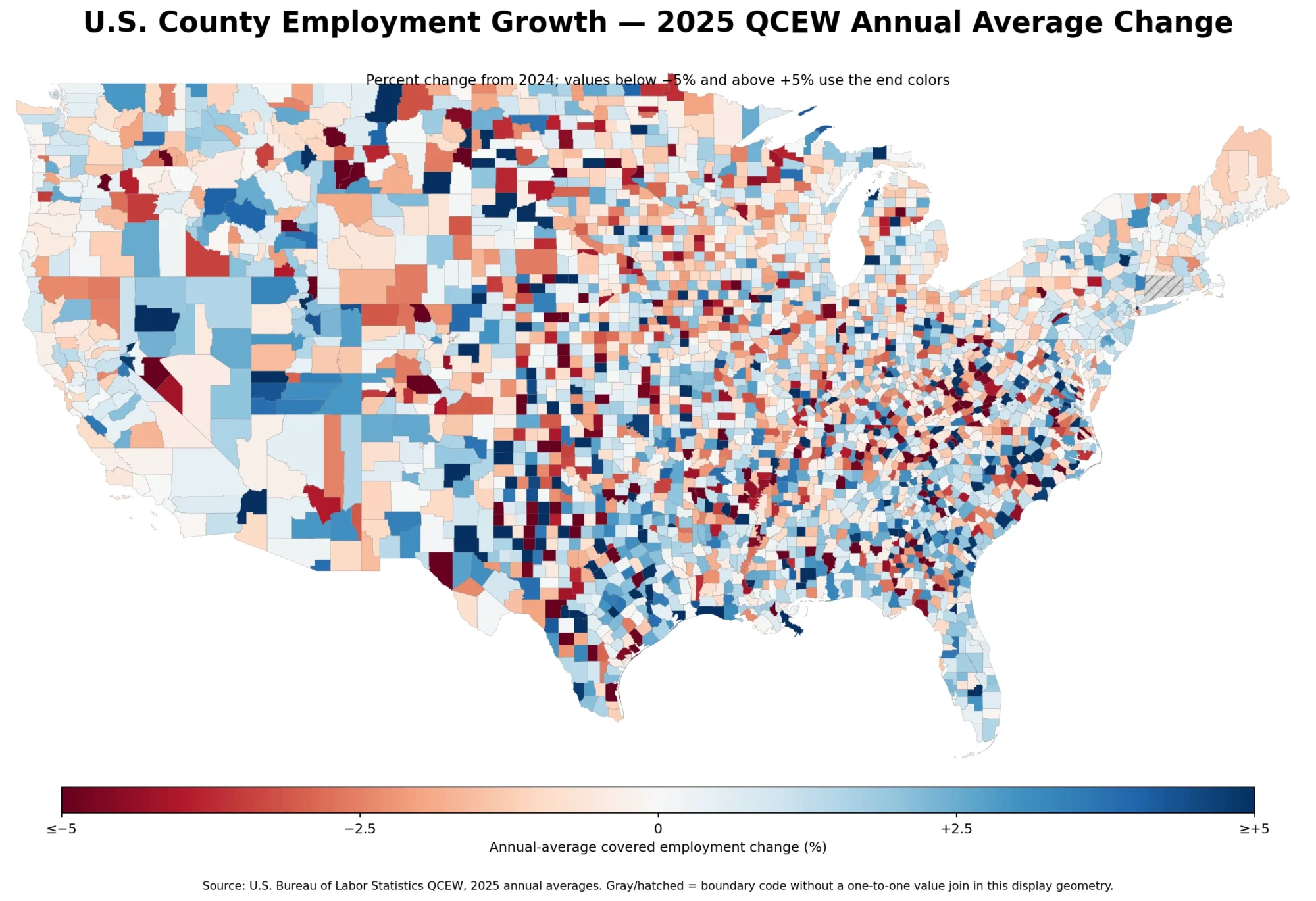
A positive national jobs number does not mean every local labor market moved in the same direction. The 2025 Quarterly
U.S. County Employment Growth Map: 2025 QCEW Annual Average Change Read More »
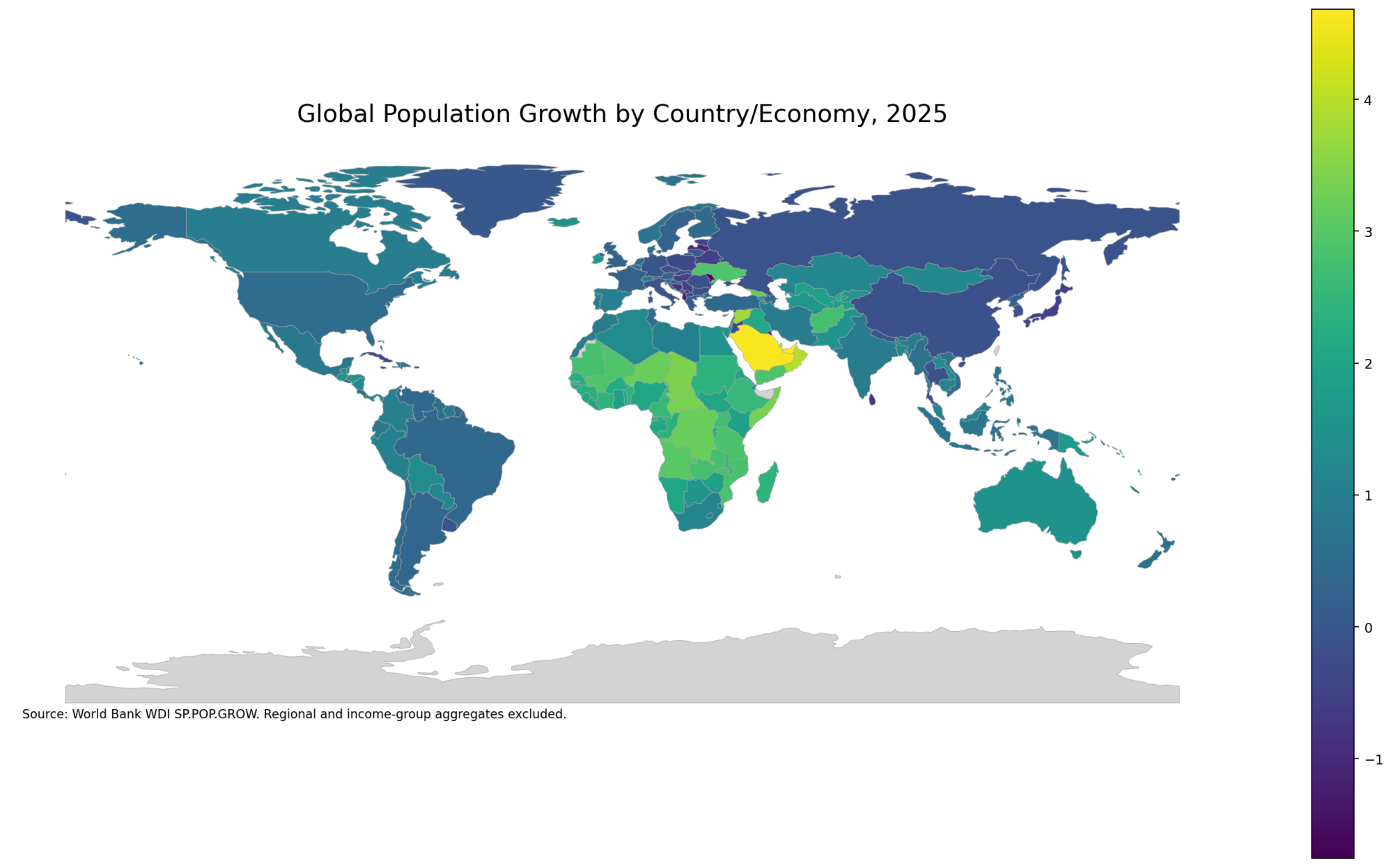
A 2025 country-level comparison of annual population growth using World Bank WDI data, with aggregate rows removed before ranking and mapping.
Population Growth Map – Country Patterns in 2025 Read More »