The labor force participation rate measures how much of the adult population is connected to the labor market. A person is counted as participating if they are employed or unemployed and actively supplying labor. That makes the indicator broader than employment alone and fundamentally different from the unemployment rate. In the 2024 World Bank national-estimate series used here, 104 countries and separately reported economies have an observation. Their rates span from 35.725 percent to 87.950 percent, a range wide enough to show that labor-market participation is shaped by very different demographic, social, and economic structures.
The official series is SL.TLF.CACT.NE.ZS, “Labor force participation rate, total (% of total population ages 15+) (national estimate).” The denominator is the population age 15 and older, while the numerator is the labor force: people who are employed plus people who are unemployed and seeking or otherwise available for work under the underlying statistical definition. The source inventory has 217 country and economy rows for 2024. Only 104 contain a value; 113 remain source-missing. Missing observations are kept as missing rather than converted to zero, and they are excluded from all rankings and summary statistics below.
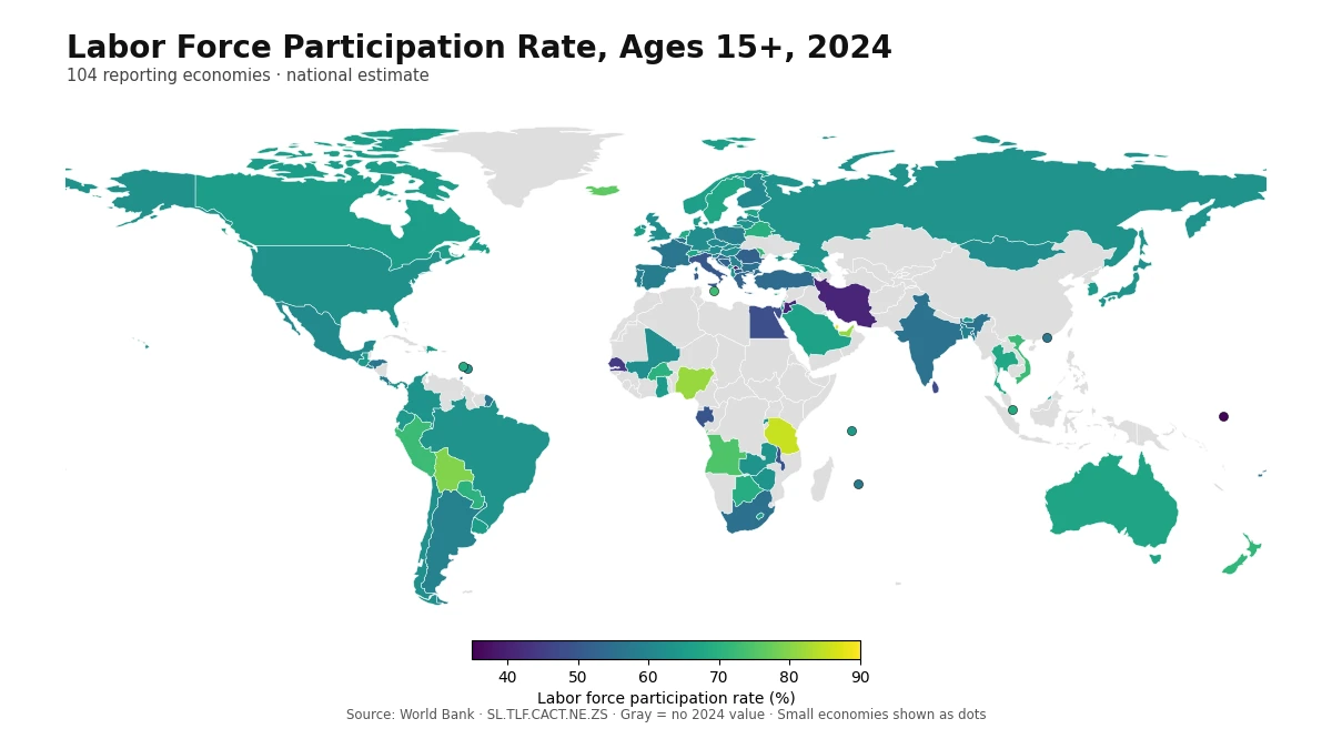
Table of Contents
What the 2024 distribution looks like
Across the 104 observations, the mean is 61.915% and the median is 62.847%. The first quartile is 57.245% and the third quartile is 65.920%, so the middle half of reporting economies falls within a band of roughly 57.2% to 65.9%. This central band is useful because it shows that many countries cluster in the low-to-mid 60s even though the full distribution stretches much farther in both directions.
The distribution is not evenly spread. Eleven observations are below 50%, 25 are between 50% and 60%, 54 are between 60% and 70%, 10 are between 70% and 80%, and four are at least 80%. The largest group is therefore the 60% to 70% range. At the same time, the gap between the maximum and minimum is 52.225 percentage points. That gap is a reminder that participation is not a simple score of economic success. Education, retirement, demographic structure, gender participation, labor demand, informality, migration, and social institutions can all affect how many adults enter the labor force.
Economies with the highest participation rates
Qatar has the highest 2024 value at 87.950%. Tanzania follows at 85.287%, then Nigeria at 81.536% and the United Arab Emirates at 81.355%. Bolivia records 79.553%, Iceland 76.251%, and Angola 74.612%. Malta, Peru, and Viet Nam complete the top ten, all above 72%. The composition of this group matters: very high values appear in the Gulf, Sub-Saharan Africa, South America, Northern Europe, and Southeast Asia. There is no single regional template that explains the top of the distribution.
| Rank | Country or economy | 2024 value |
|---|---|---|
| 1 | Qatar | 87.950% |
| 2 | Tanzania | 85.287% |
| 3 | Nigeria | 81.536% |
| 4 | United Arab Emirates | 81.355% |
| 5 | Bolivia | 79.553% |
| 6 | Iceland | 76.251% |
| 7 | Angola | 74.612% |
| 8 | Malta | 72.865% |
| 9 | Peru | 72.547% |
| 10 | Viet Nam | 72.449% |
A high participation rate means a large share of people age 15 and older are either working or in the labor force looking for work. It does not tell us whether jobs are secure, productive, well paid, or formal. A country can have high participation alongside substantial informal work, low wages, or long working hours. Another economy can have a lower participation rate because more young people remain in education or because a larger elderly population has retired. The safest interpretation is descriptive: these economies have a comparatively large share of their adult population in the labor force.
Economies with the lowest participation rates
At the bottom, Naoero (Nauru) records 35.725%, followed by Kosovo at 37.948%. Iran is at 40.707% and Jordan at 40.820%. Senegal records 44.559%, West Bank and Gaza 46.039%, Sri Lanka 47.347%, and Egypt 47.955%. Gabon and Malawi are just below 50%. These low observations are spread across several regions, so they should not be reduced to one geographic explanation.
| Rank from lowest | Country or economy | 2024 value |
|---|---|---|
| 1 | Naoero | 35.725% |
| 2 | Kosovo | 37.948% |
| 3 | Iran, Islamic Rep. | 40.707% |
| 4 | Jordan | 40.820% |
| 5 | Senegal | 44.559% |
| 6 | West Bank and Gaza | 46.039% |
| 7 | Sri Lanka | 47.347% |
| 8 | Egypt, Arab Rep. | 47.955% |
| 9 | Gabon | 49.530% |
| 10 | Malawi | 49.578% |
Many mechanisms can lower aggregate participation. A large student population may postpone entry into the labor force, an older population may raise retirement shares, and care responsibilities can keep adults outside paid work or active job search. Discouraged workers may also stop looking for a job, while conflict, weak labor demand, migration, and differences in how informal work is captured can matter. The indicator itself does not identify which mechanism dominates in a particular country. That requires additional evidence, especially participation rates by sex and age, employment-to-population ratios, unemployment rates, enrollment, and demographic structure.
Regional medians show broad patterns, not fixed rules
When all 104 observations are assigned to broad continental groups, South America has a median of 64.495%, Asia 64.044%, Africa 63.482%, North America 62.628%, Europe 61.489%, and Oceania 60.943%. These figures are descriptive summaries rather than continent rankings. The number of reporting economies differs substantially by region, and Oceania has only four observations in this 2024 national-estimate series, making its median especially sensitive to individual values.
The map also shows large differences inside the same continent. In Asia, Qatar and the United Arab Emirates exceed 80%, while Iran and Jordan are close to 41%. In Europe, Iceland reaches 76.251% while Kosovo is 37.948%. In Africa, Tanzania and Nigeria are above 80%, whereas Senegal, Gabon, and Malawi are around or below 50%. These contrasts are more informative than a single regional average because they show that national institutions and demographic structures can matter as much as broad geography.
Why the middle of the distribution deserves attention
Extreme values attract attention, but the middle half of the sample contains much of the practical comparison. The interquartile range runs from 57.245% to 65.920%. Several large economies sit within or near that range: the United States is at 62.593%, Germany at 61.848%, the United Kingdom at 62.044%, Japan at 63.300%, Brazil at 63.208%, Mexico at 61.099%, and India at 55.802%. Similar participation rates can therefore occur in economies with very different income levels, age structures, education systems, and labor-market institutions.
Small percentage-point differences around the median should not be overinterpreted. A one-year national estimate can move because of economic conditions, survey updates, population aging, migration, or shifts in education and retirement. A difference of one or two points may be meaningful, but it is not enough by itself to establish a durable structural gap. For that purpose, a multi-year series and consistent definitions are more useful than a single cross-section.
Participation is not the same as employment or unemployment
The labor force participation rate uses the labor force as the numerator and the population age 15 and older as the denominator. The employment-to-population ratio counts only employed people in the numerator. The unemployment rate uses unemployed people as the numerator but divides by the labor force rather than the population. Because both the numerators and denominators differ, these indicators can move in different directions at the same time.
For example, if people who were previously outside the labor force begin searching for work, participation can rise even before they find jobs. The unemployment rate may also rise temporarily because the labor force has expanded. Conversely, unemployment can fall when discouraged workers stop searching, even though that change does not represent additional employment. Reading participation together with employment and unemployment helps avoid these common interpretation errors.
How missing values affect the world map
The 113 missing rows require special care. They do not mean that those economies have zero participation or that no labor statistics exist. They mean only that this specific World Bank national-estimate series does not provide a 2024 observation for those rows in the verified dataset. Some economies may have values for other years, modelled international estimates, or data from national statistical agencies. Substituting a neighboring country, an older value, or zero would create a false comparison, so the map leaves them gray.
The map itself represents all 104 available observations. France, Norway, and Kosovo require name-based joins because of the ISO coding used by the low-resolution boundary file. Eight small economies—Barbados, Hong Kong, Saint Lucia, Malta, Mauritius, Nauru, Singapore, and Seychelles—do not have suitable polygons in that boundary layer and are plotted as points using the same color scale. The point size is only a locator; it does not represent population, land area, or statistical weight.
What to check before comparing countries
First, keep the year and statistical concept consistent. This article compares 2024 national estimates only. Second, an aggregate rate can conceal large differences between women and men, so sex-specific participation is often essential. Third, the age threshold of 15 years includes students, prime-age workers, and older adults, meaning that population aging and schooling patterns can influence the total. Fourth, the treatment of informal and subsistence work can matter for measured participation in economies where those activities are widespread.
Fifth, avoid treating a one-year ordering as a permanent ranking. Participation can change with recessions and recoveries, migration flows, retirement policy, care systems, educational expansion, or labor-market reforms. Sixth, countries with similar participation rates can still have very different wages, hours, productivity, job security, and living standards. The indicator is best understood as a measure of connection to the labor market, not as a complete measure of labor-market quality or economic welfare.
The main takeaway from the 2024 comparison
The median of 62.847% is the clearest reference point for this cross-country snapshot. Half of the 104 reporting economies are above it and half below it. At one end, Qatar, Tanzania, Nigeria, and the United Arab Emirates exceed 80%. At the other, Naoero (Nauru), Kosovo, Iran, and Jordan are near or below 41%. The geographic spread is large, but the meaning is specific: these values describe how much of the population age 15 and older participates in the labor force under the national-estimate series.
A useful workflow is to start with the map for spatial context, use the tables for exact values, and then bring in sex-specific, age-specific, employment, and unemployment indicators when a country requires deeper interpretation. That approach keeps the comparison grounded in what the dataset actually measures. It also prevents two major errors: treating missing observations as low values and turning a participation statistic into a broad judgment about job quality or economic performance.
Frequently Asked Questions
What does the labor force participation rate measure?
It is the share of the population age 15 and older that is in the labor force, including employed people and unemployed people who are participating in the labor market.
How many economies have a 2024 value in this comparison?
The source list contains 217 country and economy rows. A 2024 value is available for 104, while 113 remain source-missing and are not treated as zero.
Does a higher participation rate mean a better labor market?
Not necessarily. Participation shows how many adults are connected to the labor market, but it does not measure wages, job quality, productivity, informality, education, retirement, or the reasons for non-participation.
Related Articles
Green Map creates custom-edited map images using open geographic data sources such as geoBoundaries, Natural Earth, OpenStreetMap, and government open data. These maps are edited visual materials, not raw data files, and are provided for education, documents, presentations, and graphic reference.