The share of people ages 0–14 is one of the clearest snapshots of a country’s age structure. It does not merely count children. It reflects the accumulated size of birth cohorts over roughly the previous fifteen years, survival through childhood, migration, and the size of the adult and older population that forms the denominator. The World Bank’s 2025 indicator SP.POP.0014.TO.ZS contains values for all 217 reporting economies in this package, making it possible to compare the same year without filling any missing observations.
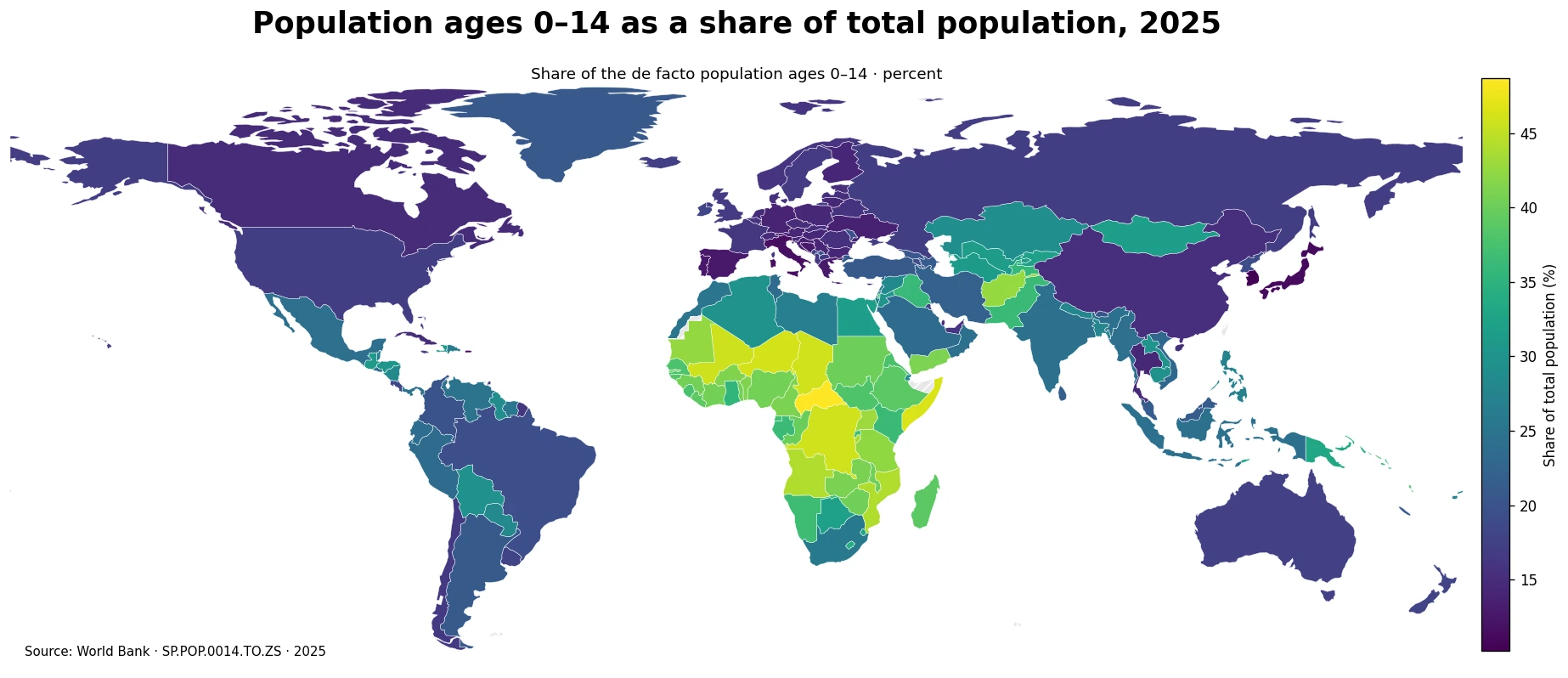
Table of Contents
The median economy had 22.0% of its population ages 0–14
Across all 217 economies, the simple mean is 25.08% and the median is 22.02%. The first quartile is 16.08% and the third quartile is 33.89%, so the middle half of the distribution falls within a range of about 16.1% to 33.9%. The full spread is 38.48 percentage points, from 10.20% to 48.68%. The mean sits above the median because a substantial group of very young populations extends the upper tail of the distribution.
25 economies are at or above 40%, while 51 are at or above 35%. At the other end, 38 economies are below 15% and 95 are below 20%. That range is large enough to make a single “global norm” misleading. In some economies, close to one person in two is younger than 15; in others the share is closer to one in ten. These differences matter for the scale of schooling and child-health systems today and for the number of people who may enter working age in the coming years.
Central African Republic had the highest share at 48.7%
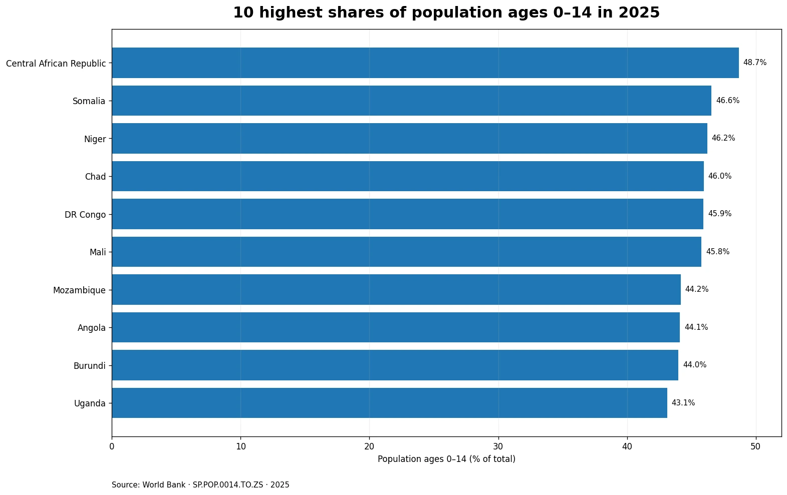
The highest 2025 value is Central African Republic at 48.7%. Somalia follows at 46.6%, Niger at 46.2%, Chad at 46.0%, DR Congo at 45.9%, and Mali at 45.8%. The top of the ranking is heavily concentrated in Sub-Saharan Africa. The average across the ten highest economies is 45.5%, which means that in this group more than two-fifths of the population is generally younger than 15.
| Economy | Population ages 0–14 |
|---|---|
| Central African Republic | 48.7% |
| Somalia | 46.6% |
| Niger | 46.2% |
| Chad | 46.0% |
| DR Congo | 45.9% |
| Mali | 45.8% |
| Mozambique | 44.2% |
| Angola | 44.1% |
| Burundi | 44.0% |
| Uganda | 43.1% |
A large child share is often associated with a younger demographic structure, but it does not by itself determine future population growth. Future size depends on how fertility changes, how survival changes at different ages, and how migration adds or removes people. A value near 45% is not a fertility rate and it does not mean that population will grow by 45%. It describes the composition of the population at one point in time.
The lowest values cluster in parts of East Asia and Southern Europe
At the low end, the Republic of Korea is at 10.2%, followed by Hong Kong SAR at 10.3%, Japan at 11.2%, Puerto Rico at 11.2%, Andorra at 11.6%, and Italy at 11.7%. Singapore and San Marino are also below 12%, while Spain and Portugal are in the 12% range. The average across the ten lowest economies is 11.5%, about 33.9 percentage points below the top-ten average.
| Economy | Population ages 0–14 |
|---|---|
| Republic of Korea | 10.2% |
| Hong Kong SAR | 10.3% |
| Japan | 11.2% |
| Puerto Rico | 11.2% |
| Andorra | 11.6% |
| Italy | 11.7% |
| Singapore | 11.7% |
| San Marino | 11.9% |
| Spain | 12.6% |
| Portugal | 12.7% |
Low child shares commonly appear where recent birth cohorts are smaller relative to the adult and older population. Even so, this indicator cannot tell us the speed of population decline, the size of future labor shortages, or the pace of aging on its own. Those questions require the shares ages 15–64 and 65+, migration balances, fertility, mortality, and preferably a full population projection. The 0–14 share is a strong structural signal, but it is not a complete demographic forecast.
Sub-Saharan Africa contains many of the highest values, but the region is not uniform
The map shows a broad concentration of high values across Sub-Saharan Africa, yet there is substantial variation inside the region. Nigeria is around 40.5%, Uganda 43.1%, and Angola 44.1%, while several countries in North Africa and parts of Southern Africa are lower. Fertility histories, urbanization, survival, migration, and the size of earlier cohorts differ from country to country, so a regional average can hide important differences in the number of children who will need schools, vaccinations, nutrition services, and eventually places in the labor market.
A share above 40% means children make up a very large portion of the population, but it does not directly translate into a required number of schools or teachers. Service demand depends on the absolute population, the narrower age bands within 0–14, geographic density, enrollment, urban-rural distribution, and access to existing services. The map is therefore best used to identify broad demographic contrasts. Detailed planning requires finer age and local-area data.
Asia and the Americas span a wide middle range
Asia includes very different positions within the same broad region. India stands at 24.2% while China is at 15.4%. Several East Asian economies are in the low teens, whereas parts of South and West Asia remain above 20%. The Americas also cover a wide range: Mexico is 24.1%, Brazil 19.4%, the United States 17.1%, and Canada 15.0%. These contrasts are why broad labels such as “young continent” or “old continent” can be less useful than examining the economy-level distribution.
Economies in the middle of the range deserve particular attention when studying change. A current share in the low twenties can remain stable for years, or it can fall quickly if recent birth cohorts shrink. At the same time, a country can continue to grow in total population while the 0–14 share declines, because large child cohorts move into the working ages. The level in one year and the direction of population growth are related but not interchangeable measures.
The child population share is not the same as the fertility rate
Fertility measures births, usually through age-specific birth rates or the total fertility rate. The 0–14 population share measures the composition of people who are already alive. It combines roughly fifteen years of birth cohorts with child survival, migration, and the number of adults and older people in the denominator. Two economies with similar current fertility can therefore have different child shares if their demographic histories are different. Conversely, the child share can remain high for some time after fertility begins to decline because earlier large cohorts are still within ages 0–14.
The denominator also matters. The number of children can remain relatively stable while the share falls if the adult and older population grows faster. A small country can have a high percentage but few children in absolute terms, while a large country can have a lower percentage but tens of millions of children. For budgets, school construction, or vaccine procurement, the absolute age-group population is usually required alongside this percentage.
Several companion indicators make the age structure easier to interpret
Useful companions include the population share ages 65+, the working-age share, age dependency ratios, total fertility rate, population growth, and net migration. A low child share combined with a high older-age share is consistent with a more advanced aging structure. A high child share followed by rapid growth of the working-age population can create very different opportunities and pressures, depending on education, job creation, health, and migration. The comparison works best when the indicators use compatible years and population definitions.
Age-specific shares within 0–14 can also reveal the timing of change. A country where ages 0–4 make up a much smaller share than ages 10–14 may have experienced a recent decline in births. Where the youngest group is larger, recent cohorts may be expanding. The aggregate 0–14 indicator is excellent for a global overview, but narrower age bands help show when a demographic shift began.
All 217 economies have values, but only 170 are drawn as map polygons
The source table contains a 2025 value for every one of the 217 economies in the dataset. The low-resolution Natural Earth boundary used for the map, however, links to 170 economy polygons. Many small island economies and city territories—such as Hong Kong, Singapore, Maldives, and several Caribbean and Pacific economies—do not have separate polygons at this resolution or are too small to display reliably. France, Norway, and Kosovo require name-based corrections because this particular low-resolution file does not carry their standard ISO3 codes.
This distinction matters because an uncolored or absent place on the map does not imply a value of zero or a missing World Bank observation. The rankings, mean, median, quartiles, and threshold counts all use the full set of 217 values. The map is a geographic overview rather than the complete table. For precise comparison of very small economies, the numeric table or source data should take priority over the polygon display.
A single 2025 snapshot cannot show the pace of demographic change
The map is a cross-section of 2025. It clearly shows a very young age structure in many African economies and much smaller child shares in several East Asian and European economies, but it does not show how quickly each place reached its current position. Age structures usually move over many years. A consistent series for 2015, 2020, and 2025 would reveal whether the child share is falling slowly, falling rapidly, stabilizing, or in some cases rising.
Population datasets may also be revised when new censuses, surveys, or demographic estimates are incorporated. For time-series work, it is therefore safer to obtain all years from the same current data system rather than combine historical downloads created under different vintages. This article focuses on the latest 2025 cross-country structure and does not infer long-run trends from the single-year ranking.
Six points to keep in mind when reading the comparison
- All 217 economies in the source data have a 2025 value; no missing observation was replaced with zero.
- The median is 22.0%, and the middle half of economies lie between about 16.1% and 33.9%.
- 25 economies are at or above 40%, while 38 are below 15%.
- The indicator measures the share of total population ages 0–14; it is not a fertility rate or population growth rate.
- A percentage does not reveal the absolute number of children, so planning requires age-group counts as well as shares.
- The low-resolution map links 170 economy polygons; some small economies remain in the statistics but are not shown as separate shapes.
Data source and calculation
The values come from the World Bank indicator Population ages 0-14 (% of total population), code SP.POP.0014.TO.ZS. The World Bank description defines the population on a de facto basis and calculates the indicator as the population ages 0–14 divided by total population. All 217 rows in the 2025 file contain valid numeric values, so the mean, median, quartiles, thresholds, and rankings were calculated directly from all 217 observations.
The map joins ISO3 codes to a low-resolution Natural Earth world boundary. 170 economy values match polygons after correcting the special low-resolution codes for France, Norway, and Kosovo. Small islands and city economies may still lack a polygon even though their values remain in the statistics. No missing value was converted to zero, and the map is used only to show spatial patterns rather than to replace the underlying table.
Frequently Asked Questions
Is the population share ages 0–14 the same as the fertility rate?
No. Fertility measures births, while this indicator measures the current age composition of the whole population. It also reflects survival, migration, and the size of adult and older age groups.
Does a low 0–14 share mean a country has few children in absolute numbers?
Not necessarily. A large-population economy can have a low percentage and still contain millions of children. Absolute age-group counts are needed for planning schools, vaccines, and other services.
Do places missing from the map have no 2025 data?
No. All 217 economies in the World Bank file have values. Some small island and city economies are not represented as separate polygons in the low-resolution map.
Related Articles
Green Map creates custom-edited map images using open geographic data sources such as geoBoundaries, Natural Earth, OpenStreetMap, and government open data. These maps are edited visual materials, not raw data files, and are provided for education, documents, presentations, and graphic reference.