Male labor force participation measures the share of men ages 15 and older who are either employed or unemployed but actively in the labor force. In the World Bank national-estimate series SL.TLF.CACT.MA.NE.ZS, 104 economies report a value for 2024. The median across those observations is 70.59%, while the mean is 70.48%. Those nearly identical central measures put the typical reported economy close to seven economically active men for every ten men ages 15 and older.
The measure is not an employment rate. An unemployed man who is actively looking for work remains in the labor force, while a student, retiree, full-time caregiver, discouraged worker who is no longer seeking work, or another person outside the labor force does not. That distinction matters because a high participation rate can coexist with high unemployment, and a lower participation rate can coexist with low unemployment. Participation is best read as a measure of labor-market attachment rather than a complete judgment on labor-market performance.
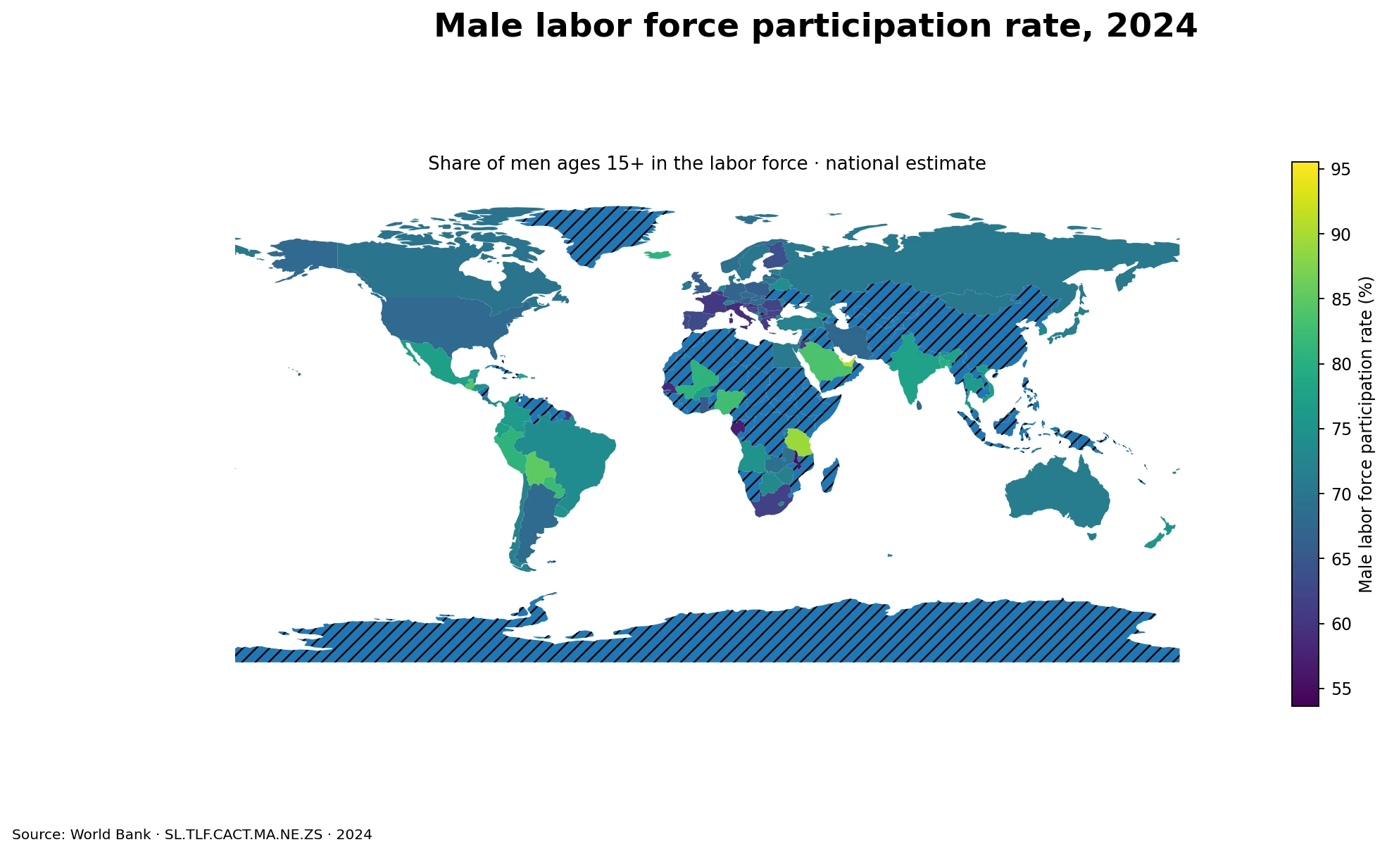
Table of Contents
The middle half of reported economies ranged from about 66% to 75%
Among the 104 valid observations, the first quartile is 66.09% and the third quartile is 74.96%. The highest reported value is Qatar at 95.52%, and the lowest is the economy recorded as Naoero in the source file, corresponding to Nauru, at 37.10%. The full reported range therefore spans 58.42 percentage points. Such a wide range reflects major differences in demographic structure, education, retirement, migration, and the way men connect with paid and unpaid economic activity.
The quartiles are more useful than a simple top-versus-bottom reading because most economies are much closer together than the extremes suggest. A participation rate around 70% is common in the dataset, while the very high and very low values are unusual. Small differences of one or two percentage points should not be overinterpreted, especially because national labor-force surveys can differ in timing, sampling, and operational details even when the World Bank places them in a common indicator framework.
The highest rates come from several different parts of the world
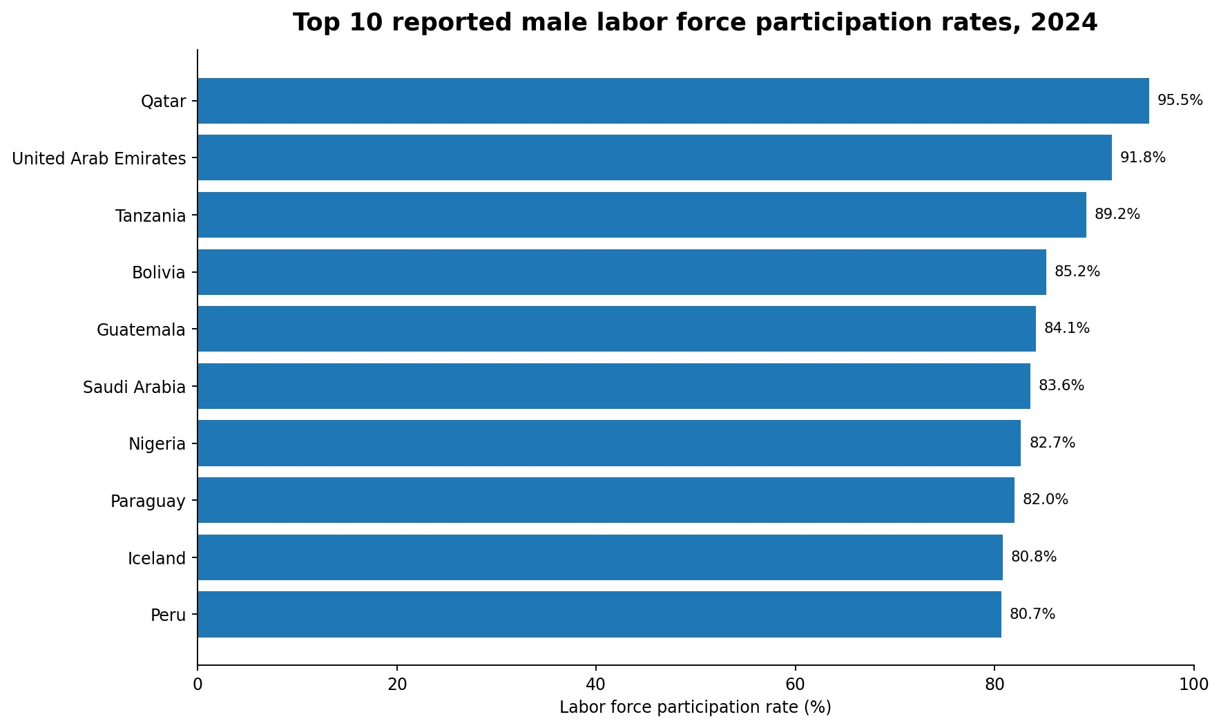
Qatar leads the reported 2024 values at 95.52%, followed by the United Arab Emirates at 91.80% and Tanzania at 89.24%. Bolivia reaches 85.17%, Guatemala 84.12%, Saudi Arabia 83.60%, Nigeria 82.66%, Paraguay 81.97%, Iceland 80.83%, and Peru 80.70%. The top ten therefore include the Gulf, Sub-Saharan Africa, Latin America and Europe. A high male participation rate is not a pattern that belongs to a single income group or a single institutional model.
Different mechanisms can produce similarly high rates. Gulf economies may have age and migrant-worker compositions that place a large share of adult men in work or active job search. In parts of Africa and Latin America, self-employment, agriculture and informal activity can keep many adults economically active even when jobs differ greatly in productivity or security. The indicator does not identify which mechanism dominates in each economy, so causal explanations require additional demographic and employment data.
Low reported rates also appear across more than one region
The bottom of the reported distribution includes Nauru at 37.10%, Kosovo at 53.63%, Malawi at 55.23%, Gabon at 57.21%, Senegal at 58.60%, Italy at 58.72%, Croatia at 58.78%, Belgium at 59.72%, France at 60.54%, and Greece at 60.67%. The presence of European and African economies in the lower group shows why participation should not be treated as a simple proxy for national income or development level.
Within Europe, Iceland is above 80%, while Italy is below 59%. The Netherlands reports 73.10%, Germany 66.92%, the United Kingdom 65.85% and France 60.54%. Retirement ages, the duration of education, part-time work, health, disability, pension incentives and population aging can all affect a 15+ participation measure. The same economy may look quite different if the denominator is limited to ages 15–64 or to a prime-age group such as ages 25–54.
Asia and the Middle East illustrate why participation is not the inverse of unemployment
Several Asian and Middle Eastern observations are far apart. Qatar and the United Arab Emirates exceed 90%, Saudi Arabia is at 83.60%, Bangladesh at 79.96%, India at 77.52%, Japan at 71.50%, Iran at 67.40% and Jordan at 61.60%. These figures describe whether men are in the labor force, not whether every participant has a job. The unemployment rate uses the labor force as its denominator, so it answers a different question.
An economy can have high participation and still have substantial unemployment if many men are looking for work. Another economy can show lower participation and low unemployment because many men are outside the labor force and therefore absent from the unemployment denominator. For a fuller labor-market picture, participation should be read together with the employment-to-population ratio and unemployment rate, ideally using the same age group, year and estimation method.
Latin America and Africa contain both high and moderate participation levels
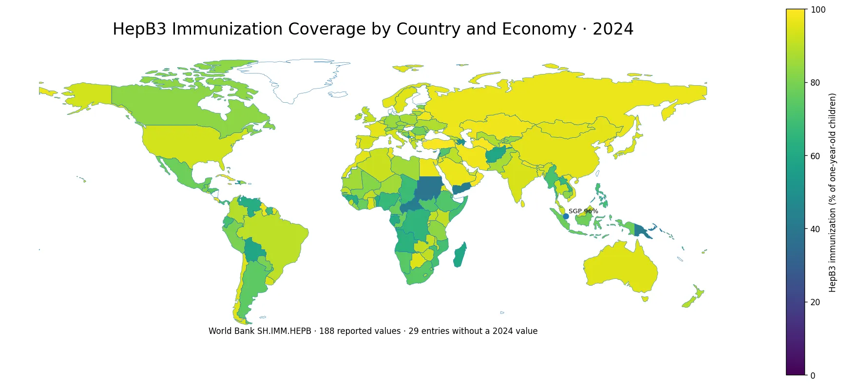
Latin American observations include Bolivia at 85.17%, Guatemala at 84.12%, Paraguay at 81.97% and Peru at 80.70%. Brazil is at 73.62% and Argentina at 68.35%. In Africa, Tanzania reaches 89.24% and Nigeria 82.66%, while Malawi, Gabon and Senegal are below 60%. These differences inside broad regions are large enough that continental averages would conceal much of the pattern visible in the country-level map.
A high participation rate is not automatically a sign of high job quality. Men may participate because household income needs require work in low-productivity self-employment, agriculture or informal occupations. Conversely, a lower rate can reflect longer education, earlier retirement, health limitations or weak demand for labor. The indicator records participation status, not wages, productivity, benefits, contract stability or working conditions.
The 15+ denominator makes population age structure important
Because every man age 15 and older is included in the denominator, the indicator mixes very different stages of life. Economies with older populations may have more retired men included in the base, which can lower the overall rate even if participation among prime-age men is high. Economies with large youth populations may include more teenagers and young adults who remain in education. Differences in age structure can therefore change the overall rate without implying the same difference in labor-market behavior at each age.
Age-specific participation rates help separate those effects. A 15–64 measure reduces the direct influence of the oldest retirees, while a prime-age measure focuses more closely on adults most likely to be attached to the labor market. Youth employment ratios and education indicators add context at the younger end. The broad 15+ measure remains useful for summarizing total adult male attachment, but it should not be treated as age-neutral.
Comparing male and female participation adds context, but the gap is not a single-cause measure
Male participation is one side of a broader gender structure in labor markets. Comparing it with female participation can show how differently men and women are connected to employment and active job search. Those differences may be associated with caregiving, social norms, sectoral composition, access to jobs, migration, education and age structure. The size of a male-female gap, however, does not by itself identify which factor is responsible.
A careful gender comparison should use the same year, age threshold and estimation concept. The 2024 male series here is a national-estimate indicator, so mixing it with a modeled estimate from another year can create artificial differences. Pairing it with the corresponding female national-estimate series is more consistent, while age-specific indicators can reveal whether the gap is concentrated among younger adults, prime-age adults or older workers.
The 113 source-missing economies remain missing, not zero
The source file contains 217 country and economy rows. Of those, 104 have a 2024 observation and 113 are source-missing. The missing rows are excluded from the mean, median, quartiles and rankings. Replacing missing observations with zero would falsely place unreported economies at the bottom of the distribution and would pull the global summary sharply downward. On the map, missing areas are shown separately from the numerical color scale.
Of the 104 reporting economies, 96 join directly to polygons in the low-resolution world boundary used for the visualization. Barbados, Hong Kong, St. Lucia, Malta, Mauritius, Nauru, Singapore and Seychelles retain their numerical values in the analysis but are not represented as independent filled polygons in that boundary layer. France, Norway and Kosovo require name-based handling because the boundary file does not provide the usual ISO3 code. Map coverage and statistical coverage are therefore related but not identical concepts.
Indicators that help interpret male labor force participation
- Employment-to-population ratio: shows the share of all men ages 15+ who are actually employed.
- Male unemployment rate: measures the share of the male labor force that is unemployed and seeking work.
- Age-specific participation: separates youth, prime-age and older-worker patterns hidden inside the 15+ aggregate.
- Hours and employment status: distinguishes full-time, part-time, self-employment and other forms of work.
- Wages, productivity and social protection: help assess the quality and economic return of participation.
Using these indicators together prevents a common interpretation error. Participation tells us how many men are connected to the labor market, but the employment ratio tells us how many actually have jobs, and unemployment shows how many participants are still seeking work. Pay, hours and job status then describe the conditions behind the headline rate. No single measure can replace the others.
Data source and calculation method
This comparison uses the World Bank indicator Labor force participation rate, male (% of male population ages 15+) (national estimate), code SL.TLF.CACT.MA.NE.ZS for 2024. The World Bank defines labor force participation as the proportion of the population ages 15 and older that is economically active, meaning people who supply labor for the production of goods and services during the reference period. This is the national-estimate series and should be distinguished from separately modeled series.
All descriptive statistics use only the 104 valid 2024 observations: mean 70.48%, median 70.59%, first quartile 66.09% and third quartile 74.96%. No missing value is imputed, replaced with zero or substituted from another year. The map joins ISO3 identifiers to a low-resolution world boundary, with name-based fixes for a few boundary-code exceptions. Rankings use the numerical source data rather than the ability of a small economy to appear as a polygon on the map.
Frequently Asked Questions
What does a male labor force participation rate of 70% mean?
It means about 70 of every 100 men ages 15 and older are either employed or unemployed but actively in the labor force. The other 30 are not necessarily unemployed; many are outside the labor force.
Does a higher male participation rate always mean a stronger labor market?
No. Participation measures labor-market attachment, not whether participants are employed, how much they earn, how many hours they work, or how secure their jobs are.
Were economies without a 2024 value treated as 0%?
No. The 113 source-missing economies remain missing and are excluded from the mean, median, quartiles and rankings.
Related Articles
Green Map creates custom-edited map images using open geographic data sources such as geoBoundaries, Natural Earth, OpenStreetMap, and government open data. These maps are edited visual materials, not raw data files, and are provided for education, documents, presentations, and graphic reference.