How much of a country’s workforce is employed in services? World Bank indicator SL.SRV.EMPL.ZS answers that question by measuring service-sector employment as a percentage of total employment under the ILO modelled-estimate framework. Among the 182 countries and reporting economies with a valid 2025 value, the median is 59.51% and the simple unweighted mean is 58.59%. The middle half of observations runs from about 47.19% to 72.88%, while the full range stretches from 11.56% to 92.17%.
“Services” is much broader than shops and restaurants. The World Bank definition includes wholesale and retail trade, hotels and restaurants, transport, storage and communications, finance, insurance, real estate and business services, plus community, social and personal services. The map therefore describes the sectoral structure of employment rather than a narrow set of occupations. It keeps only the 182 non-missing 2025 observations; the 35 source-missing rows are not converted to zero.
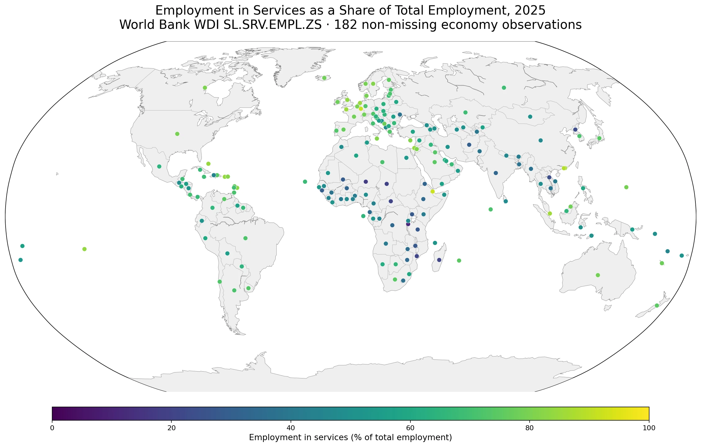
Table of Contents
This indicator classifies the industry where people work, not their occupation
The distinction between industry and occupation matters. ILO sector statistics classify workers according to the economic activity of the establishment or enterprise in which they work. An accountant employed by a manufacturing company can have a service-like occupation while still being counted under manufacturing. By contrast, people with many different occupations can be counted in services when they work for banks, schools, hospitals, transport firms, hotels, retailers or other service-sector organizations.
The denominator is total employment. A service-employment share of 70% means roughly 70 of every 100 employed people are classified in service industries. It does not mean that 70% of all adults are employed in services. People who are unemployed or outside the labor force are not part of this denominator, so the measure should not be confused with the employment-to-population ratio or labor-force participation. It also does not measure wages, hours, job security or contract type.
The center of the 2025 distribution is close to 60%, but the spread is wide
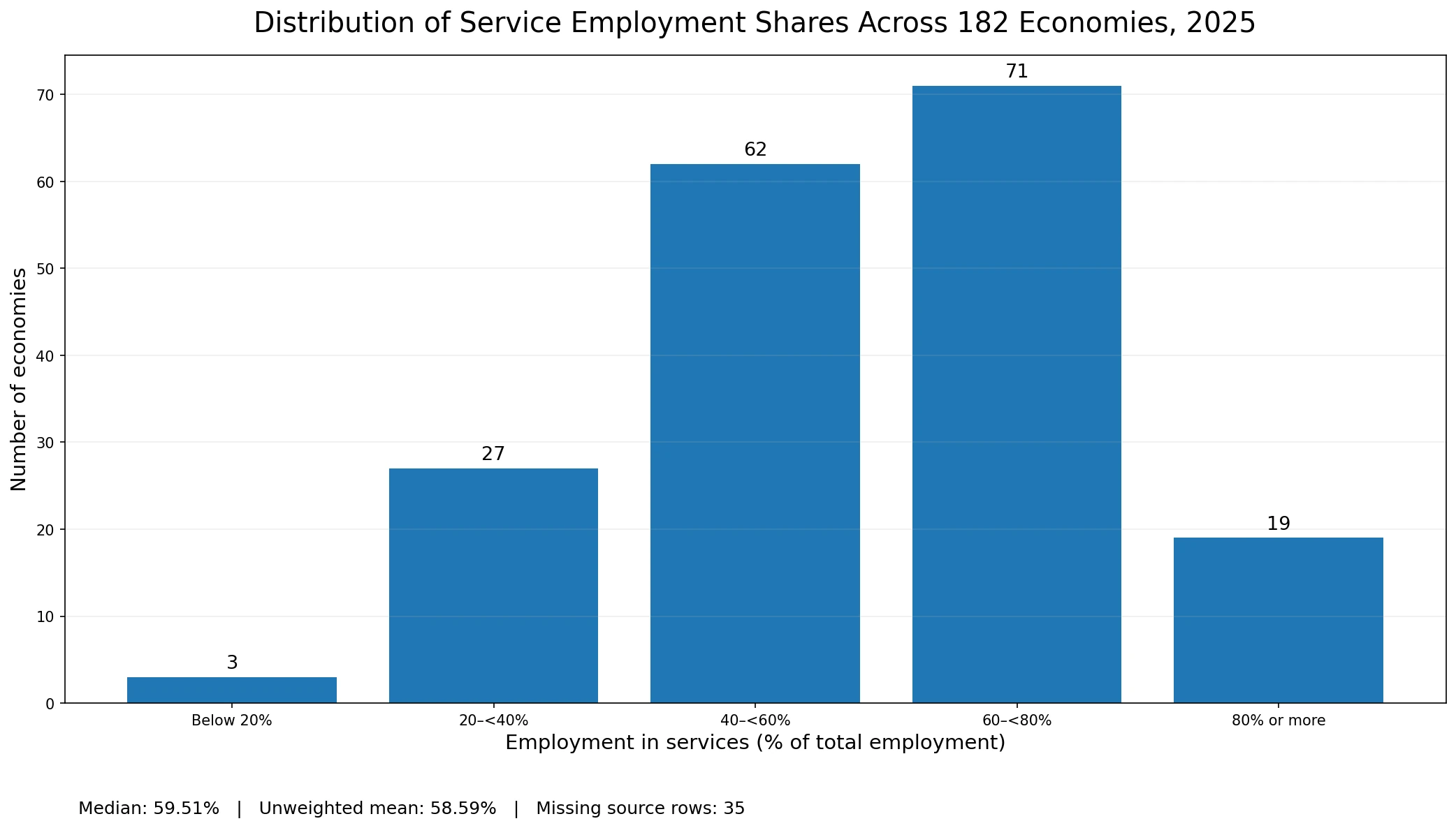
The median across the 182 valid observations is 59.51%. The first quartile is 47.19% and the third quartile is 72.88%, so half of the observations fall within a band of roughly 47% to 73%. The unweighted mean is 58.59%, close to the median. This is an average across economy observations, not a world employment-weighted service share. A true global workforce average would require weighting each country by the number of employed people.
Grouping the values into broad bands shows where most observations sit. Seventy-one economies fall between 60% and under 80%, and another 62 are between 40% and under 60%. Nineteen are at 80% or more, 27 are between 20% and under 40%, and only three are below 20%. The distribution makes clear that services account for a majority of employment in many economies, while a substantial group still has much larger employment shares in agriculture and industry.
High service-employment shares are common across Europe and North America
Many European economies sit in the upper part of the distribution. Luxembourg is at 91.48%, the Netherlands 84.54%, the United Kingdom 83.23%, Sweden 81.41%, Belgium 79.77%, France 78.33%, Spain 76.77%, Germany 72.95% and Italy 70.23%. North America is also service-heavy in employment terms, with Canada at 80.15% and the United States at 79.56%. The map makes this broad cluster easier to see than a long country table.
A high share is not a general score of labor-market quality or economic performance. Service employment includes activities with very different productivity, pay and working conditions. Finance and information-intensive business services sit in the same broad sectoral family as retail, hospitality and many personal services. The indicator tells us how employment is distributed across sectors; it does not tell us whether those jobs are high-paying, stable or productive.
Asia spans from low 30s to the mid-80s
The Asian distribution is especially broad. Singapore is at 85.91% and Hong Kong at 85.80%, while Japan is 73.96%, Saudi Arabia 74.43%, the United Arab Emirates 67.97%, Indonesia 50.17%, China 46.53%, Viet Nam 40.13% and India 32.56%. Neighboring economies can therefore occupy very different bands even within the same broad region. Sector mix, urbanization and the relative size of agriculture, manufacturing, tourism, finance and public services can all vary, but the map alone does not establish which factor causes a specific value.
Percentages should also be kept separate from absolute numbers. India and China have lower service-employment shares than several small high-income economies, yet their very large workforces mean the number of people employed in services can still be enormous. This indicator is designed to compare composition, not headcounts. A country with a 50% share and a much larger workforce can employ far more service workers than a small economy with an 85% share.
Africa contains both the lowest band and a striking high-share outlier
Several of the lowest observations are in Sub-Saharan Africa. Burundi is at 11.56%, Niger 17.74%, Chad 19.76%, the Central African Republic 20.55%, Mozambique 20.55% and Madagascar 20.89%. These values indicate that service industries account for a smaller share of total employment than in most of Europe or North America. They can be consistent with larger agricultural and other non-service employment shares, but this indicator by itself cannot quantify informality, farm employment or the reasons behind the sector mix.
Djibouti is the major exception, at 92.17%, the highest valid observation in this 2025 set. South Africa is also relatively high at 73.83%. Those contrasts are a useful reminder that continents are not single labor-market categories. Broad regional patterns can be visible, but individual economies may differ sharply from nearby countries, and the causes require separate data.
The Americas are service-majority too, but not at one common level
Across Latin America, Argentina is at 71.81%, Brazil 72.16% and Mexico 64.08%. Several Caribbean reporting economies are higher: The Bahamas is 84.44% and Barbados 82.58%. Small island economies can be difficult to see as polygons on a world map, so the visual uses reference-location points for every valid observation rather than dropping areas that are too small at global scale. That approach keeps the 182-value statistical coverage visible without implying that a missing row equals zero.
Selected values show how different employment structures can be
The table below is a set of reference points from different regions and parts of the distribution. It is not intended as a precise ranking of labor markets. The modelled-series caveat matters especially when countries are separated by only small fractions of a percentage point.
| Country or economy | Employment in services | 2025 distribution position |
|---|---|---|
| Djibouti | 92.17% | Above 90% |
| Luxembourg | 91.48% | Above 90% |
| United Kingdom | 83.23% | 80% or more |
| Canada | 80.15% | Around 80% |
| United States | 79.56% | Upper part of 60–80% |
| Japan | 73.96% | 60–80% |
| Brazil | 72.16% | 60–80% |
| Mexico | 64.08% | 60–80% |
| Indonesia | 50.17% | 40–60% |
| China | 46.53% | 40–60% |
| India | 32.56% | 20–40% |
| Burundi | 11.56% | Below 20% |
All values in the table are dated 2025, so the comparison does not mix reference years. That does not mean every estimate has the same amount of direct national evidence behind it. The ILO modelled-estimate system combines reported labor statistics with statistical modeling used to fill gaps and produce broader same-year coverage. The extra decimal places support reproducible calculations; they should not be treated as proof that tiny country differences are substantively meaningful.
ILO modelled estimates are useful for broad patterns, not precise country rankings
The World Bank metadata states that this series comes from the ILO Modelled Estimates database. National labor statistics are combined with models that can impute missing observations and produce projections. That design is useful for a broad 2025 cross-section with consistent coverage, but it comes with uncertainty. The World Bank explicitly cautions that imputed observations are not based on national data and should not be used for country comparisons or rankings when precision matters.
Comparability is also affected by national measurement practices. Countries can differ in how they treat the armed forces, self-employed workers, unpaid family workers, age coverage and geographic coverage. Establishment surveys may omit some self-employed and unpaid workers, while urban-only data can understate agriculture. Broad service, industry and agriculture categories are valuable for structural analysis, but they can hide important shifts within each sector.
Data source and mapping method
The statistical source is the World Bank World Development Indicators series Employment in services (% of total employment) (modeled ILO estimate), code SL.SRV.EMPL.ZS. The World Bank identifies the ILOSTAT ILO Modelled Estimates database as the underlying source. The unit is percent of total employment and the series is annual.
The 2025 table contains 217 country and economy rows. Numeric values are present for 182 rows and 35 are source-missing. All averages, medians, bands, selected examples and map colors use only the 182 non-missing observations. Missing rows are not set to zero and no older value is substituted into the same-year comparison. The map plots every valid observation at a country or economy reference location, including small islands and special reporting areas that are difficult to distinguish as polygons at world scale.
Frequently Asked Questions
What does a 60% employment-in-services share mean?
It means about 60 of every 100 employed people are classified in service industries. It does not mean 60% of the entire adult population works in services.
What activities are included in the services sector?
The broad category includes wholesale and retail trade, hotels and restaurants, transport and communications, finance, insurance, real estate, business services, and community, social and personal services.
How are economies with no 2025 value handled?
The source table has 217 rows, with 182 valid 2025 observations and 35 source-missing rows. Missing values remain missing; they are not converted to zero or replaced with older observations.
Does a higher service-employment share mean a better labor market?
No. The indicator describes the sectoral composition of employment and does not directly measure wages, productivity, hours or job security. Modelled ILO estimates are also better suited to broad patterns than precise rankings.
Related Articles
Employer Share of Total Employment in 2025 – Global Patterns in ILO Modelled Estimates
Global Employment-to-Population Ratio Map – Ages 15+ in 2025
Unemployment Rate Map – Country Patterns in 2025
Green Map creates custom-edited map images using open geographic data sources such as geoBoundaries, Natural Earth, OpenStreetMap, and government open data.
These maps are edited visual materials, not raw data files, and are provided for education, documents, presentations, and graphic reference.