Southern Indiana’s Harrison County is split between two dominant covers that occupy nearly the same share of the county but appear in very different places. Forest accounts for 48.38% of the 2025 map and agriculture for 40.49%. Broad farm areas are easiest to see in the north, while much larger wooded tracts spread across the west and southwest. Near the middle of the county, Corydon creates the clearest developed concentration. It also gives readers an easy reference point for comparing the surrounding rural landscape.
Four map views are provided here: general land cover, forest and farmland, impervious surface/developed land, and the 1985–2025 land-cover comparison. The WebP images are designed for quick viewing on the page, while the four original JPG maps are available together in one ZIP. Reading the maps in sequence makes it easier to separate present-day cover from hard surfaces and then from long-term classification differences.
Table of Contents
Forest and agriculture are close in total share but far apart on the map
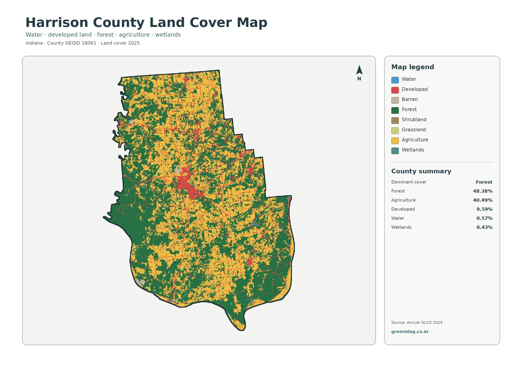
The 2025 summary lists forest at 48.38%, agriculture at 40.49%, developed land at 9.59%, water at 0.57%, and wetlands at 0.43%. Those numbers immediately show why no single land-cover class overwhelms the county. Forest has the largest total share, yet farmland is only about eight percentage points behind it. Because the two dominant classes are distributed unevenly, location matters more than the small gap between their countywide percentages.
Northern Harrison County contains some of the broadest agricultural areas. Yellow cover forms sizable blocks, with woodland breaking the fields into irregular pieces rather than disappearing completely. Moving toward the center, the mix becomes more complicated as farms, forest, and developed areas occur closer together. Corydon stands out as the largest red concentration. That built center makes the middle of the county look different from both the farm-heavy north and the more wooded southwest.
Farther west and south, green cover expands into much larger tracts. Agricultural patches remain present, but they are more often separated by forest than they are in the north. Water and wetlands occupy small countywide shares, so they do not dominate the overall color pattern. Their placement still matters locally, especially near rivers and low-lying areas. Still, the main story of the general map is the contrast among northern farms, southwestern woods, and the developed center around Corydon.
The north reads as farm country while the southwest reads as woodland
Starting at the top of the county reveals why agriculture can look dominant even though forest ranks first overall. Fields extend across large parts of the north and northeast, and many wooded areas there are broken into smaller patches. Roads and small developed locations interrupt the farm cover without replacing it. A reader who only looked at this part of the map might reasonably describe Harrison County as strongly agricultural.
That impression changes sharply toward the west and southwest. Large wooded tracts occupy a much greater share of the landscape, and farms appear within or along the edges of those forested areas. Development becomes less continuous, with smaller built patches separated by woods and agricultural land. This shift within one county explains why the 48.38% forest and 40.49% agriculture totals are more useful when paired with the map than when quoted alone.
A simplified forest-and-farmland view makes the comparison easier by placing less emphasis on developed and other classes. Forest remains 48.38% and agriculture 40.49%, while the summary also lists grassland at 0.17%, shrubland at 0.05%, water at 0.57%, and wetlands at 0.43%. Those smaller categories help explain local breaks in the dominant pattern. They do not change the countywide contrast between broad northern fields and much larger wooded areas to the southwest.
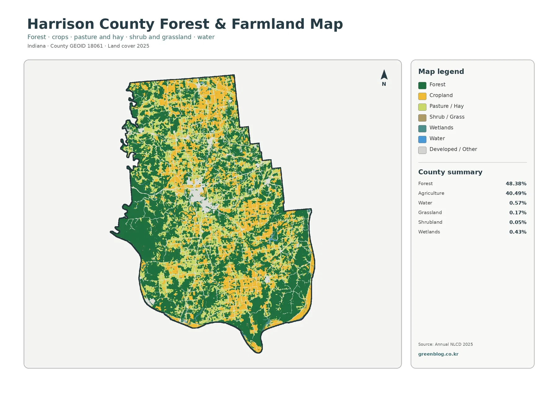
Color on this map should not be treated as a legal land-use designation. A yellow agricultural cell does not establish zoning or ownership, and a green forest cell does not prove that the land is publicly owned or protected. The product describes the physical cover visible to the classification system. Parcel boundaries, conservation status, and land-use rules require separate county or state records.
Harrison-Crawford State Forest helps explain the wooded southwest
According to Indiana DNR, Harrison-Crawford State Forest covers roughly 24,000 acres of hardwood forest across western Harrison County and eastern Crawford County. The agency also identifies the Ohio River and Blue River as important natural features associated with the property. That official context fits the broad woodland visible in the western and southwestern part of the land-cover map. It gives readers a real geographic reference for the largest green areas.
Not every forest-colored cell belongs to the state forest. Private woodland, other public land, and smaller wooded properties can appear with the same land-cover classification. For that reason, the map is useful for describing where tree cover is extensive but not for drawing management or ownership boundaries. When an exact state-forest boundary is needed, the DNR property map should be used instead of the land-cover image.
Water deserves the same kind of caution. Only 0.57% of the county is classified as water. Even so, the Ohio River is a major geographic feature along the region, and Blue River is important within the forested landscape. A boundary river can be highly significant without occupying a large percentage of raster cells inside the county. A land-cover map therefore answers a different question from a hydrography map. It shows surface classes, not a complete measure of river importance or watershed extent.
Edges of the large forest contain farms, roads, residences, and small developed areas rather than forming one sharp dividing line. Those transitions are useful in classroom or environmental work because they show how wooded and agricultural cover intermix in the southern part of the county. They should still be described as mapped cover, not as evidence that a particular field or house lies inside a protected forest.
Corydon becomes the clearest built center on the impervious-surface map
Developed land represents 9.59% of the 2025 county summary, and its largest concentration occurs around Corydon. Official county and state-library references identify Corydon as the county seat, so the central built area provides a practical geographic reference. Smaller developed patches appear elsewhere, but they are separated by much larger areas of farm and forest cover. As a result, the landscape does not read as one continuous urban area.
Hard surfaces are isolated more clearly in the impervious layer. Across the county, mean impervious cover is 1.62%, while 0.53% of the area is shown with impervious cover of 50% or more. Darker concentrations cluster around Corydon, and narrow traces follow road networks through the countryside. Most rural areas remain very light, which is consistent with extensive woodland and farmland even where scattered buildings are present.
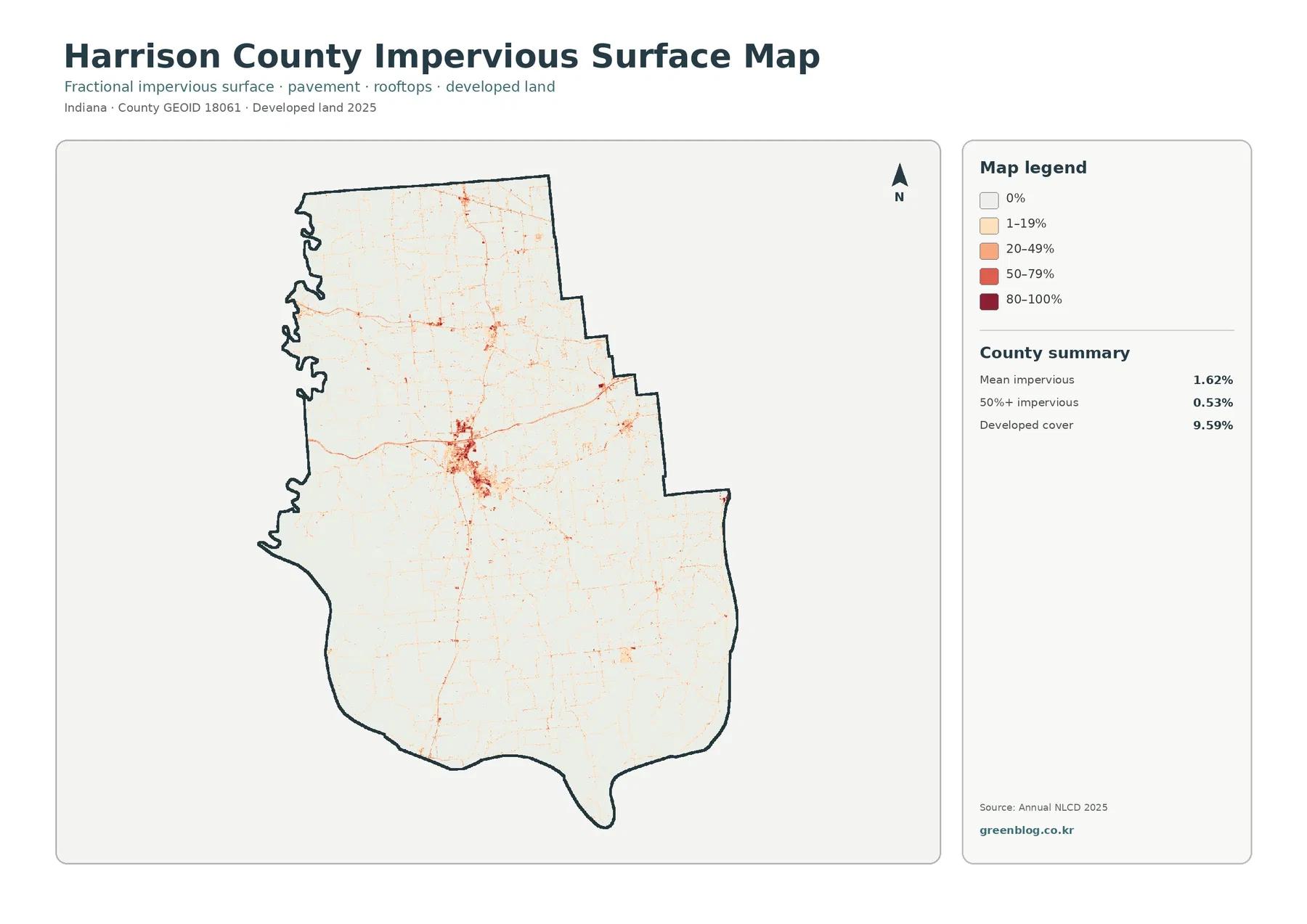
The gap between 9.59% developed land and 1.62% mean impervious cover is expected because the two measurements are not equivalent. Developed classes can contain lawns, trees, landscaped areas, and other pervious surfaces along with buildings and pavement. Impervious data focus more directly on hard surfaces such as rooftops, parking lots, and paved roads. A rural county can therefore have a noticeable developed share while maintaining a much lower average impervious percentage.
Impervious cover should not be turned into a flood-risk rating. Pavement can affect runoff, but flooding also depends on terrain, soil, drainage systems, rainfall, and nearby waterways. Use this map to locate concentrations of hard surface and compare them with the broader developed class. Site-specific drainage or hazard decisions require separate official flood and engineering information.
The 12.99% change figure is a class difference, not a countywide development rate
The 1985–2025 comparison reports a total class difference of 12.99%. Within that total, 2.14% is classified as change to developed land, 1.15% as forest loss, 0.69% as agricultural loss, and 8.96% as other class difference. Wetland difference is shown separately in the legend. Treating the full 12.99% as newly developed land would combine several categories that the map intentionally keeps apart.
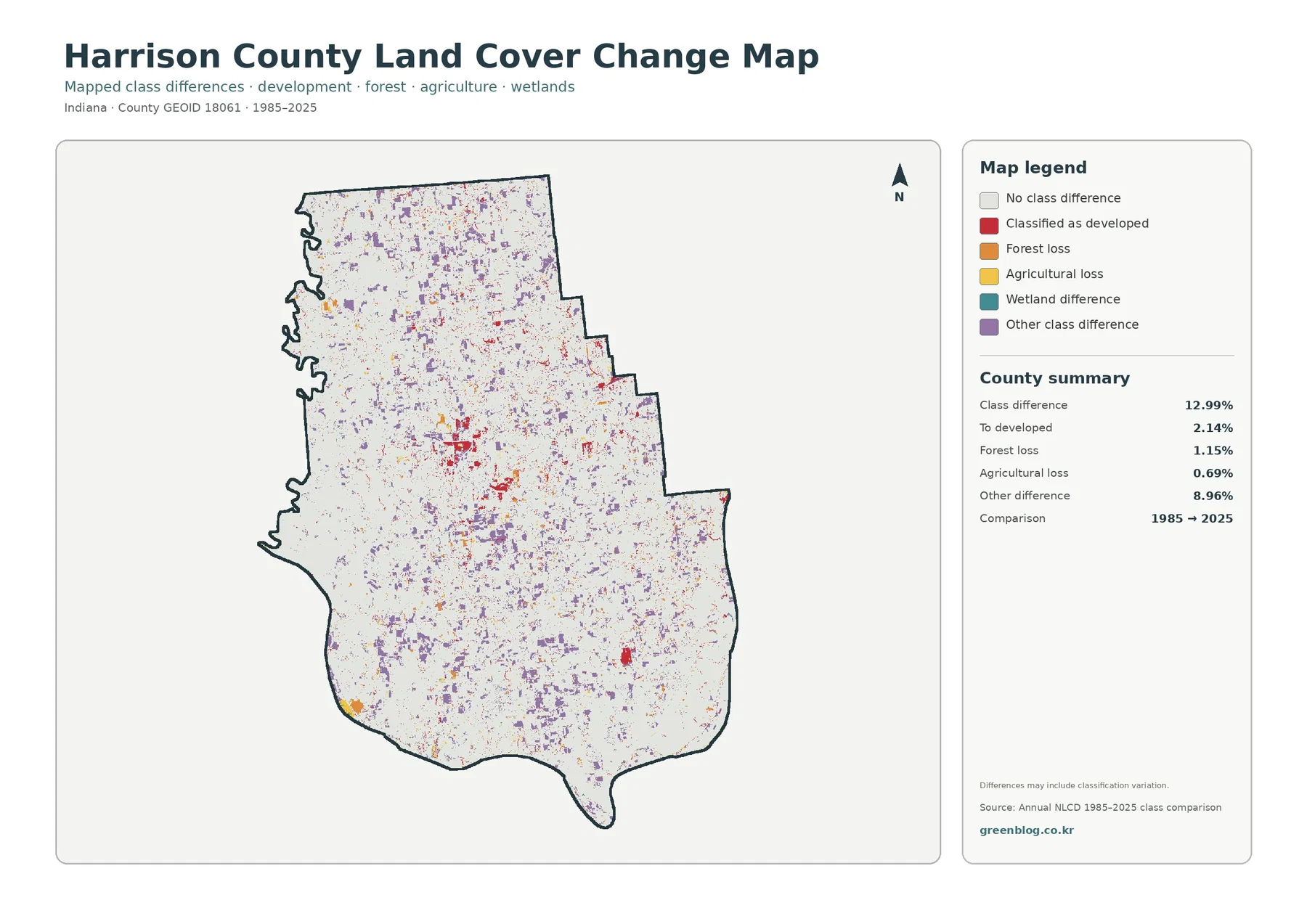
Red change cells are relatively easy to notice around Corydon and at several smaller developed locations. Purple other-difference cells are more widely scattered, while forest-loss and agricultural-loss colors occur in smaller pockets. Large pale areas indicate no mapped class difference between the two comparison years. The pattern suggests that change was not uniform across Harrison County and that built expansion is only one part of the full comparison.
Classification differences can reflect real land conversion, but they can also be influenced by raster resolution and changes in how mixed cells are classified. A narrow road edge, small clearing, or field boundary may move from one dominant class to another without representing a simple one-to-one land conversion. Establishing the exact year when a parcel was developed requires more evidence. Historical aerial imagery, parcel records, and local GIS are better suited to that task than this comparison alone.
Pairing the change view with the current land-cover map prevents a common mistake. The current map answers where forest, agriculture, developed land, water, and wetlands are classified in 2025. The comparison map answers where the class differs between 1985 and 2025. Those questions overlap, but they are not interchangeable.
A simple reading order makes the four maps easier to use together
Begin with the general land-cover image when the goal is to understand the whole county. It establishes the farm-heavy north, the wooded west and southwest, and the developed concentration around Corydon in one view. Countywide percentages can be introduced at the same time, but the discussion should immediately connect those numbers with their location. That step prevents the 48.38% forest share from being interpreted as evenly distributed forest.
Move to the forest-and-farmland map when the topic is rural land or woodland. Its simpler legend removes much of the developed-color competition and makes the north-to-southwest contrast easier to teach or present. For settlement or infrastructure, the impervious map is more useful as the second view. Corydon and the road network become more distinct against the low-impervious countryside.
Finish with the change map when the question involves long-term difference. Keeping it last helps readers separate a change category from a current land-cover class. For example, red on the change map means a location was classified as developed in the comparison, while red on the current map represents present developed cover. Showing the legends and dates with each image is essential when both maps appear in the same report or slide deck.
Different map combinations work for different purposes. A natural-resource presentation can pair the forest/farmland map with the Indiana DNR state-forest information. A community-development discussion can compare current developed cover with impervious surface. The change map can then identify locations where classes differ over time. Selecting a clear question for each image avoids repeating the same county description four times.
Raster classification is useful at county scale but not a substitute for parcel data
Annual NLCD classifies the land surface as raster cells. Each cell represents a generalized surface class, so a small area containing trees, pavement, lawn, and a building may not reproduce every feature visible on the ground. At county scale this generalization is helpful because broad patterns become easy to compare. At property scale, however, boundaries can look different from survey lines, zoning polygons, or current aerial imagery.
Legal meaning should never be assigned from the map color alone. Agricultural cover does not prove agricultural zoning, and forest does not establish public ownership. Developed cover does not define buildable land. A wetland-class cell also does not replace an official regulatory wetland determination. County planning, property, permit, and conservation questions need the appropriate local, state, or federal source.
Dates are another important limitation. Three current-condition products—the general land-cover, forest/farmland, and impervious maps—describe 2025, while the change product compares 1985 with 2025. Construction, clearing, farming changes, or restoration after the observation year may not be represented. When a project depends on current conditions, recent aerial imagery and local GIS should be checked alongside these county-scale maps.
What the four original JPG maps are best suited for
The download ZIP contains four original JPG images, each measuring 2480 by 1754 pixels. For report openings, the general land-cover map works well because it carries the full class legend and county summary. For rural-land discussions, the forest/farmland image provides a cleaner view. The impervious map focuses attention on hard surfaces, while the change map is reserved for the 1985–2025 comparison.
Printed handouts and classroom materials benefit from keeping the legend, source year, and county outline visible. Cropping those elements can make a figure difficult to interpret later, especially when developed cover and change-to-developed use similar visual emphasis. In presentation slides, one map can establish the countywide pattern and a second can answer a narrower question about forest, impervious surface, or change.
Upscaling the files does not create additional geographic detail. The images reflect the resolution and classification of the source data, so a larger print cannot turn them into parcel maps. They are best used for county comparison, education, presentations, and general planning context. Detailed measurement or site decisions should return to the underlying data and official GIS layers.
Frequently Asked Questions
Why does northern Harrison County look more agricultural if forest is the largest countywide class?
The 48.38% forest figure is calculated across the entire county. Very large wooded areas in the west and southwest raise the countywide forest share, while larger farm blocks dominate much of the north. The map is therefore more informative than the percentage by itself: forest is the largest total class, but agriculture is the stronger cover in several northern areas.
Why is developed land 9.59% while mean impervious cover is only 1.62%?
Developed land can include lawns, trees, landscaped areas, and other surfaces that still absorb water, as well as buildings and pavement. The impervious layer focuses on hard surfaces such as rooftops, parking areas, and paved roads. Because most of Harrison County is rural and even developed areas contain pervious surfaces, the countywide mean impervious value is much lower than the developed-land percentage.
Does the 12.99% class difference mean that 12.99% of Harrison County was developed after 1985?
No. The 12.99% figure combines several categories of classification difference between 1985 and 2025. The summary lists 2.14% as to developed, 1.15% forest loss, 0.69% agricultural loss, and 8.96% other class difference, with wetland difference shown separately in the legend. It is a two-date class comparison, not a single development-rate measure.
Map File Information
The ZIP contains four original JPG maps for Harrison County. They cover 2025 land cover, forest and farmland, impervious surface/developed land, and the 1985–2025 land-cover change comparison.
- Printable Size: 2480 × 1754 px each
- File Type: ZIP containing 4 JPG files
Related Maps
- Adams County Indiana Land Cover Map
- Allen County Indiana Land Cover Map
- Bartholomew County Indiana Land Cover Map
Sources and references
- MRLC Annual NLCD Data – official access to Annual NLCD land-cover products and year-based data
- USGS Annual NLCD Land Cover Classification – classification definitions and interpretation guidance
- U.S. Census Bureau TIGER/Line Shapefiles – official geographic boundary source used for county reference
- Indiana DNR Harrison-Crawford State Forest – official context for the large wooded area in western and southwestern Harrison County
- Harrison County Government – county administration and local reference information
- Indiana State Library – Harrison County – county history and reference material
Green Map creates custom-edited map images using open geographic data sources such as geoBoundaries, Natural Earth, OpenStreetMap, and government open data. These maps are edited visual materials, not raw data files, and are provided for education, documents, presentations, and graphic reference.