DeKalb County in northern Illinois is overwhelmingly agricultural in the 2025 land-cover map, but the county is not visually uniform. Agriculture accounts for 85.68% of the mapped area, while a broad developed cluster around DeKalb and Sycamore forms the clearest break in the farm landscape. This page compares the general land-cover map with forest-and-farmland, impervious-surface, and 1985–2025 change views.
The four map images can be viewed on the page, and the matching JPG files are available together in one ZIP download. Each version is useful for a different question: the general map shows the overall mix, the forest-and-farmland map makes narrow natural corridors easier to see, the impervious map separates heavily paved areas from lighter development, and the change map highlights places where classifications differ between 1985 and 2025. Land cover describes the physical surface, not ownership, zoning, or legal development rights.
Table of Contents
The DeKalb–Sycamore area creates a distinct central development belt
The most prominent nonagricultural feature is the broad red developed area in the middle of the county. The larger southwestern part corresponds to DeKalb, while the northeastern part aligns with Sycamore, and developed cover continues through portions of the space between them. DeKalb County government identifies Sycamore as the county seat and notes that Northern Illinois University is located in DeKalb, confirming the importance of this central pair of communities within the county.
Outside this central belt, the transition back to agriculture is quick. The large red patches break into smaller pieces, then into thin lines that follow roads through the countryside. This is especially useful when the map is viewed at county scale: instead of treating all developed cover as one urban category, the reader can distinguish a broad connected settlement area from isolated rural development and transportation lines.
The 11.45% developed figure should not be read as the percentage of the county that is fully urban, residential, or paved. Annual NLCD developed classes can include a mix of buildings, roads, lawns, and other surfaces at different development intensities. Agricultural cover likewise does not define farm ownership or zoning. The map is best used to compare visible surface classes, while parcel records and land-use regulations should be checked separately for legal or property questions.
Impervious surfaces reveal the difference between the urban core and the road grid
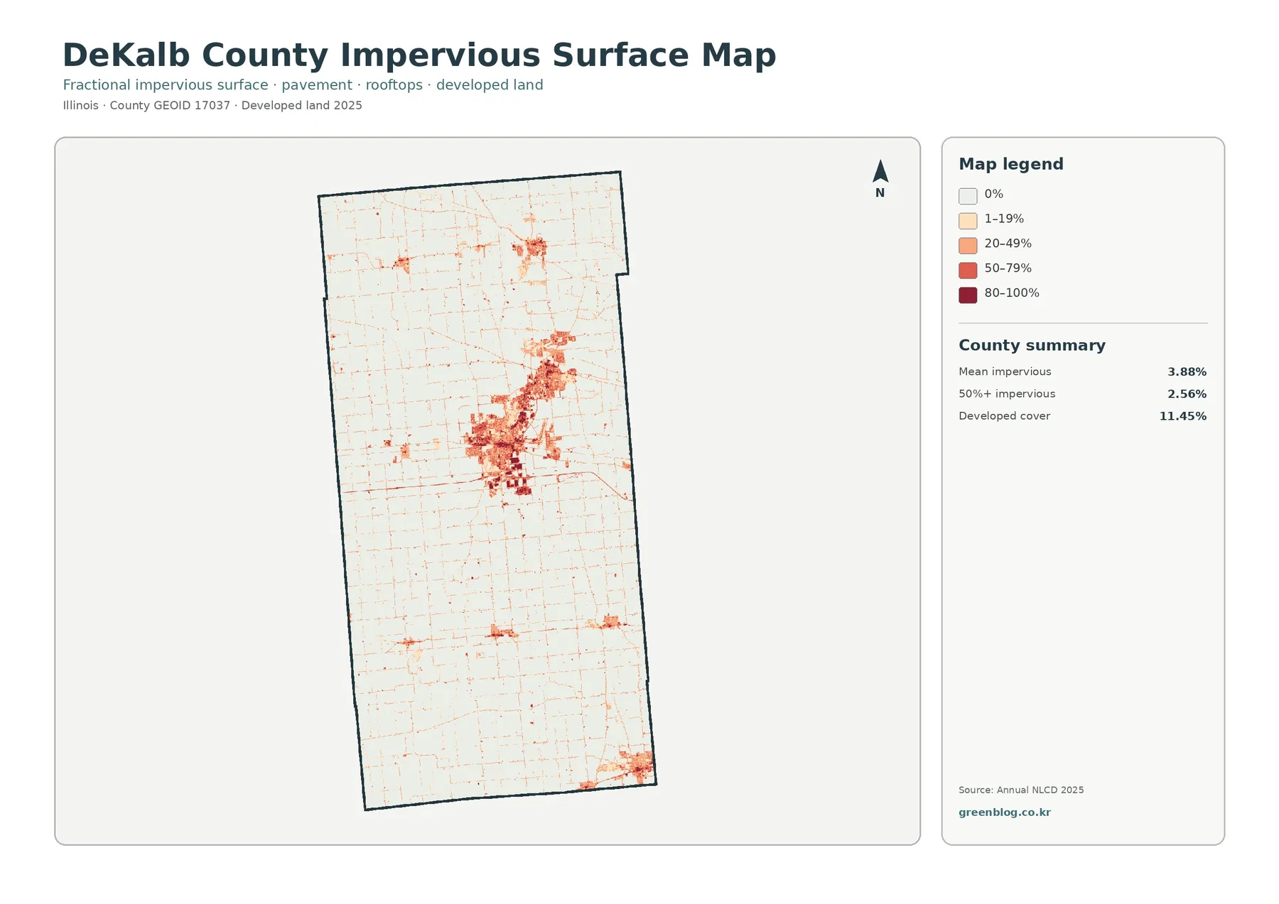
Impervious surface means pavement, rooftops, and similar surfaces that do not readily absorb water. The county summary reports a mean impervious value of 3.88%. Areas where impervious cover exceeds 50% account for 2.56% of the county, while the broader developed land-cover class totals 11.45%. That gap matters because a developed pixel can contain substantial vegetation or open space and does not have to be mostly pavement.
The darkest impervious values are concentrated around DeKalb and Sycamore. DeKalb forms a large dense patch, and another strong cluster appears to the northeast around Sycamore, with developed surfaces connecting parts of the central corridor. Once outside that area, the high-value patches become much smaller. The rural road network remains visible as a fine web of low impervious values crossing mostly agricultural land.
Smaller communities north and south of the central area can also be found on this map, but they occupy much less space than the DeKalb–Sycamore concentration. This makes the impervious layer particularly useful for comparing settlement intensity. The general land-cover map answers where developed cover exists; the impervious version adds information about how strongly built or paved that surface is within the limitations of a county-scale raster map.
Impervious percentage is not a population map. A parking lot, warehouse district, or major paved facility can have a high impervious value even if few people live there, while a low-density neighborhood with lawns and trees may appear lighter. For that reason, the map should be used for physical surface comparison rather than as a substitute for census population, traffic counts, or detailed land-use data.
A farm landscape dominates nearly every part of the county
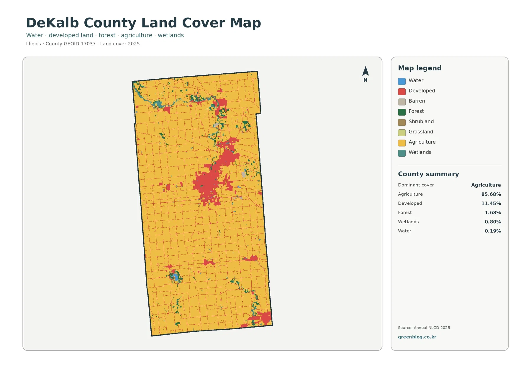
The county summary on the 2025 land-cover map reports agriculture at 85.68%. Developed land is the next largest class at 11.45%, followed by forest at 1.68%, wetlands at 0.80%, and water at 0.19%. Because the agricultural share is so large, the yellow farm class creates a continuous background across most of the map. Developed areas, wooded strips, and wet patches stand out mainly because they interrupt that broad agricultural field.
The agricultural pattern is not a featureless block. A regular road grid divides the countryside into smaller units, and scattered developed spots appear around communities and road junctions. The largest developed area sits in the central part of the county, with smaller clusters toward the north and south. This arrangement makes it possible to compare a concentrated urban core with a surrounding landscape where buildings and roads are much more dispersed.
DeKalb County government describes the county as roughly 632.7 square miles and identifies Sycamore as the county seat. Its county history also emphasizes the long importance of agriculture in the area. Those historical facts are separate from the Annual NLCD classification, but they provide useful local context for a 2025 map in which more than five-sixths of the county is classified as agricultural cover.
Forest and wetland cover appears in narrow corridors rather than large blocks
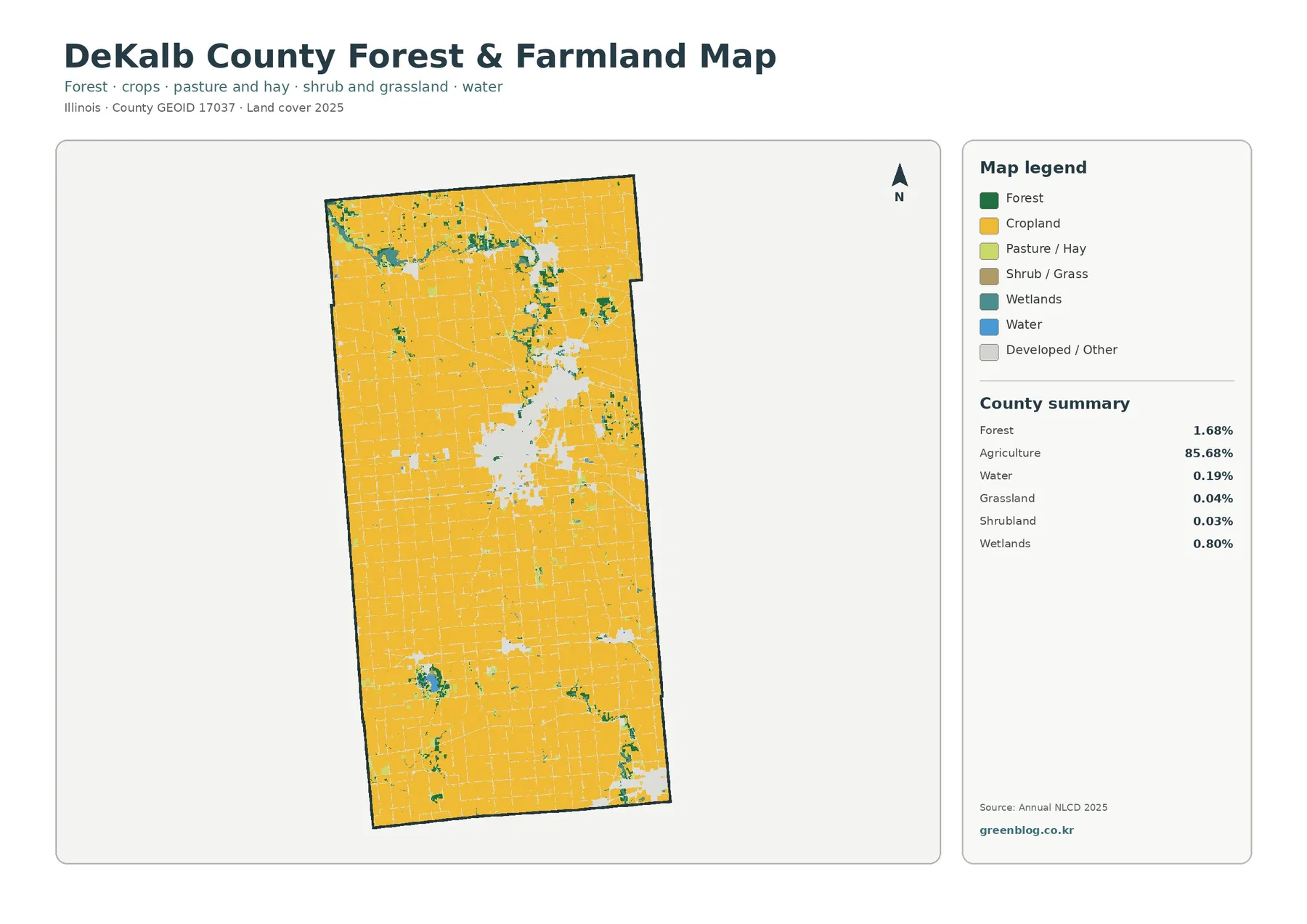
The forest-and-farmland map changes the emphasis. Developed and other surfaces are made visually quieter so that cropland, forest, wetlands, water, pasture or hay, and small shrub or grass classes are easier to compare. Agriculture remains 85.68%, while forest is only 1.68% and wetlands 0.80%. Grassland is 0.04% and shrubland 0.03%, so those two classes are minor parts of the county-wide pattern.
Green and teal areas are not spread evenly across the county. Several irregular bands and branching patches are visible in the northern half, with additional small natural-cover pockets in the southwest and southeast. Their shapes contrast with the straight agricultural grid. The map itself does not label individual streams, so a narrow green strip should not automatically be assigned a river name, but the pattern is useful for locating places where natural cover follows low or wet ground through the farm landscape.
Local Forest Preserve District information helps add context without turning the map into a stream map. The district states that the South Branch Kishwaukee River flows northwest through several preserves, and the Sycamore Forest Preserve page identifies the East Branch Kishwaukee River along that preserve. Those official descriptions confirm that river corridors are an important part of the county landscape, while the land-cover image shows how some wooded and wet surfaces occur as narrow connected shapes rather than broad forest blocks.
This version is also useful because it keeps the central developed belt visible as a light area while emphasizing the agricultural and natural classes around it. A reader can follow the edge of the DeKalb–Sycamore area, then compare that edge with the narrow wooded and wetland features farther into the countryside. The result is a clearer view of where natural cover remains within an otherwise strongly agricultural county.
The 1985–2025 comparison concentrates change around established communities
The change map compares mapped classes in 1985 and 2025. Its summary reports class differences across 6.18% of the county. Areas classified as a change to developed cover account for 3.12%, agricultural loss for 0.37%, forest loss for 0.02%, and other class differences for 2.65%. Most of the county therefore remains in the no-class-difference background, but the colored changes are not distributed evenly.
Red change-to-developed patches are most obvious around the DeKalb–Sycamore corridor, where they form much larger groups than elsewhere in the county. Smaller red patches also appear around other settlement areas and along scattered roads. When this map is compared with the 2025 impervious layer, the largest change clusters generally occur in the same central part of the county that now contains the strongest concentration of built surfaces.
The 6.18% figure should not be treated as a precise measure of real-world land-use conversion. The map itself warns that differences may include classification variation, and the 2.65% other-difference category is large enough to matter. Changes in class boundaries, mixed pixels, and differences between the two mapped years can produce small colored fragments even where the practical landscape change is modest. Large continuous clusters deserve more attention than isolated pixels.
The very small 0.02% forest-loss summary also needs careful wording. It does not prove that almost no trees were removed during forty years. It only describes the area captured by this particular comparison as forest loss under its classification rules. A parcel-level history would require aerial imagery, local records, or other time-specific evidence rather than a single county-wide change layer.

Choosing the right map depends on the question
Start with the general land-cover map when the goal is a quick county overview. It places the 85.68% agricultural share, 11.45% developed share, and smaller forest, wetland, and water classes in one visual frame. For a presentation or classroom explanation, it is the easiest image for establishing the basic contrast between the central developed belt and the surrounding farm landscape.
Use the forest-and-farmland map when narrow natural features matter more than developed intensity. By muting developed and other surfaces, it makes the irregular green and teal patches easier to follow through the agricultural grid. It is a better choice for discussing how little of the county is forested overall while still showing that natural cover is not randomly scattered.
Choose the impervious map when the subject is pavement and built surface. It separates high-intensity areas from lightly developed surroundings and shows the rural road grid clearly. The change map answers a different question: it does not describe the 2025 surface directly but identifies locations where the 1985 and 2025 classifications differ. Viewing all four together prevents a single class or year from dominating the interpretation.
County planning policy and satellite land cover should not be confused
DeKalb County planning documents provide an interesting but separate layer of context. A county staff review states that since the 1972 Comprehensive Plan, two long-standing land-use policies have been to preserve prime agricultural land for agriculture and to encourage nonagricultural development near municipalities instead of scattering it through rural unincorporated areas. Those policies help explain what local planners have tried to manage, but they are not the source of the NLCD percentages on these maps.
A comprehensive plan describes policy and future land-use direction. Annual NLCD classifies the physical surface at a given time. The two can overlap without being identical. A planned agricultural area can still contain roads, homes, wooded patches, or other cover, and a municipal area can include parks, water, or open ground. Keeping that distinction clear prevents the 85.68% agricultural-cover figure from being mistaken for a zoning statistic.
For decisions about a specific property, development rights, zoning, assessments, or future land use, the county provides separate property and planning maps. The four maps on this page are better suited to county-scale environmental comparison: they show where agriculture dominates, where built surfaces cluster, where natural cover interrupts the farm grid, and where classifications differ across the long 1985–2025 interval.
Practical use, printing, and interpretation limits
The JPG set works well for printed reference sheets, presentations, classroom activities, and comparisons with other Illinois counties. One useful sequence is to begin with the general land-cover map, move to the impervious layer to isolate the DeKalb–Sycamore built core, and then use the change map to show where long-term classification differences are concentrated. The forest-and-farmland version can then add the smaller natural corridors that are easy to miss in the general map.
For county-to-county comparisons, use the statistics printed on the maps rather than relying only on visual color area. DeKalb County is characterized by a very high agricultural share, a clearly concentrated central development belt, a mean impervious value of 3.88%, and a 6.18% class-difference total in the 1985–2025 comparison. Those measures give a consistent starting point for comparing another county produced from the same map series.
These are raster land-cover maps, so they are not intended to trace legal parcel boundaries or classify every small feature perfectly. A narrow stream, roadside tree line, small building, or mixed patch of grass and pavement can be simplified by the grid and the classification method. When printing or enlarging a map, keep the legend visible and interpret groups of adjacent cells rather than treating one isolated colored cell as exact ground truth.
The 2025 layer also has a time limit: development or restoration that occurred after the mapped year will not appear. The 1985–2025 map compresses a long period into a two-date comparison and cannot show every intermediate change. For current project review or site-specific research, newer aerial imagery and local government GIS records should be used alongside the county-wide land-cover maps.
Frequently Asked Questions
Does the 85.68% agricultural cover figure mean that 85.68% of DeKalb County is legally zoned or owned as farmland?
No. The 85.68% figure is the share classified as agricultural land cover in the 2025 Annual NLCD map. It does not define ownership, parcel boundaries, zoning, or development rights. County planning and property GIS resources should be used for those legal or parcel-specific questions.
Which map is best for comparing development in DeKalb and Sycamore?
The general land-cover map is best for seeing the full developed footprint, while the impervious-surface map is better for comparing how strongly paved or built different parts of the DeKalb–Sycamore area are. The central corridor is the county’s largest developed concentration in both views.
Does the 6.18% change total from 1985 to 2025 represent only confirmed real-world land-use change?
No. It is the share where the two mapped classifications differ. The summary includes 3.12% change to developed, 0.37% agricultural loss, 0.02% forest loss, and 2.65% other class differences, and the map warns that classification variation can contribute to the result. Small changes should be checked with additional imagery or records.
Sources and reference material
- MRLC Annual NLCD Data – official access point for Annual NLCD land-cover datasets.
- USGS Annual NLCD Land Cover Classification – definitions for developed, agricultural, forest, wetland, and other classes.
- DeKalb County Government – County History – local context on the county seat, county size, and agricultural history.
- DeKalb County Government – Land Use Plans – access to comprehensive, future land-use, and transportation planning resources.
- DeKalb County Forest Preserve District – official information on forest preserves and Kishwaukee River corridors.
- U.S. Census Bureau TIGER/Line Shapefiles – official county boundary source.
Map File Information
The four JPG maps package DeKalb County's 2025 land cover and long-term classification change into one ZIP file for convenient reference.
- Included Versions: land cover, forest & farmland, impervious/developed land, and 1985–2025 land-cover change
- File Type: ZIP containing four JPG files
- Intended Use: printing, classroom reference, presentations, and county land-cover comparison
Related Maps
- Adams County Illinois Land Cover Map
- Alexander County Illinois Land Cover Map
- Bond County Illinois Land Cover Map
Green Map creates custom-edited map images using open geographic data sources such as geoBoundaries, Natural Earth, OpenStreetMap, and government open data. These maps are edited visual materials, not raw data files, and are provided for education, documents, presentations, and graphic reference.