Developed land covers most of DeKalb County in the supplied 2025 classification, yet the map is not uniformly urban from edge to edge. The DeKalb County Georgia Land Cover Map shows an 80.56% developed share, with larger forest remnants and small wetland and water features becoming easier to notice toward the eastern and southeastern parts of the county.
This page pairs four views of the same county boundary: 2025 land cover, forest and farmland, impervious surface, and a 1985–2025 class comparison. The WebP images are included for on-page reading, while the four original 2480 × 1754-pixel JPG maps are available together in one download for lessons, reports, presentations, and county-to-county comparison.
Table of Contents
Why 80.56% developed cover does not mean 80.56% pavement
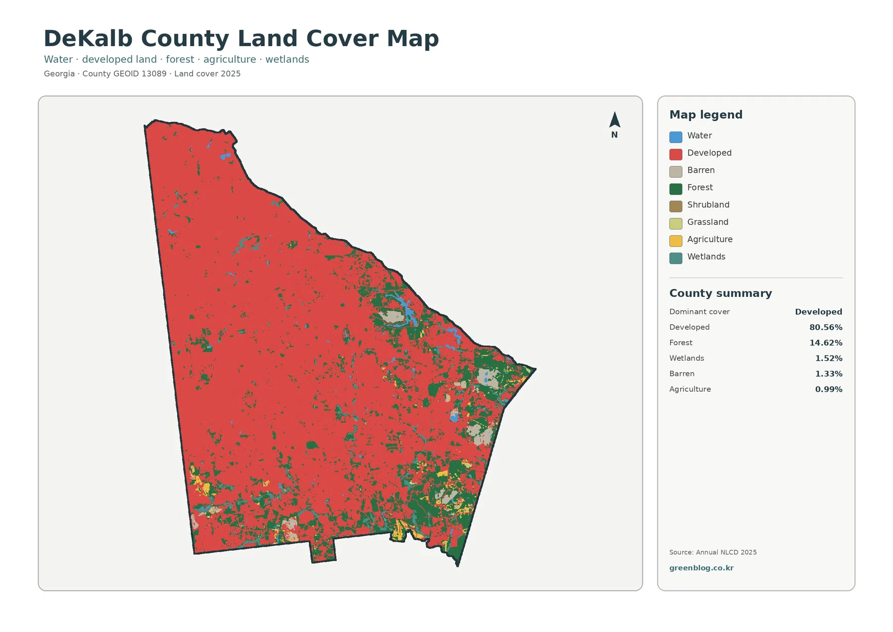
The 2025 summary is dominated by developed land at 80.56%. Forest is the clear second class at 14.62%. Wetlands account for 1.52%, barren land for 1.33%, and agriculture for 0.99%. The companion forest-and-farmland map also reports 0.77% water, 0.19% grassland, and 0.02% shrubland, completing a picture in which nondeveloped classes occupy relatively small shares of the county.
The countywide image is almost continuously red across the west, north, and much of the center. Developed cells also extend through the south. Larger green patches become more apparent farther east and southeast, where forest, small water bodies, and wetland cells interrupt the urban background. This makes DeKalb different from a rural county with one compact town surrounded by open land: development forms the background, while natural cover appears as islands, corridors, and larger edge patches.
That distinction matters when the map is used in a report. Land cover describes the surface that a satellite-based classification assigns to each cell. It does not show zoning, ownership, subdivision boundaries, building permits, or whether a parcel can be developed. A red developed cell can still contain lawns, trees, gardens, and other surfaces that allow water to soak into the ground.
The eastern green areas also have a real local context. DeKalb County describes Davidson-Arabia Mountain Nature Preserve in the southeastern part of the county as a preserve of more than 2,500 acres with mixed hardwood forest, granite outcrops, creeks, lakes, and historic features. That official description is useful background when interpreting the larger forest and open-surface patches in the east and southeast, although the land-cover image itself does not draw the legal preserve boundary.
Forest is a minority class, but its location still shapes the map
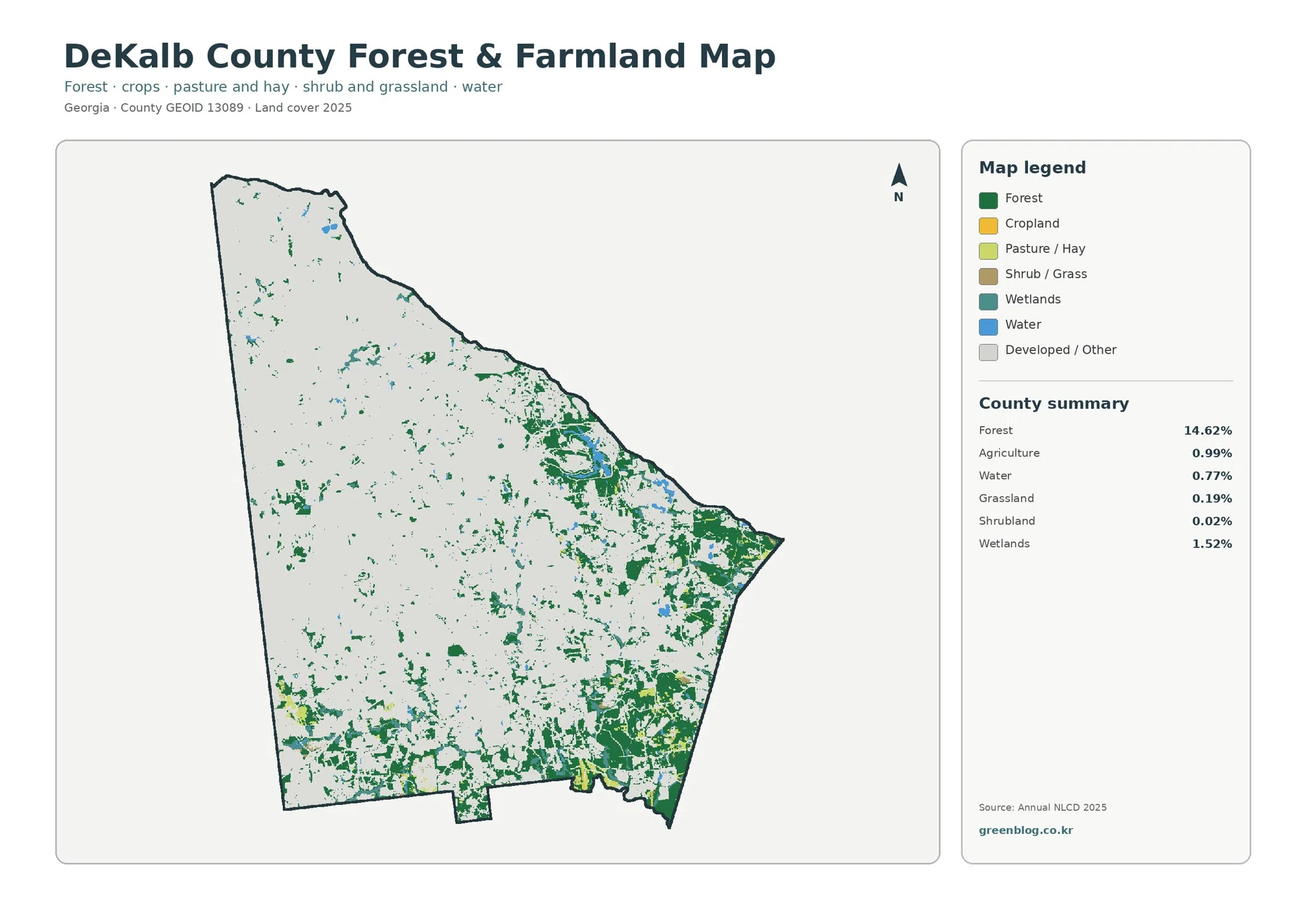
Removing the strong red developed color changes what is easiest to see. Forest at 14.62% becomes the main subject, and its uneven distribution is obvious. The largest dark-green blocks are concentrated in the eastern and southeastern portions of the county. Smaller forest pieces occur through the center and west, but they are more fragmented and are surrounded by a much larger developed matrix.
Agriculture is only 0.99%, so the map does not show broad, continuous farm belts. Yellow agricultural patches are small and are most noticeable near the southern and southeastern edges. Grassland at 0.19% and shrubland at 0.02% are even more limited. In practical terms, this means that a discussion of DeKalb’s nonurban surface should focus much more on forest and scattered wet areas than on farming.
Water covers 0.77% and wetlands 1.52%. Blue and teal cells are most visible in the eastern half and near some of the larger forest patches. They do not form one huge lake or marsh system across the county; instead, the map shows small water bodies and wetland pieces embedded within a heavily developed landscape. Those features can be easy to miss in the general land-cover image because the developed class is visually dominant.
For environmental education, the two maps work best as a pair. The countywide image establishes how urban DeKalb is, while the forest-and-farmland view pulls the remaining natural classes forward. A student can compare the same boundary twice and see why a class that represents only a few percent of the county can still matter spatially when it occurs in connected or locally concentrated areas.
Hard surfaces are dense in many places, but not equally dense everywhere
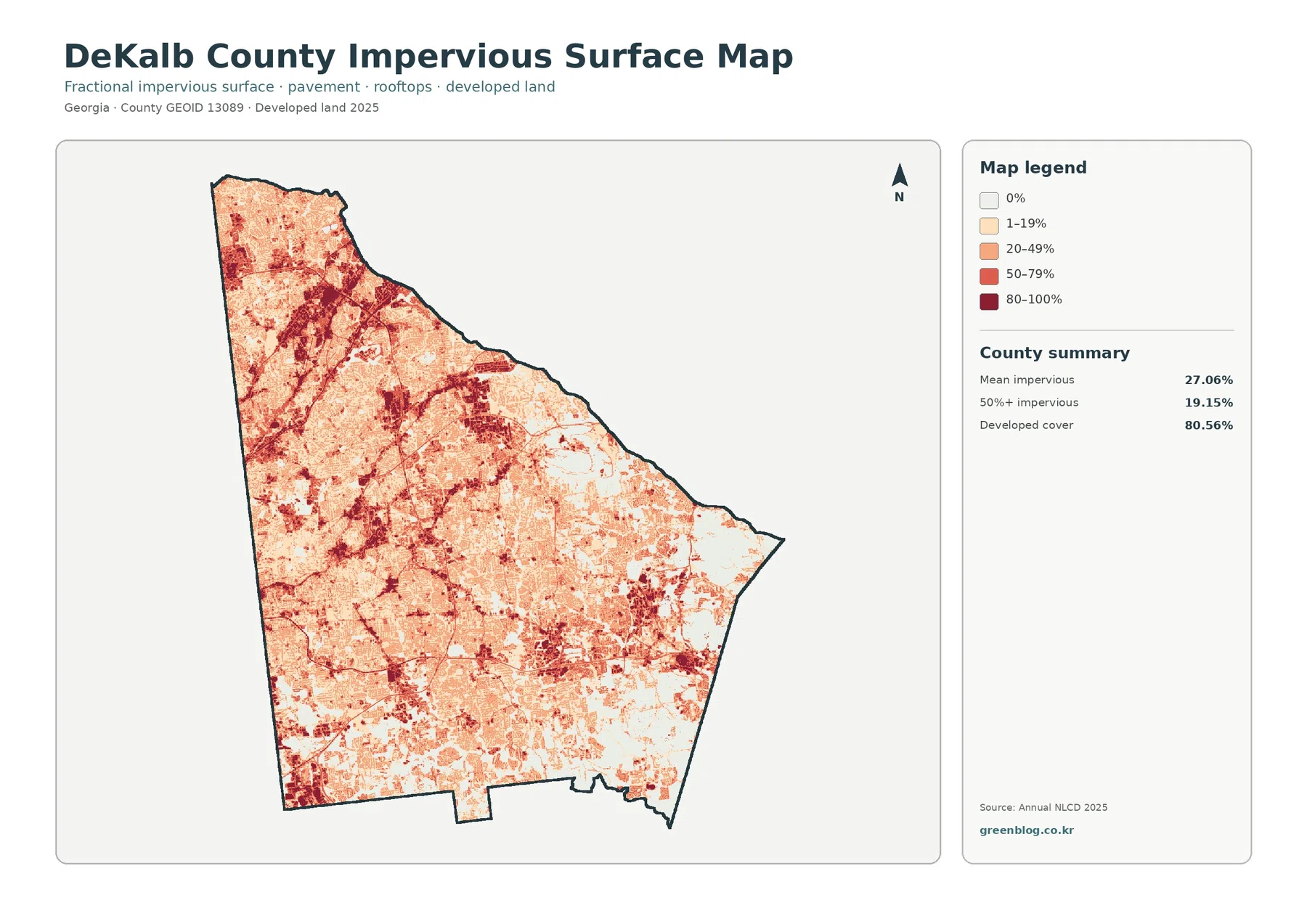
Mean impervious cover is 27.06%, and 19.15% of the county falls in cells with at least 50% impervious surface. Those numbers are much lower than the 80.56% developed-land share because the measurements answer different questions. Developed land is a land-cover class. Impervious percentage estimates how much of a cell is physically covered by hard material such as pavement or rooftops.
The darkest red impervious areas are widespread in the west and northwest and appear along connected urban corridors through the county. Strong concentrations also occur through central and southern developed areas. The eastern side has more light-colored cells and blank or low-impervious areas, especially where forest and other natural surfaces were visible in the first two maps.
This map is useful when a simple “urban versus forest” comparison is not enough. Two neighborhoods can both be classified as developed, but one may contain more tree canopy and lawns while the other contains large buildings, parking lots, and closely spaced streets. The impervious map captures that difference better than the general land-cover map, even though it still remains a generalized raster product rather than a property survey.
The same caution applies at small scales. A dark cell should not be read as the exact outline of a parking lot, and a light cell should not be used to calculate a parcel’s stormwater requirement. For site-level work, current aerial imagery, parcel data, engineered surveys, and the county’s official GIS resources are the appropriate next step.
The 1985–2025 comparison highlights where classification changed
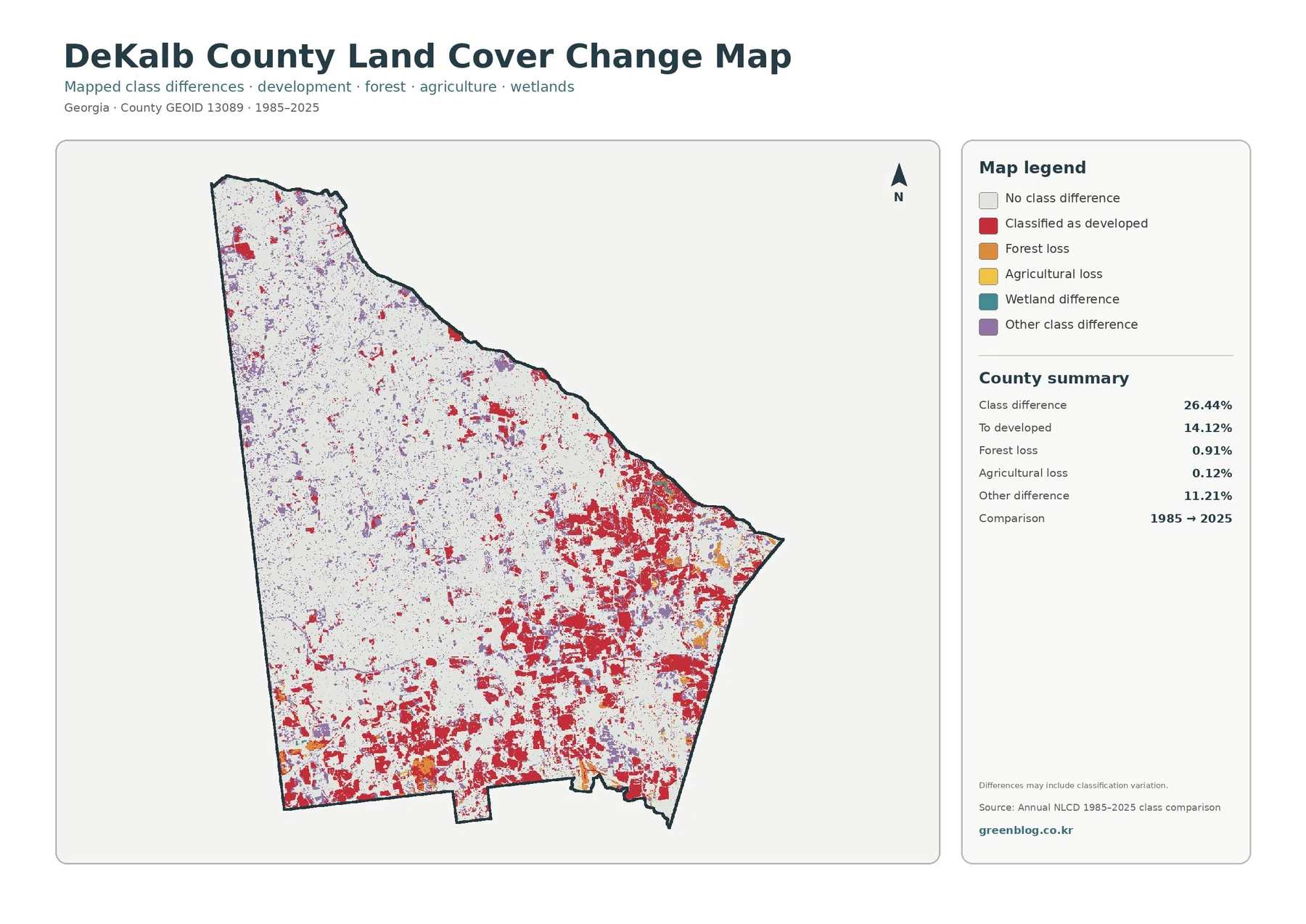
Across the county, 26.44% of cells fall into a different class at the two endpoints. The largest named change is “to developed” at 14.12%. Forest loss accounts for 0.91% and agricultural loss for 0.12%, while other class differences total 11.21%. Wetland difference is shown in the legend, but the summary panel does not provide a separate percentage, so it is safer to discuss its visible location rather than invent a number.
Red “to developed” cells form especially noticeable clusters in the east, southeast, and southern portions of the county. The west and northwest are highly urban in the 2025 maps, yet some of those places show fewer red change cells. One reasonable explanation is that many western cells were already classified as developed at the 1985 endpoint, so they would remain gray if their broad class did not change. The map supports that interpretation, but it does not provide the exact year or cause of any individual development.
The 26.44% class-difference value should not be treated as a damage total or as a count of construction projects. Endpoint comparisons can include real land-cover change as well as classification variation, boundary shifts between categories, or differences in how mixed surfaces are represented. The map itself warns that differences may include classification variation.
For research, the change map is best used as a screening layer. Start with the larger red clusters, note where other differences are common, and then use intermediate-year imagery or local records if the timing matters. A gray cell only means that the endpoint class is the same in 1985 and 2025; it does not prove that nothing happened there during the intervening forty years.
DeKalb’s remaining green areas are easier to understand with local context
The county’s official parks information provides a useful example of what some of the larger eastern green areas can represent on the ground. Davidson-Arabia Mountain Nature Preserve contains mixed hardwood forest, granite outcrops, creeks, and lakes. The presence of a major natural preserve in southeastern DeKalb fits the broad map pattern of larger forest and open-surface patches toward that side of the county.
At the same time, the land-cover map cannot identify every green patch as public parkland. Forest classification says what the surface looks like, not who owns it or whether it has legal protection. Some forest may be in parks, some on institutional land, some along streams, and some on private property. The correct way to connect a specific patch to a named property is to use DeKalb County GIS or another official boundary source.
The county’s long-range planning pages also illustrate why land cover and land use should not be confused. Planning documents address future land use, housing, mobility, public investment, and development policy. The NLCD-based maps on this page instead summarize observed surface cover. Both are useful, but they answer different questions and should not be substituted for one another.
How to read the maps without overinterpreting them
Annual NLCD is built from raster cells that represent generalized surface conditions. A 30-meter cell can contain a house, street, lawn, trees, and a drainage feature at the same time, yet it must still be summarized through the available classification or fractional-impervious values. Zooming the JPG does not create parcel-level detail that was not present in the source data.
The 2025 maps also represent a particular observation year. Construction, demolition, vegetation recovery, tree loss, temporary bare ground, or changes in water conditions after that observation may not appear. When the purpose is current permitting, property research, or infrastructure design, the maps should be treated as background context rather than the final authority.
Color is another source of confusion. Red on the land-cover map means developed class, while the red scale on the impervious map represents increasing hard-surface percentage. Red on the change map has a third meaning: cells classified as developed at the 2025 endpoint after a different class in 1985. Reading the legend for each image is essential because the same general color family does not represent the same measurement.
Choosing the right image for a report, lesson, or comparison
Use the general 2025 land-cover map when the main question is what covers DeKalb County today. It immediately shows the county’s developed majority and the contrast with the larger eastern and southeastern forest patches. It is the strongest opening graphic for a county profile or a simple urban-versus-natural comparison.
Use the forest-and-farmland map when small natural classes would otherwise disappear behind the developed background. It is especially helpful for explaining forest fragmentation, the limited agricultural share, and the location of water and wetlands. For comparisons with a more rural Georgia county, this view makes the difference in agricultural and forest dominance easier to discuss.
Choose the impervious map when the subject is hard-surface intensity rather than land-cover class. It can support a general discussion of where rooftops and pavement are more concentrated, while still avoiding parcel-level claims. Choose the 1985–2025 comparison when the question concerns long-term endpoint differences and where cells became classified as developed.
The original JPG maps are 2480 × 1754 pixels each. They work well for digital documents, classroom material, and many ordinary print layouts, but the package does not mark them as meeting an A3 high-resolution reference. If you plan a large poster, test the output first and make sure the legend text remains comfortable to read.
Four original JPG maps in one download
The downloadable ZIP contains the 2025 land-cover map, forest-and-farmland map, impervious-surface/developed-land map, and the 1985–2025 land-cover-change map. Because all four use the same county boundary, they can be placed side by side to compare present cover, remaining natural areas, hard-surface intensity, and endpoint change without searching for separate files.
Frequently Asked Questions
Why is developed cover 80.56% when mean impervious cover is only 27.06%?
Developed land is a broad land-cover class that can include yards, trees, bare soil, and other permeable surfaces around buildings and roads. Impervious cover isolates the share occupied by hard surfaces such as rooftops and pavement. A neighborhood can therefore be developed without being close to 100% impervious.
Does the 14.12% “to developed” value show exactly how much construction occurred after 1985?
No. It shows the share of cells that received a developed class at the 2025 endpoint after another class in 1985. It does not identify the construction year, project type, or cause, and the endpoint comparison can also include classification variation. Intermediate imagery and local records are needed for precise change history.
Are the larger eastern forest patches all parks or protected land?
No. Forest color describes surface cover, not ownership or legal protection. DeKalb County does have major public greenspaces such as Davidson-Arabia Mountain Nature Preserve, but the map does not draw park boundaries. Use the county GIS and official park information to identify a specific property or preserve.
Sources and Reference Data
- MRLC Annual NLCD Data – official access point for annual land-cover and comparison products
- USGS Annual NLCD Land Cover Classification – class definitions and guidance for developed land, forest, agriculture, wetlands, and related surfaces
- U.S. Census Bureau TIGER/Line Shapefiles – official county-boundary reference for DeKalb County
- DeKalb County GIS – official county mapping, parcel-viewer, addressing, and spatial-data resources
- DeKalb County Parks & Facilities – official information on county parks and Davidson-Arabia Mountain Nature Preserve
- DeKalb County Long Range Planning – adopted plans and long-term land-use and community-planning resources
Map File Information
The ZIP contains four original JPG maps for comparing DeKalb County’s 2025 developed cover, forest and small natural patches, impervious intensity, and 1985–2025 class differences.
- Included Files: Four JPG maps shown on this page
- File Type: JPG files bundled in a ZIP archive
- Intended Use: Printing, education, presentations, and map-based projects
Related Maps
- Appling County Georgia Land Cover Map
- Atkinson County Georgia Land Cover Map
- Bacon County Georgia Land Cover Map
Green Map creates custom-edited map images using open geographic data sources such as geoBoundaries, Natural Earth, OpenStreetMap, and government open data. These maps are edited visual materials, not raw data files, and are provided for education, documents, presentations, and graphic reference.