A cross-country comparison of the World Bank indicator MS.MIL.TOTL.TF.ZS shows a strongly skewed distribution in 2020. There are 168 economies with reported values and 49 source-missing economies. The median is 0.83% of the labor force, while the mean is higher at 1.26%. Eritrea stands far above the rest at 13.29%; the Democratic People’s Republic of Korea is next at 8.62%, followed by the Syrian Arab Republic at 5.44% and Djibouti at 5.40%.
The denominator matters as much as the numerator. The indicator does not measure military personnel as a share of the whole population. It compares armed forces personnel with the labor force, meaning the economically active population under the ILO definition. Armed forces personnel refer to active-duty military personnel and may include paramilitary forces when their organization, training, equipment and control indicate that they can support or replace regular forces. It is therefore a relative labor-force measure, not a score of military power or defense capability.
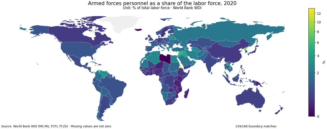
Table of Contents
Most reported economies are below 2%, and the upper tail is unusually long
The middle half of the reported observations runs from 0.41% at the first quartile to 1.44% at the third quartile. The 90th percentile is 2.83% and the 95th percentile is 4.05%. This gap between the median and the upper percentiles explains why the average sits noticeably above the median. A small number of high observations raises the mean without changing the fact that the typical reported value is under 1%.
A band count makes the shape clearer: 21 economies are below 0.25%, 32 are from 0.25% to under 0.5%, 47 are from 0.5% to under 1%, and 41 are from 1% to under 2%. Together, 141 of the 168 reported economies are below 2%. Only 27 reach 2% or more, 16 reach 3% or more, four reach 5% or more, and just one exceeds 10%.
The highest values are exceptional rather than representative
Eritrea’s 13.29% observation is an outlier even within the high-value group. The next entries are the Democratic People’s Republic of Korea at 8.62%, the Syrian Arab Republic at 5.44%, Djibouti at 5.40%, Montenegro at 4.66%, Iraq at 4.40%, Israel at 4.23%, Lebanon at 4.10%, Lao PDR at 4.08%, and Jordan at 3.98%. The sharp fall from the maximum to the rest is one reason a single global average is not a good description of the whole distribution.
| Country or economy | 2020 share |
|---|---|
| Eritrea | 13.29% |
| Korea, Dem. People’s Rep. | 8.62% |
| Syrian Arab Republic | 5.44% |
| Djibouti | 5.40% |
| Montenegro | 4.66% |
| Iraq | 4.40% |
| Israel | 4.23% |
| Lebanon | 4.10% |
| Lao PDR | 4.08% |
| Jordan | 3.98% |
A high percentage should be read narrowly. It indicates that active armed forces personnel are large relative to the labor force measured for that economy. It does not tell us how large the economy is, how much a government spends on defense, how many reservists exist, what equipment is available, or how effective the armed forces are. Two economies can have the same percentage while having very different absolute numbers of military personnel and workers.
Three reported zeros must not be mixed with 49 missing observations
Libya, Iceland, and the West Bank and Gaza have reported values of 0.00% in the cleaned 2020 dataset. Those records are different from missing data. Haiti is the next-lowest observation at 0.02%, followed by Mozambique at 0.08%, Liberia at 0.09%, Tanzania at 0.10%, Niger at 0.11%, Kenya at 0.11%, and Burkina Faso at 0.12%. Missing economies have no value in the source for this comparison year and are excluded from the descriptive statistics.
| Country or economy | 2020 share |
|---|---|
| Libya | 0.00% |
| Iceland | 0.00% |
| West Bank and Gaza | 0.00% |
| Haiti | 0.02% |
| Mozambique | 0.08% |
| Liberia | 0.09% |
| Tanzania | 0.10% |
| Niger | 0.11% |
| Kenya | 0.11% |
| Burkina Faso | 0.12% |
Treating missing values as zero would create a false cluster at the bottom of the ranking and would depress the mean. For that reason, the 49 source-missing records remain NA throughout the calculation and visualization. The three genuine zero observations remain numeric values and are retained. This distinction is especially important on maps, where a missing territory can otherwise look like a measured low value.
The same troop count can produce very different percentages because labor-force size changes the denominator
Consider two economies that each have 100,000 active armed forces personnel. If one has a labor force of 10 million, the ratio is 1%; if the other has a labor force of 2 million, the same personnel count corresponds to 5%. The percentage therefore answers a structural question about the scale of the armed forces relative to the economically active population. A separate total-personnel indicator is needed when the question is about the absolute size of the armed forces.
Labor force is also not synonymous with population. It includes employed people and unemployed people who meet the labor-force criteria, while people outside the labor market are not part of the denominator. Differences in population age structure, participation in the labor market, and the size of the working-age population can therefore affect the ratio even when armed-forces staffing is unchanged.
The 2020 reference year makes this a historical cross-section, not a statement about current force structure
All figures in this comparison refer to 2020. Using one common year improves comparability because every reported economy is observed at the same reference point, but it also sets a clear limit: the map does not describe force structure in 2026. Personnel levels and labor-force totals can change, so current analysis would require a newer year with adequate coverage or a time-series comparison.
The indicator can be combined with other datasets, but causal conclusions should not be imported into it. Defense spending, recruitment systems, security conditions, population structure, and labor-market participation may be relevant context, yet this single percentage cannot identify why a particular economy is high or low. Those questions require separate evidence measured on compatible dates.
The map is a spatial guide; the tables are better for exact comparisons
The local country-boundary layer matches 159 of 168 reported ISO3 economies, a 94.6% direct join rate. Nine reported economies lack a polygon match in that simplified boundary source. They are not deleted from the underlying analysis. Their observations still affect percentiles, the mean, the median, and ranking tables. The map should therefore be used to identify broad spatial patterns, while exact values should be read from the underlying data or tables.
Color intensity on the map represents only this labor-force ratio. It is not a risk index, readiness index, geopolitical ranking, or measure of state capacity. The safest interpretation is descriptive: where the ratio was high or low in 2020, how unusual the extremes were, and how the reported economies were distributed around the median.
A practical reading checklist
First, confirm the unit: the value is a percentage of total labor force. Second, separate relative share from absolute military headcount. Third, keep source-missing records separate from genuine zeros. Fourth, keep the year attached to every comparison. Finally, avoid treating the ratio as a stand-alone explanation for military, economic, or political outcomes. Following those steps preserves what the indicator actually measures and prevents common denominator errors.
The distribution itself is the strongest takeaway. Values around or below 1% are common, values above 3% are relatively rare, and the highest few observations sit far away from the center of the dataset. That pattern is more informative than a simple leaderboard because it shows how exceptional the upper tail is within the broader set of reporting economies.
Frequently Asked Questions
Is this the share of military personnel in the total population?
No. The denominator is the labor force, meaning the economically active population under the ILO definition, not the total population.
Should the 49 economies without a 2020 value be treated as zero?
No. They are source-missing observations. Three separate economies have genuine reported values of 0.00%, and those are retained as numeric observations.
Does a higher percentage mean stronger armed forces?
No. The indicator measures active armed forces personnel relative to labor-force size. It does not measure spending, equipment, reserves, readiness, effectiveness, or overall military capability.
Related Articles
Green Map creates custom-edited map images using open geographic data sources such as geoBoundaries, Natural Earth, OpenStreetMap, and government open data. These maps are edited visual materials, not raw data files, and are provided for education, documents, presentations, and graphic reference.