World Bank data for 2020 show a wide spread in international tourism expenditures when those expenditures are measured relative to total imports. This indicator is not a ranking of the largest tourism markets or the largest amounts spent abroad. It asks a narrower question: how large were international tourism expenditures compared with the value of all imports in each reporting country or economy? Among 137 reported values, the median was 3.05% and the mean was 4.05%. Qatar recorded 19.48%, Aruba 18.85%, Guinea 17.03%, and Kuwait 15.21%, while Tajikistan was at 0.35%, Ireland at 0.45%, and Samoa at 0.48%. The contrast is useful for understanding how tourism-related spending fits into each economy’s broader import structure.
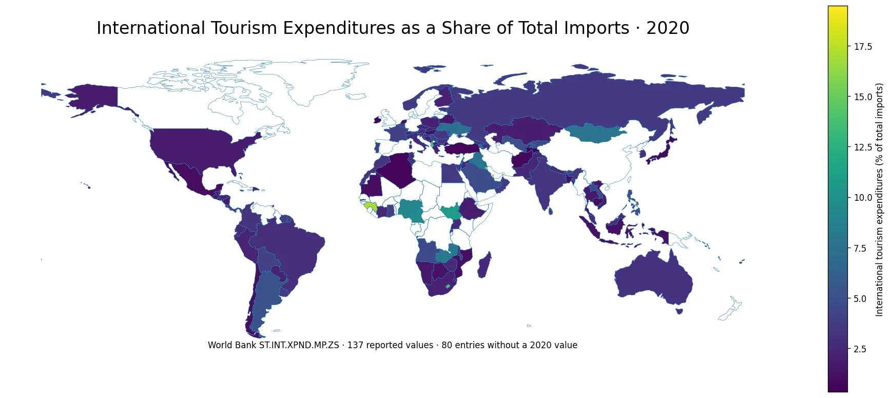
Table of Contents
What the indicator measures
World Bank indicator ST.INT.XPND.MP.ZS reports international tourism expenditures as a percentage of total imports. The numerator is international tourism expenditure by residents, while the denominator is the economy’s total imports. A value of 10% therefore does not mean that tourism accounts for 10% of GDP, that 10% of residents traveled abroad, or that the country has a 10% share of global tourism. It is a ratio between one type of international expenditure and a much broader import total.
This denominator matters. Two economies can have similar tourism spending in money terms and still post very different percentages if one has a much larger import bill. Conversely, an economy with moderate tourism expenditure can record a high ratio when total imports are relatively small. For that reason, the indicator is best used as a structural comparison of spending relative to imports rather than as a direct measure of tourism market size.
The middle of the 2020 distribution was close to 3%
Across the 137 reported observations, the mean was 4.05% and the median was 3.05%. The first quartile was 2.00% and the third quartile was 4.56%, so the middle half of reported values fell roughly between 2.00% and 4.56%. The mean being higher than the median reflects a long upper tail created by a relatively small group of economies with ratios above 10%.
There were 11 reported values at or above 10% and 11 below 1%. Most observations therefore sat between these two extremes. Because this is a single-year cross-section, it should not be treated as a permanent ranking. The year 2020 was highly unusual for international travel, which makes the common comparison year useful for a snapshot but less suitable as a stand-alone description of normal long-term tourism behavior.
Qatar and Aruba exceeded 18%
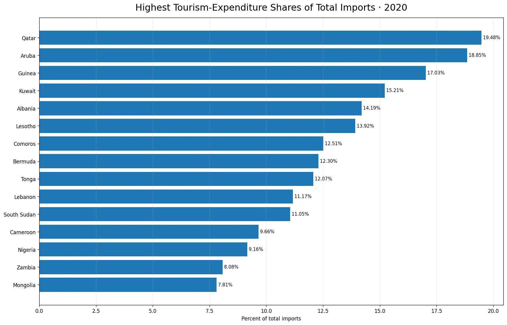
Qatar had the highest reported value at 19.48%, followed closely by Aruba at 18.85%. Guinea was third at 17.03%, Kuwait fourth at 15.21%, and Albania fifth at 14.19%. Lesotho, Comoros, Bermuda, Tonga, and Lebanon also appeared in the top ten. The group spans the Middle East, the Caribbean, Africa, Europe, and the Pacific, which is a warning against assigning one simple geographic explanation to the top of the distribution.
A high percentage can come from a larger tourism-spending numerator, a smaller total-import denominator, or a combination of both. The ratio itself cannot tell us which mechanism dominated in a particular economy. To answer that question, analysts would need the underlying expenditure amount, total imports, and ideally several years of observations. The map and ranking therefore describe the outcome, not a complete causal explanation.
Top 10 reported values
| Country or economy | Tourism expenditures / total imports |
|---|---|
| Qatar | 19.48% |
| Aruba | 18.85% |
| Guinea | 17.03% |
| Kuwait | 15.21% |
| Albania | 14.19% |
| Lesotho | 13.92% |
| Comoros | 12.51% |
| Bermuda | 12.30% |
| Tonga | 12.07% |
| Lebanon | 11.17% |
The top ten ranged from about 11.17% to 19.48%. Qatar and Aruba stood well above the median, but even within the top group the gap between first and tenth place was more than eight percentage points. The geographic mix is also broad: Qatar, Kuwait, and Lebanon represent the Middle East; Aruba and Bermuda are in the Caribbean and Atlantic; Guinea, Lesotho, and Comoros are in Africa; Albania is in Europe; and Tonga is in the Pacific. The distribution is therefore not a simple story of one region dominating the indicator.
Low ratios do not necessarily mean low tourism spending
At the lower end, Tajikistan reported 0.35%, Ireland 0.45%, Samoa 0.48%, Trinidad and Tobago 0.62%, and Algeria 0.64%. Afghanistan, Turkiye, The Gambia, Japan, and Cambodia were also below 1%. These values are low relative to total imports, but they should not automatically be read as evidence that residents spent very little abroad in absolute terms.
The denominator can be decisive. If two economies each record the same amount of international tourism expenditure but one imports ten times as much overall, their ratios will differ by a factor of ten. This is why the measure cannot replace data on tourism expenditures in current dollars, expenditure per traveler, outbound departures, or household income. It answers a relative import-structure question, not an absolute-spending question.
The world map shows a dispersed pattern rather than a single regional cluster
High values appear across several regions rather than forming one continuous geographic block. The same is true of low values. That dispersed pattern suggests that location alone cannot explain the ratio. Trade intensity, the size of the import base, resident travel spending, exchange-rate conditions, and the 2020 travel environment can all affect the numerator or denominator. The data do not isolate the contribution of each factor, so those influences should be treated as possible context rather than proven causes.
The map also preserves missing observations. Of 217 countries and economies in the comparison frame, 80 did not have a 2020 value. Those places are not colored as zero. Converting missing observations to zero would falsely imply that international tourism expenditures were exactly 0% of imports and could create artificial geographic patterns, especially in regions with several missing entries.
Why the year 2020 deserves special care
The comparison uses one common year instead of mixing the latest available observation from different years. That improves cross-country comparability because every reported value refers to 2020. At the same time, 2020 was an exceptional year for international mobility, so the values should not automatically be treated as normal baseline conditions. A country’s position in 2020 may differ substantially from its position before or after that year.
For trend analysis, the natural next step is to compare the same indicator in 2019, 2021, and later years where coverage is available. That would help distinguish a persistent import-structure characteristic from a temporary change in travel activity. The current view deliberately keeps the time frame fixed so that the geographic comparison itself remains internally consistent.
Median, quartiles, and range describe the distribution better than the mean alone
The mean of 4.05% is useful but does not represent the typical observation as well as the 3.05% median because several high values pull the average upward. The minimum was 0.35% and the maximum was 19.48%, while the middle half of observations occupied a much narrower range from roughly 2.00% to 4.56%. This combination tells us that most reported economies were clustered at relatively low single-digit percentages even though a small upper group reached double digits.
The arithmetic mean across countries should also not be confused with a world aggregate ratio. A true global ratio would require summing tourism expenditures across economies and dividing by summed imports, which would weight large economies much more heavily. The 4.05% figure used here is simply the unweighted average of country-level percentages and is included only to describe the cross-country distribution.
Reported economies are not the same as a count of sovereign states
World Bank country lists can include territories and separately reported economies. Aruba and Bermuda are examples of places that can appear as distinct reporting units. Therefore, the statement that 137 values are available should be read as 137 countries and economies with observations, not 137 sovereign states. This distinction matters when describing coverage and when comparing counts with other international datasets.
The full frame contains 217 geographic entries, of which 80 are missing for 2020. That missing share is substantial enough to affect the visual impression of regional coverage. Analysts should check whether apparent gaps on the map reflect genuinely low ratios or simply the absence of a reported observation. Here, missing data remain explicitly missing.
What the indicator can and cannot tell us
The indicator can tell us how large international tourism expenditures were relative to total imports in each reporting economy in 2020. It supports comparisons of rank, distribution, outliers, and geographic variation. It does not directly tell us the number of travelers, the value of tourism receipts from foreign visitors, the contribution of tourism to GDP, the quality of tourism infrastructure, or whether residents became more willing to travel.
It is also important to distinguish tourism expenditures from tourism receipts. Expenditures relate to spending by residents abroad, while receipts relate to spending by nonresidents visiting the economy. A tourism balance analysis would need both directions. This ratio uses only the expenditure side and then scales it by total imports, so its interpretation should remain tied to that definition.
Three checks make the map easier to read correctly
First, a darker value does not mean a larger tourism industry; it means a larger ratio of international tourism expenditures to total imports. Second, blank areas are no-data observations, not zero-spending economies. Third, a high ratio should not be assigned a single cause without examining the numerator and denominator separately. These checks prevent the most common misreadings of percentage maps.
Once those limits are understood, the map becomes a useful screening tool. It highlights where the ratio was unusually high or low and helps identify economies for deeper study. The next layer of analysis could combine absolute tourism expenditures, total imports, outbound departures, income, and additional years. The current comparison is intentionally narrower and keeps the official indicator definition intact.
The main takeaway from the 2020 distribution
Most reported countries and economies had international tourism expenditures below 10% of total imports, and the median was only about 3%. Yet the upper tail was pronounced: Qatar and Aruba exceeded 18%, Guinea exceeded 17%, and Kuwait exceeded 15%. Eleven observations were at or above 10%, while another eleven were below 1%. The spread is therefore more informative than a single global average.
The 2020 time frame, the 80 missing entries, and the ratio’s denominator all need to be kept in view. Used carefully, the indicator is a useful way to compare the place of outbound tourism spending within broader import structures. Used as a proxy for total tourism size or competitiveness, it would answer a question the data were not designed to answer.
Frequently Asked Questions
What does tourism expenditure at 10% of total imports mean?
It means international tourism expenditures by residents were equal to 10% of the economy's total imports. It is not tourism's share of GDP or a traveler-count measure.
Which economy had the highest reported value in 2020?
Qatar had the highest reported ratio at 19.48%, followed by Aruba at 18.85%, Guinea at 17.03%, and Kuwait at 15.21%.
Are countries without a 2020 value treated as zero?
No. The 80 entries without a 2020 observation are preserved as missing data and are not interpreted as 0%.
Related Articles
Green Map creates custom-edited map images using open geographic data sources such as geoBoundaries, Natural Earth, OpenStreetMap, and government open data. These maps are edited visual materials, not raw data files, and are provided for education, documents, presentations, and graphic reference.