Export totals answer how much a country sells abroad, but they do not show where those goods go. World Bank indicator TX.VAL.MRCH.R4.ZS isolates one destination group: low- and middle-income economies in the Middle East and North Africa. For each reporting economy, the indicator expresses merchandise exports to that group as a percentage of the reporting economy’s total merchandise exports.
The dataset contains 205 economies, but it is not a perfectly synchronized 2023 panel. 186 observations are dated 2023; the other 19 are the most recent non-missing values available for those economies, spanning 1989 through 2022. The map should therefore be read as a latest-available comparison through 2023 rather than as 205 observations measured in exactly the same year.
The distribution is extremely uneven. The median is only 0.44%, while the simple mean is 2.24%. The mean is pulled upward by a small upper tail: 62 economies are below 0.1%, whereas only 12 are at or above 10%. This makes the median and the full distribution more informative than the mean alone.
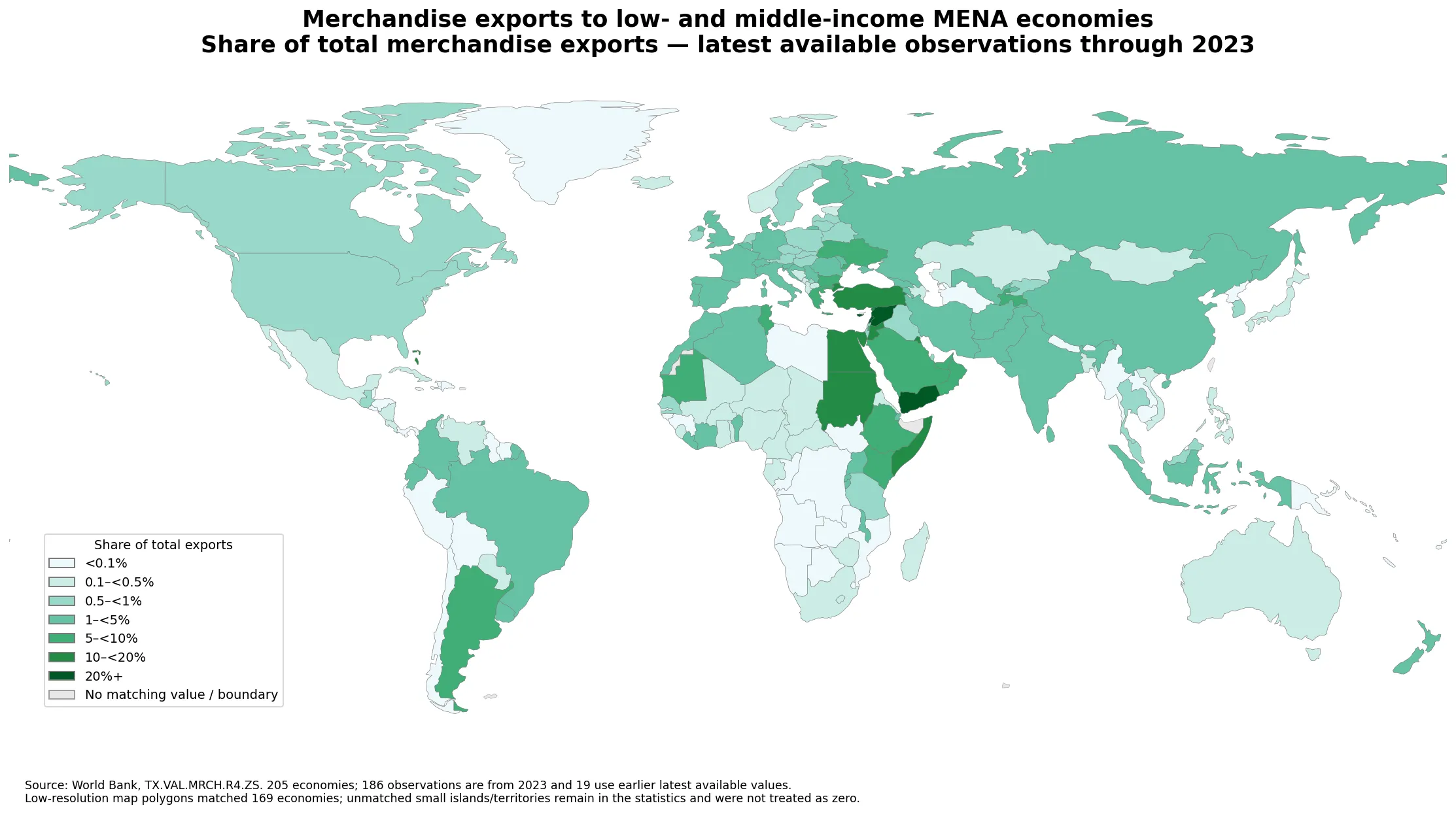
Table of Contents
What the indicator includes—and what it leaves out
The numerator is merchandise exports from the reporting economy to low- and middle-income economies in the Middle East and North Africa. The denominator is all merchandise exports from that reporting economy. A value of 6% therefore means that about six out of every 100 units of merchandise exports went to the specified partner group. It does not mean that the country exported 6% more goods, nor does it reveal the absolute value of trade.
The partner group is narrower than “all MENA economies.” High-income economies in the region are outside the low- and middle-income partner group used in this indicator. That distinction matters for interpretation: a country may export heavily to MENA overall but still record a modest value here if a large share of those exports goes to high-income regional markets.
The World Bank methodology also requires sufficient partner-country coverage for the grouped calculation. Because this is an aggregate destination share rather than a bilateral series, it is best used to describe trade orientation at a high level. Questions about specific partners, products or trade corridors require more detailed bilateral data.
Most economies sit near the bottom of the scale
The first quartile is 0.05% and the third quartile is 1.67%. Half of the observations therefore fall between roughly 0.05% and 1.67%. The central tendency is much closer to zero than to the 2.24% mean, which is why a linear scale would hide much of the variation among the majority of economies.
| Share band | Number of economies |
|---|---|
| <0.1% | 62 |
| 0.1–<0.5% | 44 |
| 0.5–<1% | 28 |
| 1–<5% | 46 |
| 5–<10% | 13 |
| 10–<20% | 8 |
| 20%+ | 4 |
More than half of the dataset falls below 0.5%. Only 25 economies are at 5% or above, and just four exceed 20%. The map therefore uses narrow bands at the low end and wider bands at the upper end. That design reflects the observed distribution rather than implying that a one-percentage-point difference has the same practical meaning everywhere.
The highest shares form a concentrated upper tail
The Syrian Arab Republic has the highest recorded share at 58.07%. Cyprus follows at 28.36%, then Yemen at 21.28% and Lebanon at 21.04%. Jordan and Egypt are both above 16%, while Turkiye, Sudan, Kuwait and Bahrain also appear among the ten highest observations. These values create a clear concentration around the eastern Mediterranean, the Middle East and nearby areas.
| Economy | Observation year | Share of total merchandise exports |
|---|---|---|
| Syrian Arab Republic | 2023 | 58.07% |
| Cyprus | 2023 | 28.36% |
| Yemen, Rep. | 2023 | 21.28% |
| Lebanon | 2023 | 21.04% |
| Jordan | 2023 | 17.67% |
| Egypt, Arab Rep. | 2023 | 16.63% |
| Turkiye | 2023 | 14.21% |
| Sudan | 2023 | 12.28% |
| Kuwait | 2023 | 11.93% |
| Bahrain | 2023 | 10.77% |
This ranking is not a ranking of export performance. A high percentage only shows that the specified destination group occupies a large place in the reporter’s export mix. A relatively small exporter can post a high share if its sales are concentrated in that market, while a very large exporter can post a low share if its exports are spread across many destinations.
The Bahamas, at 10.56%, is a useful reminder that the map is not explained by geography alone. It stands out as a distant high-share observation compared with the broader regional pattern. The indicator itself does not identify the reason, so explanations involving re-exports, product composition, shipping routes or firm structure would require separate evidence.
A broad low-share pattern covers much of the world
Many economies in North America, East Asia, Oceania and Latin America are below 1%. That does not mean they have no trade with the Middle East and North Africa. The measure is a ratio with a narrowly defined numerator. Exports to high-income MENA economies, exports to other regions, and a large overall export denominator can all leave this particular share small.
The lightest map categories should therefore be read as “a small share of total merchandise exports goes to this specified partner group,” not “no trade.” The minimum observation is a very small positive value rather than zero, and missing or unmatched geographies were never filled with zeros.
Proximity is visible in the map but does not fully determine the result. Economies around the eastern Mediterranean and parts of MENA tend to be darker, yet neighboring countries can still sit in different bands. Trade composition, partner income classification, product specialization and the geographic spread of the exporter’s wider market all matter.
Freshness varies across 19 economies
The strong point of the dataset is that 186 of the 205 observations are from 2023. The limitation is the remaining 19. Four are from 2022 and six are from 2021, while nine are from 2020 or earlier. The oldest latest-available observation is Tonga in 1989; New Caledonia is dated 2002 and Samoa 2008. Those older values should not be treated as direct descriptions of 2023 trade patterns.
| Observation-year group | Economies |
|---|---|
| 2023 | 186 |
| 2022 | 4 |
| 2021 | 6 |
| 2020 or earlier | 9 |
This matters most when making fine comparisons. A 2023 value and a decades-old latest observation are not equally fresh, even if they appear on the same choropleth. For current policy or commercial analysis, the observation year should be checked before drawing conclusions, and stale cases should be supplemented with newer bilateral or national trade data where available.
Replacing missing 2023 observations with zero would be worse. “No current observation” and “zero percent of exports” are different facts. The dataset and map therefore preserve the latest non-missing value supplied for each economy, while the article explicitly identifies the mixed-year limitation.
How to interpret a high or low share
A high share can be used as evidence that low- and middle-income MENA markets occupy an important place in the reporting economy’s merchandise export mix. It can help identify economies whose export destinations are unusually concentrated in this group and can serve as a starting point for more detailed bilateral analysis.
A low share should not automatically be labeled better diversified. The reporting economy might instead be concentrated in a different region or in high-income partners. Similarly, a high share is not inherently a weakness. The measure says where exports go, not whether that destination pattern is economically desirable.
For a fuller trade picture, this indicator can be paired with total merchandise exports, major destination partners, product-level export shares and measures that include high-income MENA destinations. Those complementary series answer questions that this indicator intentionally leaves outside its scope.
Three checks make the map more useful
First, read the colors as percentages of each reporter’s total merchandise exports, not as export values. Second, remember that the partner group covers low- and middle-income MENA economies rather than every economy in the region. Third, check the observation year when a specific country matters, because 19 rows predate 2023.
The low-resolution world boundary layer matches 169 of the 205 economies. Thirty-six small islands and territories do not have a usable matching polygon in this boundary file, but their observations remain in all descriptive statistics. A gray or unfilled area should therefore never be interpreted automatically as a zero value.
Taken together, the data show a highly asymmetric global pattern. The typical economy has less than half a percent of merchandise exports going to this partner group, while a small set of economies near the eastern Mediterranean and MENA reaches double-digit shares. The definition of the partner group and the mixed observation years are essential context for interpreting that contrast accurately.
Frequently Asked Questions
What does a 10% value mean?
It means that about 10% of the reporting economy’s merchandise exports went to low- and middle-income economies in the Middle East and North Africa. It is a destination share, not an absolute export value.
Are all 205 observations from 2023?
No. 186 observations are from 2023 and 19 use the latest non-missing value available from 1989–2022. The map is therefore a latest-available comparison through 2023.
Does the indicator include exports to every MENA economy?
No. The partner group is limited to low- and middle-income economies in the Middle East and North Africa. High-income MENA destinations are not included in the numerator.
Do gray or unmapped places have a value of zero?
No. Some small islands and territories lack a matching polygon in the low-resolution boundary layer. Their source observations remain in the statistics and were not replaced with zero.
Related Articles
Green Map creates custom-edited map images using open geographic data sources such as geoBoundaries, Natural Earth, OpenStreetMap, and government open data.
These maps are edited visual materials, not raw data files, and are provided for education, documents, presentations, and graphic reference.