Labour force participation among people ages 15–64 differs substantially across countries and areas in 2025. World Bank indicator SL.TLF.ACTI.ZS uses modeled ILO estimates and measures the labour force—employed plus unemployed persons—as a percentage of the population ages 15–64. Of 217 country and area rows, 182 have a reported 2025 value and 35 are source-missing. The median among reported observations is 69.96% and the simple mean is 67.63%.
Labour force participation is not the same as the employment-to-population ratio or the unemployment rate. Employed people and unemployed people who meet the statistical criteria for unemployment are both inside the labour force. People outside the labour force can include students, caregivers, early retirees, people not actively seeking work, and others depending on the statistical definition. A high participation rate therefore does not automatically mean that employment conditions are strong, and a low rate does not automatically mean that unemployment is high.
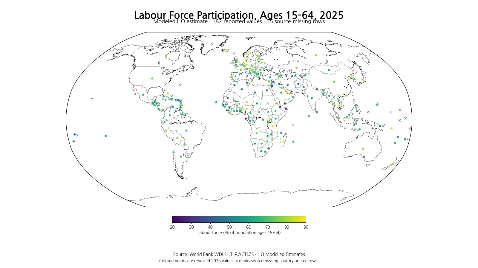
Table of Contents
The highest observations are spread across several regions
The ten highest observations are DPRK, Qatar, Iceland, Madagascar, Cambodia, the Solomon Islands, the Netherlands, Tanzania, Switzerland and Sweden. DPRK is highest at 89.27%, followed by Qatar at 88.10% and Iceland at 87.51%. The top group spans East Asia, the Gulf, Europe, Africa and the Pacific. That geographic variety is an immediate warning against treating high participation as the product of one income level, one labour-market institution or one demographic structure.
| Rank | Country or area | Labour force participation, ages 15–64 |
|---|---|---|
| 1 | DPRK | 89.27% |
| 2 | Qatar | 88.10% |
| 3 | Iceland | 87.51% |
| 4 | Madagascar | 86.89% |
| 5 | Cambodia | 86.14% |
| 6 | Solomon Islands | 85.84% |
| 7 | Netherlands | 85.59% |
| 8 | Tanzania | 85.00% |
| 9 | Switzerland | 84.04% |
| 10 | Sweden | 83.85% |
A high rate means that a large share of the 15–64 population is in the labour force, but that labour force includes both employed and unemployed people. Two countries can both record an 85% participation rate and still differ substantially in unemployment, hours worked, wages, informality, job security and productivity. The ranking should therefore be read as a measure of labour-market engagement, not as an overall score of labour-market quality.
The lowest observations imply a much larger share outside the labour force
At the lower end are Sao Tome and Principe, Djibouti, Yemen, Somalia, Afghanistan, Syria, Tajikistan, Mauritania, Nepal and Jordan. Sao Tome and Principe is lowest at 23.42%, followed by Djibouti at 33.34%, Yemen at 33.99% and Somalia at 34.78%. In these observations, a much larger portion of the 15–64 population is outside the labour force under the modeled ILO framework.
| Rank | Country or area | Labour force participation, ages 15–64 |
|---|---|---|
| 1 | Sao Tome and Principe | 23.42% |
| 2 | Djibouti | 33.34% |
| 3 | Yemen, Rep. | 33.99% |
| 4 | Somalia, Fed. Rep. | 34.78% |
| 5 | Afghanistan | 38.45% |
| 6 | Syrian Arab Republic | 38.89% |
| 7 | Tajikistan | 40.39% |
| 8 | Mauritania | 41.87% |
| 9 | Nepal | 41.89% |
| 10 | Jordan | 42.77% |
There can be many reasons for a low participation rate, including education, caregiving, early retirement, health conditions, social norms, migration, economic conditions and labour-market institutions. Those explanatory variables are not contained in this single indicator series, so the map cannot identify one cause for any country. Differences in female and male participation can also affect the total rate, but a sex-specific analysis requires separate indicators.
The middle half lies between about 60.62% and 76.99%
Across the 182 reported values, the median is 69.96%, the first quartile is 60.62%, and the third quartile is 76.99%. The middle half of country and area observations therefore falls between about 60.62% and 76.99%. The simple mean, 67.63%, is slightly below the median because a number of very low observations in the 20–40% range extend the lower tail.
| Participation band | Countries and areas |
|---|---|
| Under 50% | 18 |
| 50–59.9% | 22 |
| 60–69.9% | 52 |
| 70–79.9% | 67 |
| 80% or higher | 23 |
The largest band is 70–79.9%, with 67 observations, followed by 60–69.9% with 52. Twenty-three observations are at or above 80%, 22 are between 50% and 59.9%, and 18 are below 50%. These counts describe the distribution of country and area observations. They are not population-weighted, so the simple mean is not the labour force participation rate of the world’s entire 15–64 population.
The ages 15–64 denominator makes this series different from an ages 15+ measure
The denominator in this indicator is the population ages 15–64. That is different from labour force participation series that use everyone age 15 and older. In countries with large populations age 65 and above, an ages-15+ rate can be lower because older people remain in the denominator even when many are outside the labour force. Restricting the denominator to ages 15–64 focuses more directly on the conventional working-age population.
Green Blog already has a 2025 ILOSTAT article using an age-15+ population and retained observations from that source. The present dataset is different: it is the World Bank WDI ages-15–64 series, uses modeled ILO estimates, and provides 182 reported country and area values for the same 2025 reference year. Similar indicator names therefore do not imply identical data, rankings or interpretation.
Modeled ILO estimates improve same-year coverage but are not identical to national survey values
The phrase “modeled ILO estimate” matters. National labour-force surveys differ in timing and availability, and some country-year observations can be missing. ILO modeling uses official labour-market information and statistical methods to produce estimates designed for broader international comparability. This allows many more economies to be compared in the same reference year, but the resulting value should not be described as a raw national survey observation.
The modeled nature of the series is also a reason not to overinterpret tiny decimal-point differences. A gap of a few tenths of a percentage point is less informative than broad structural differences such as rates in the 40% range versus the 80% range. Model-based international series are especially useful for patterns, ranges and consistent cross-country comparison rather than a competition for precise rank positions.
Employment-to-population ratios answer a different question
Labour force participation uses employed plus unemployed persons in the numerator. An employment-to-population ratio uses employed people only. Reading the two together helps distinguish labour-market engagement from actual employment. If participation is high but the employment-to-population ratio is meaningfully lower, unemployment can account for part of the gap. If both are low, the share of the working-age population outside the labour force becomes especially important.
The unemployment rate uses yet another denominator: the labour force. People outside the labour force are not counted as unemployed. This is why a country can have a relatively low unemployment rate and still have modest labour force participation. Participation, employment and unemployment are complementary indicators rather than substitutes.
East Asia shows substantial variation even within one broad region
East Asian observations are far from uniform. Japan is at 82.28% and China at 74.03%, while other economies sit at different points in the distribution. Differences in population structure, labour-market institutions, education, women’s participation, migration and industry mix can all matter, but those factors are not separately identified in this dataset. The map is most useful for showing that neighboring or regionally grouped economies need not share similar participation rates.
The age range is particularly important when comparing highly aged societies. Because people age 65 and above are excluded from this denominator, an ages-15–64 rate can look substantially different from an ages-15+ rate. Combining the two series without checking the age definition can create misleading country comparisons.
The Gulf and nearby economies also show sharp contrasts
Qatar is near the top of the distribution at 88.10%, while Jordan is 42.77% and Yemen 33.99%. These countries are geographically closer than their participation rates suggest. Migration, sex composition, labour-market institutions and economic structure can all affect participation. The indicator alone cannot quantify the contribution of each factor, but the geographic contrast is clear.
Countries with large working-age migrant populations can have a 15–64 population that is especially concentrated among people who moved for employment. That can raise participation without implying that one policy variable explains the result. Demographic composition and migration therefore belong in the interpretation of some high-participation economies.
The 35 missing rows are not zero participation
Thirty-five of the 217 country and area rows do not have a reported 2025 value. They are not countries with 0% participation. The map marks those rows separately and excludes them from the mean, median, quartiles and rankings. Replacing missing values with zero would create false low-participation observations and severely distort the distribution.
The 182 reported rows should also not be described as 182 sovereign states. World Bank country and economy datasets can include separately reported territories and statistical areas. The correct geographic unit is the set of World Bank country and area rows represented in the source, excluding aggregate groups.
A 2025 cross-section does not show the direction of change
This map shows one year. It cannot establish whether participation is rising or falling in a particular country. Trends can be influenced by economic cycles, education, ageing, female labour-market participation, migration and policy changes. A trend analysis requires the same age definition and the same modeled series across multiple years.
Modeled estimates can also be revised when new national data or methodological updates are incorporated. For long-run analysis, it is better to use a consistent release of the time series rather than combining values downloaded at different times without checking revisions.
Three checks make this indicator easier to interpret
First, the denominator is the population ages 15–64 and the unit is percent. Second, the labour force includes both employed and unemployed people. Third, the values are modeled ILO estimates rather than a simple collection of raw national survey observations. Keeping those three facts in view prevents high participation from being mislabeled as high employment and low participation from being mislabeled as high unemployment.
World Bank WDI series SL.TLF.ACTI.ZS reports labour force participation for the population ages 15–64 using modeled ILO estimates. Every ranking, quartile, distribution count and map value in this article is calculated from the same 182 reported observations dated 2025. The 35 source-missing rows remain missing throughout the analysis.
Frequently Asked Questions
Are unemployed people included in the labour force participation rate?
Yes. The labour force includes employed and unemployed people, so a high participation rate is not the same as a high employment rate.
What age group does this indicator cover?
The denominator is the population ages 15–64. It should not be treated as identical to an age-15+ labour force participation series.
Were the 35 missing 2025 rows treated as zero?
No. Source-missing rows remain missing and are excluded from rankings and summary statistics.
Related Articles
Green Map creates custom-edited map images using open geographic data sources such as geoBoundaries, Natural Earth, OpenStreetMap, and government open data.
These maps are edited visual materials, not raw data files, and are provided for education, documents, presentations, and graphic reference.