Self-employment occupies very different shares of employment across the 182 countries and reporting areas with a non-missing 2025 value in World Bank indicator SL.EMP.SELF.ZS. The unweighted median is 31.84% and the simple mean is 38.47%. Those numbers describe the distribution of economy-level observations, not a population-weighted global self-employment rate. The wide spread is more informative than a single average: some labor markets are overwhelmingly organized around wage and salary jobs, while others have a much larger self-employed component.
The statistical meaning of “self-employed” is broader than the everyday idea of a small-business owner. In the ILO status-in-employment framework used by the World Bank series, the category includes employers, own-account workers, members of producers’ cooperatives, and contributing family workers. The denominator is total employment. A value of 60% therefore means that roughly 60 of every 100 employed people fall into the self-employed category; it does not mean 60% of all adults or all residents are self-employed.
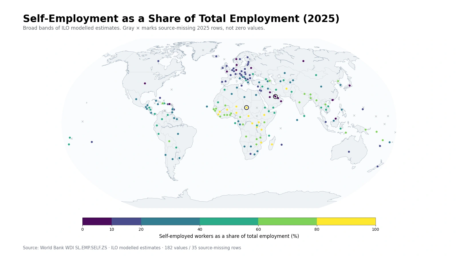
Table of Contents
The clearest map contrast runs between high-self-employment parts of Sub-Saharan Africa and wage-employment-heavy regions
A broad-band map makes the strongest spatial pattern easy to see. Many economies in Sub-Saharan Africa fall above 60%, and a notable group is above 80%. The 2025 modelled values include Chad at 91.56%, Niger at 89.48%, Sierra Leone at 88.81%, Nigeria at 86.15%, Tanzania at 85.34%, Mozambique at 85.31%, the Democratic Republic of the Congo at 85.08%, Burundi at 84.85%, and Ethiopia at 84.31%. The value of the map is the regional continuity, not the ordering of decimal points.
The opposite end is visible in parts of the Gulf, northern Europe, and North America. Qatar is at 0.83%, Bahrain 2.44%, Kuwait 3.16%, Norway 4.87%, Oman 4.96%, the United Arab Emirates 5.07%, and the United States 6.07%. These values imply that wage and salaried employment occupies a much larger part of the employment-status mix. They do not, by themselves, say anything definitive about wages, stability, benefits, productivity, or worker wellbeing.
South and Southeast Asia show large differences even within neighboring labor markets
South Asia sits mostly on the high side of the distribution, but not at one uniform level. Afghanistan is at 83.40%, Nepal 78.58%, India 74.90%, Bangladesh 61.04%, and Pakistan 57.00%. Agriculture, household production, small-scale services, and own-account work can all contribute to a large self-employed share, yet this one indicator cannot separate those mechanisms. It identifies employment status, not the sector or quality of work.
Southeast Asia is similarly diverse. Lao PDR is at 77.14%, Cambodia 55.52%, Viet Nam 53.35%, Indonesia 53.34%, Thailand 50.70%, Malaysia 25.37%, and Singapore 12.69%. That range within a relatively compact part of the world is a useful reminder that continental labels are too coarse for employment structure. The map is best used to locate broad clusters and neighboring contrasts before turning to more detailed country-level labor statistics.
Half of the 182 valid values lie between about 15.57% and 58.56%
The first quartile is 15.57%, the median is 31.84%, and the third quartile is 58.56%. The middle half of the observations therefore spans roughly 42.99 percentage points, which is wide for one employment-status measure. The simple mean, 38.47%, sits above the median because a substantial upper tail extends into the 60–90% range. Each reporting economy carries equal weight in these summary statistics, so the mean should not be described as the share of the world’s workers who are self-employed.
| 2025 self-employment band | Countries and areas | Share of 182 valid values | Illustrative observations |
|---|---|---|---|
| Below 10% | 18 | 9.9% | Qatar 0.83%, Norway 4.87%, United States 6.07%, Germany 8.15% |
| 10% to under 20% | 42 | 23.1% | Japan 9.05%, Austria 12.20%, Canada 12.91%, Australia 16.10% |
| 20% to under 40% | 44 | 24.2% | Chile 23.92%, Malaysia 25.37%, Brazil 30.29%, China 37.67% |
| 40% to under 60% | 33 | 18.1% | Colombia 45.64%, Thailand 50.70%, Indonesia 53.34%, Pakistan 57.00% |
| 60% to under 80% | 30 | 16.5% | Bangladesh 61.04%, Kenya 64.80%, India 74.90%, Nepal 78.58% |
| 80% or more | 15 | 8.2% | Uganda 80.53%, Afghanistan 83.40%, Nigeria 86.15%, Chad 91.56% |
There are 18 observations below 10%, 42 from 10% to under 20%, and 44 from 20% to under 40%. Another 33 fall between 40% and 60%. The two highest bands contain 45 observations, or 24.7% of the valid dataset. The distribution is therefore too broad for one “typical” country to stand in for the global pattern.
This is a worker-status indicator, not a count of businesses or entrepreneurs
A high self-employment share should not be translated into “more businesses” without additional evidence. The unit of observation behind the concept is a worker’s status in employment, not a registered enterprise. One person can own multiple businesses, a business can have multiple owners, and legal registration does not map neatly onto labor-force categories. Contributing family workers and cooperative members can also be counted within the self-employed group even though they may not match the everyday image of a business proprietor.
The series therefore answers a specific composition question: among people who are employed, how large is the group whose remuneration is tied to the profits of their economic activity rather than a wage or salary relationship? Startup formation, business survival, entrepreneurship, informality, and firm size are separate questions. A labor market can have a high self-employment share for very different structural reasons.
Reading self-employment together with wage and salaried work clarifies the employment mix
The ILO status-in-employment framework separates wage and salaried workers from self-employed workers as broad employment categories. In practical terms, high self-employment shares usually correspond to lower wage-and-salaried shares in the companion series, while low self-employment shares correspond to labor markets where paid employment is dominant. That relationship helps explain why Gulf economies and many high-income European economies appear dark on a self-employment map and bright on a wage-and-salaried-worker map.
Neither side of that composition is automatically better. Self-employment can range from employers running growing firms to own-account workers with little protection or bargaining power. Wage employment can range from highly protected professional jobs to low-paid or insecure work. Job quality requires additional indicators on earnings, hours, contracts, social protection, informality, productivity, and underemployment.
ILO modelled estimates are more useful for broad patterns than for decimal-place country rankings
The source is an ILO modelled-estimate series published through World Bank World Development Indicators. The modelling framework combines nationally reported labor statistics with statistical models used to fill gaps and create consistent country coverage over time. That is why a same-year 2025 cross-section can contain 182 values rather than a patchwork of observation years. The trade-off is uncertainty: not every number has the same relationship to direct national survey evidence.
World Bank metadata explicitly cautions that model-imputed observations can carry high uncertainty and should not be used for precise country ranking. This article therefore emphasizes broad bands, medians, quartiles, regional clusters, and clearly separated examples rather than a 1-to-182 league table. A difference between 31.8% and 32.0% is not treated as meaningful evidence that one labor market is structurally “more self-employed” than another. The minimum and maximum are useful only for describing the observed range.
Thirty-five 2025 source-missing rows remain missing rather than becoming zero
The source table contains 217 country-and-area rows. A numeric 2025 value is present for 182, while 35 rows are source-missing. Missing entries include several small territories and economies, as well as some larger reporting areas. Replacing those missing values with zero would falsely assert that no employed person is self-employed, so the calculations exclude them and the map marks them separately. No older observation is substituted into the 2025 cross-section.
All 217 reporting units are linked to representative geographic points for visualization. Colored markers correspond to the 182 valid values; gray × markers correspond to source-missing rows. Marker size does not encode employment or population size. The map is designed to show spatial pattern and broad magnitude, while the tables and summary statistics provide the exact numerical context.
What other indicators help explain a high or low self-employment share?
Employment status reflects more than one economic mechanism. Sector structure, agricultural employment, urbanization, firm size, labor-market institutions, informality, social protection, migration, and family work can all matter. Two countries with the same self-employment share can therefore have very different labor-market realities. A high value can coexist with productive professional self-employment in one setting and widespread low-productivity own-account work in another.
Useful companion indicators include employers as a share of employment, own-account workers, wage and salaried workers, informal employment, sectoral employment, the employment-to-population ratio, labor-force participation, unemployment, hours, and earnings. The present 2025 map is best understood as a structural snapshot of how employed people are classified, not as a causal explanation or a score of labor-market performance.
Data source and calculation
The analysis uses 2025 values from World Bank API series SL.EMP.SELF.ZS. The World Bank metadata identifies the underlying source as the ILO Modelled Estimates database and defines self-employed workers to include employers, own-account workers, members of producers’ cooperatives, and contributing family workers. The unit is percent of total employment.
Of the 217 rows in the source table, 182 contain a 2025 numeric value and 35 are source-missing. Missing rows are not set to zero and no earlier-year value is substituted. The mean, median, quartiles, and band counts are calculated directly from the 182 valid observations. Geographic coordinates are used only to place reporting units on the map and do not enter any statistical calculation.
Frequently Asked Questions
What does a 60% self-employment share mean?
It means about 60 of every 100 employed people are classified as self-employed under the ILO status-in-employment framework. It is not 60% of the total population.
Does a higher self-employment share mean there are more businesses or startups?
Not necessarily. The indicator classifies workers by employment status and does not directly measure registered businesses, startup formation, entrepreneurship, or business survival.
Should the 2025 ILO modelled estimates be used for precise country rankings?
They are better suited to broad patterns than precision rankings. Model-imputed observations can carry substantial uncertainty, so small decimal differences should be interpreted cautiously.
How are the 35 source-missing 2025 rows handled?
They remain missing. They are excluded from summary statistics, are not converted to zero, and are shown separately on the map.
Related Articles
Wage and Salaried Worker Share 2025 – Global Employment Map · Employer Share of Total Employment 2025 – ILO Modelled Estimates · Global Employment-to-Population Ratio Map – Ages 15+ in 2025
Green Map creates custom-edited map images using open geographic data sources such as geoBoundaries, Natural Earth, OpenStreetMap, and government open data.
These maps are edited visual materials, not raw data files, and are provided for education, documents, presentations, and graphic reference.