Women ages 55–59 occupy very different shares of the female population from one country or separately reported area to another. Across 217 World Bank observations dated 2025, the median is 5.18% and the simple unweighted mean is 5.02%. The values range from 1.84% to 9.24%, a spread of about 7.40 percentage points. Those numbers describe the position of one five-year cohort inside each female population. They do not tell us how many women are ages 55–59.
The formal World Bank indicator is Population ages 55-59, female (% of female population), code SP.POP.5559.FE.5Y. The numerator is the female population ages 55 through 59, and the denominator is the female population of all ages. A value of 6% therefore means that roughly six of every 100 females are in this age band. It is not the 55–59 share of the total male-and-female population, and it is not a count. World Bank metadata identifies the UN Population Division’s World Population Prospects as the source and describes the figures as annual midyear age-structure estimates.
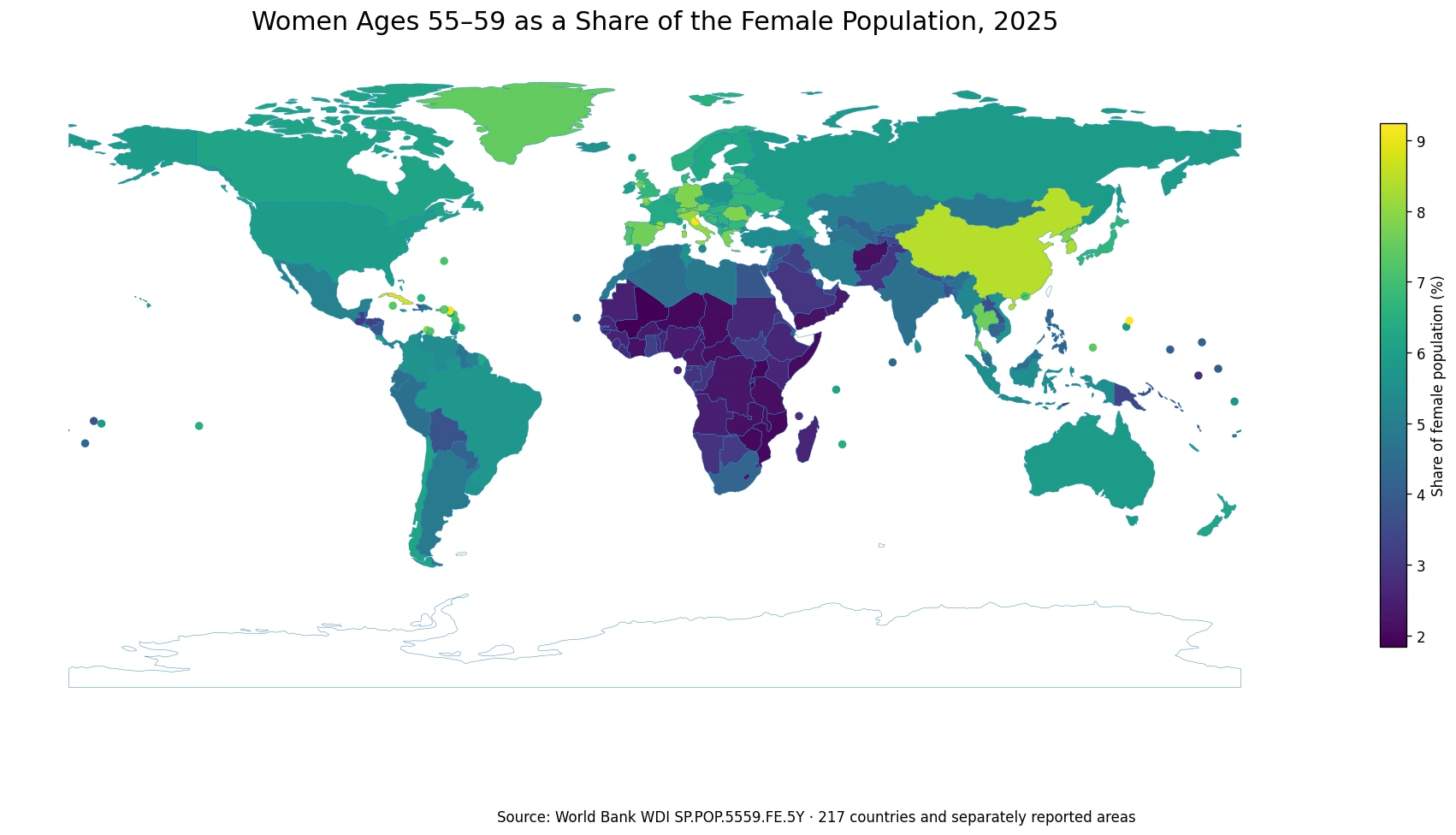
Table of Contents
A percentage of the female population is not a headcount of women ages 55–59
Share and headcount answer different questions. A large country can have millions of women ages 55–59 and still show a middle-range percentage because the denominator contains a much larger female population. A small territory can have far fewer women in the same age band but record a high percentage if that cohort is unusually large relative to women of other ages. The map is therefore useful for comparing age composition, while service planning usually needs the corresponding number of people as well.
The narrow age range also matters. Ages 55–59 cover one five-year slice rather than the whole late-working-age or older population. Two places with the same 55–59 share can have very different populations ages 50–54, 60–64, or 65 and older. A high value in this series does not automatically imply a high old-age share, just as a modest value does not mean older women are scarce overall.
Age composition is shaped by the accumulated history of births, survival, and migration. A large cohort can move through the age structure over time, while migration can enlarge or reduce particular adult age groups. The current series records the resulting share in 2025 but does not identify which mechanism produced a country’s value. Causal explanations require additional demographic evidence rather than the map alone.
The middle half of observations lies between about 3.16% and 6.54%
Giving every country or separately reported area equal weight, the first quartile is 3.16%, the median is 5.18%, and the third quartile is 6.54%. Half of the 217 observations therefore falls within a span of roughly 3.16% to 6.54%. The simple mean of 5.02% sits slightly below the median because the low end includes a group of values close to 2%. This mean is not a global female-population-weighted percentage; it is an arithmetic average of 217 separate shares.
| 2025 female population share ages 55–59 | Countries and separately reported areas |
|---|---|
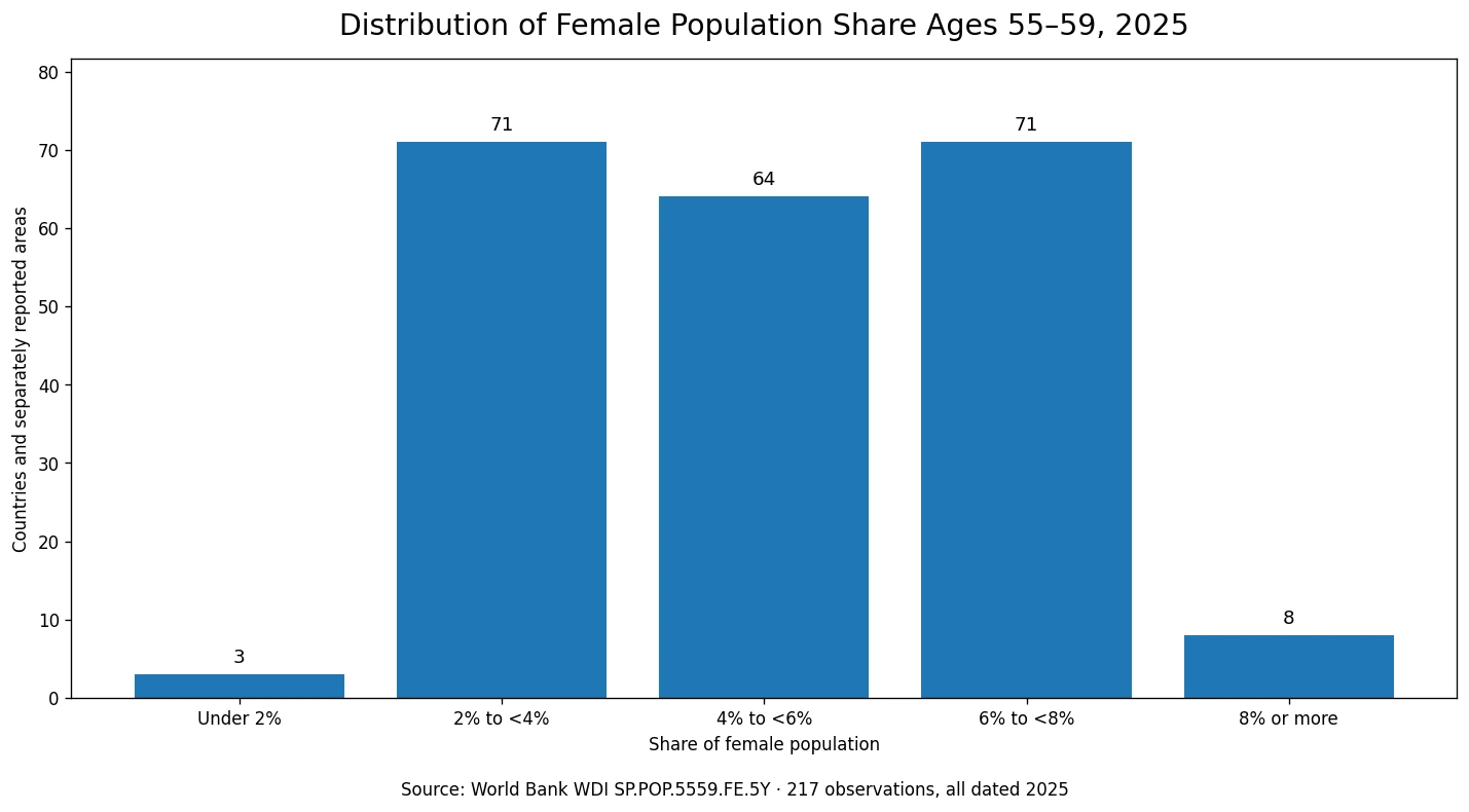
| Under 2% | 3 |
| 2% to under 4% | 71 |
| 4% to under 6% | 64 |
| 6% to under 8% | 71 |
| 8% or more | 8 |
The distribution is broad but not dominated by the extremes. The 2% to under 4% and 6% to under 8% bands each contain 71 observations, while 64 fall between 4% and 6%. Only three are below 2%, and eight reach at least 8%. That pattern makes the map easier to interpret: most countries and areas sit somewhere in the 2% to 8% span, while the values at either end are comparatively unusual.
Several of the highest shares occur in Europe and in small island or city-based economies
The five highest observations are the Northern Mariana Islands at 9.24%, San Marino at 9.20%, Sint Maarten at 9.06%, Cuba at 8.90%, and China at 8.42%. This mix of small territories and very large countries is a useful reminder that a high percentage says nothing by itself about the size of the cohort. A small population can rank near the top with relatively few women, while a very populous country can combine a high percentage with a very large headcount.
Many European countries occupy the upper half of the map. Italy is 8.09%, Germany 7.80%, Greece 7.79%, Austria 7.67%, and Spain 7.65%. Romania, Portugal, the Netherlands, Slovenia, Lithuania, and Croatia are also above 6.9%. The pattern is geographically visible, but Europe is not uniform: France is 6.35% and Ireland 6.07%, while other countries fall closer to the middle of the global distribution.
East and Southeast Asia also show considerable internal variation. China is above 8%, Thailand is 7.61%, Japan 6.68%, Viet Nam 5.61%, Indonesia 5.46%, and India 4.55%. These differences make it risky to summarize an entire region with one age-structure label. Cohort histories vary substantially even among neighboring or economically connected countries.
Low shares form a broad cluster across much of Sub-Saharan Africa
Mali has the lowest value at 1.84%, followed by Burundi at 1.87% and Uganda at 1.94%. Zimbabwe and Mozambique are both close to 2.01%, while Niger, Somalia, Chad, Malawi, and the Central African Republic are only slightly higher. On the map, many of the lowest values form a broad cluster across Sub-Saharan Africa rather than appearing as isolated outliers.
A low 55–59 share should not be read as a direct measure of mortality, life expectancy, or well-being. A very young female population can push the percentage down because younger cohorts make the denominator much larger. Past cohort size and migration can also matter. The series tells us where women ages 55–59 occupy a smaller place in the female age structure; it does not explain the mechanism on its own.
| Highest observations | Share | Lowest observations | Share |
|---|---|---|---|
| Northern Mariana Islands | 9.24% | Mali | 1.84% |
| San Marino | 9.20% | Burundi | 1.87% |
| Sint Maarten (Dutch part) | 9.06% | Uganda | 1.94% |
| Cuba | 8.90% | Zimbabwe | 2.01% |
| China | 8.42% | Mozambique | 2.01% |
The same percentage can imply very different numbers of people and service needs
Women ages 55–59 can be relevant to questions about employment, health care, household responsibilities, and preparation for retirement, but the percentage alone cannot size any of those populations. If two countries both record 6%, one may have tens of thousands of women in the age band while another has millions. Headcounts are required whenever the practical question concerns the number of potential workers, patients, households, or service users.
The percentage becomes more informative when the goal is to compare age structure across places of very different population sizes. It can also be paired with adjacent five-year bands to see whether a cohort becomes more or less prominent as it moves through the age distribution. The denominator must remain clear, however: this series uses the female population only. A total-population share or a male age-band share is a different indicator.
A common 2025 reference year removes a major source of comparison error
All 217 observations used here are dated 2025, and the source table contains no missing values. That consistency is important because international comparisons often combine each country’s latest available observation even when the years differ. Here, a high or low value cannot be attributed to one place being represented by an older observation than another. Every row refers to the same comparison year.
The 217 rows are not the same thing as 217 sovereign states. World Bank reporting also includes some territories and separately listed economies. In the low-resolution geographic layer, 170 observations can be joined to country polygons and 47 small or separately reported areas are shown as point markers. All 217 values remain in the statistical summaries regardless of how they are represented on the map.
Source and interpretation notes
The World Bank WDI metadata defines the series as women ages 55–59 as a percentage of the total female population and identifies the UN Population Division’s World Population Prospects as the source. The methodology describes the values as midyear age-and-sex population estimates. That makes broad bands, quartiles, and geographic patterns more meaningful than attaching strong significance to differences of only a few hundredths of a percentage point.
The map is best used as a compact view of where the 55–59 female cohort is relatively large or small within each female population. Questions about population aging as a whole require wider age groups, while questions about actual service demand require counts. The indicator is one well-defined slice of the age structure, not a general score for demographic health, longevity, or policy performance.
Frequently Asked Questions
What does a 5% share for women ages 55–59 mean?
It means about five of every 100 females in that country or area are ages 55–59. It is not the share of the total population and not a headcount.
Are all 217 observations from 2025?
Yes. Every observation used in this comparison is dated 2025, and the source table has no missing values.
Does a high 55–59 female share mean a country is older overall?
Not necessarily. The indicator covers only one five-year age band. Broader age groups such as the population age 65 and older are needed to describe population aging more completely.
Is the 5.02% mean a population-weighted global female share?
No. It is the simple unweighted mean of 217 country and area percentages, giving each observation equal weight.
Related Articles
- Women Ages 45–49 as a Share of Female Population by Country (2025)
- Female Population Ages 70–74 in 2025: Country-by-Country Share Comparison
- Women Ages 75–79 as a Share of Female Population by Country (2025)
Green Map creates custom-edited map images using open geographic data sources such as geoBoundaries, Natural Earth, OpenStreetMap, and government open data.
These maps are edited visual materials, not raw data files, and are provided for education, documents, presentations, and graphic reference.