A country can have a high employment rate and still have a very different mix of employment relationships from another country with a similar headline labor-market number. World Bank indicator SL.EMP.WORK.ZS looks at that mix by measuring wage and salaried workers as a percentage of total employment. In 2025, 182 countries and reporting areas have a non-missing value in the dataset used here. Their median is 68.16%, while the simple mean is 61.53%. The gap between the two already hints at a wide distribution: many economies have very high employee shares, but a substantial group remains below 40%.
The indicator is about status in employment, not about whether a person is employed at all. Wage and salaried workers are people in paid employment jobs with an explicit or implicit employment contract and basic remuneration that is not directly dependent on the revenue of the unit for which they work. It is therefore different from the employment-to-population ratio, unemployment rate, average pay, job quality, or the share of permanent contracts. The map below uses only 2025 values; 35 source-missing rows remain missing rather than being treated as zero.
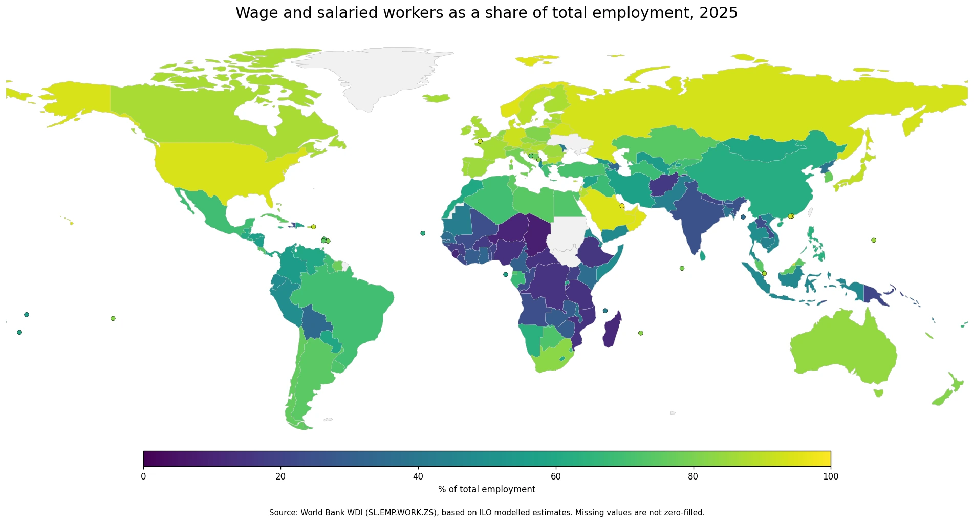
Table of Contents
What the wage and salaried worker share actually measures
The World Bank definition follows the ILO concept of paid employment. A worker can be included even without a formal written contract if an oral or implicit employment relationship exists and the job provides basic remuneration that is not directly tied to the revenue of the business or organization. That makes the category broader than a casual idea of an office employee. Factory workers, service employees, public-sector employees, and many other paid workers can all fall within the same status-in-employment group.
The denominator is total employment, not the adult population or the labor force. If a country has a value of 80%, the statement is that about 80 out of every 100 employed people are wage or salaried workers. Unemployed people are outside the denominator, and people who are not participating in the labor market are outside it as well. This distinction matters because a country can have a high employee share and still have a low overall employment rate, or the reverse.
The remaining employment statuses broadly fall within forms of self-employment, including employers, own-account workers, and other categories in the ILO framework. A lower wage-and-salaried share can therefore be associated with a larger role for self-employment, small-scale agriculture, or informal economic activity, but the indicator does not identify which of those explanations is responsible. It should be used to describe employment structure rather than to score labor-market quality.
The 2025 median is 68.16%, with a long lower tail
Across the 182 reported values, the median is 68.16% and the simple mean is 61.53%. The first quartile is 41.44% and the third quartile is 84.43%, so the middle half of the observations spans a very broad range. The minimum is 8.44% and the maximum is 99.17%. Because the lower end stretches much farther away from the center than most of the upper end, low-share economies pull the mean below the median.
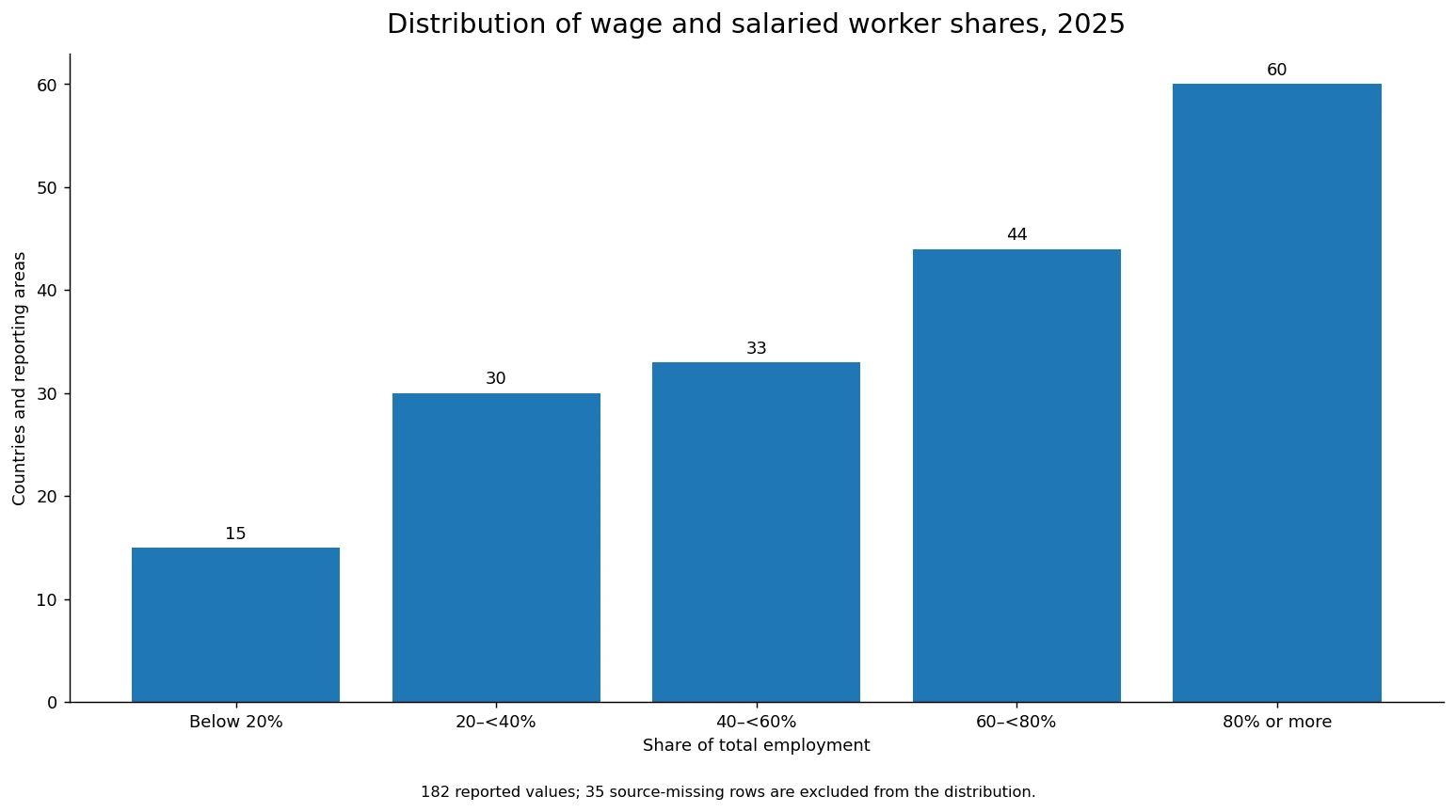
Broad bands make the distribution easier to read. Fifteen countries or reporting areas are below 20%, 30 are from 20% to under 40%, 33 are from 40% to under 60%, 44 are from 60% to under 80%, and 60 are at 80% or above. That means 104 of the 182 valid observations are at least 60%, yet 45 are still below 40%. There is no single world pattern that can represent all labor markets.
High employee shares form clear clusters in Europe and the Gulf
Northern and Western Europe show a broad cluster of high employee shares. Norway is at 95.13%, Germany at 91.85%, Sweden at 89.76%, France at 86.72%, and the United Kingdom at 86.85%. The map is useful here because the pattern is not limited to one outlier: neighboring countries often appear in similar high-value bands, indicating that paid employment is the dominant employment status across much of the region.
The Gulf is another striking high-share cluster. Qatar is at 99.17%, Bahrain at 97.56%, Kuwait at 96.84%, Oman at 95.04%, the United Arab Emirates at 94.93%, and Saudi Arabia at 94.45%. These numbers should not be read as a direct ranking of job quality or worker welfare. Labor migration, the size of the self-employed sector, industrial structure, and the way employment is organized can all influence the share without being measured by the indicator itself.
North America also leans strongly toward wage and salaried employment, but with an internal contrast. The United States is at 93.93% and Canada at 87.09%, while Mexico is at 69.15%. The difference is large enough to be meaningful as a structural contrast, but the source is an ILO modelled series, so the safest use of the map is to focus on broad bands rather than tiny decimal-place gaps.
Many Sub-Saharan African economies sit at the lower end of the scale
A large low-share cluster appears across parts of Sub-Saharan Africa. Chad is at 8.44%, Niger at 10.52%, Sierra Leone at 11.19%, Madagascar at 11.68%, and Nigeria at 13.85%. Tanzania, Mozambique, the Democratic Republic of the Congo, Burundi, and Ethiopia are also below 20%. These values indicate that wage and salaried employment accounts for a relatively small part of total employment, leaving a much larger role for other statuses such as own-account work or family-based economic activity.
World Bank metadata notes that a sizeable own-account worker share can be associated with a large agricultural sector and limited formal-economy growth. That is a useful interpretive clue, but it is not something this single series can prove for each country. To identify the cause of a low employee share, it would be necessary to add industry employment, informality, farm employment, enterprise size, and country-specific labor-force survey data.
South Africa, at 82.73%, is a reminder that the continent is not uniform. A country can sit in a very different band from many nearby economies. Those contrasts are one reason the map is more informative than a simple continental average: regional labels can hide large differences in the actual status-in-employment structure.
Asia spans almost the full range
Asia contains some of the sharpest contrasts in the dataset. Japan is at 90.95%, while India is at 25.10%. China is at 62.33%, the Philippines at 63.85%, Thailand at 49.30%, Viet Nam at 46.65%, Bangladesh at 38.96%, and Pakistan at 43.00%. The spread reflects very different mixes of large formal employers, small firms, agriculture, own-account work, and other forms of employment across East, Southeast, and South Asia.
Australia and New Zealand are in the high-share group at 83.90% and 81.59%, whereas Papua New Guinea is much lower at 21.33%. Even within the wider Asia-Pacific region, the status-in-employment pattern cannot be summarized by one regional figure. Looking at neighboring countries and subregions separately gives a more useful picture.
Latin America often falls in the middle-to-high range
Several large Latin American economies lie between roughly 65% and 80%. Argentina is at 74.42%, Chile at 76.08%, Brazil at 69.71%, and Mexico at 69.15%. Wage and salaried work is therefore the majority employment status in these examples, but other employment statuses remain more prominent than in many Northern European or Gulf economies. Small Caribbean reporting areas are represented with point markers on the map when the base boundary layer does not provide a practical polygon at this scale.
Percentages should not be confused with headcounts. A 70% share in a very large country represents far more workers than the same share in a small island economy. The purpose of this map is to compare the composition of employment, not the number of employees. Population and total employment would be needed to convert these percentages into approximate counts.
Why modelled ILO estimates should not be treated as a precise league table
The indicator name includes “modelled ILO estimate” for an important reason. The ILO modelled estimates combine nationally reported observations that are harmonized to international standards with model-based values used to fill gaps and produce consistent time series. The World Bank metadata and ILO guidance explicitly caution that imputed observations can carry substantial uncertainty and should not be used for precise country rankings or comparisons.
That warning changes how the numbers should be read. A difference between 91.9% and 91.4% is not a meaningful basis for saying that one labor market performs better than another. Broad differences such as 15% versus 85% are far more useful for describing the structure of employment. When a country is the main subject of analysis, the modelled series should ideally be checked against the latest national labor-force survey and ILOSTAT country data.
Using a common 2025 reference year does not mean that every value comes from an identical survey design. National inputs can come from labor-force surveys, household surveys, censuses, and other official sources, and models may be used when direct observations are not available. The common-year map improves temporal alignment, but it does not remove all measurement uncertainty.
Reading the map together with the distribution
The map answers the geographic question: where is wage and salaried employment dominant, and where are other employment statuses more common? The distribution chart answers a different question: how many countries fall into each broad range? Together, they prevent a few extreme values from dominating the story. Sixty observations are at 80% or above, but 45 are below 40%, so the global employment structure remains highly diverse.
Clusters of similar colors can be a starting point for investigating shared economic structures, but they do not establish causation. Income level, urbanization, the size of agriculture, firm organization, labor regulation, migration, and informality can all be relevant. Sharp color changes across neighboring countries can be equally informative because they highlight places where employment structures diverge despite geographic proximity.
The 35 source-missing rows also matter. They are not shown as low values and they are not included in the distribution. Treating missing data as zero would create false low-share countries and distort both the map and the summary statistics. Keeping missingness visible is essential for an honest comparison.
Selected 2025 examples
The values below are examples chosen to show the scale of the spread and several geographic patterns. Because the source is a modelled series, the table is better read as a set of reference points than as a precise ranking.
| Country or area | Wage and salaried workers | How to read the example |
|---|---|---|
| Qatar | 99.17% | Almost all employed people are classified in paid employment |
| Norway | 95.13% | An example of the high employee share seen across Northern Europe |
| United States | 93.93% | A high-share North American case |
| Japan | 90.95% | A high-share East Asian case |
| Brazil | 69.71% | A middle-to-high Latin American example |
| China | 62.33% | A large economy in the 60% range |
| India | 25.10% | Other employment statuses account for a much larger share |
| Nigeria | 13.85% | A low employee-share example |
| Chad | 8.44% | One of the lowest values in the 2025 dataset |
All figures in the table refer to the same 2025 reference year, but the underlying national inputs and the amount of model-based estimation can differ. The decimal places are useful for reproducibility, not as evidence that the estimates are accurate enough for fine-grained league tables.
How to combine this indicator with other labor-market measures
The wage and salaried worker share becomes more informative when it is paired with the employment-to-population ratio, unemployment rate, and labor-force participation rate. The employment-to-population ratio describes how much of the relevant population is employed. Unemployment describes people in the labor force who are seeking work but do not have a job. Labor-force participation measures the share that is either employed or unemployed. This indicator asks a different question: among people who already have jobs, how many are employees rather than working under other status-in-employment arrangements?
Two countries can therefore have similar employment rates but very different employee shares. Likewise, two countries with similar wage-and-salaried shares can have very different unemployment rates, wages, working hours, social protection coverage, or levels of informality. Keeping those concepts separate prevents a structural employment statistic from being mistaken for a general measure of economic performance.
For trend analysis, one year is not enough. Industrialization, urbanization, changes in agricultural employment, recessions, labor-market reforms, and demographic shifts can all change status-in-employment patterns over time. The 2025 map is a cross-section. A claim that a country is becoming more or less employee-based requires a consistent time series and attention to revisions in the modelled estimates.
Frequently Asked Questions
What does a 70% wage and salaried worker share mean?
It means about 70 of every 100 employed people are classified as wage or salaried workers in paid employment. It does not mean 70% of the entire adult population are employees.
Is this the same as the employment rate or permanent-job share?
No. The employment rate measures how much of a population is employed. This indicator looks only at employed people and asks what share are wage or salaried workers. It does not directly measure permanent contracts.
How are countries with no 2025 value handled?
There are 217 rows in the source dataset, with 182 valid 2025 values and 35 source-missing rows. Missing observations are kept missing and are not converted to zero on the map or in the distribution.
Does a higher employee share mean a better labor market?
Not by itself. The indicator describes status in employment and does not measure wages, job security, social protection, unemployment, or productivity. ILO guidance also cautions against precise rankings based on modelled estimates.
Related Articles
Global Employment-to-Population Ratio Map – Ages 15+ in 2025
Unemployment Rate Map – Country Patterns in 2025
Labour Force Participation Rate 2025
Green Map creates custom-edited map images using open geographic data sources such as geoBoundaries, Natural Earth, OpenStreetMap, and government open data.
These maps are edited visual materials, not raw data files, and are provided for education, documents, presentations, and graphic reference.