The 2022 map of personal remittances received as a share of GDP shows how differently cross-border personal transfers and certain worker compensation flows matter relative to the size of each economy. This article uses World Bank World Development Indicators series BX.TRF.PWKR.DT.GD.ZS, “Personal remittances, received (% of GDP).” The denominator is gross domestic product, so the map is a relative economic-weight comparison rather than a ranking of remittance dollars received.
The verified common-year file contains 217 World Bank country/economy master rows. 174 have a numeric 2022 observation and 43 are source-missing, giving 80.2% numeric coverage. Regional, income-group and other aggregate rows are excluded, and missing values are not filled with another year or treated as zero. Every table and summary below therefore stays on the same 2022 reference year.
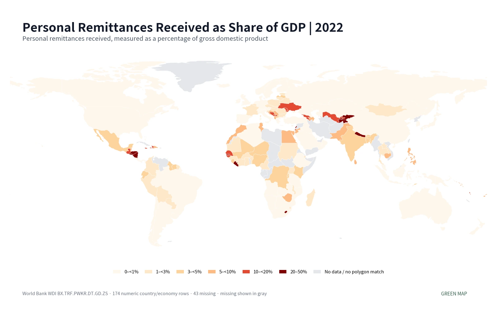
Table of Contents
What the remittance-to-GDP indicator actually measures
World Bank metadata defines personal remittances as the sum of personal transfers and compensation of employees. Personal transfers are current transfers in cash or in kind between resident and nonresident households. Compensation of employees includes income earned by border, seasonal and other short-term workers employed in an economy where they are not resident, as well as residents employed by nonresident entities. The series follows the sixth edition of the IMF Balance of Payments Manual framework.
That definition is broader than a casual idea of “money sent home by migrants,” but much narrower than all cross-border money flows. Foreign direct investment, export receipts, government aid and corporate financing are not automatically part of this remittance measure. The indicator is built around household transfers and specific forms of worker compensation, so it should remain separate from trade, capital-flow and aid statistics.
The GDP denominator is equally important. Two economies can receive the same dollar amount of personal remittances and have very different percentages if their GDP levels differ. A high percentage therefore means remittances are large relative to domestic output; it does not necessarily mean that the economy receives the largest remittance amount in the world. Absolute inflow rankings require a current-dollar remittance series instead.
The 2022 distribution is strongly right-skewed
Across the 174 numeric observations, the simple unweighted mean is 5.8% while the median is only 2.5%. The first quartile is 0.5% and the third quartile 7.3%. The gap between the mean and median reflects a relatively small upper tail with remittance shares above 20% and, in a few cases, above 30% of GDP. For this distribution, the median and class counts are more informative than the mean alone.
| Personal remittances received as % of GDP | Country/economy count | Share of numeric observations |
|---|---|---|
| 0–<1% | 59 | 33.9% |
| 1–<3% | 40 | 23.0% |
| 3–<5% | 21 | 12.1% |
| 5–<10% | 21 | 12.1% |
| 10–<20% | 18 | 10.3% |
| 20–50% | 15 | 8.6% |
59 observations are below 1% of GDP and another 40 are between 1% and 3%. Together, 99 of 174, or 56.9%, are below 3%. At the upper end, 15 observations are at or above 20%. The map therefore needs broad classes rather than a linear scale dominated by a few very high ratios.
Highest remittance shares in 2022
| Country or economy | 2022 personal remittances received (% of GDP) |
|---|---|
| Tajikistan | 49.9% |
| Tonga | 38.7% |
| Samoa | 31.5% |
| Lebanon | 30.7% |
| Honduras | 27.0% |
| Kyrgyz Republic | 26.9% |
| El Salvador | 24.6% |
| West Bank and Gaza | 24.0% |
| Nepal | 22.9% |
| Gambia, The | 22.8% |
Tajikistan is the highest observation at 49.9% of GDP, followed by Tonga at 38.7%, Samoa at 31.5% and Lebanon at 30.7%. Honduras and the Kyrgyz Republic are close to 27%, while El Salvador is 24.6%, West Bank and Gaza 24.0%, Nepal 22.9% and The Gambia 22.8%. These are rankings of the measured ratios only; the dataset does not establish why each economy occupies its position.
Several geographic clusters are visible without being universal. Tajikistan and the Kyrgyz Republic stand out in Central Asia. Honduras, El Salvador, Guatemala and Nicaragua form a high-share cluster in Central America. Nepal is prominent in South Asia, while Tonga and Samoa are unusually high Pacific observations. The appearance of high ratios in distant regions is a reason to avoid one-cause explanations. Migration patterns, labor arrangements, GDP size, exchange rates and financial channels would require separate evidence.
Very low shares do not mean remittances are absent
| Country or economy | 2022 personal remittances received (% of GDP) |
|---|---|
| Angola | 0.011% |
| Kuwait | 0.012% |
| Saudi Arabia | 0.023% |
| Chile | 0.028% |
| United States | 0.029% |
| Oman | 0.036% |
| Canada | 0.039% |
| Papua New Guinea | 0.046% |
| Malta | 0.065% |
| Australia | 0.071% |
The lowest numeric observations include Angola at 0.011%, Kuwait 0.012%, Saudi Arabia 0.023%, Chile 0.028%, the United States 0.029%, Oman 0.036%, Canada 0.039%, Papua New Guinea 0.046%, Malta 0.065% and Australia 0.071%. A small percentage should not be translated into “no remittances.” Because GDP is the denominator, even a sizable dollar inflow can produce a small ratio in a large economy.
The indicator also covers receipts, not payments. An economy can have a low received-remittance share while being an important origin of remittance payments. Net migration, outward payments and the balance between received and paid remittances are separate questions. A complete remittance-flow profile would use those additional series rather than infer them from this map.
Selected economies reveal large within-region gaps
| Country | 2022 personal remittances received (% of GDP) |
|---|---|
| Tajikistan | 49.90% |
| Honduras | 27.00% |
| Kyrgyz Republic | 26.92% |
| El Salvador | 24.63% |
| Nepal | 22.85% |
| Nicaragua | 20.64% |
| Guatemala | 19.04% |
| Armenia | 10.87% |
| Philippines | 9.41% |
| Pakistan | 8.05% |
| Egypt, Arab Rep. | 5.94% |
| Sri Lanka | 5.15% |
| Bangladesh | 4.67% |
| Mexico | 4.19% |
| India | 3.42% |
| Nigeria | 3.11% |
| France | 1.17% |
| Indonesia | 0.99% |
| Germany | 0.47% |
| Korea, Rep. | 0.44% |
| Brazil | 0.25% |
| South Africa | 0.21% |
| United Kingdom | 0.12% |
| Japan | 0.12% |
| China | 0.11% |
| Australia | 0.07% |
| Canada | 0.04% |
| United States | 0.03% |
Within Asia, Nepal is at 22.85%, the Philippines 9.41%, Pakistan 8.05%, Sri Lanka 5.15%, Bangladesh 4.67% and India 3.42%, compared with Indonesia at 0.99%, South Korea at 0.44%, Japan at 0.12% and China at 0.11%. These values demonstrate that a continental label is not enough to describe remittance dependence. Even neighboring or economically linked countries can occupy very different map classes.
In the Americas, Honduras is 27.00%, El Salvador 24.63%, Nicaragua 20.64%, Guatemala 19.04% and Mexico 4.19%, while the United States and Canada are both below 0.05%. In Europe, Germany is 0.47%, France 1.17% and the United Kingdom 0.12%. These percentages are not rankings of GDP, household income or living standards. They answer only the specific question of received personal remittances relative to GDP in 2022.
Why an absolute-dollar remittance map would look different
A ratio to GDP deliberately normalizes for economic size. That makes it useful for identifying economies where remittance inflows are large relative to domestic output, but it hides the dollar scale of the numerator. A large economy can receive billions of dollars and still record a ratio well below 1%, while a much smaller economy can reach 20% or 30% with a smaller absolute amount. Users interested in the size of the remittance market should therefore use a current-US-dollar received-remittance series.
The ratio can also move because the denominator changes. If remittance receipts stay roughly stable while GDP falls, the remittance-to-GDP percentage can rise. If remittances grow but GDP grows faster, the percentage can fall. A time-series explanation of changing dependence must inspect both the numerator and denominator. This article avoids that causal shortcut and focuses on the spatial pattern of one aligned 2022 snapshot.
Forty-three missing rows are not zero-remittance economies
There are 43 source-missing 2022 rows, including Afghanistan, the United Arab Emirates, Bahrain, Brunei Darussalam, Iran, Libya, Singapore, Viet Nam and Venezuela, among others. They remain NA and are excluded from the rankings and descriptive statistics. Mixing older or newer observations into those gaps would create a visually fuller map but weaken the common-year comparison.
The statistical sample and the rendered world geometry are also different. All 174 numeric rows remain in the calculations, but 145 low-resolution Natural Earth polygons receive a direct value join. Small islands, special territories and separately reported economies can have valid statistics without a distinct visible polygon at this map scale. Gray or invisible geography should therefore not be interpreted automatically as a missing statistical observation.
Source, coverage and interpretation rules
The statistical source is World Bank World Development Indicators series BX.TRF.PWKR.DT.GD.ZS. World Bank describes personal remittances as personal transfers plus compensation of employees and states that the data combine IMF balance-of-payments information with World Bank and OECD GDP estimates. The official definition is available in the World Bank WDI metadata glossary.
The cleaned package uses a single 2022 year, country/economy geography and ISO-3 identifiers. Aggregate regions are excluded and missing values are preserved. The {mean:.1f}% mean reported here is an unweighted average across country/economy ratios, not the world remittance share of world GDP. A true global aggregate would need GDP weighting or an official World aggregate constructed under the provider’s aggregation method.
How to use this map with other economic maps
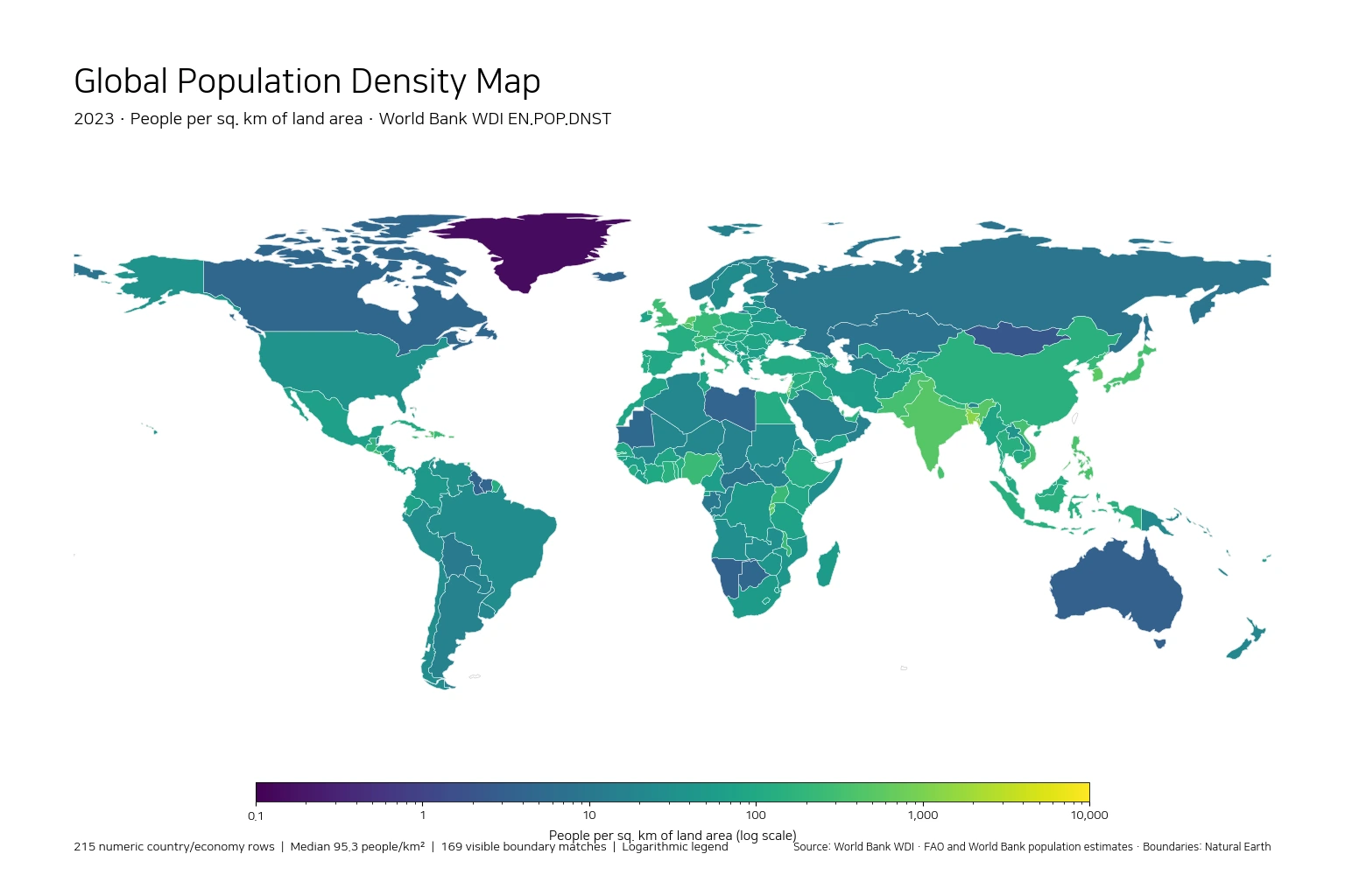
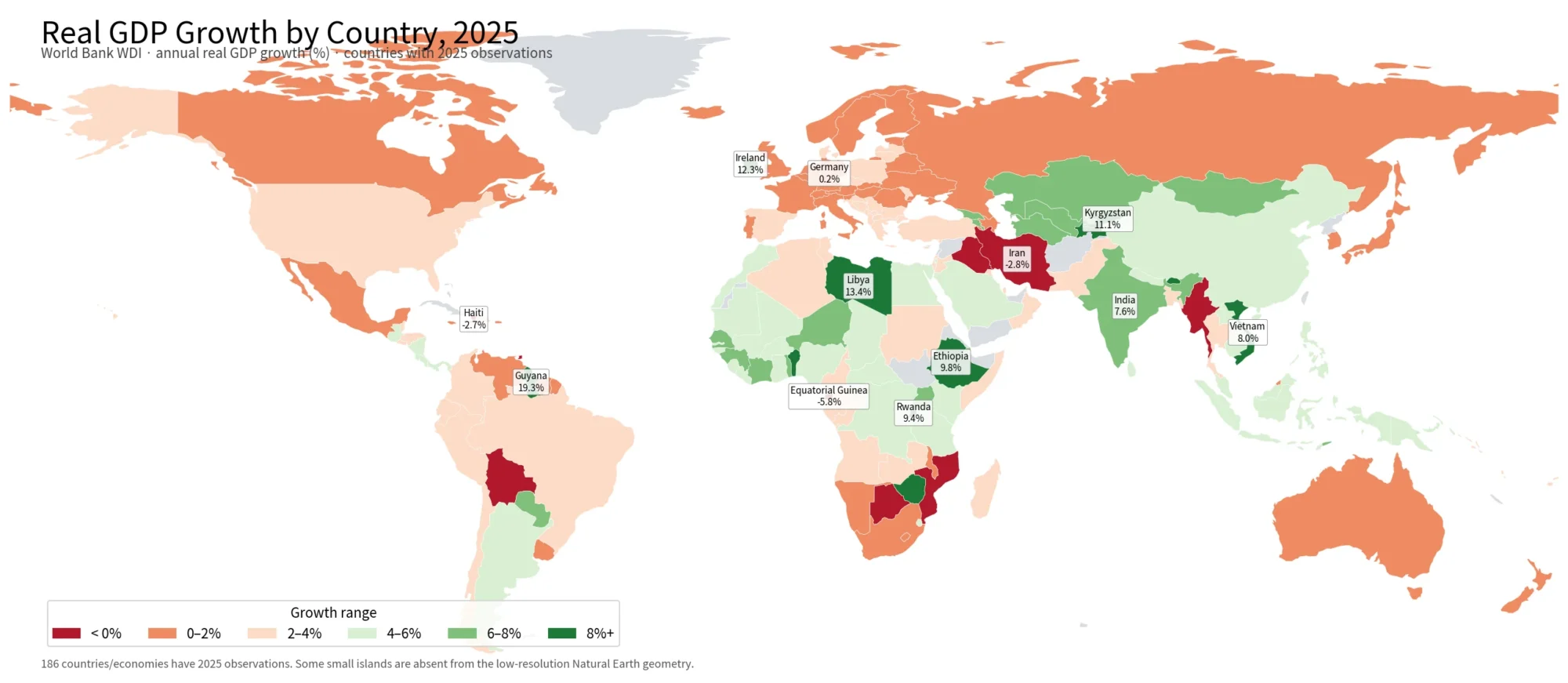
This map works best as a screening layer for identifying economies where personal remittance receipts are large or small relative to domestic output. A GDP-per-capita map answers a level question about output per person, a GDP-growth map answers a change question, and a population-growth map answers a demographic question. Their different denominators and reference years mean they should not be collapsed into one score or treated as interchangeable explanations.
For a high-share economy, useful follow-up data can include received remittances in current dollars, remittances paid, migrant stocks, labor-force patterns, household income, exchange rates and financial access. For a low-share economy, the next step is to determine whether the numerator is small, the GDP denominator is large, or both. The map tells you where the ratio is unusual; it does not prove the mechanism behind that result.
Frequently Asked Questions
Does this indicator rank countries by the dollar amount of remittances received?
No. BX.TRF.PWKR.DT.GD.ZS divides personal remittances received by GDP. A current-US-dollar remittance series is needed for absolute inflow rankings.
What was South Korea’s personal-remittance share of GDP in 2022?
The verified 2022 World Bank WDI observation for South Korea is about 0.44% of GDP. Japan is about 0.12% and China about 0.11% in the same file.
Is the 5.8% simple mean the world remittance share of GDP?
No. It is an unweighted mean across 174 country/economy ratios. A world aggregate would require GDP weighting or the provider’s official aggregate methodology.
Does gray or missing map geometry mean remittances are zero?
No. Some 2022 observations are source-missing, and some small economies have valid statistics but no separate visible polygon in the low-resolution map layer. Missing is not treated as zero.
Related Articles
These Green Map comparisons help keep remittance dependence separate from GDP levels, economic growth and demographic change.
- Global GDP per Capita Map 2025 – Country Comparison
- Global GDP Growth Map – Country Patterns in 2025
- Global Population Growth Map – 2025 Country Comparison
Green Map creates custom-edited map images using open geographic data sources such as geoBoundaries, Natural Earth, OpenStreetMap, and government open data.
These maps are edited visual materials, not raw data files, and are provided for education, documents, presentations, and graphic reference.