Floyd County has one of the clearest urban-to-forest contrasts in this part of southern Indiana. Forest is the largest 2025 class at 43.78%, yet developed land reaches 28.13% and forms a broad concentration on the eastern side around New Albany. Agriculture accounts for 26.45% and is more visible toward the west and northwest. This Floyd County Indiana Land Cover Map is therefore useful for comparing a dense river-side urban edge with wooded knobs, rolling uplands, and a mixed farm landscape in the same small county.
Four map views are included on the page: current land cover, forest and farmland, impervious surface and developed land, and a 1985–2025 class-difference comparison. The WebP images support the discussion, while the four original 2480 × 1754-pixel JPG maps are packaged together in one downloadable ZIP below. They are suited to county profiles, lessons, presentations, and broad environmental comparisons, not parcel surveys or regulatory decisions.
Table of Contents
A developed eastern edge sits inside a county that is still 43.78% forest
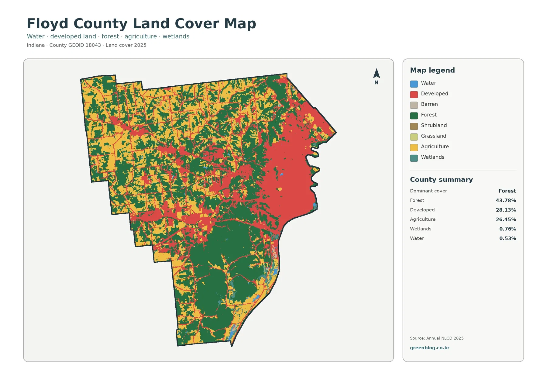
The county summary lists forest at 43.78%, developed land at 28.13%, agriculture at 26.45%, wetlands at 0.76%, and open water at 0.53%. Forest leads by area, but the red developed class is highly concentrated, so it commands attention on the map. The east and southeast contain a large connected urban footprint. By contrast, the southern half contains broad dark-green tracts, and the west has a more fragmented combination of fields, woods, and smaller developed centers.
The largest red concentration broadly corresponds to New Albany. Floyd County’s official parks planning material identifies New Albany along the Ohio River and notes roughly eleven miles of Ohio River shoreline in the county. That local context helps explain why the map’s most urbanized area belongs on the river side of the county. The preview does not draw the New Albany city limit, however, so the red edge should not be mistaken for a municipal boundary.
Farther west, agriculture becomes more obvious. Yellow blocks are especially common in the northwest and west-central sections, but they are repeatedly interrupted by forest. This is not a simple checkerboard farm county. Fields, wooded slopes, settlements, and narrow developed traces meet one another over short distances, which is why the 26.45% agricultural share looks different from the broad uninterrupted farm grids seen in flatter counties farther north.
Land cover describes the observed surface, not the legal use of the land. A developed pixel can contain lawns, trees, bare ground, and small open spaces as well as buildings and roads. Agricultural color does not identify a crop, owner, or surveyed field. Forest does not automatically mean a public park or protected tract. Those distinctions matter before using the maps for planning or property questions.
The southern half becomes the forest anchor when built surfaces are faded
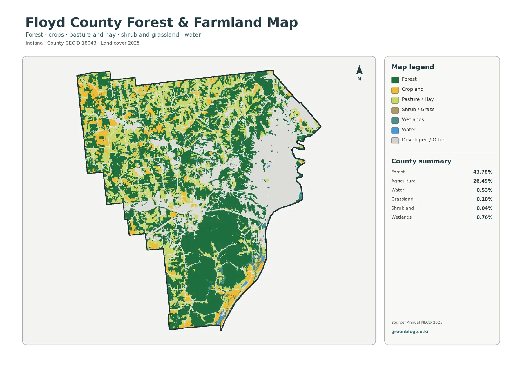
Removing most of the red developed surface makes the forest pattern much easier to see. Large dark-green areas dominate the south, while additional forest follows broken bands through the center and northeast. The west and northwest retain more cropland and pasture openings. The boundary between wooded and agricultural land is irregular rather than straight, and many field blocks have forest on more than one side.
Floyd County’s planning documents describe a landscape of Ohio River lowlands, knobs, rolling highlands, and steep slopes. That description fits the visual contrast between the broad southern woods and the more open western landscape. The land-cover map does not contain contours, so forest color cannot be converted directly into elevation. Still, the official terrain context is useful when explaining why the county does not resemble a uniformly flat agricultural grid.
Agriculture remains a major class at 26.45%. Cropland is most obvious in the western half and in scattered openings elsewhere, while pasture or hay adds lighter green areas around some fields and settlements. Because Annual NLCD works with 30-meter cells, the straight edges can look more precise than they are. Narrow tree lines, driveways, farm lanes, ditches, and small buildings may be absorbed into the dominant class of a cell.
Grassland is only 0.18% and shrubland 0.04% in the supplied summary. They appear in the legend but should not be elevated into defining county characteristics. Wetlands are 0.76%, and open water is 0.53%. Those percentages are small, yet blue and teal features still matter along the Ohio River edge and smaller drainage courses. Wetland color is not the same as exposed water, and neither class is a legal wetland determination.
The Ohio River and the Knobs give the color pattern important local context
The county’s current parks plan calls the Ohio River the primary water resource and describes Little Indian Creek as one of the larger creeks crossing Floyd County. It also discusses the Ohio River Greenway along the New Albany shoreline. Those named features are useful context, but they are not labeled on the supplied land-cover images. A blue line or a narrow teal strip should therefore remain unnamed unless it is checked against an official hydrography or local GIS layer.
The same caution applies to the wooded interior. Official county planning material describes Floyds Knobs and other upland areas, but the map does not draw a boundary around “the Knobs.” The dark-green belt in the south and center can be discussed as a forested upland pattern, while exact ridge names and elevations require a terrain map. Keeping that distinction prevents a land-cover graphic from being asked to provide information it was never designed to show.
New Albany is the easiest settlement to associate with the large eastern developed concentration. Georgetown and Greenville are also recognized local centers in county planning documents, and Floyds Knobs is an important unincorporated area. Smaller red clusters in the west may lie near those places, but the preview has no municipal boundaries or labels. Naming every red patch from memory would be less accurate than using a separate boundary layer.
Impervious cover is concentrated around New Albany rather than spread evenly across Floyd County
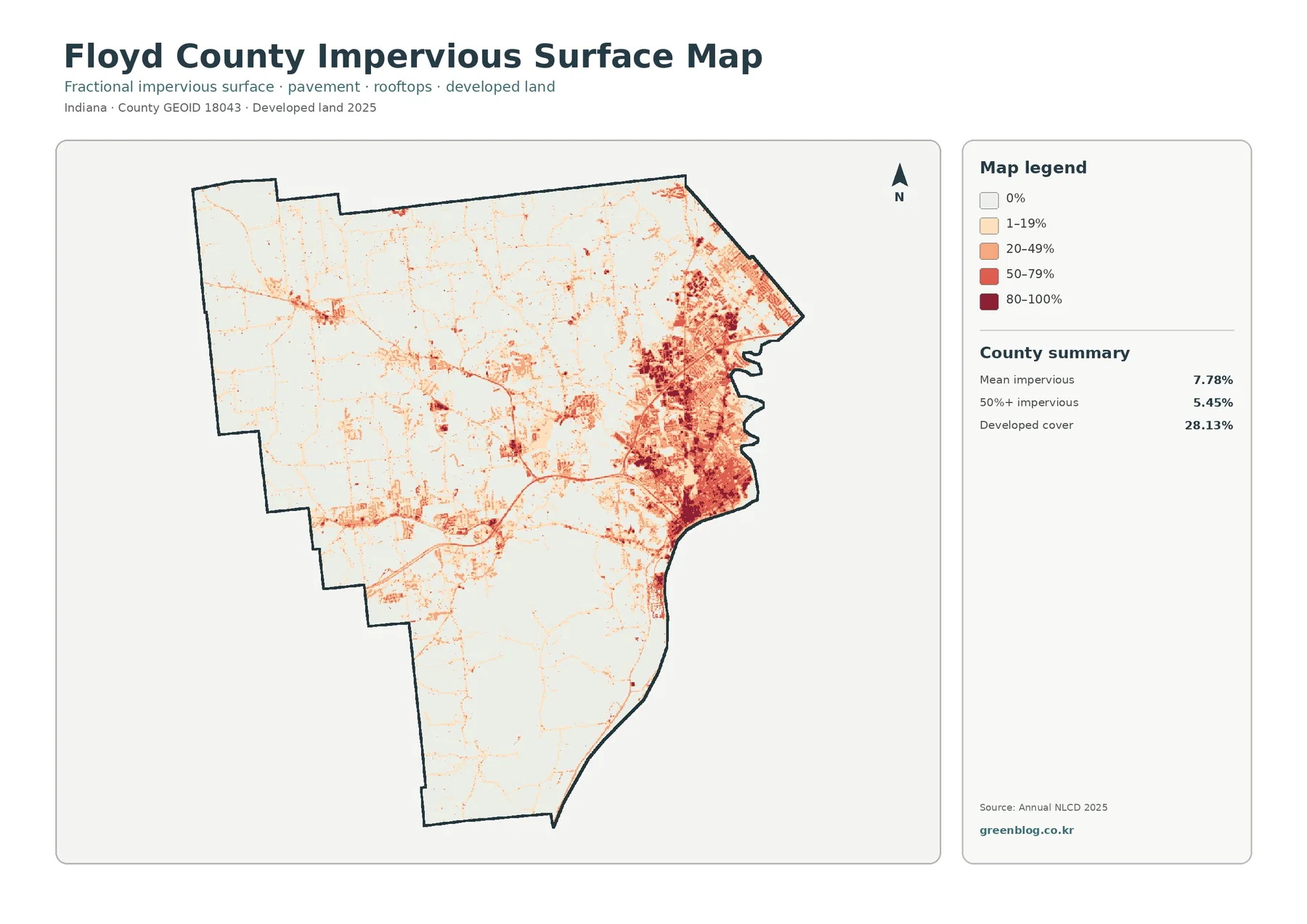
Mean impervious cover is 7.78%, and 5.45% of the county is mapped at 50% impervious or greater. Both figures are much lower than the 28.13% developed share. Developed classes can contain lawns, trees, soil, and other permeable surfaces around structures. The impervious map narrows the question to hard surfaces such as roofs, pavement, and parking areas that shed rather than absorb much of the rainfall reaching them.
The darkest values are overwhelmingly concentrated in the east and southeast. They overlap the broad New Albany-area developed footprint, then thin quickly toward the wooded south and much of the western county. Smaller hard-surface clusters and thin lines appear farther west. This distribution is why the countywide mean should not be treated as a typical value for every neighborhood or rural tract.
Fine linear features cross the rural landscape, but the preview does not label highways or local roads. A line that resembles a major route should not automatically be called I-64, State Road 64, or State Road 150 without a transportation layer. The map can show that hard surfaces follow certain linear paths. It cannot tell the reader the road name, traffic volume, construction date, or whether a transportation project caused nearby development.
Impervious cover is useful for framing runoff questions, yet it is not a flood map. Floyd County’s stormwater program identifies multiple watersheds and drainage systems across the county. Rainfall intensity, soil, slope, culverts, streams, floodplains, and local drainage infrastructure all affect water movement. A dark impervious cluster is one piece of that puzzle, not a complete risk assessment.
Planning boundaries should be added before small developed patches are given place names
Floyd County’s Plan Commission works with comprehensive planning, zoning, subdivision review, and development applications. Those records answer legal and administrative questions that the Annual NLCD layer cannot. A parcel may be zoned for development but still appear as agriculture or forest in 2025. A developed raster cell may cross a zoning line because the classification is based on surface appearance rather than property law.
This is especially important outside the main New Albany cluster. Georgetown, Greenville, Floyds Knobs, Galena, and other local places can be used as geographic references only after their boundaries or coordinates are checked. The land-cover map is excellent for showing where developed surfaces become denser, but it is not precise enough to assign each small patch to a town, subdivision, industrial site, or road corridor by itself.
The same rule protects against mistakes on the natural side of the map. A large green patch is not automatically a county park, state preserve, or privately managed forest. A teal patch is not automatically a regulated wetland. A yellow area is not proof of an active farm operation. Those questions require parcel, ownership, regulatory, or site-specific records in addition to the countywide raster classification.
The 16.55% endpoint difference is split between development and several other changes
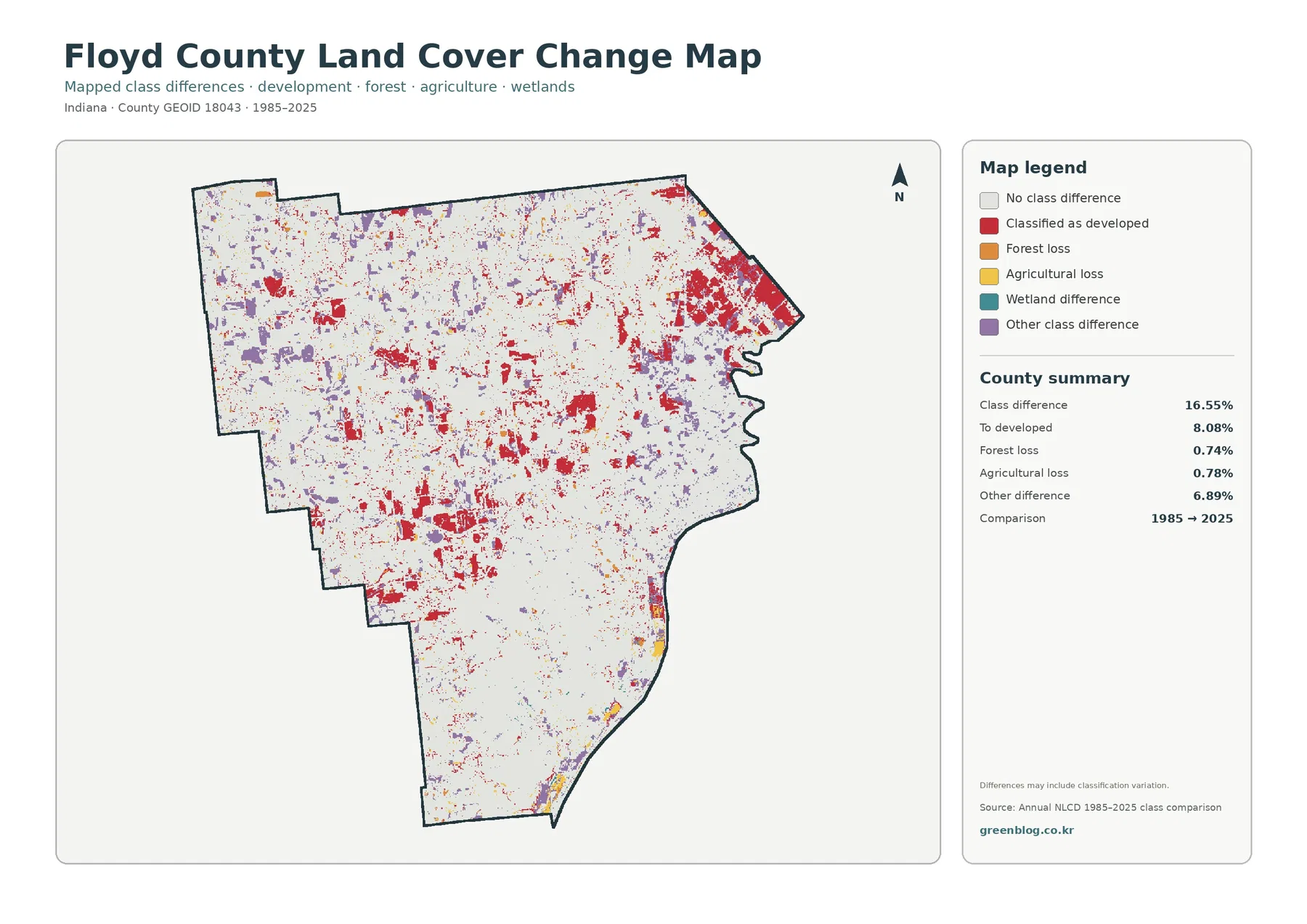
The total class difference between 1985 and 2025 is 16.55%. The supplied components list 8.08% as classified to developed, 0.74% as forest loss, 0.78% as agricultural loss, and 6.89% as other class difference. The total must not be rewritten as a 16.55% development-growth rate. Nearly half of the difference is represented by categories other than the developed-change component.
Red developed-change cells are most visible in the eastern urban area, but they also appear as smaller patches across the west and center. Their broad overlap with current development is expected, yet the current and change maps answer different questions. The 2025 land-cover map identifies the endpoint surface class. The change map identifies cells whose classifications differ between the two endpoints.
Purple other-difference cells are scattered widely and make up 6.89%. The map does not state that they represent one process, so they should not be relabeled as urban growth, agricultural conversion, storm damage, forest recovery, or classification error without evidence. Wetland difference is also shown in the legend, but the package provides no separate verified percentage. Creating one by subtraction would invent a statistic that is not supplied.
Forest loss and agricultural loss are endpoint classification terms, not event records. A cell that changed away from forest does not automatically document logging, and a cell that changed away from agriculture does not prove abandonment or construction. Intermediate annual images, aerial photography, permits, planning records, and field observations are needed to establish timing and cause.
Use the maps at county scale, then download the original JPG set for the comparison you need
For a general profile, begin with the 2025 overview because it shows the 43.78% forest share, the 28.13% developed footprint, and the 26.45% agricultural landscape together. Use the forest-and-farmland view when the main question is the relationship between woods and working land. Switch to the impervious map when the focus is the intensity of hard surfaces around New Albany and smaller built centers.
The change map is easier to understand after the current map. Readers first see what the county looks like in 2025, then compare where endpoint classifications differ from 1985. That order keeps red change cells from being mistaken for the entire developed class. In a presentation, two carefully chosen maps usually communicate more clearly than four maps shown without explanation.
Annual NLCD uses 30-meter raster cells. Each square receives a predominant class even when a road, tree line, lawn, creek, field, and building share the same area. Zooming enlarges the grid but does not create parcel detail. Mixed cells are especially important along the edge of New Albany, narrow drainage courses, small farm openings, and the boundary between forest and developed land.
Each original JPG measures 2480 × 1754 pixels. The maps work for screen presentations, reports, classroom handouts, and general print reference, but the package does not identify them as meeting an A3 high-resolution standard. Test a large print first. The files are not substitutes for surveys, parcel maps, official wetland determinations, flood-insurance products, building permits, or engineering plans.
Frequently Asked Questions
Why does Floyd County look so urban when forest is the largest land-cover class?
Forest covers 43.78% and is spread broadly through the south and interior. Developed land is smaller at 28.13% but is heavily concentrated on the eastern side around New Albany. A concentrated urban footprint can look visually dominant even when a more dispersed natural class covers more total area.
Why is mean impervious cover 7.78% when developed land is 28.13%?
Developed classes may include lawns, trees, bare soil, and other permeable surfaces around buildings and roads. Impervious cover isolates hard surfaces such as rooftops, pavement, and parking areas. The countywide impervious mean is therefore much lower than the broader developed-land share.
Does the 16.55% 1985–2025 class difference mean that much land was developed?
No. The developed-change component is 8.08%, while forest loss is 0.74%, agricultural loss 0.78%, and other class difference 6.89%. The 16.55% total combines several endpoint differences and cannot be used as a single development-growth percentage.
Sources and Reference Data
- MRLC Annual NLCD Data – official access point for annual land-cover and comparison products
- USGS Annual NLCD Land Cover Classification – definitions and guidance for forest, agriculture, developed land, wetlands, water, and related classes
- U.S. Census Bureau TIGER/Line Shapefiles – official county-boundary reference for Floyd County
- Floyd County Parks and Recreation Master Plan – official county context for the Ohio River, Little Indian Creek, local terrain, and recreation planning
- Floyd County Plan Commission – official county planning, zoning, subdivision, and development-review context
- Floyd County Stormwater – official county information on watersheds, drainage, and stormwater management
Map File Information
The ZIP contains four original JPG maps for comparing Floyd County's forest-dominated south, New Albany-area development, western farmland, impervious surfaces, and 1985–2025 class differences.
- Included Files: Use only the versions confirmed in the article and supplied images
- File Type: Use the confirmed download contents
- Intended Use: Printing, education, presentations, and map-based projects
Related Maps
- Adams County Indiana Land Cover Map
- Allen County Indiana Land Cover Map
- Bartholomew County Indiana Land Cover Map
Green Map creates custom-edited map images using open geographic data sources such as geoBoundaries, Natural Earth, OpenStreetMap, and government open data.
These maps are edited visual materials, not raw data files, and are provided for education, documents, presentations, and graphic reference.