The global slum population share map compares the percentage of each country or economy’s urban population living in households that meet the World Bank indicator definition of a slum household. The comparison is locked to 2022 rather than mixing each location’s latest observation. After regional and income-group aggregates are removed, the package contains 217 country/economy master rows, of which 181 have a numeric value and 36 remain source-missing.
The distribution is unusually wide. The median of the 181 numeric observations is 13.25%, while the simple unweighted mean is 23.68%. South Sudan is reported at 94.20%, Mali at 92.50%, Burkina Faso at 87.88%, Sao Tome and Principe at 82.39%, and Chad at 82.00%. At the other end, 17 rows are reported at exactly 0.0%. Those extremes are why a world map and country table communicate more than one average.
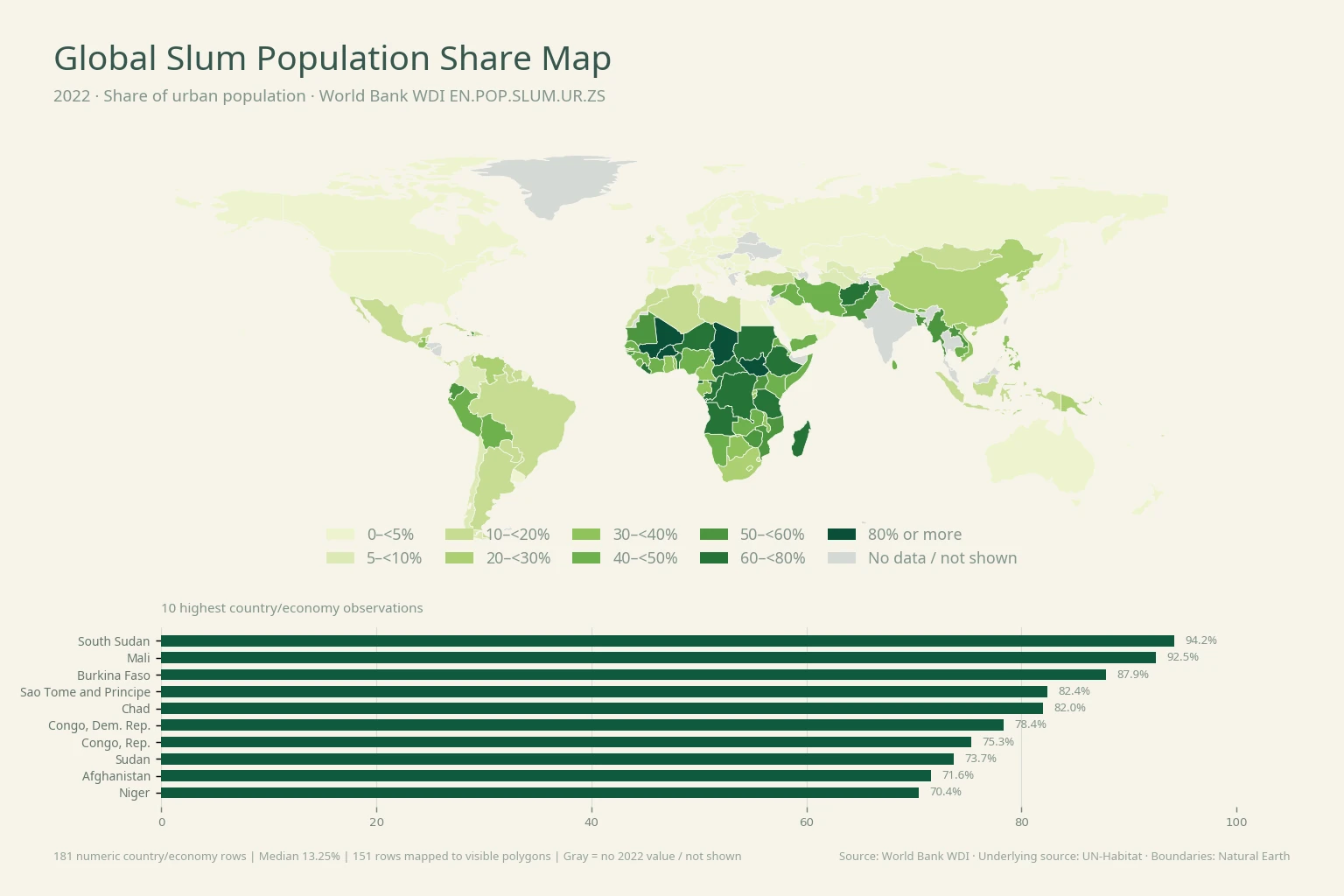
Table of Contents
What the slum-population indicator actually measures
World Bank series EN.POP.SLUM.UR.ZS is titled Population living in slums (% of urban population). The denominator matters: it is the urban population, not the total national population. A value of 50% therefore means that half of the urban population falls within the indicator’s slum-household definition. It does not mean that half of everyone in the country lives in a slum.
The World Bank metadata describes a slum household as a group of people under the same roof lacking one or more of five conditions: improved water, improved sanitation, sufficient living area, housing durability, and security of tenure. The underlying source is the UN-Habitat Urban Indicators Database. The metadata also notes that the successor SDG 11.1.1 framework considers inadequate housing, including affordability, as a complement to the older slum/informal-settlement concept. This article does not invent a broader composite; it maps the WDI series exactly as supplied.
A large low-share group coexists with a substantial high-share group
Of the 181 numeric rows, 73 are below 5%, equal to 40.3% of the statistical sample. Yet 30 observations are at or above 50%, 11 are at or above 70%, and 5 are at or above 80%. The simple mean sits well above the median because the high end extends into the 70–94% range.
| 2022 share of urban population | Countries/economies | Share of 181 |
|---|---|---|
| 0–<5% | 73 | 40.3% |
| 5–<10% | 13 | 7.2% |
| 10–<20% | 18 | 9.9% |
| 20–<30% | 7 | 3.9% |
| 30–<40% | 15 | 8.3% |
| 40–<50% | 25 | 13.8% |
| 50–<60% | 12 | 6.6% |
| 60–<80% | 13 | 7.2% |
| 80% or more | 5 | 2.8% |
The table shows why a binary high-versus-low map would be misleading. Seventy-three observations fall below 5%, but 25 sit between 40% and 50% and another 30 are at or above 50%. Broad bands preserve the global pattern without pretending that small decimal differences between countries are always substantively meaningful.
Nine of the ten highest observations are in Africa
| Country or economy | 2022 population living in slums |
|---|---|
| South Sudan | 94.20% |
| Mali | 92.50% |
| Burkina Faso | 87.88% |
| Sao Tome and Principe | 82.39% |
| Chad | 82.00% |
| Congo, Dem. Rep. | 78.36% |
| Congo, Rep. | 75.34% |
| Sudan | 73.70% |
| Afghanistan | 71.59% |
| Niger | 70.44% |
South Sudan and Mali are the only observations above 90% in this 2022 file. Burkina Faso is close to 88%, while Sao Tome and Principe and Chad are above 80%. The Democratic Republic of the Congo, Republic of the Congo, Sudan, Afghanistan, and Niger complete the top ten. Afghanistan is the only non-African economy in that group, making the African concentration the clearest spatial pattern in the map.
The geography does not establish one common cause. Housing supply, infrastructure coverage, land tenure, urban growth, income, conflict and displacement, and national statistical systems can differ sharply from one country to another. None of those explanatory variables is included in this one-series package, so the map identifies where the measured share is high without assigning causation.
Selected large economies do not converge on one level
| Country | 2022 share of urban population living in slums |
|---|---|
| Congo, Dem. Rep. | 78.36% |
| Ethiopia | 64.31% |
| Pakistan | 55.97% |
| Bangladesh | 51.51% |
| Nigeria | 48.50% |
| China | 26.32% |
| South Africa | 24.20% |
| Indonesia | 19.41% |
| Mexico | 17.60% |
| Brazil | 14.90% |
| Korea, Rep. | 4.50% |
| Japan | 2.00% |
| Canada | 1.10% |
| United States | 0.09% |
The selected-country comparison spans from 78.36% in the Democratic Republic of the Congo and 64.31% in Ethiopia to 0.09% in the United States. Pakistan is 55.97%, Bangladesh 51.51%, Nigeria 48.50%, China 26.32%, South Africa 24.20%, Indonesia 19.41%, Mexico 17.60%, and Brazil 14.90%. South Korea is 4.50%, Japan 2.00%, and Canada 1.10%.
These percentages are not counts of people. A smaller economy with a high share can have fewer affected residents than a much larger economy with a lower share. Estimating the number of urban residents living in slums would require a compatible 2022 urban-population series and a careful treatment of the statistical definition. That second dataset is not bundled here, so this article does not manufacture headcounts by multiplying unrelated values.
A reported zero is not the same as missing data
The source table reports exactly 0.0% for 17 country/economy rows. Those are numeric observations and remain in the distribution. The 36 rows without a 2022 value are different: they are kept as NA and excluded from means, medians, rankings, and colored classes. Replacing missing observations with zero would turn “no 2022 value” into a false statement about housing conditions.
Even a reported 0.0% should be read at the precision and methodology of the international series. It is the value published in WDI, not a universal claim that no household experiences inadequate housing or informal-settlement conditions under every possible definition. The safest interpretation stays inside the indicator contract rather than expanding it into a broader housing-quality score.
Why some statistical rows cannot be seen as separate polygons
The statistical calculations use all 181 numeric country/economy rows, while 151 of those rows match a visible polygon in the low-resolution Natural Earth layer used for the world map. Small island economies and separately reported territories can have valid values without appearing as an independent polygon at this scale. Sao Tome and Principe, Singapore, the Maldives, and several Pacific or Caribbean economies illustrate that limitation.
The 217-row master is also not a count of sovereign states. It reflects the World Bank country/economy geography set after aggregate regions and income groups are removed. The 2022 numeric coverage in this package is 83.4%. The map is therefore a spatial summary of the statistical table, not a replacement for it.
What this map can and cannot tell you about urban deprivation
The indicator is useful for locating high shares of urban residents living in slum households under a consistent international definition. It is not a poverty rate, homelessness rate, house-price index, rent-burden measure, infrastructure investment score, or direct measure of informal employment. Those topics can be related to urban deprivation, but each requires separate data and should not be inferred from this percentage alone.
A strong use of the map is diagnostic: identify countries or regional clusters with unusually high values, then connect official water, sanitation, housing, urban-growth, tenure, or income data for deeper explanation. A weak use would be to rank governments, cities, or living standards from this one measure without checking what the denominator and household criteria actually mean.
Data source and mapping method
Values come from the World Bank World Development Indicators series Population living in slums (% of urban population), code EN.POP.SLUM.UR.ZS. The unit is percent of urban population. The World Bank metadata glossary identifies UN-Habitat’s Urban Indicators Database as the underlying source, lists annual periodicity, and gives a current reference period of 2000–2022.
This package keeps only 2022 observations, removes regional and income-group aggregates, preserves source-missing values as NA, and performs no interpolation or backfilling. The map was generated directly from the verified CSV by joining ISO-3 codes to a Natural Earth low-resolution country layer. The classes are 0–<5%, 5–<10%, 10–<20%, 20–<30%, 30–<40%, 40–<50%, 50–<60%, 60–<80%, and 80% or more.
Frequently Asked Questions
Is the denominator total population or urban population?
Urban population. EN.POP.SLUM.UR.ZS reports the share of urban residents living in slum households, so a 50% value is not a claim that half of the entire national population lives in slums.
How does the indicator define a slum household?
World Bank metadata describes a household lacking one or more of improved water, improved sanitation, sufficient living area, housing durability, and security of tenure.
Are countries without a 2022 value treated as zero?
No. The 36 source-missing rows remain NA and are excluded from rankings and summary statistics. Numeric 0.0% observations are retained separately.
Is the 23.68% mean the global urban slum rate?
No. 23.68% is the simple unweighted mean across the 181 numeric country/economy observations. A population-weighted world rate is a different statistic.
Related Articles
Population change and infrastructure-access maps provide useful context without being treated as causes of slum prevalence. These are live Green Map articles that use separate official indicators.
- Global Population Growth Map – 2025 Country Comparison
- Global Electricity Access Map – 2024 Country Comparison
- Global Internet Use Map – 2024 Country Comparison
Green Map creates custom-edited map images using open geographic data sources such as geoBoundaries, Natural Earth, OpenStreetMap, and government open data.
These maps are edited visual materials, not raw data files, and are provided for education, documents, presentations, and graphic reference.