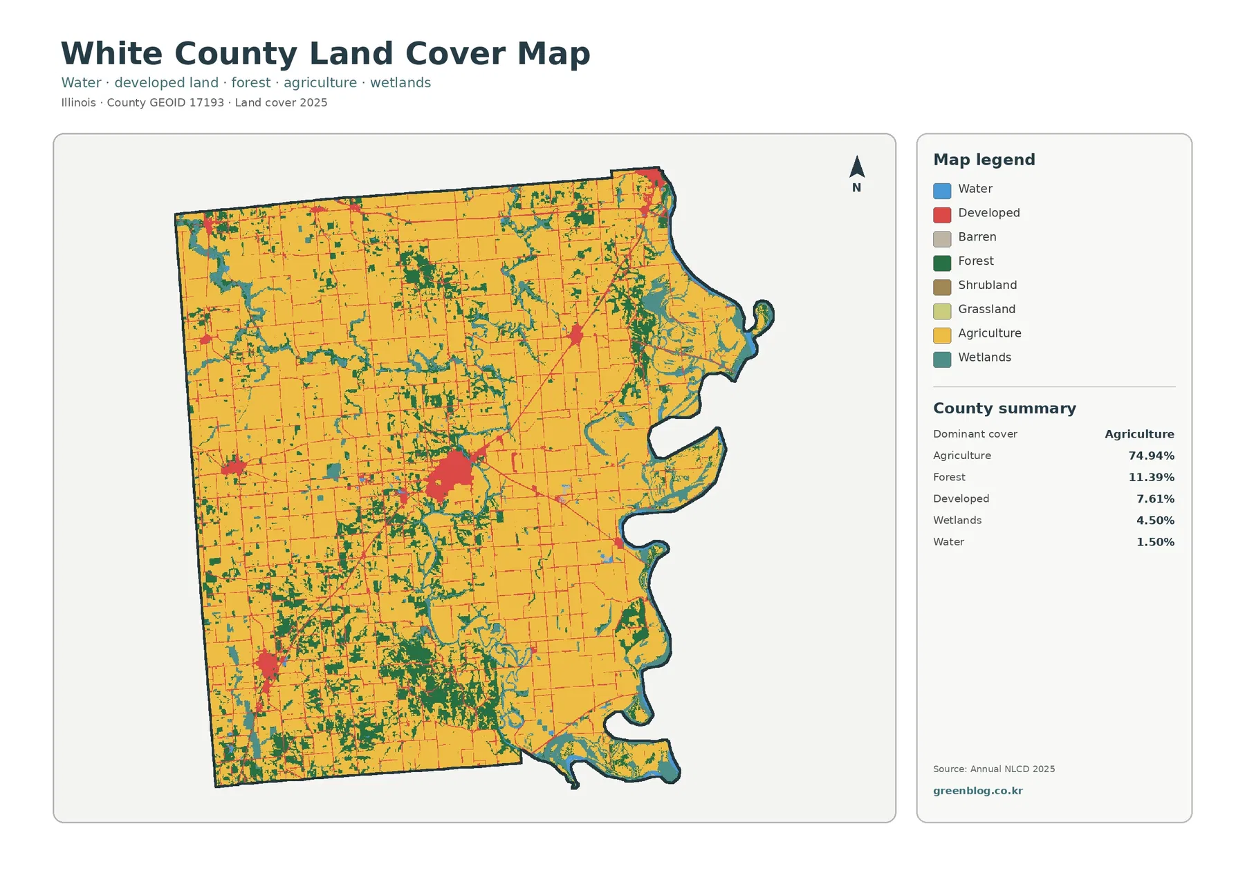
White County is overwhelmingly agricultural in the 2025 land-cover summary, with agriculture covering 74.94% of the county. The maps still show a landscape with several strong contrasts: woodland becomes much more common in the southern half, wetlands and water stand out along the irregular eastern edge, and the largest developed cluster sits near the middle of the county. Four map views on this page separate those patterns into current land cover, forest and farmland, impervious surface, and 1985–2025 class differences.
The WebP images are sized for quick viewing in the article. A single download farther down the page contains the four original JPG maps using the same County GEOID 17193 boundary, making it easy to compare the same location from one theme to another. These maps describe surface cover seen in satellite-based data; they do not show ownership, zoning, parcel rights, or whether a site can legally be developed.
Table of Contents
The broad pattern is simple at first glance, but the county is not uniform
Agriculture accounts for 74.94% of White County in the 2025 summary. Forest follows at 11.39%, developed land at 7.61%, wetlands at 4.50%, and water at 1.50%. Grassland is only 0.01%, while shrubland rounds to 0.00%. The yellow agricultural class therefore dominates the map, especially across the north and much of the interior. Yet the green and teal classes are not evenly scattered. They form larger concentrations in the south and along the eastern side, giving those parts of the county a visibly different texture from the broad farm blocks farther north.
The developed class is also concentrated rather than spread evenly. A large red cluster appears near the county center, with a smaller developed center in the southwest and several minor pockets elsewhere. Thin red lines extend through agricultural areas, but most of the county remains visually dominated by farms. Looking at location as well as percentage is important here: 7.61% developed cover is modest compared with agriculture, but its tight clustering makes it easy to identify on the map.
The central developed cluster is much broader than the county’s darkest impervious areas
Developed land on the general map includes more than rooftops and pavement. Lower-density developed classes can contain lawns, trees, bare soil, and other permeable surfaces mixed with roads and buildings. That is why White County’s 7.61% developed share should not be read as 7.61% hard surface. The impervious map answers a narrower question by estimating the fraction of each cell covered by surfaces such as pavement and rooftops.
Mean impervious cover is 1.68%, and only 0.55% of the county has impervious values of 50% or more. Most of the map is very light, reflecting the large area occupied by farmland, forest, wetlands, and other surfaces where water can infiltrate. The strongest values cluster in the central developed area, with smaller concentrations in the southwest and near the northeastern edge. Fine linear traces connect some of these places through the agricultural landscape.
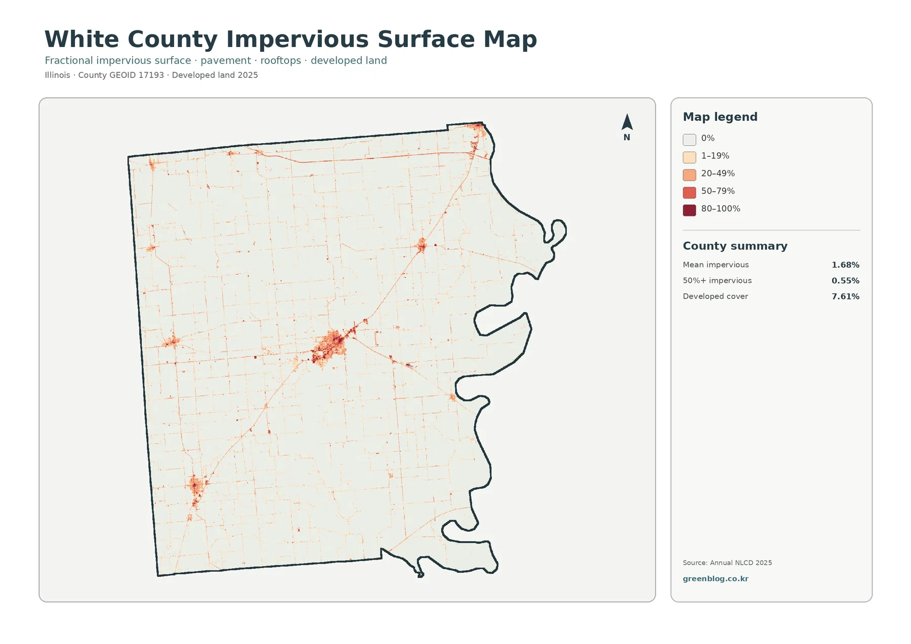
The thin lines on the impervious map are useful for seeing where harder surfaces form narrow corridors, but the image alone does not identify road names or road classes. Likewise, the central developed area contains both dark and light cells because built-up places are mixtures of hard and permeable surfaces. Comparing the land-cover and impervious maps side by side prevents a common mistake: treating every developed pixel as fully paved.
Impervious cover can be relevant to runoff, but this map is not a flood-risk or drainage model. Rainfall, topography, soil, drainage infrastructure, and receiving waters all matter for hydrologic behavior. The map supports a county-scale comparison of hard-surface intensity; it does not by itself establish where flooding will occur.
Southern White County contains the county’s most persistent woodland pattern
Forest covers 11.39% of White County, making it the second-largest class after agriculture. The forest-and-farmland view shows that this share is strongly uneven. Woodland patches become larger and more frequent across the southern and southwestern parts of the county, while much of the north consists of broad agricultural areas interrupted by smaller green fragments. Around the central developed cluster, woodland appears in broken pieces rather than a continuous belt.
The simplified forest-and-farmland map is useful because it removes much of the visual competition from developed and other classes. Cropland forms a broad yellow background, while forest and wetlands break that background into smaller pieces. In the south, green areas are often close to teal wetland patches. Along the eastern side, forest also appears near wetland-rich areas, creating a more complex edge than the large farm blocks visible in northern sections.
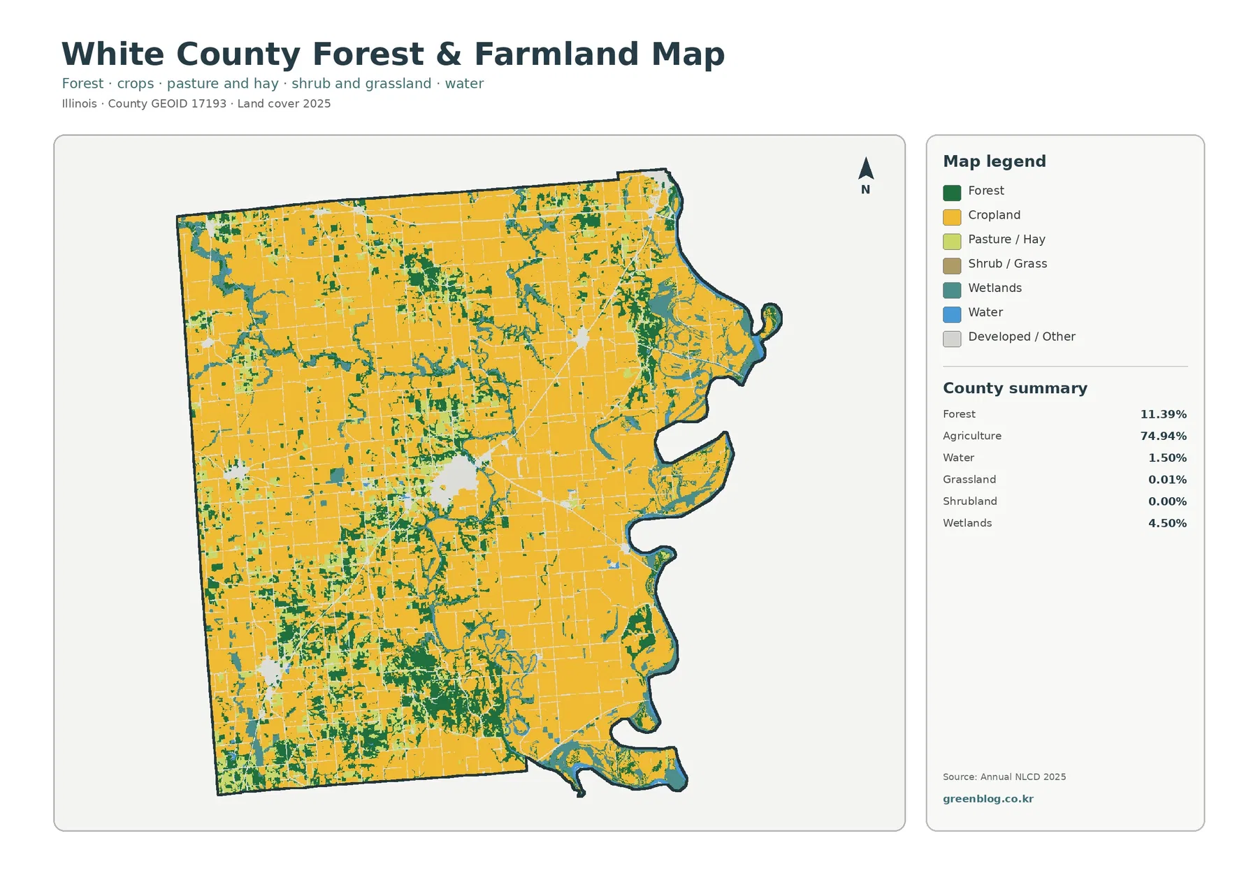
The map shows where forest exists, not why it has remained there. It does not directly provide elevation, soil type, drainage history, or land-management history. Those factors should not be inferred from the green pattern alone. What the image does support is a clear county-scale observation: forest cover is not evenly distributed, and southern White County has a noticeably more wooded appearance than the broad agricultural north.
Wetlands and water give the eastern edge a different land-cover mix
Wetlands make up 4.50% of the county and water 1.50%. Those shares are much smaller than agriculture, but their concentration makes them visually important. Teal wetland areas recur along the irregular eastern boundary, including the northeastern end and the lower eastern projections. Blue water appears near many of the same areas. Smaller wetland traces also occur through the interior, but the eastern side has the strongest combined water-and-wetland pattern.
Water and wetlands should be read as separate classes. Blue indicates cells classified as open water, while teal marks wetland cover that can include vegetation. A location where the colors touch does not mean they are interchangeable categories. This distinction is useful when comparing the general map with the forest-and-farmland view, where wetland areas interrupt both cropland and woodland in the south and east.
These are raster classifications rather than surveyed legal boundaries. Annual NLCD uses cells roughly 30 meters across, so narrow water features, wetland edges, trees, and farmland can share a cell. For county-wide pattern recognition, the concentration of wetlands along the eastern side is meaningful. For permitting, parcel review, or formal wetland delineation, a purpose-specific official dataset and field procedures are required.
The 1985–2025 change map records a 7.92% class difference, mostly in small scattered patches
The long-term comparison marks cells whose 1985 and 2025 land-cover classes differ. White County’s total class difference is 7.92%. The summary breaks that into 0.93% classified as developed, 0.57% forest loss, 1.17% agricultural loss, and 5.00% other class difference. The “other” category is the largest component, so the 7.92% total is not the same thing as a verified land-use conversion rate.
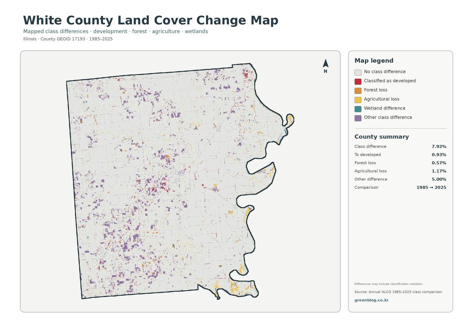
Change colors appear throughout the county as small patches rather than one large continuous zone. Developed-change cells are visible around the central built cluster and in smaller developed areas. Purple “other difference” cells are widespread across western, northern, and southern farm landscapes, while yellow and orange categories occur in scattered locations. The eastern edge also contains a mixture of change classes near current wetlands and water.
Several factors can contribute to a long-term class difference. Some differences represent real development or vegetation change, while others may reflect acquisition timing, classification methods, or mixed cells along boundaries. Confirming a specific change requires additional evidence such as other NLCD years, aerial imagery, or local records. The change map is best used to identify where closer investigation may be worthwhile.
Cross-checking the same location across the four maps reveals what each metric actually measures
Start with the central developed cluster. The general map shows a broad red developed area, while the impervious map concentrates its darkest values in a smaller core and along selected linear connections. The change map marks only some cells as conversion to developed or another class difference. Current development, hard-surface intensity, and long-term class comparison are therefore related but not interchangeable measurements.
The southern half tells a different story. On the general map, green forest and teal wetlands repeatedly interrupt the agricultural background. The forest-and-farmland map makes those breaks easier to follow, while the impervious view stays mostly pale across the same area. Scattered change cells appear in the long-term comparison without erasing the overall present-day pattern of farms mixed with woodland and wet areas.
Along the eastern edge, the four-map comparison is especially useful. Wetlands and water stand out first on the general map. The forest-and-farmland view shows how woodland and cropland fit around them, and the impervious image confirms that most of the same landscape has low hard-surface intensity. The change map adds historical class differences without implying that every wetland or water cell is newly formed. Reading all four views keeps those distinctions clear.
A 30-meter raster is strongest for broad county patterns, not parcel-level decisions
Annual NLCD represents the landscape as a grid, assigning a representative class or value to each cell. A cell roughly 30 meters wide can contain several real-world surfaces at once: a crop-field edge, trees, a narrow road, a small building, and water may all fall within the same area. The final class simplifies that mixture. Boundaries on the map should therefore be treated as mapped classification edges rather than surveyed property or regulatory lines.
At county scale, the major White County patterns are robust enough to describe clearly: agriculture dominates most of the interior, woodland is much more frequent in the south, wetlands and water are concentrated toward the east, and high impervious values are localized in a few developed centers. The maps are not substitutes for parcels, zoning, engineering surveys, ownership records, or official wetland delineations. The appropriate dataset depends on the question being asked.
A practical way to use the images is to begin with large color blocks and repeated directional patterns before zooming into small cells. Isolated pixels can be influenced by mixed surfaces or classification uncertainty. Larger clusters, such as the central developed area or the extensive agricultural background, are more suitable for county-level description. The same caution applies to the change map: a small colored patch is a prompt for verification, not proof of a specific land-use event.
Download the four White County JPG land-cover maps
The ZIP contains the White County general land-cover map, forest-and-farmland map, impervious-surface/developed-land map, and 1985–2025 land-cover change map as JPG files. All four use County GEOID 17193, so the central developed cluster, southern woodland, eastern wetlands and water, and surrounding farmland can be compared at matching locations. The WebP versions in the article are optimized for browsing, while the JPG files are convenient for local reference, documents, classroom work, and presentations.
Frequently Asked Questions
Where are forest and wetlands most visible in White County?
Forest is most noticeable across the southern and southwestern parts of the county, while wetlands and water are especially prominent along the irregular eastern edge and in the southeast. Northern sections generally show broader uninterrupted agricultural areas.
Why is developed cover 7.61% when mean impervious cover is only 1.68%?
Developed land can include lawns, trees, soil, and other permeable surfaces mixed with buildings and roads. Impervious cover measures the harder fraction such as pavement and rooftops. In White County, the highest impervious values are concentrated in the central developed cluster and a few smaller centers.
Does the 7.92% class difference prove that 7.92% of the county changed land use?
No. The total includes 5.00% in the “other class difference” category, and long-term comparisons can also reflect acquisition timing, classification methods, and mixed pixels. A specific site should be checked with additional imagery or records before drawing a land-use conclusion.
Sources and reference data
- MRLC Annual NLCD Data – annual land-cover and impervious-surface datasets
- USGS Annual NLCD Land Cover Classification – classification and legend documentation
- U.S. Census Bureau TIGER/Line Shapefiles – county boundary and standard geographic data
Map File Information
Download the four original JPG maps for White County to compare agriculture, forest, wetlands, developed land, impervious surface, and 1985–2025 class differences.
- Included Files: Land cover map, forest & farmland map, impervious & developed land map, land cover change map
- Intended Use: County land-cover comparison, farm and forest reference, wetland pattern review, impervious-surface comparison, and long-term class-change review
Related Maps
- Adams County Illinois Land Cover Map
- Alexander County Illinois Land Cover Map
- Bond County Illinois Land Cover Map
Green Map creates custom-edited map images using open geographic data sources such as geoBoundaries, Natural Earth, OpenStreetMap, and government open data.
These maps are edited visual materials, not raw data files, and are provided for education, documents, presentations, and graphic reference.