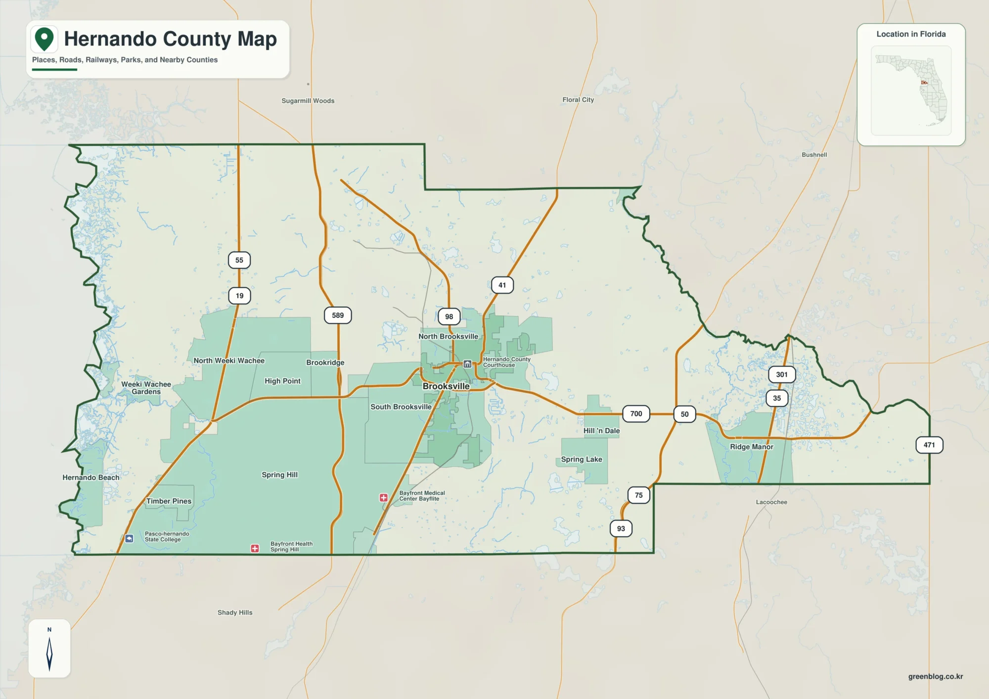
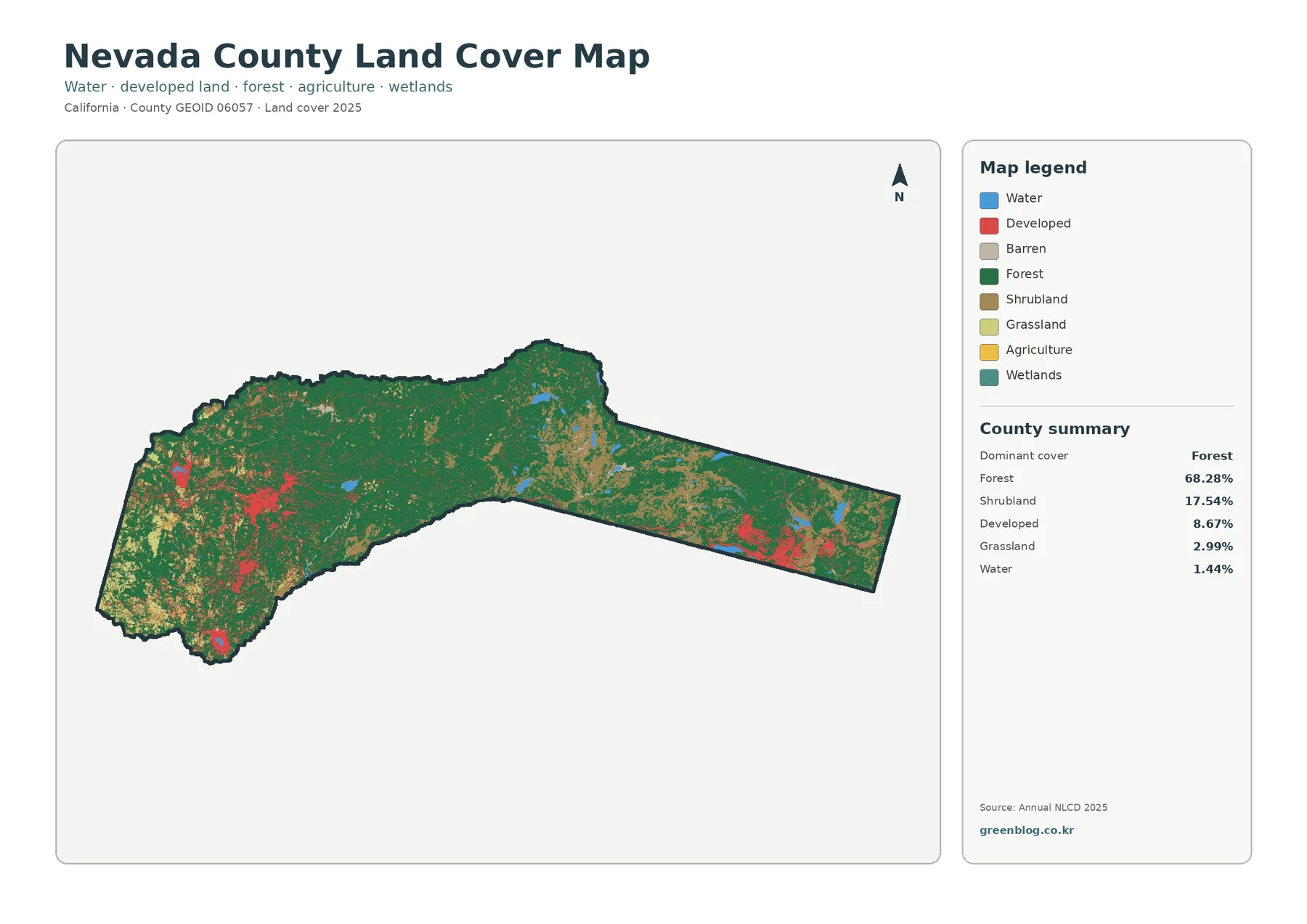
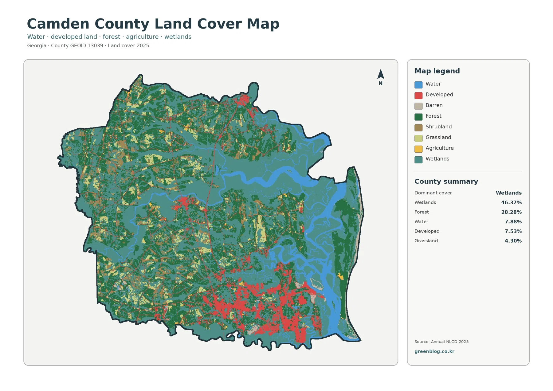
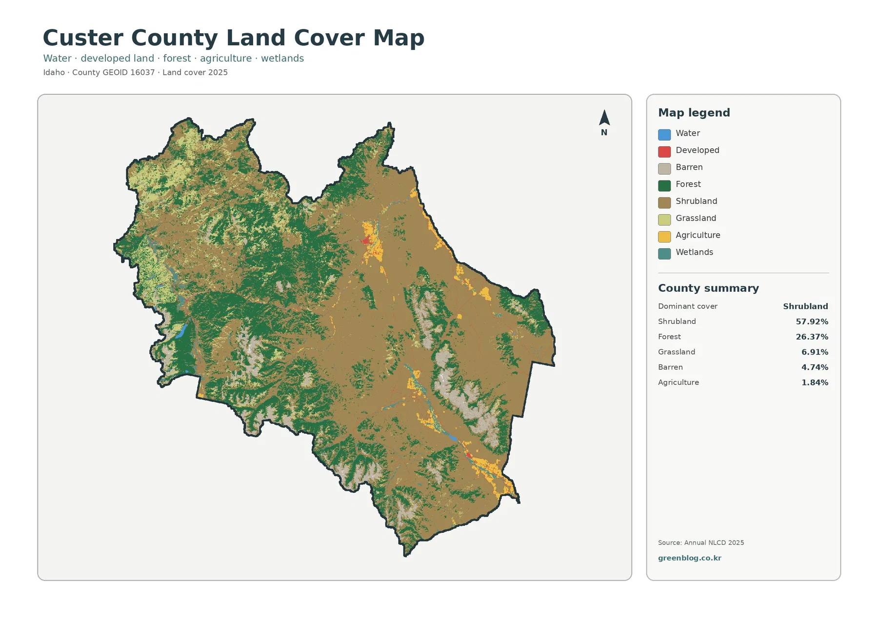
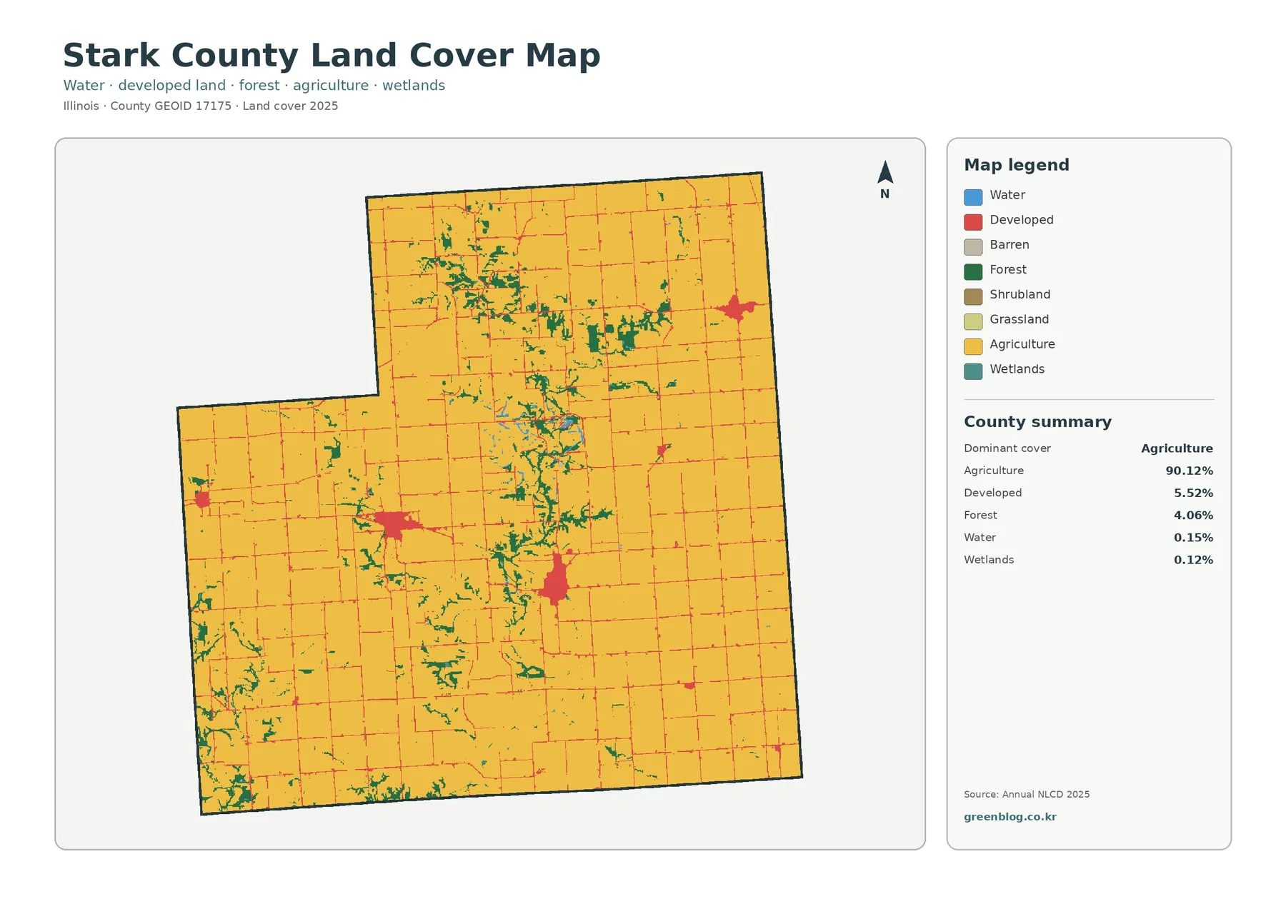
Stark County, Illinois is overwhelmingly agricultural in the 2025 land-cover data. Agriculture accounts for 90.12% of the county, so the first map is dominated by farm cover rather than by a large city, lake, or continuous forest. The four maps on this page separate that broad farm landscape into useful details: present land cover, forest and farmland, impervious surface, and mapped class differences between 1985 and 2025.
All four original JPG maps are available together in one download after the map explanations. They are useful when you want to compare the small developed centers with the surrounding fields, trace the narrow wooded areas that break up the farm grid, or check where long-term class differences appear. These are land-cover maps, not parcel, ownership, zoning, or building-permit maps, so the page keeps those uses clearly separated.
Table of Contents
Agriculture fills the frame, but the county is not visually uniform
The 2025 summary makes the basic pattern unusually clear: agriculture is 90.12%, developed land is 5.52%, forest is 4.06%, water is 0.15%, and wetlands are 0.12%. A viewer can therefore understand the county faster by looking at where the minority classes occur instead of treating the large agricultural percentage as the whole story. Roads form a fine network through the fields, compact developed clusters interrupt the yellow farm cover, and irregular green strips cut across some of the otherwise rectilinear agricultural areas.
Wooded drainage patterns stand out inside the farm grid
The forest-and-farmland map removes much of the visual competition from developed classes, making the 4.06% forest share easier to locate. Green cover is not concentrated in one large block. Instead, it appears in branching and curving shapes, especially through the northern and central portions of the county, with additional patches toward the western and southwestern edges. Those shapes contrast sharply with the broad, straight-edged agricultural areas around them.
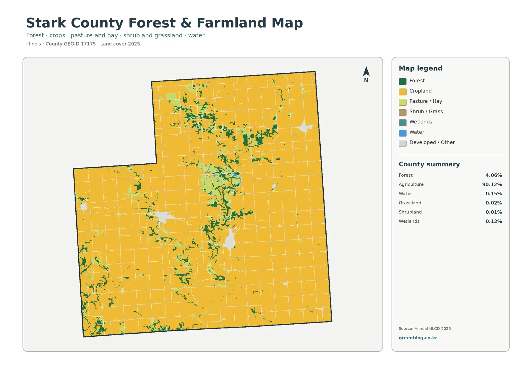
Some of the green features lie near the few mapped water and wetland cells, which makes the relationship between wooded cover and drainage features worth comparing. The map supports a careful statement that forest and water-related cover often occur near one another in parts of the county. It does not prove that a particular stream caused a woodland to remain, and it does not establish a protected riparian boundary. That distinction matters when a visual association is obvious but the map does not provide a causal explanation.
Impervious cover stays low outside compact settlement centers
Impervious surface measures hard cover such as pavement and rooftops that limits direct infiltration of water into the ground. The countywide mean is only 1.10%, and just 0.34% of the county is summarized as having more than 50% impervious cover. Those values fit the visual impression of a rural county: most of the map is very light, with stronger colors appearing only in a few compact centers and along parts of the road network.
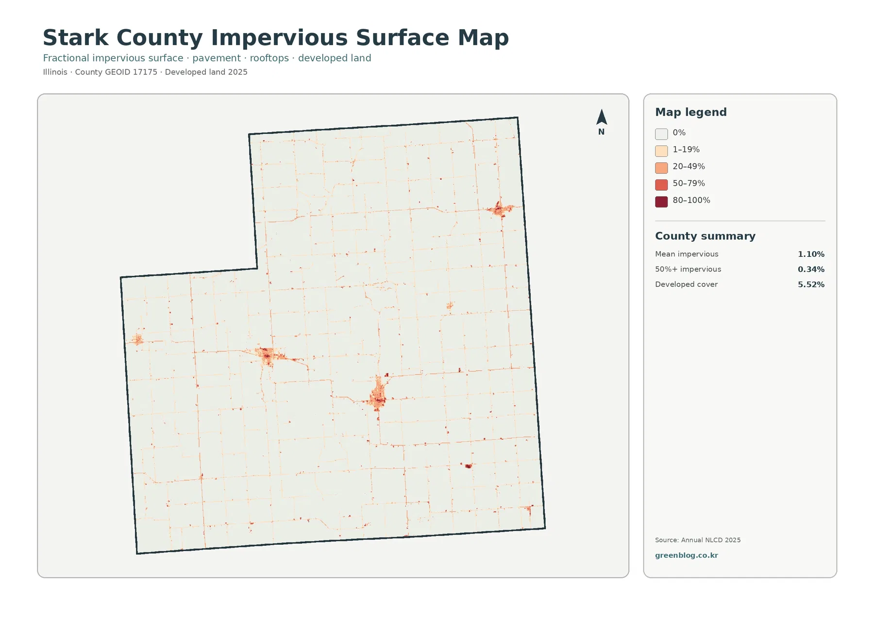
The map shows several small concentrations rather than a continuous high-value corridor. A cluster in the northeastern part of the county, another in the south-central area, and smaller western concentrations stand out against the pale agricultural background. Thin lines connect many of these places because roads add narrow strips of impervious surface through farmland. The image makes the rural road grid visible without turning every road into a claim about urban growth.
The 1985–2025 change map is scattered, not dominated by one large conversion
Stark County’s mapped class difference between 1985 and 2025 is 3.90%. The supplied summary breaks that total into 0.53% classified to developed, 0.27% forest loss, 0.22% agricultural loss, and 2.86% other class difference. Most of the county therefore remains in the no-difference color. The changed cells appear as small patches, short lines, and isolated groups rather than as one broad band that reshapes the county.
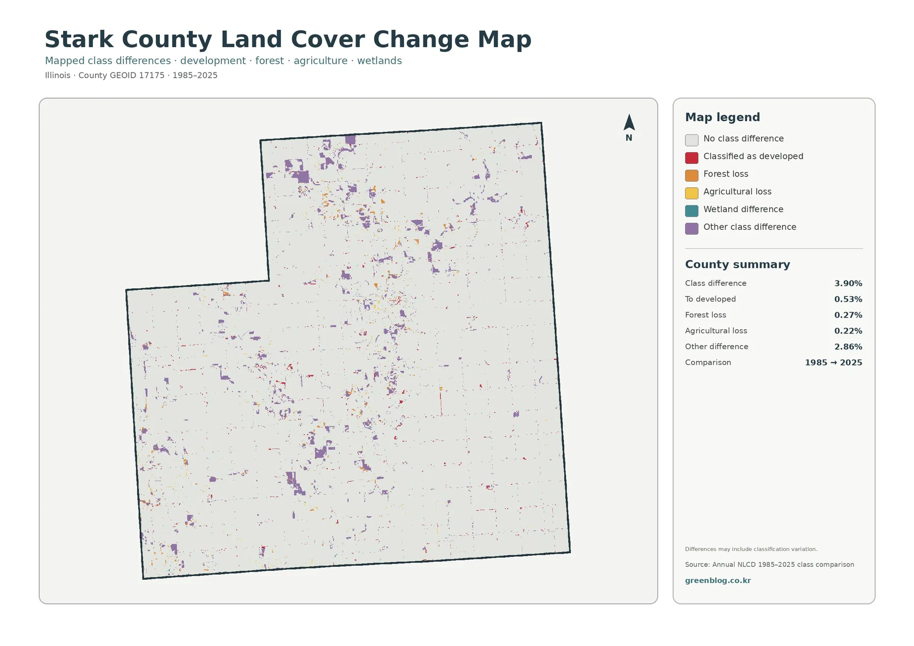
The largest change category is “other class difference” at 2.86%, so the change layer must be read cautiously. The map itself warns that differences may include classification variation. A cell can receive a different class because the surface actually changed, but imagery, classification methods, mixed pixels, or the exact position of a boundary can also affect the comparison. The map is therefore good for locating candidate areas of change, not for assigning a precise history to a farm field or building site.
Comparing the four views reveals details hidden by the 90% headline
A practical way to read the set is to start with the general land-cover map and identify the dominant agricultural background. Next, switch to the forest-and-farmland map to locate the branching green areas that interrupt the farm blocks. The impervious layer then isolates the few places where pavement and rooftops are concentrated. Finally, the change map shows whether those same areas contain more 1985–2025 class differences than the surrounding agricultural sections.
Raster classification is generalized and does not follow parcel lines
Annual NLCD is a raster dataset, which means the landscape is represented by a regular grid of cells rather than by surveyed parcel polygons. Land-cover products are commonly used at 30-meter cell size. Within one cell, a road edge, crop field, trees, a yard, and a building can be mixed together. The final class summarizes that area, so narrow features and sharp property boundaries may look simplified or slightly displaced when compared with detailed aerial photography.
Mixed pixels are particularly relevant in Stark County because narrow wooded features run through large agricultural blocks. A strip of trees can be narrower than a cell in places, while a small pond or wetland may occupy only part of a cell. The map can still reveal the countywide pattern, but it should not be used to measure a setback, locate a fence, or determine exactly where one cover type stops and another begins.
Choosing the right JPG for a report, class, or local comparison
The general land-cover JPG is the best starting image when the goal is to explain the county at a glance. It puts the 90.12% agricultural share in context while still showing where development and forest occur. The forest-and-farmland version is more focused when the subject is agriculture, conservation, wooded drainage, or habitat context. Its simplified palette makes narrow green areas easier to follow across the farm grid.
Use the impervious image when the question concerns the intensity of hard surfaces rather than the mere presence of development. Because Stark County’s mean is only 1.10%, the map makes compact settlement centers and roads stand out sharply. Use the 1985–2025 change image when the subject is long-term class difference. It should always be presented with the note that some mapped differences may reflect classification variation rather than a documented land-use event.
Frequently Asked Questions
Does 90.12% agriculture mean that 90.12% of Stark County is legally zoned for farming?
No. The 90.12% figure is a 2025 land-cover classification from the supplied map data. It describes agricultural cover observed across the raster grid, not the legal zoning assigned to parcels. Zoning, ownership, assessed use, and building rights require separate county records. The land-cover map is useful for seeing how dominant farming is in the landscape, but it is not a substitute for those legal sources.
Can the 3.90% class difference be quoted as the exact amount of real land conversion since 1985?
It should be described as mapped class difference, not as a verified parcel-by-parcel conversion rate. The comparison includes 0.53% to developed, 0.27% forest loss, 0.22% agricultural loss, and 2.86% other difference, and the map warns that classification variation may be included. Site-level conclusions require intermediate imagery, local records, or other evidence that can confirm what actually changed and when.
Sources and reference links
- MRLC Annual NLCD Data – Annual NLCD land-cover and impervious-surface data access
- USGS Annual NLCD Land Cover Classification – official explanation of land-cover classes and classification
- U.S. Census Bureau TIGER/Line Shapefiles – reference geography for county boundaries
- Stark County Soil & Water Conservation District – county-specific soil, water, woodland, wildlife, and conservation information
- Stark County Building & Zoning – official zoning and construction information that should be kept separate from land cover
- Illinois Extension – Henry, Mercer, Rock Island and Stark Counties – local agriculture and natural-resources education serving Stark County
Map File Information
The four original Stark County JPG maps are bundled in one ZIP for comparing agriculture, forest, developed surfaces, and long-term land-cover differences.
- Included Files: land cover map, forest and farmland map, impervious surface map, land cover change map
- File Type: ZIP containing four JPG maps
- Intended Use: side-by-side reference, printing, classroom material, and county-scale land-cover comparison
Related Maps
- Adams County Illinois Land Cover Map
- Alexander County Illinois Land Cover Map
- Bond County Illinois Land Cover Map
Green Map creates custom-edited map images using open geographic data sources such as geoBoundaries, Natural Earth, OpenStreetMap, and government open data.
These maps are edited visual materials, not raw data files, and are provided for education, documents, presentations, and graphic reference.