St. Clair County sits on the Illinois side of the St. Louis metropolitan area, and its land-cover pattern changes sharply from west to east. The 2025 map places the densest developed cover along the western and northwestern side of the county, while broad agricultural areas dominate much of the east and south. The county summary is 55.25% agriculture, 25.37% developed land, 9.93% forest, 6.98% wetlands, and 2.05% water. Four maps on this page separate those patterns so the urban edge, farmland, natural cover, impervious surface, and long-term change can be compared without treating them as the same thing.
The four original JPG maps are available together in one download after the map explanations. They are useful when you want a clean county-wide reference for printing, classroom work, environmental discussion, or side-by-side comparison. These are land-cover maps, not parcel or zoning maps: the colors describe what the ground was classified as being covered by, rather than ownership, legal land use, or development rights.
Table of Contents
A metropolitan edge gives way to a broad farm landscape
The strongest visual contrast in St. Clair County is between the developed west and the agricultural east. A large red area fills much of the northwest and spreads through the west-central portion of the general land-cover map. Farther east, yellow agricultural cover becomes more continuous and forms large blocks separated mainly by roads, small settlements, drainage features, wetlands, and scattered wooded patches. The south also remains largely agricultural, although developed pockets and natural corridors break up the farm pattern in several places.
This is a useful county for seeing how a metropolitan landscape can meet productive rural land within one boundary. East St. Louis and the Mississippi Riverfront lie on the western side of the county, while Belleville and other developed communities extend farther inland. County planning documents also identify transportation and development activity around I-64, I-255, the river ports, MidAmerica St. Louis Airport, and Scott Air Force Base. Those references help locate the broader human setting, but the map itself only shows cover. It does not prove that a particular road, airport, or development project caused an individual mapped change.
Wetlands and forest keep the county from reading as a simple two-part urban-versus-farm map. Green forest patches appear around drainageways, along parts of the western and southern margins, and in irregular clusters within the agricultural interior. Blue-green wetland cover forms branching shapes in several central and southern areas. Water occupies only 2.05% of the county, yet its placement matters because water and wetlands often form narrow corridors that remain visible even where their total area is modest.
The 2025 land-cover map puts the 55.25% agricultural share in context
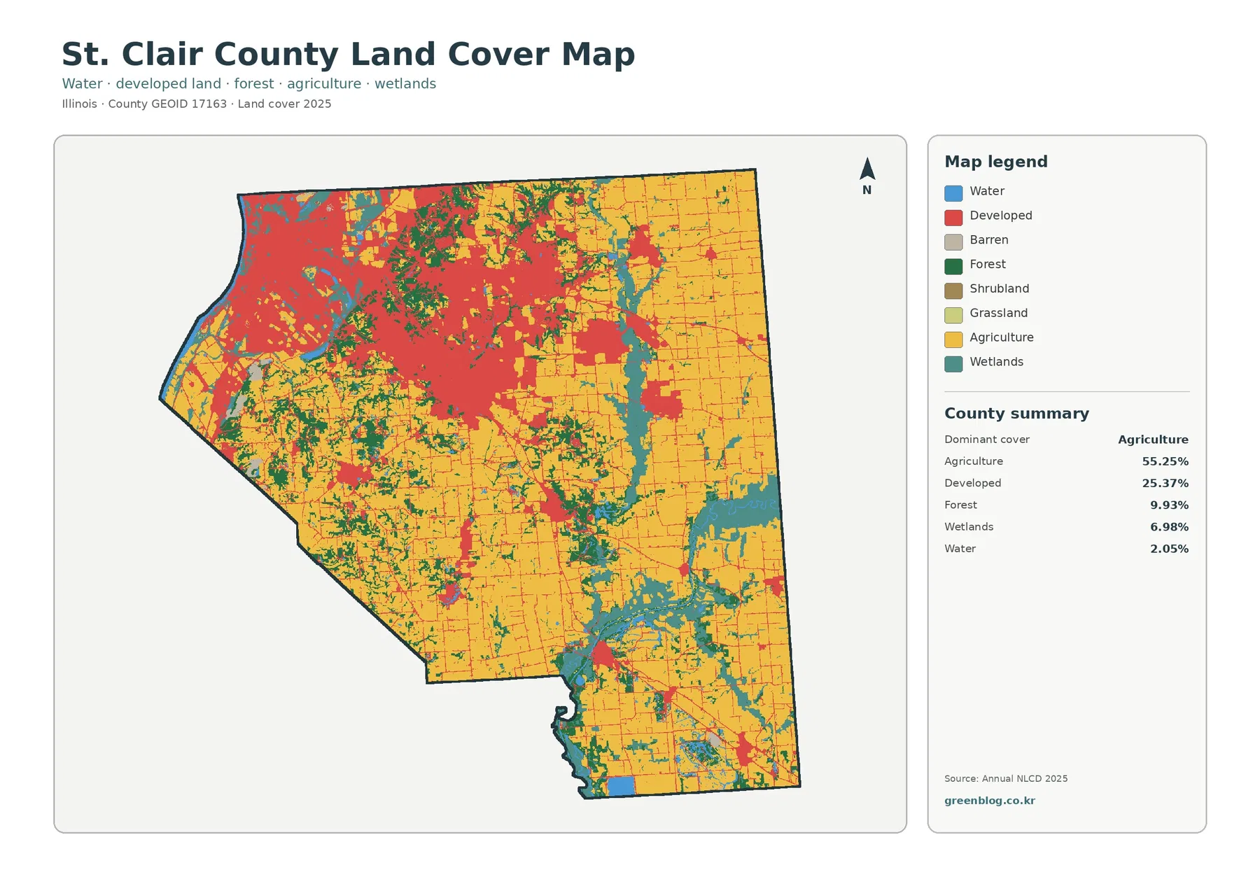
Agriculture is the dominant class at 55.25%, but the map shows why a single countywide percentage cannot describe the whole landscape. In the east and southeast, agricultural cover forms broad, connected areas. In the west, that same class is broken into smaller pieces by development, forest, wetlands, and water. The central part of the county works as a transition between those conditions, with farm cover still extensive but interrupted more often by developed corridors and drainage-related natural cover.
Developed land accounts for 25.37%, a large share for a county that also has more than half of its area in agriculture. The western concentration is visually dominant, but developed cover also appears as smaller hubs and narrow lines across the farm belt. NLCD developed classes can include a mixture of pavement, buildings, lawns, trees, and other vegetation depending on development intensity. For that reason, a red area should not automatically be read as a fully paved or high-density city block.
Forest makes up 9.93% and wetlands 6.98%. Neither class rivals agriculture in total area, yet both help define the shape of the rural landscape. Forest tends to form irregular patches rather than large rectangular fields, while wetlands often follow more sinuous, branching forms. Looking at those shapes is more informative than simply ranking the percentages. They show where natural cover interrupts the agricultural grid and where river or drainage environments remain evident inside a heavily settled metropolitan county.
Impervious surface separates built intensity from the broader developed class
The impervious surface map answers a different question from the general land-cover map. Impervious surface means roofs, pavement, and other hard surfaces that allow little water to soak directly into the ground. St. Clair County has a mean impervious value of 8.98%, and 6.75% of the county is mapped at 50% impervious or higher. Those numbers are not supposed to match the 25.37% developed-land share, because developed land can contain substantial vegetation while still belonging to a developed NLCD class.
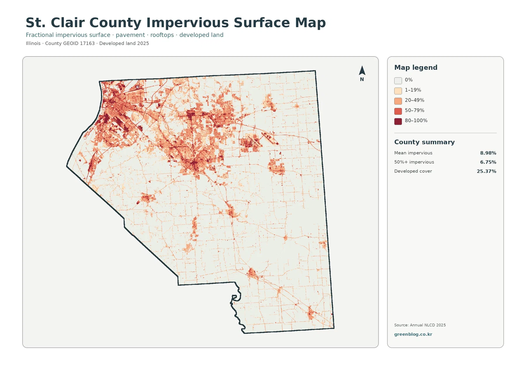
The darkest impervious values cluster in the west and northwest, where the county is most urbanized. Medium and lower values spread outward through connected developed areas, while thin lines trace roads across the agricultural interior. Small towns and other built locations appear as compact islands or nodes in the east and south. The result is a useful density check: a place can be classified as developed on the land-cover map but show relatively modest impervious cover if yards, trees, or other vegetation make up much of the surface.
This map can also be paired with wetlands and water when discussing stormwater context. Hard surfaces and low-lying water-related cover occur close to one another in parts of the county, especially toward the urbanized west. That spatial relationship is worth noticing, but it is not a flood-risk map. Floodplain boundaries, drainage capacity, levees, elevation, sewer conditions, and local engineering all require separate official sources. St. Clair County maintains floodplain and planning documents for those questions.
The county comprehensive plan describes major transportation and economic-development corridors associated with I-64, I-255, river and rail activity, airports, and other infrastructure. The impervious pattern is consistent with a county that has concentrated metropolitan development plus smaller built centers across the farm belt. Still, the safest reading is descriptive: the map shows where hard surface is concentrated today, while planning documents explain the regional setting through which that pattern can be understood.
Forest, farmland, and wetland corridors are easier to see after developed areas are muted
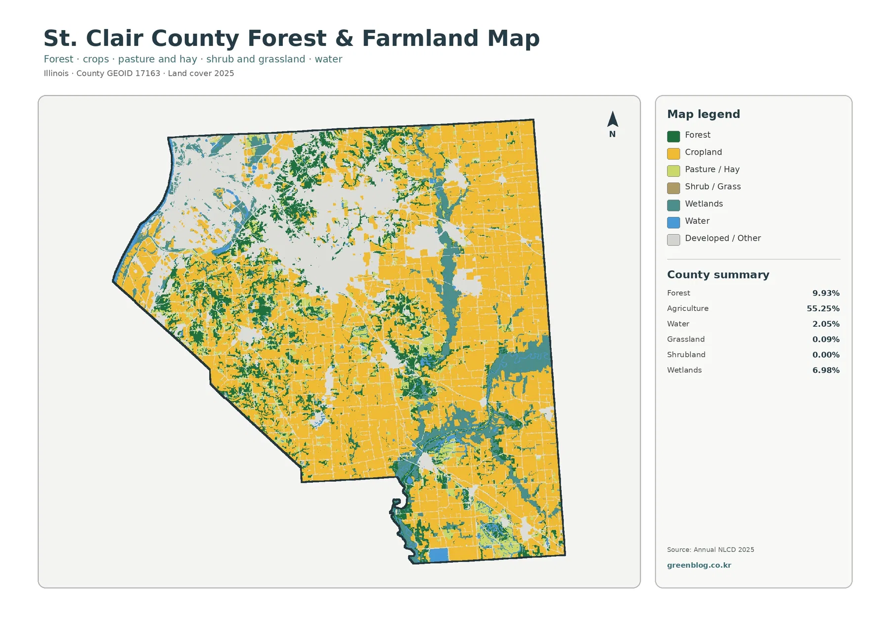
Once developed and other classes are pushed into a pale background, the agricultural structure becomes much clearer. Cropland spreads across the east, southeast, and much of the south in large connected blocks. The western side is more fragmented, where urban land and natural cover reduce the continuity of the farm pattern. This makes the map especially useful for comparing the county’s rural interior with its metropolitan side without letting the developed color dominate every visual decision.
Forest does not form one continuous belt. Instead, wooded areas appear in branching and irregular patches that often sit along drainage corridors, around wetland complexes, or at the edges of cultivated areas. Those patterns are especially visible in parts of the west-central and southern county. The map does not identify tree species, ownership, forest age, or management status, so it should be used to locate wooded cover rather than to infer ecological quality from color alone.
Wetlands are a substantial secondary class at 6.98%. In several places they create elongated or branching shapes that cut across farm country, and in the southern half they become especially noticeable around water-related corridors. The Illinois Department of Natural Resources describes the American Bottoms near East St. Louis as part of the Lower Mississippi River Bottomlands, a region historically associated with bottomland forest, wet prairie, and marsh environments. That regional context helps explain why wetland and water cover deserve attention on the western side even though modern development is extensive there.
Agricultural color should also be read at the appropriate level of detail. This map does not identify a specific crop, farm operator, soil rating, or parcel boundary. It tells you where the 2025 land-cover classification treats the surface as agricultural. For broad comparison, that is enough to show that the county’s eastern and southern landscapes remain heavily farmed and that natural corridors and developed nodes break that pattern unevenly.
The 1985–2025 comparison concentrates mapped development change in the west
The change map compares land-cover classification between 1985 and 2025. The county summary reports class differences across 14.15% of the area. Cells classified as becoming developed account for 6.27%, agricultural loss for 0.85%, forest loss for 0.34%, and other class differences for 6.37%. The remaining majority of the map is shown as having no class difference under this comparison. These categories provide a broad view of where the mapped landscape differs across four decades.
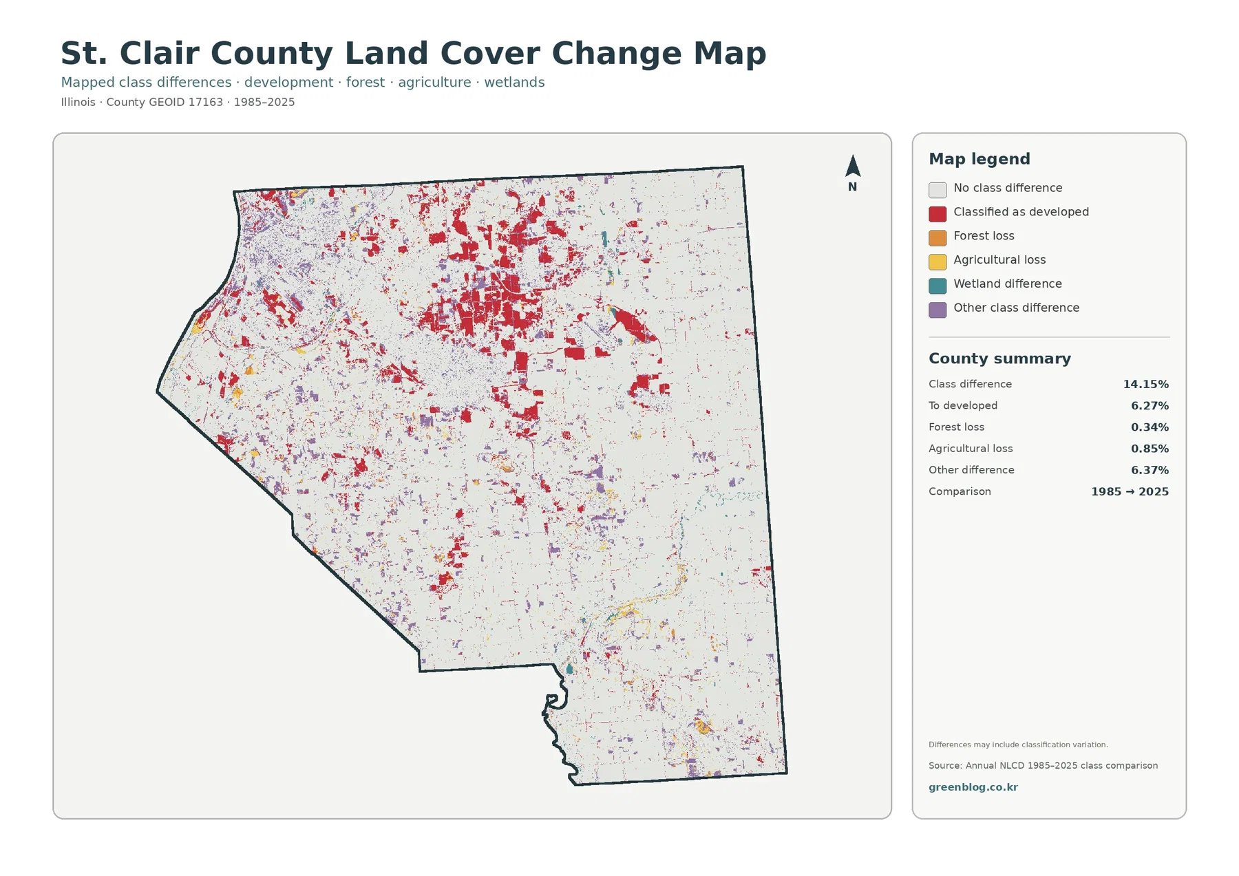
Red change patches are densest across the western and northwestern part of the county, around and beyond the present developed landscape. Smaller red areas appear in central, eastern, and southern locations as well, usually as compact patches or thin extensions rather than the broad concentration seen near the metropolitan side. This distribution makes the map useful for locating long-term development change without implying that every red cell changed at the same time or through the same type of project.
The agricultural-loss and forest-loss percentages are much smaller than the mapped change-to-developed share. It would be a mistake, however, to subtract those values mechanically and claim that all agricultural or forest loss became development. The map includes 6.37% in other class differences, and the legend explicitly notes that differences can include classification variation. A sound reading compares the change map with the 2025 cover map and treats individual colored cells as leads for further investigation rather than as parcel-level historical records.
That caution matters most around edges. A 30-meter-scale land-cover product generalizes what is on the ground, and mixed pixels can contain more than one real surface type. Improvements in imagery, classification methods, or the exact placement of a boundary can also change the class assigned to a cell. Large clusters of change are useful for understanding broad landscape evolution; a single cell or narrow line deserves much less confidence without supporting imagery or local records.
Four maps work best as a sequence rather than four separate illustrations
For a quick county overview, start with the 2025 land-cover map. It establishes the dominant farm belt, the western developed concentration, and the wetland and forest corridors that cut through them. If your question concerns urban intensity, move next to the impervious surface map. It shows which developed places contain the greatest concentration of hard surface and which areas are more lightly built even though they belong to a developed class.
For rural and environmental comparison, switch to the forest and farmland view. This makes the continuity of cropland and the placement of wooded or wet areas easier to follow. The change map then adds a time dimension by showing where the 1985 and 2025 classifications differ. Used in that order, the four maps answer progressively narrower questions without requiring the reader to treat one image as a complete description of the county.
A classroom or presentation can use the same sequence. Students can first estimate which cover dominates, check the 55.25% agricultural summary, and then ask why 25.37% developed land does not equal the 8.98% mean impervious value. A second exercise can trace wetland corridors and compare them with forest patches. A final comparison can locate the strongest red development-change clusters and see whether those places are now part of the present developed landscape.
For environmental or watershed discussion, the maps can help identify places where agriculture, wetlands, water, forest, and built cover meet. Those transition zones are often more informative than the center of a uniform field or a fully developed block because several surface types occur close together. The maps do not replace field surveys or hydrologic analysis, but they provide a consistent county-wide base for deciding where a closer look may be worthwhile.
What the maps can and cannot tell you at local scale
Annual NLCD is designed for consistent land-cover comparison across large areas, not for legal parcel decisions. Raster cells generalize the surface into a grid, and a cell that contains a road, lawn, trees, and a building may be represented by one class or a fractional impervious value. This is why boundaries between development, agriculture, forest, and wetlands can look blocky at close zoom. The pattern is meaningful at neighborhood, corridor, and county scales, but it should not be treated as a survey line.
Land cover is also different from zoning and ownership. An agricultural-colored cell does not prove that a parcel is legally zoned for agriculture, and a developed cell does not establish permitted density or land-use rights. St. Clair County GIS maintains parcel, street, address, and multiple boundary layers, while the Building & Zoning Department provides zoning and floodplain materials. Those local sources are the right place to check a property-specific question after the land-cover map has been used for broad context.
Time is another limitation. The current maps refer to 2025, while the change map compares 1985 with 2025. Construction, vegetation change, farming practices, restoration, or other land-cover changes after the observation period will not be reflected until a later dataset captures them. Likewise, a location that changed more than once during the forty-year interval may appear only according to the two endpoint classifications used in this particular comparison.
The maps are strongest when they are used as a visual index rather than a final answer. They can show where developed land is concentrated, where farms remain continuous, where forest and wetlands persist, and where mapped classes differ over time. Once a specific site becomes important, higher-resolution imagery, county GIS, floodplain data, field observations, or other specialized records should take over.
Using the JPG set for printing, comparison, and reference
The downloadable JPG files preserve the full map layouts, including title, legend, county outline, summary statistics, and source note. That makes them more useful than screenshots when you need consistent presentation. The general land-cover map works well as the opening figure in a report. The forest and farmland map is better when the discussion focuses on the rural landscape, while the impervious map is the clearest choice for showing built-surface intensity.
The change map should always be labeled clearly when reused because it does not show present land cover by itself. A red cell means a classification change to developed land in the 1985–2025 comparison, not simply “urban land in 2025.” Keeping the legend and comparison years visible prevents that common misunderstanding. When cropping a figure, leave enough of the legend or caption in place for readers to understand what the colors mean.
If you compare St. Clair County with another county, use both percentages and map shape. Two counties can have similar agricultural shares but very different arrangements if one has large continuous fields and the other has fragmented farm patches. In St. Clair County, the 55.25% agricultural total is concentrated mainly in the broad eastern and southern farm belt, while the 25.37% developed share is strongly concentrated on the metropolitan side. Wetlands and forest further divide those broad zones into a more complex pattern than the headline percentages suggest.
Frequently Asked Questions
Why are developed land and high impervious values concentrated on the western side of St. Clair County?
The maps show the concentration, but they do not establish a single cause. The western side includes the Mississippi Riverfront and major parts of the Illinois side of the St. Louis metropolitan area, with East St. Louis and other urban or industrial communities nearby. County planning documents also describe major highway, rail, port, and airport-related development contexts. Those facts help explain the setting, but determining the cause of a specific mapped change requires project records, historical imagery, or other local evidence.
Does the 6.98% wetland value define regulated wetlands?
No. It is the share of the county classified in wetland land-cover categories in the Annual NLCD-based map. It is a generalized raster classification, not a legal wetland delineation, floodplain determination, or development permit boundary. Regulatory work should use the appropriate agency data and, when required, field delineation.
What does the 6.27% “to developed” value mean on the 1985–2025 map?
It represents cells whose mapped class is categorized as changing to developed land between the two comparison endpoints. It does not mean that 6.27% of the county was developed in one year, that every cell changed through the same process, or that all change came directly from agriculture or forest. The map also includes other class differences and a warning that classification variation may account for some differences.
Sources and reference links
These official resources provide the data definitions and local context needed to interpret the maps. MRLC and USGS document the Annual NLCD products and classes, Census TIGER/Line data support standardized geographic boundaries, and St. Clair County sources provide local GIS, planning, zoning, and floodplain information that should be kept separate from land-cover classification.
- MRLC Annual NLCD Data – Annual NLCD land cover and impervious-surface products
- USGS Annual NLCD Land Cover Classification – definitions for land-cover classes
- U.S. Census Bureau TIGER/Line Shapefiles – standardized county and other geographic boundaries
- St. Clair County GIS – official county GIS information and local spatial-data resources
- St. Clair County Building & Zoning Documents – comprehensive planning, zoning, stormwater, and floodplain documents
- Illinois Department of Natural Resources – Natural Divisions of Illinois – regional context for the American Bottoms near East St. Louis
Map File Information
The original JPG set includes four views of St. Clair County land cover so you can compare current cover, forest and farmland, impervious surface, and mapped change.
- File Type: four JPG maps in one ZIP
- Intended Use: on-screen comparison, print reference, classroom work, and local land-cover review
Related Maps
- Adams County Illinois Land Cover Map
- Alexander County Illinois Land Cover Map
- Bond County Illinois Land Cover Map
Green Map creates custom-edited map images using open geographic data sources such as geoBoundaries, Natural Earth, OpenStreetMap, and government open data.
These maps are edited visual materials, not raw data files, and are provided for education, documents, presentations, and graphic reference.