Saline County has a land-cover pattern that changes noticeably from one part of the county to another. Agriculture is the dominant 2025 class at 60.37%, but it does not fill the county uniformly. Broad farm areas are most obvious across much of the north, center, and east, while forest becomes much more prominent toward the south. Wetland patches and smaller water areas break up the farm-and-forest pattern, especially through the western half.
Four map views are provided here: a 2025 land-cover map, a forest-and-farmland view, an impervious-surface and developed-land map, and a 1985–2025 class-difference map. The four original JPG maps are available together in one download, so the page can be used both as an on-screen reference and as a source for larger images for teaching, reports, or county comparisons.
Table of Contents
A county split between broad farm cover and a much woodier south
The 2025 summary places agriculture first at 60.37% and forest second at 21.72%. That numerical gap is large, yet the map makes the southern forest visually important because it forms several broad, connected blocks rather than tiny isolated patches. By contrast, much of the northeastern and eastern interior is a more continuous agricultural field pattern. The western side is less simple, with forest and wetlands repeatedly interrupting the agricultural background.
Developed land accounts for 9.81%. Instead of forming one continuous urbanized region, it appears in several separate clusters. A large cluster lies south of the county center, another stands out in the northeast, and smaller built concentrations appear farther west and northwest. Thin developed lines extend from those clusters and across the surrounding rural cover. These are mapped developed classes, not municipal boundaries or zoning districts.
Wetlands cover 6.04% and water 1.47%. The wetland class is especially useful for understanding why the western half looks more fragmented than the agricultural east. Teal wetland patches wind between farm areas and woodland, while blue water bodies appear as smaller but distinct features. The percentage for water is low, but several compact water areas are large enough to remain easy to see on the county-scale map.
Reading the 2025 map without losing the smaller classes
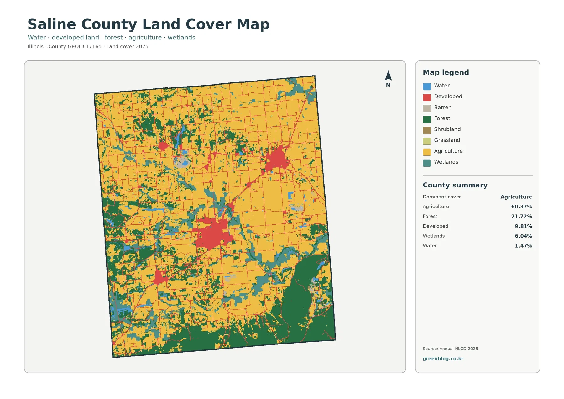
The general map is the best place to start because it keeps the main land-cover classes in one frame. Agriculture forms the yellow background across large parts of the county. Forest appears as dark green, with the strongest concentration along the southern edge and additional branches and patches across the west. Developed land is shown in red, making the larger built clusters and road-like lines easy to separate from nearby farm cover.
The legend also includes barren land, shrubland, and grassland. Those classes are present in the classification, but they are not major parts of the county summary. The separate forest-and-farmland view reports grassland at 0.08% and shrubland at 0.04%. That makes it more useful to focus first on agriculture, forest, developed land, wetlands, and water rather than treating every legend color as equally important to the county landscape.
The southeast is a good example of why spatial distribution matters. A large forest block occupies a noticeable part of that corner, with agriculture and wetland cover around its edges. In the west, woodland is more broken and mixed with wetlands. Around the larger developed clusters, agriculture remains the dominant neighboring cover. Those contrasts give the county several distinct local patterns even though agriculture is the single largest category.
Forest and farmland reveal a sharper west-to-east contrast
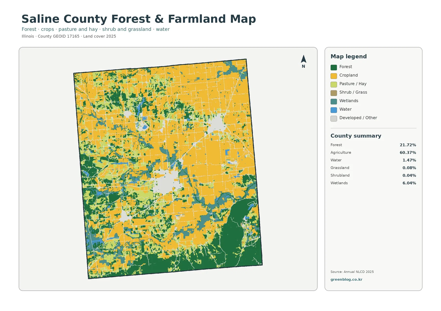
Removing much of the developed and miscellaneous color makes the rural pattern easier to interpret. Cropland remains widespread through the north and east, while forest occupies a much larger share of the southern edge. The western half is a mosaic rather than a single broad farm surface. Forest patches, wetlands, and smaller areas of other cover repeatedly divide the cropland there.
The map summary again gives forest as 21.72% and agriculture as 60.37%. Wetlands remain substantial at 6.04%, while water is 1.47%. Grassland at 0.08% and shrubland at 0.04% are comparatively minor. That combination is important: Saline County is not simply a farm-and-forest two-class landscape. Wetlands make a meaningful third natural-cover component, particularly where the map shows teal patches alongside woodland in the west and south.
This view is useful when the goal is to compare open agricultural cover with wooded and wet areas without the stronger visual emphasis of developed land. It also shows that the large southern forest is not just a narrow streamside line. Several dark green areas are wide enough to form a substantial block, while the west contains more branched and scattered woodland. The difference between those two forest patterns is one of the clearest county-specific observations in the set.
Hard surfaces are concentrated in a few built clusters
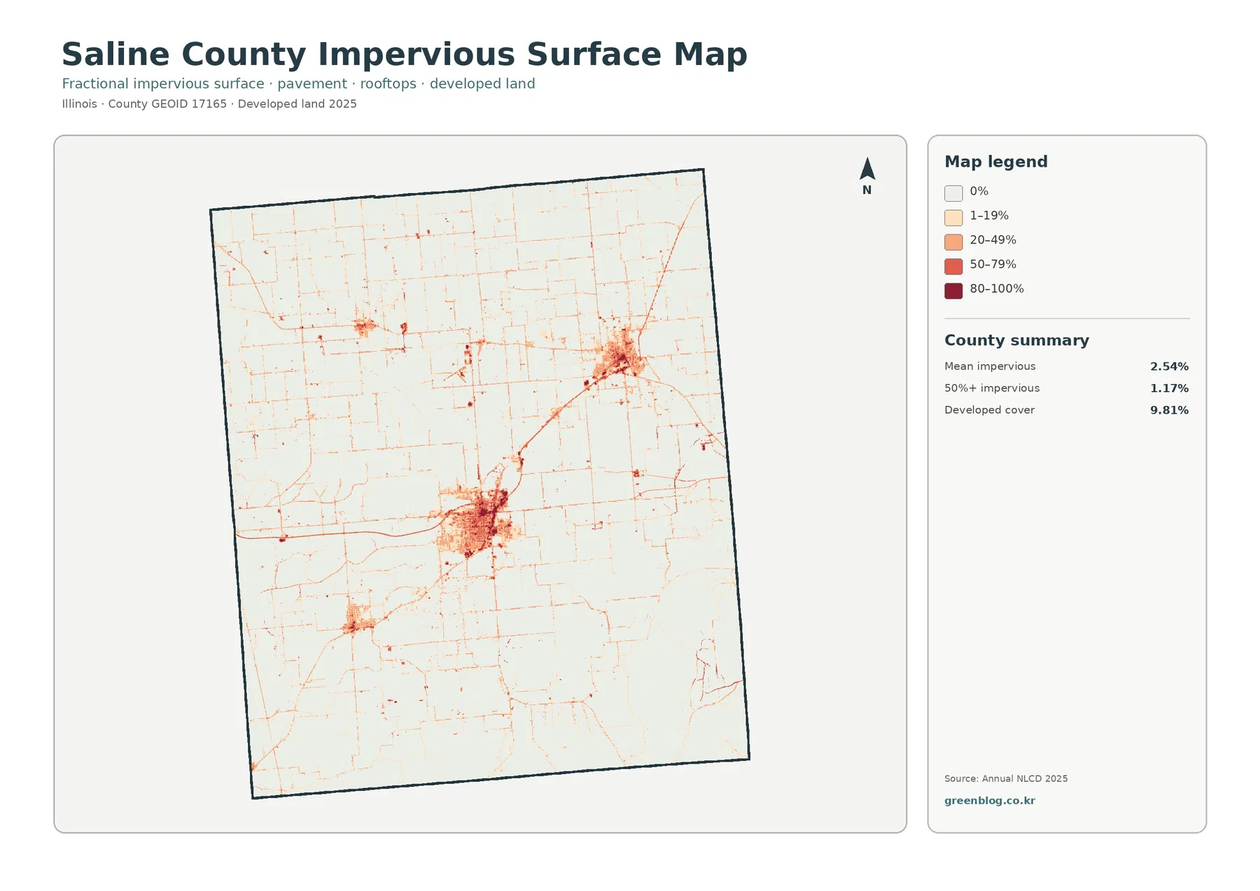
Impervious surface means hard cover such as pavement and rooftops where water does not readily soak into the ground. The county mean is 2.54%, while 1.17% of the county is mapped above 50% impervious. Developed cover is 9.81%, a much larger figure. The difference between those values shows why developed land should not be treated as completely paved or built over.
The strongest impervious concentration is the large cluster just south of the center. A second major concentration appears in the northeast, and smaller clusters are visible in the west. Thin lines connect and extend away from these areas, matching the appearance of roads or other narrow developed surfaces. Most of the agricultural and forested county remains pale, so the map quickly separates the built concentrations from the much less impervious countryside.
This map is useful for county-scale comparison, not parcel measurement. A raster cell can contain a mixture of road, roof, lawn, soil, trees, or other surfaces, so a single cell value is a generalized fraction. Enlarging the JPG does not create building footprints or legal parcel boundaries that are absent from the source data. For site-level drainage, permitting, ownership, or construction questions, more detailed and current local information is required.
What the 1985–2025 class-difference map does—and does not—say
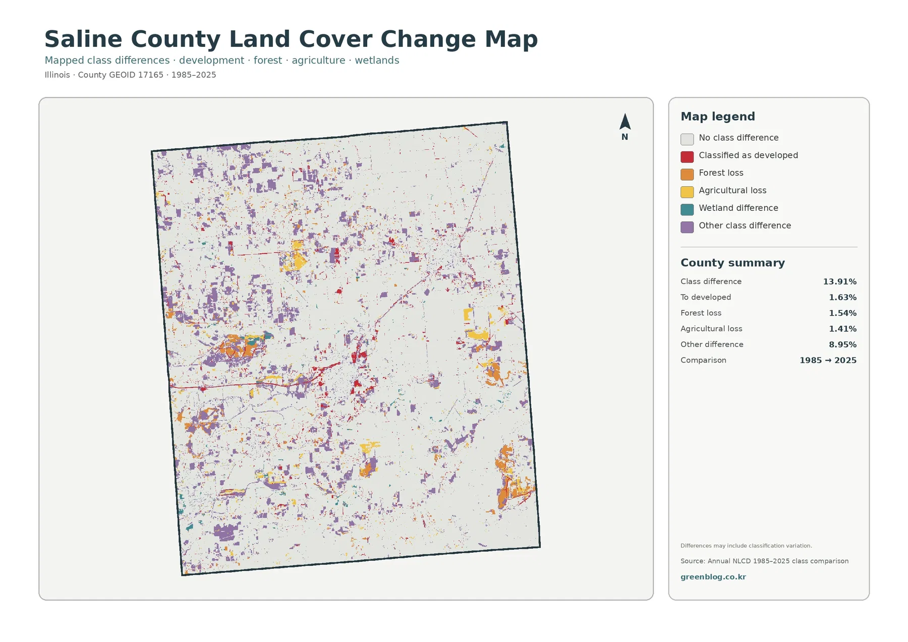
The class-difference map reports 13.91% of the county as different between 1985 and 2025. Its summary separates that total into 1.63% classified as developed, 1.54% forest loss, 1.41% agricultural loss, and 8.95% other class difference. Because the “other” category is by far the largest of these listed components, the overall 13.91% cannot be read as a development rate or as one simple type of land conversion.
Purple other-difference cells are scattered broadly and form many visible patches in the western and northwestern parts of the county. Red developed-difference cells occur around current built clusters and along some narrow corridors. Orange forest-loss and yellow agricultural-loss patches are also visible, but their countywide percentages are each close to one and a half percent. A few visually large patches should therefore be interpreted in the context of the full summary rather than treated as proof of a dominant countywide trend.
The map itself notes that differences may include classification variation. A comparison between two distant years can reflect actual land-cover change, but it can also be affected by how mixed pixels, vegetation condition, moisture, or classification methods are represented. The safest use is to identify places where the mapped class differs and then consult additional years, imagery, or local records before assigning a cause.
Three comparisons that make the four-map set easier to use
First, compare the general land-cover map with the forest-and-farmland view. The first map shows how developed land fits among all major covers, while the second makes the southern forest block and the western forest-wetland mosaic easier to see. This pairing is especially helpful when explaining why a county with 60.37% agriculture still has large areas where natural cover dominates the visual pattern.
Second, compare developed land with impervious surface. The 9.81% developed-cover value and 2.54% mean impervious value answer different questions. Developed land includes places classified as developed even when they contain vegetation or other permeable surfaces. The impervious map emphasizes the hardest surfaces, so its darkest areas are more tightly clustered than the red developed class on the general map.
Third, use the current maps before the 1985–2025 difference map. Knowing where farm cover, forest, wetlands, and built clusters are located in 2025 makes it easier to understand where change colors fall. It also reduces the risk of reading every colored change cell as urban growth. The 8.95% “other difference” share is a strong reminder that the change map contains more than one kind of comparison outcome.
Choosing a map for a lesson, report, or printed reference
For a general county profile, the 2025 land-cover map is the most complete single image. It allows a reader to see the agricultural majority, the southern forest, the western wetland pattern, the built clusters, and the smaller water areas at once. A short explanation can point first to the broad farm cover and then to the way natural cover becomes more prominent toward the south and west.
For agriculture or habitat discussion, the forest-and-farmland map is cleaner because developed and miscellaneous cover is visually reduced. For built-area discussion, the impervious map is more informative because it distinguishes concentrated hard surfaces from the broader developed class. For historical comparison, the change map should be used with its legend and summary visible so the different change categories are not collapsed into a single story.
When preparing a presentation, it is usually better to use one map at a readable size and add a second map only for a direct comparison. Placing all four maps in a small grid can make the legends and narrow wetland or road patterns difficult to see. Because the four maps share the same county outline, switching between them or showing them side by side at a larger size makes location comparison straightforward.
Limits of the classification and map scale
These maps describe land cover, not zoning, ownership, legal land use, or parcel boundaries. Land cover is a classification of what is observed at the surface, such as agriculture, forest, water, wetlands, or developed cover. A cell classified as agriculture is not automatically proof that a specific parcel is actively cropped, and a cell classified as developed does not establish a planning designation or development right.
Raster classification generalizes the landscape into cells. Along a forest edge, wetland boundary, road, or small water body, one cell may contain more than one real surface. The mapped class or impervious fraction summarizes that mixture. This is why a county-scale map can describe broad patterns well while remaining unsuitable for survey, parcel, or engineering work.
The current land-cover and impervious summaries refer to 2025 in the supplied maps. Changes after that observation year are not shown. The 1985–2025 difference map also covers a long period and may include classification variation. Anyone using the maps for environmental review or detailed site analysis should pair them with more recent imagery, local records, and field information.
Download the four original JPG maps
The download archive contains one original JPG for each view used in the article: 2025 land cover, forest and farmland, impervious surface and developed land, and the 1985–2025 land-cover class difference. Each image is 2480×1754 pixels. The files keep the same county boundary, making them practical for switching between current cover, natural-cover emphasis, built surfaces, and long-term comparison without having to realign the geography.
Frequently Asked Questions
What is the largest land-cover class in Saline County?
Agriculture is the largest 2025 class at 60.37%. Forest follows at 21.72%, developed land at 9.81%, wetlands at 6.04%, and water at 1.47%. The map still shows major local contrasts: the south contains broad forest blocks, while the west contains a more fragmented mix of woods and wetlands among farm areas.
Why is developed cover 9.81% while mean impervious cover is only 2.54%?
They measure different things. Developed cover is a land-cover class that can include vegetation and other permeable surfaces within developed settings. Impervious surface measures the fraction covered by harder materials such as pavement and rooftops. As a result, the county can have 9.81% developed cover while the average impervious fraction remains 2.54%.
Does the 13.91% class difference mean 13.91% of the county was developed between 1985 and 2025?
No. The total class difference is 13.91%, but only 1.63% is listed as classified to developed. Forest loss is 1.54%, agricultural loss is 1.41%, and other class difference is 8.95%. The map also warns that classification variation may be included, so the total should be read as a difference between mapped classes, not as a single development statistic.
Sources and Reference Data
- MRLC Annual NLCD Data – source portal for annual land-cover data
- USGS Annual NLCD Land Cover Classification – explanation of land-cover classes
- U.S. Census Bureau TIGER/Line Shapefiles – county boundary reference data
Map File Information
Download four original JPG maps of Saline County land cover in one ZIP archive.
- Included Files: Use only the versions confirmed in the article and supplied images
- File Type: Use the confirmed download contents
- Intended Use: Printing, education, presentations, and map-based projects
Related Maps
- Adams County Illinois Land Cover Map
- Alexander County Illinois Land Cover Map
- Bond County Illinois Land Cover Map
Green Map creates custom-edited map images using open geographic data sources such as geoBoundaries, Natural Earth, OpenStreetMap, and government open data.
These maps are edited visual materials, not raw data files, and are provided for education, documents, presentations, and graphic reference.