Putnam County is a small Illinois county with a land-cover pattern that changes sharply around the Illinois River. Agriculture covers 61.98% of the county in the 2025 summary, yet the map is not simply a sheet of cropland. Water, wetlands, and forest form a broad central corridor, while developed areas appear as compact clusters and thin road lines within the farm landscape. The four maps on this page separate those patterns so they can be compared without treating every developed or natural area as the same thing.
The WebP images are convenient for reading on the page, and the four original JPG maps are available together in one download below. One map shows the full 2025 land-cover mix, another emphasizes forest and farmland, the impervious-surface map isolates pavement and rooftops, and the 1985–2025 comparison identifies cells whose mapped classes differ between the two dates. Used together, they give a clearer picture than any single percentage.
Table of Contents
Start with the river corridor, not the county average
The most important visual feature is the wide water-and-wetland corridor through the middle of the county. Large agricultural blocks dominate the east, south, and western extension, but they break apart near the river. Blue water, teal wetlands, and dark green forest occupy much more of the central area than they do across the broad farm fields. This contrast is strong enough that the countywide percentages make more sense after the map is viewed geographically.
Putnam County government offices are in Hennepin, and the county’s official site lists the courthouse at 120 North Fourth Street in Hennepin. Illinois Department of Natural Resources material also identifies Hennepin-Hopper Lake in Putnam County south of Hennepin. Those references provide useful local context for the extensive river, lake, wetland, and bottomland pattern visible near the center of the land-cover maps. The maps themselves do not label every water body, so a separate place-name map is still needed for precise identification.
The 2025 map shows five large pieces of the landscape
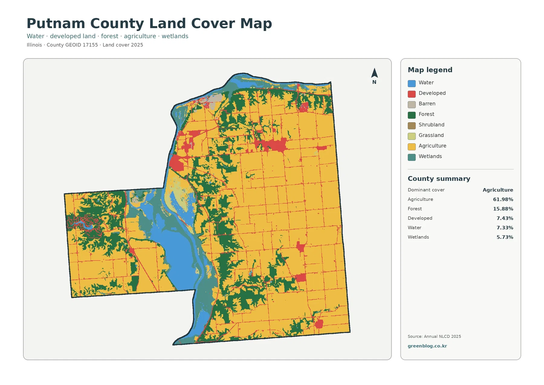
Agriculture is the dominant class at 61.98%. Forest accounts for 15.88%, developed land 7.43%, water 7.33%, and wetlands 5.73%. These values do not describe five evenly mixed ingredients. Cropland is spread broadly across much of the county, while water and wetlands are concentrated in a narrow part of the county. Forest occupies several belts and blocks near the river, northern edge, western extension, and broken terrain farther south.
The eastern half is the clearest example of agricultural dominance. Large yellow fields fill most of the map between the road grid, with small developed patches interrupting them. Forest becomes more frequent toward the northern edge and where the river corridor cuts through the county. The western projection has a more mixed appearance, with cropland broken by forest, water, wetlands, and one noticeable developed cluster. This makes the western section visually different from the wide open farmland farther east.
Developed land is visible in several separate clusters rather than as one continuous urban area. A group near the river on the northwest side of the main county block is especially easy to see, and another larger cluster appears farther east near the center. Smaller developed patches occur near the northeastern and southeastern edges. Thin red lines also follow many roads, which helps distinguish settlement and transportation patterns from the much larger agricultural background.
Land cover is not the same as zoning or legal land use. A pixel classified as agriculture tells the reader what surface type was mapped there, not whether a parcel is permanently protected as farmland. A forest pixel does not show ownership, harvest restrictions, or conservation status. The same caution applies to wetlands: a mapped wetland class is useful environmental information, but it does not replace a jurisdictional wetland determination.
Farmland is extensive, but forest defines many of the edges
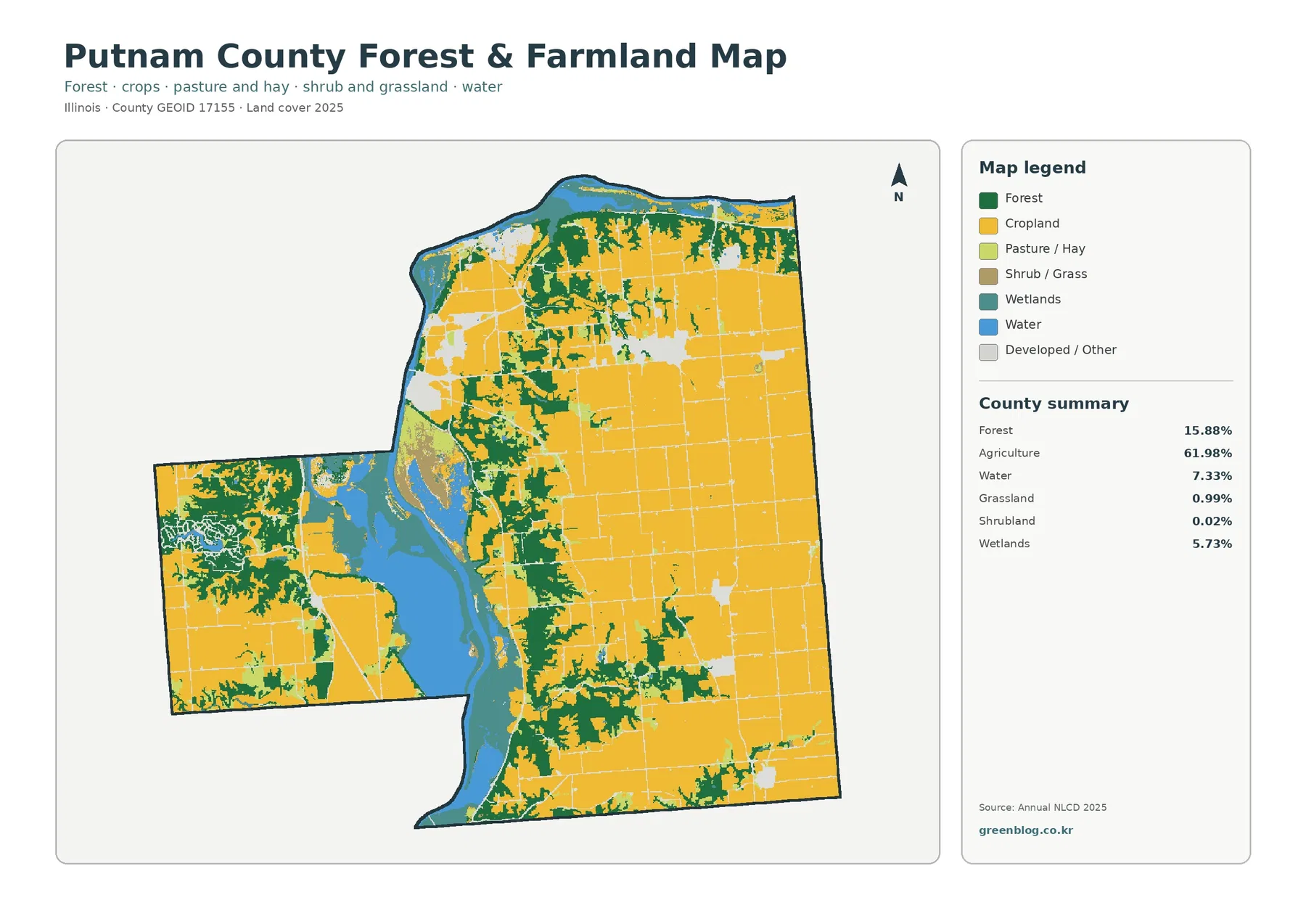
The forest-and-farmland map strips away some of the detail from the general map and makes the main contrast easier to read. Agriculture remains 61.98% and forest 15.88%. Grassland is only 0.99% and shrubland 0.02%, so the county’s open land is overwhelmingly agricultural rather than a broad grassland landscape. Water and wetlands remain visible because they are essential to understanding where the farm pattern is interrupted.
Forest is most useful to read as a set of connected margins and irregular blocks. Dark green follows much of the river corridor, spreads along the northern edge, and branches into farm country in the north-central part of the county. Additional wooded patches occur south of the river bend and along the outer edges of several agricultural blocks. The result is not a simple east-west split. Cropland and forest repeatedly meet along irregular boundaries, especially near the river and its surrounding lowlands and slopes.
Water covers 7.33% of the county and wetlands 5.73%. Those two classes should be read separately. Water represents open-water surfaces, while wetlands include land with wet conditions and wetland vegetation. On the map they occur next to each other in many places, which is expected in a river landscape, but combining them into a single percentage would hide the distinction between open water and vegetated wet areas.
This map is particularly useful for presentations about agriculture because it prevents a common mistake: treating a 61.98% agriculture share as if farmland fills every direction equally. The central river corridor creates a major break, and forest is far more common near that corridor than across the open eastern fields. A presentation that pairs the percentage with this spatial pattern gives a more accurate description of Putnam County than a table alone.
The built footprint is small, concentrated, and easy to isolate
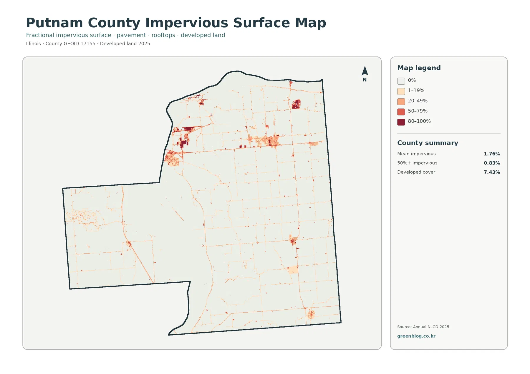
Impervious surface means pavement, rooftops, and other hard surfaces that do not absorb rainfall like soil or vegetation. The countywide mean is 1.76%, and only 0.83% of the mapped area falls in the 50% or greater impervious category. Developed land, however, covers 7.43%. The difference matters because a developed land-cover class may contain lawns, trees, bare ground, and other surfaces in addition to pavement and buildings.
Most of the county appears very light on this map. Darker orange and red are confined to a few settlement clusters and short road segments. The strongest concentration is near the northwestern side of the main block close to the river, with another visible cluster farther east near the center. Smaller high-impervious patches appear toward the northeast and southeast. Roads form a fine network between these clusters without turning the surrounding farm fields into broadly developed land.
That pattern makes the impervious map a better choice than the general land-cover map when the question is specifically about built surfaces. The general map is better for asking how much land is developed overall, while the impervious map shows where the hardest surfaces are concentrated within those developed areas. For watershed education, the distinction is valuable because a neighborhood with lawns and trees can be classified as developed without being covered entirely by pavement.
The map should not be used by itself to predict flooding or drainage problems. Impervious cover can affect runoff, but flood risk also depends on elevation, drainage infrastructure, soil, rainfall, river stage, and other factors. Putnam County’s Illinois River setting makes those additional datasets especially important. A property-level decision should use current flood maps, surveys, and local records rather than a countywide land-cover image.
The 1985–2025 comparison is a difference map, not a growth chart
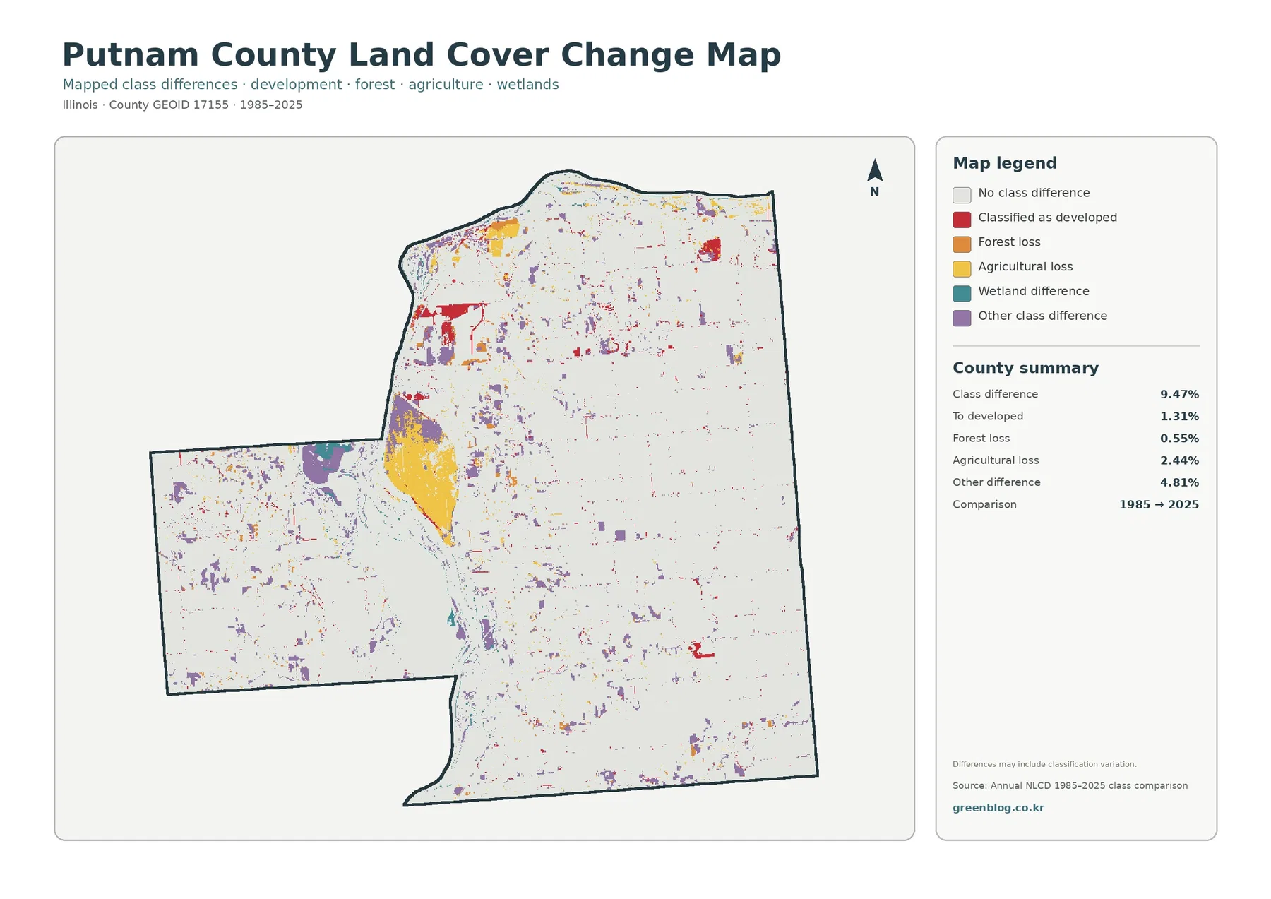
The total mapped class difference between 1985 and 2025 is 9.47%. Within that total, 1.31% is classified as a change to developed, 0.55% as forest loss, 2.44% as agricultural loss, and 4.81% as other class difference. The largest named component is therefore the catch-all “other” category, not development. That alone is a strong reason not to describe the 9.47% total as an urban-growth rate.
The map also has a distinctive spatial pattern. A large yellow agricultural-loss area appears beside the central river corridor, and purple “other difference” cells are scattered across the west, north, and south. Red change-to-developed cells form several clusters near existing developed areas and roads, but they occupy far less of the map than the unchanged background. The pattern is uneven and local, rather than a continuous band of change moving across the county.
Agricultural loss does not automatically mean that farmland became pavement or housing. The comparison has a separate developed category, so an agricultural cell can move into another mapped class without becoming urban land. Forest loss likewise does not identify a cause such as logging, construction, flooding, or classification adjustment. Aerial photographs and local land records would be needed to determine what happened at a specific location.
Annual NLCD comparisons can also include classification variation. A cell near the boundary between wetland, forest, agriculture, or developed classes may be assigned differently when imagery and classification methods differ between years. This is why the map is best used to find places worth examining in more detail. It is a screening and comparison tool, not a parcel-level history of every land-use decision made since 1985.
Choosing the right map for a Putnam County question
For a general county overview, the 2025 land-cover map should usually come first because it contains agriculture, forest, developed land, water, wetlands, and the smaller classes in one view. It is the best single image for explaining why Putnam County is both heavily agricultural and strongly shaped by the Illinois River corridor. The forest-and-farmland version is more effective when the subject is habitat, conservation, agriculture, or the boundary between cropland and wooded land.
The impervious-surface map should be selected when the audience needs to see settlements, roads, and hard surfaces without the stronger colors of agriculture and forest. It can support a discussion of runoff or development intensity, provided it is not presented as a flood map. The change map belongs in a different kind of presentation: one that asks where 1985 and 2025 classifications differ and which areas deserve closer review.
Printing the maps separately is often clearer than shrinking all four onto one page. The wetland and forest boundaries around the river corridor are narrow in places, and the developed-road network can disappear when the map is reduced too far. A practical sequence is to show the general map at a readable size, then add one supporting map that answers a specific question. The downloadable JPG set makes that approach easy for classroom slides, county profiles, and research notes.
When the purpose is comparison across counties, keep the legend and year visible. A 61.98% agriculture share can be compared with another county only if the same class definition and dataset year are used. The same applies to impervious cover and change categories. Removing the legend or date makes a map look simpler, but it also removes the information needed to interpret the colors correctly.
Scale and classification limits matter around the river
These maps are raster classifications, meaning the county is represented by a grid of cells rather than surveyed parcel shapes. A cell can contain more than one real-world surface, especially near narrow roads, small streams, forest edges, and wetland margins. The assigned class represents the mapped result for that cell, not a legal boundary on the ground. This matters in Putnam County because the river corridor contains many narrow transitions among water, wetland, forest, and agricultural land.
The 2025 map also represents a specific observation period. New construction or land-cover changes after that period will not appear until newer data are used. The 1985–2025 change product compares two endpoints and does not show the timing of every change between them. If a field changed to another class in the 1990s and later returned to agriculture, a two-date comparison may not describe that sequence.
For local planning or property research, use the land-cover maps as context and then move to more precise sources. County GIS, survey information, floodplain data, wetland records, road maps, and current aerial photography answer questions that a generalized land-cover product cannot. This separation keeps the map useful: it is excellent for regional patterns and comparison, but it should not be asked to provide parcel boundaries or legal determinations.
Frequently Asked Questions
Is Putnam County mostly farmland?
Agriculture is the largest 2025 class at 61.98%, but that percentage does not describe the whole county equally. Water, wetlands, and forest form a major central corridor around the Illinois River, and forest is also common along the northern edge and in several irregular blocks. The county is strongly agricultural, but its river landscape creates an important contrast.
Why is developed land 7.43% when mean impervious cover is only 1.76%?
Developed land is a broader land-cover class that can include buildings, roads, lawns, trees, and other surfaces within developed settings. Impervious cover measures the fraction of hard surfaces such as rooftops and pavement. A place can therefore be classified as developed without being mostly impervious.
Does the 9.47% 1985–2025 class difference mean 9.47% of the county was developed?
No. The change-to-developed category is 1.31%. The total also includes 2.44% agricultural loss, 0.55% forest loss, 4.81% other class difference, and wetland-related differences shown on the map. The comparison identifies cells whose classes differ between the two dates; it is not a single development-growth percentage.
Map File Information
Download the four original JPG maps for Putnam County, covering 2025 land cover, forest and farmland, impervious surface, and mapped class differences from 1985 to 2025.
- Included Files: Use only the versions confirmed in the article and supplied images
- File Type: Use the confirmed download contents
- Intended Use: Printing, education, presentations, and map-based projects
Related Maps
- Adams County Illinois Land Cover Map
- Alexander County Illinois Land Cover Map
- Bond County Illinois Land Cover Map
Sources and References
- MRLC Annual NLCD Data
- USGS Annual NLCD Land Cover Classification
- U.S. Census Bureau TIGER/Line Shapefiles
- Official Putnam County, Illinois website
- Illinois DNR statewide waters reference including Hennepin-Hopper Lake
Green Map creates custom-edited map images using open geographic data sources such as geoBoundaries, Natural Earth, OpenStreetMap, and government open data.
These maps are edited visual materials, not raw data files, and are provided for education, documents, presentations, and graphic reference.