The global renewable energy share map compares the percentage of total final energy consumption (TFEC) supplied by renewable energy across countries and economies. It uses World Bank World Development Indicators series EG.FEC.RNEW.ZS and the verified 2021 same-year dataset included in this package. This is not the same as the share of electricity generated from renewable sources, so the article consistently treats the metric as renewable energy consumption in final energy use.
The master geography file contains 217 World Bank countries and economies. Of those, 212 have a numeric 2021 observation. The five preserved source-missing rows are Channel Islands, St. Martin (French part), Monaco, San Marino, Kosovo. World Bank regional, income-group, and development-group aggregates are excluded from the packaged geography master used here.
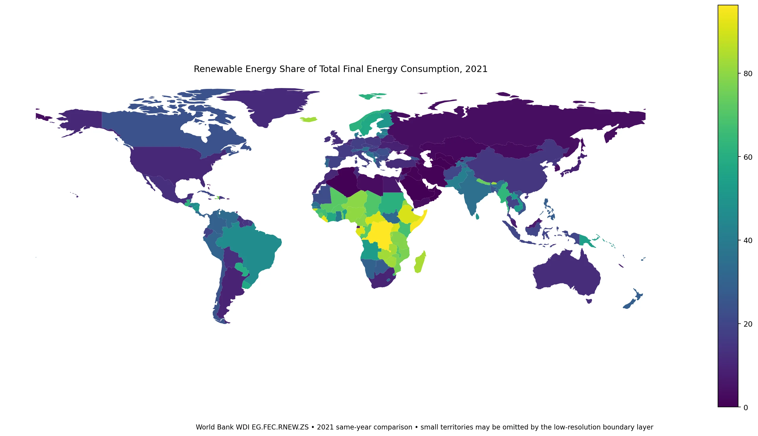
Table of Contents
This is not a renewable electricity generation map
The World Bank definition uses total final energy consumption as the denominator. The numerator includes direct consumption of renewable energy and the final consumption of electricity and heat estimated to have been produced from renewable sources. The concept therefore reaches beyond wind and solar power generation. Hydropower, solid biofuels, liquid biofuels, biogas, geothermal energy, marine energy, and renewable waste can also contribute.
That distinction is essential when comparing countries. A high share can reflect a modern electricity and heat system with large hydro, geothermal, wind, or solar contributions, but it can also reflect substantial direct use of traditional biomass. A high number in this indicator is therefore not automatically a ranking of wind-and-solar deployment, grid decarbonization, or clean household energy access.
The 2021 distribution spans almost the full 0–100% range
Across the 212 numeric observations, the median is 20.3% and the unweighted mean is 29.1%. The 25th percentile is 7.2% and the 75th percentile is 46.0%. The reported values range from 0.0% to 96.3%, showing that national energy systems occupy very different positions even under one standardized indicator.
| Range | Economies | Share of 212 |
|---|---|---|
| 0–5% | 44 | 20.8% |
| 5–15% | 45 | 21.2% |
| 15–30% | 44 | 20.8% |
| 30–50% | 30 | 14.2% |
| 50–75% | 26 | 12.3% |
| 75%+ | 23 | 10.8% |
49 economies, or 23.1% of the numeric set, are at 50% or above. At the other end, 89 economies, or 42.0%, are below 15%. The broad spread is more informative than a single center point because the same indicator captures very different energy structures.
Many of the highest reported shares are in Africa
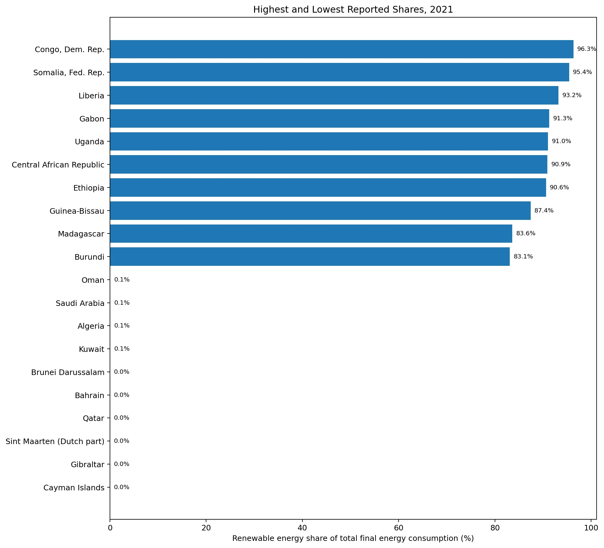
The Democratic Republic of the Congo has the highest 2021 observation at 96.3%, followed by Somalia at 95.4%, Liberia at 93.2%, Gabon at 91.3%, Uganda at 91.0%, the Central African Republic at 90.9%, and Ethiopia at 90.6%. These rankings should not be read as a league table of modern renewable technology. The TFEC indicator can include traditional biomass, which is especially important when interpreting very high shares in lower-income energy systems.
| Country or economy | 2021 renewable share |
|---|---|
| Congo, Dem. Rep. | 96.3% |
| Somalia, Fed. Rep. | 95.4% |
| Liberia | 93.2% |
| Gabon | 91.3% |
| Uganda | 91.0% |
| Central African Republic | 90.9% |
| Ethiopia | 90.6% |
| Guinea-Bissau | 87.4% |
| Madagascar | 83.6% |
| Burundi | 83.1% |
At the low end, Bahrain, Brunei Darussalam, the Cayman Islands, Gibraltar, Qatar, and Sint Maarten are reported at 0.0% for 2021. Kuwait, Algeria, Turkmenistan, Oman, and Saudi Arabia are around 0.1%. A displayed 0.0% should be treated as the value reported at the source precision rather than as proof that every form of renewable energy use was literally absent.
Similar percentages can come from very different energy mixes
The map places many Sub-Saharan African economies in high-value bands, but it also shows high shares in countries such as Iceland at 82.4%, Norway at 61.4%, Sweden at 57.9%, and Finland at 50.2%. Those countries do not necessarily reach similar percentages through the same combination of energy sources. A hydro- and geothermal-heavy system and an economy with extensive biomass use can produce superficially similar TFEC shares while having very different infrastructure, emissions, and household-energy implications.
South America provides another contrast: Paraguay is 58.8% and Brazil 46.5%, while in North America Canada is 23.8% and the United States 10.9%. Large Asian economies also differ sharply: India is 34.9%, Indonesia 20.2%, China 15.2%, Japan 8.8%, and South Korea 3.6%. The map is strong at identifying where the indicator differs; explaining why requires source-specific data on hydro, bioenergy, wind, solar, geothermal, transport fuels, heat, and sectoral final consumption.
How several large economies compare
| Economy | 2021 share |
|---|---|
| Brazil | 46.5% |
| India | 34.9% |
| Canada | 23.8% |
| Indonesia | 20.2% |
| Germany | 17.6% |
| France | 16.2% |
| China | 15.2% |
| Mexico | 13.0% |
| Australia | 12.3% |
| United Kingdom | 12.2% |
| United States | 10.9% |
| South Africa | 9.7% |
| Japan | 8.8% |
| Korea, Rep. | 3.6% |
| Russian Federation | 3.5% |
Brazil and India stand relatively high among the selected large economies, whereas the United States, Japan, South Korea, and Russia are much lower. This does not contradict rapid renewable-electricity growth in some of those countries. Electricity is only one part of final energy demand. Transport, industrial heat, buildings, and other end uses can keep the overall TFEC renewable share below the renewable share of electricity generation.
Why this article uses 2021 instead of 2022
Current World Bank metadata lists the reference period for this indicator through 2022, so 2022 observations do exist. Coverage is not uniform, however. The official DataBank table shows 2022 values for economies such as Afghanistan, Andorra, and American Samoa while countries including Albania, Angola, and Argentina remain blank in 2022. A “latest available” map would therefore mix years unless each observation were labeled individually.
The collection rule embedded in this package selects the latest single year with at least 80% coverage, and it selected 2021 with 212 numeric observations out of the 217-row geography master. This article therefore keeps a strict 2021 same-year comparison. It should not be described as a map of each country’s latest renewable share. Country-specific updates can be checked separately in the World Bank series.
The 29.1% simple mean is not the global renewable-energy share
The 29.1% unweighted mean gives the same statistical weight to a small island economy and to a very large energy consumer. A true global TFEC renewable share requires weights based on each economy’s amount of final energy consumption. Those weights are not included in this cleaned file, so the mean and median in this article are used only to summarize the cross-country distribution.
The same logic applies to the map. A deeply shaded country is not necessarily one of the world’s largest consumers of renewable energy in absolute terms. A small economy can have an 80% share but little total energy demand, while a much larger economy at 20% can consume far more renewable energy in terajoules. Share and scale answer different questions.
Data source and mapping method
The statistical values come from World Bank World Development Indicators series EG.FEC.RNEW.ZS. The World Bank metadata glossary defines the measure as renewable energy consumption as a share of total final energy consumption and identifies the IEA Energy Statistics Data Browser as the underlying source. The concept is also the basis of UN SDG indicator 7.2.1.
The visualization joins ISO-3 codes to a low-resolution world country boundary layer. 169 of the 212 numeric observations are directly represented by polygons in that layer. Very small islands and separately reported territories may not appear at this scale, so a missing polygon does not automatically mean the statistical value is missing. Rankings and distribution statistics use all 212 numeric observations, not only mapped polygons.
Frequently Asked Questions
Does this map show the renewable share of electricity generation?
No. World Bank series EG.FEC.RNEW.ZS measures renewable energy as a share of total final energy consumption, which can include direct renewable use as well as renewable-derived electricity and heat.
Why does the comparison use 2021 rather than 2022?
Some 2022 observations exist, but coverage is uneven across countries. The package rule selects the latest single year with at least 80% coverage, and 2021 provides 212 numeric observations out of the 217-row geography master.
Does a high share mean a country leads in wind and solar power?
Not necessarily. The indicator can include hydro, geothermal, bioenergy, and traditional biomass. Energy-source detail is needed before attributing a high value to modern wind or solar deployment.
Is the 29.1% simple mean the global renewable-energy share?
No. It is an unweighted mean across 212 countries and economies. A true global share requires weighting by each economy’s total final energy consumption.
Related Articles
These Green Map articles provide useful context for comparing the renewable-energy pattern with other global indicators and for locating countries on printable maps.
- Global GDP Growth Map – Country Patterns in 2025
- Global Unemployment Rate Map – Country Patterns in 2025
- Free Printable Map Download Archive
Green Map creates custom-edited map images using open geographic data sources such as geoBoundaries, Natural Earth, OpenStreetMap, and government open data.
These maps are edited visual materials, not raw data files, and are provided for education, documents, presentations, and graphic reference.