A positive national jobs number does not mean every local labor market moved in the same direction. The 2025 Quarterly Census of Employment and Wages (QCEW) shows a much more uneven county picture. This map compares the over-the-year percent change in annual-average covered employment from 2024 to 2025 for U.S. counties and county-equivalent areas.
National QCEW annual-average employment increased from 154,990,441 in 2024 to 155,732,363 in 2025, a gain of roughly 0.5%. The median county-level change, however, was only +0.2%. Of the 3,143 county and county-equivalent records used in this analysis, 1,630 (51.9%) were above zero, 66 (2.1%) were unchanged, and 1,447 (46.0%) were below zero. A growing national total and a nearly split local map are therefore not contradictory.
QCEW is especially useful for this comparison because it is an administrative employment-and-wage system covering more than 95% of U.S. jobs. It is not a count of every worker, though. Self-employed workers and some other employment categories fall outside QCEW coverage. Throughout this page, “employment growth” refers specifically to the change in QCEW covered employment, not to a universal measure of all people who worked during the year.
Table of Contents
What the 2025 county employment growth map shows
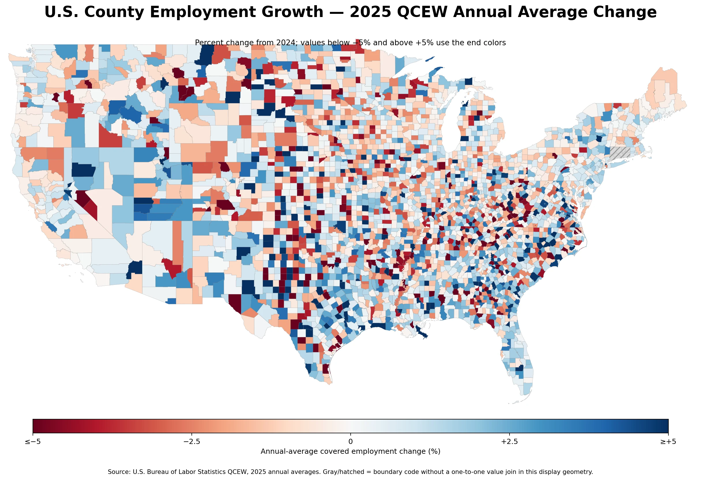
The most important visual pattern is fragmentation rather than a single coast-to-coast direction. Growth counties sit next to declining counties, and the same state can contain both strong positive and negative changes. That local variation is exactly what a county map reveals and what a state total can conceal.
The mapped metric is the BLS annual-file field oty_annual_avg_emplvl_pct_chg. It compares current-year annual-average employment with the prior-year annual average. BLS annual-average employment is based on the twelve monthly employment levels, and the published over-the-year percentage is reported to one decimal place. This makes the measure less sensitive to one unusual month than a point-in-time comparison, although large business or industry changes can still create sharp annual shifts.
The source slice originally contained 3,193 area rows. Fifty of those rows had FIPS codes ending in 999 and are labeled by BLS as Unknown Or Undefined areas. They are not counties. Excluding those noncounty buckets leaves 3,143 actual counties and county equivalents for the map analysis. Keeping the 999 rows would inflate the apparent geography count and could place non-geographic residual categories into county rankings.
Most counties were much closer to zero than the extremes suggest
| Distribution point | Employment change |
|---|---|
| 10th percentile | -3.1% |
| 25th percentile | -1.3% |
| Median | +0.2% |
| 75th percentile | +1.5% |
| 90th percentile | +3.1% |
The middle half of counties fell between about -1.3% and +1.5%. The 10th percentile was -3.1% and the 90th percentile was +3.1%. In other words, the darkest map colors represent a relatively small tail of the distribution. A county near the national narrative is far more likely to have a low-single-digit change than a double-digit swing.
This is also why the +0.5% national change should not be compared directly with the +0.2% county median as though they were calculated the same way. The national total is effectively driven by the number of covered jobs in each place. The county median gives every geography one position in the ordered list, whether it contains hundreds of covered jobs or hundreds of thousands. Both statistics are useful, but they answer different questions.
The largest percentage swings often came from small employment bases
| County or equivalent | Change | 2025 annual-average employment |
|---|---|---|
| Bradford County, Florida | +53.2% | 9,673 |
| Armstrong County, Texas | +41.5% | 733 |
| Jefferson Davis County, Mississippi | +34.4% | 2,202 |
| Jackson County, North Carolina | +33.1% | 19,262 |
| Braxton County, West Virginia | +33.1% | 4,975 |
| County or equivalent | Change | 2025 annual-average employment |
|---|---|---|
| Swain County, North Carolina | -39.2% | 6,871 |
| Pope County, Illinois | -32.8% | 432 |
| Stanton County, Kansas | -24.1% | 680 |
| Haywood County, Tennessee | -21.6% | 6,337 |
| Coke County, Texas | -20.4% | 871 |
Bradford County, Florida recorded the largest positive change in the dataset at +53.2%, while Swain County, North Carolina recorded the largest decline at -39.2%. Those figures are real QCEW changes, but percentage magnitude alone is not enough to describe economic importance. Armstrong County, Texas had annual-average covered employment of 733, for example, and Pope County, Illinois had 432. A change of a few hundred jobs can produce a very large percentage when the starting base is small.
For that reason, an extreme color should be treated as a prompt for a second question: how large is the employment base? It should not automatically be read as “best labor market” or “worst labor market.” Explaining why a county moved would require industry-level QCEW detail and, where relevant, other official information about openings, closures, projects, or classification changes. The county map identifies where the change occurred; it does not establish the cause.
A larger-employment subset has a much narrower range
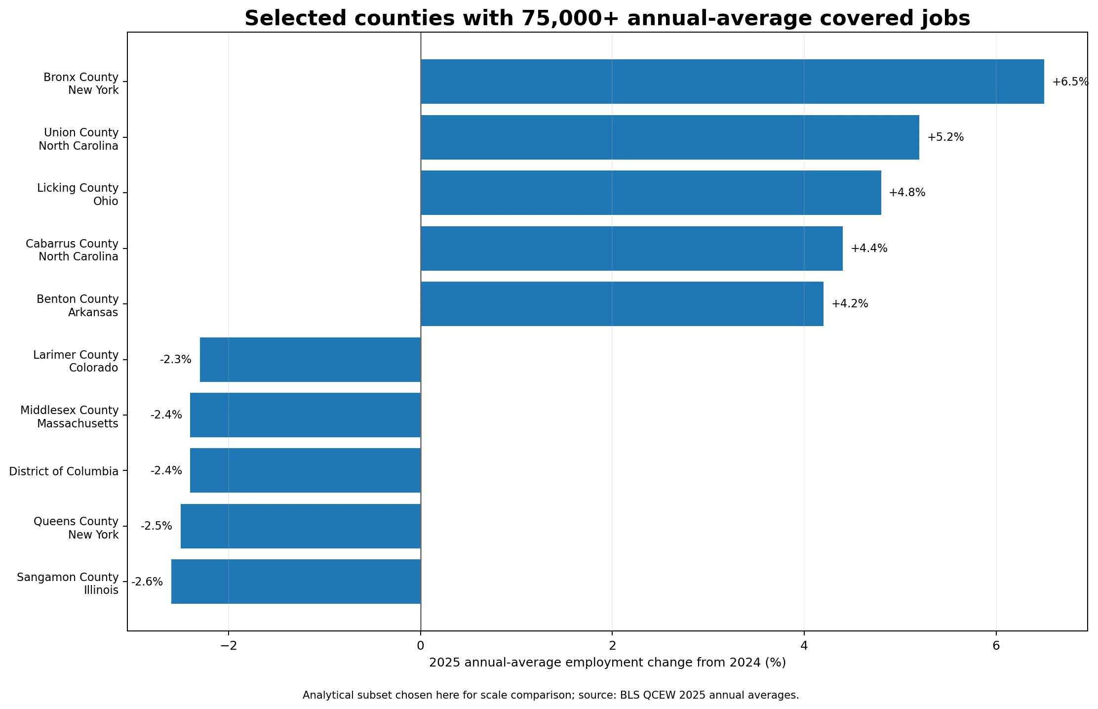
To reduce the visual impact of tiny denominators, a separate comparison was made for the 376 geographies with at least 75,000 annual-average covered jobs in 2025. This is an analytical screen used on this page to compare similarly larger employment bases; it is not presented as an official quality rating of counties.
| Higher-growth large geography | Change | 2025 annual-average employment |
|---|---|---|
| Bronx County, New York | +6.5% | 354,440 |
| Union County, North Carolina | +5.2% | 78,177 |
| Licking County, Ohio | +4.8% | 75,544 |
| Cabarrus County, North Carolina | +4.4% | 91,560 |
| Benton County, Arkansas | +4.2% | 150,665 |
| Lower-growth large geography | Change | 2025 annual-average employment |
|---|---|---|
| Sangamon County, Illinois | -2.6% | 130,936 |
| Queens County, New York | -2.5% | 751,303 |
| District of Columbia | -2.4% | 741,567 |
| Middlesex County, Massachusetts | -2.4% | 903,942 |
| Larimer County, Colorado | -2.3% | 171,281 |
The scale difference is striking. Bronx County, New York was up 6.5%, Union County, North Carolina was up 5.2%, and Licking County, Ohio was up 4.8%. On the negative side, Sangamon County, Illinois was down 2.6%, Queens County, New York was down 2.5%, and the District of Columbia was down 2.4%. These are meaningful movements, but they are far smaller than the +53.2% and -39.2% extremes found in the full county file.
This does not prove that large counties are inherently stable. It demonstrates a measurement issue that matters for map reading: a percentage should be viewed alongside its denominator. A useful interactive version of this map would therefore show both the growth rate and annual-average employment whenever a user selects a county.
Neighboring counties can move in sharply different directions
The Census Bureau 2025 County Adjacency File makes it possible to test whether an extreme value is part of a broader local cluster or a sharp discontinuity. Census treats counties as adjacent when they share a boundary edge or even a boundary point.
Bradford County, Florida, at +53.2%, provides a clear example. Its listed neighbors in the 2025 adjacency file include Alachua (+1.3%), Baker (-1.0%), Clay (+0.4%), Putnam (+1.7%), and Union (-0.2%). The Bradford spike is not mirrored by all of its immediate neighbors, which makes it a much more localized outlier than the statewide color alone would imply.
An even larger contrast appears in western North Carolina. Swain County declined 39.2%, while adjacent Jackson County increased 33.1%. The difference between the two neighboring growth rates is 72.3 percentage points. Other Swain neighbors were much closer to zero: Graham -2.9%, Haywood -0.4%, Macon +2.1%, Blount County, Tennessee +0.3%, and Sevier County, Tennessee -1.0%.
Haywood County, Tennessee is another localized decline. Its -21.6% change compares with Crockett -3.8%, Fayette +3.6%, Hardeman -2.7%, Lauderdale 0.0%, Madison +0.1%, and Tipton +0.6%. These neighbor comparisons are useful for identifying places that merit follow-up research. They are not causal evidence. A map cannot tell us, by itself, which employer, industry, policy, or project produced the difference.
State medians summarize the map, but they are not state growth rates
| States with higher county medians | Median county change |
|---|---|
| Utah | +2.2% |
| Nevada | +1.9% |
| Idaho | +1.3% |
| New Jersey | +1.1% |
| Georgia | +1.0% |
| States with lower county medians | Median county change |
|---|---|
| Iowa | -0.7% |
| West Virginia | -0.5% |
| Tennessee | -0.5% |
| South Dakota | -0.4% |
| Wisconsin | -0.4% |
Using an unweighted median of county changes, Utah was at +2.2%, Nevada +1.9%, and Idaho +1.3%. At the other end, Iowa was -0.7%, while West Virginia and Tennessee were each -0.5%. These figures summarize the typical county direction inside a state; they do not mean that Utah total covered employment grew by 2.2% or that Iowa total covered employment fell by 0.7%.
That distinction is important because a state median ignores county employment size. A sparsely populated county has the same influence on the median as a large metropolitan county. Official state-level QCEW aggregates should be used when the question is the growth of the state labor market as a whole. The medians here are included only to make the county map easier to scan for broad regional tendencies.
How to interpret QCEW county employment growth correctly
- The measure is annual-average covered employment, not every kind of employment or every person with a job.
- QCEW annual averages use the year’s monthly employment levels, so the result can differ from a single-month year-over-year comparison.
- BLS reports the annual-average over-the-year percent change to one decimal place.
- Large percentage changes deserve a denominator check because a small employment base can magnify a modest absolute change.
- Current county-equivalent definitions matter. Connecticut now uses nine planning regions as county equivalents, so analyses should not mix those current codes with the former eight-county structure.
The wage and pay columns included in the same QCEW data can support additional analysis, but they should not be used to manufacture a causal story. A county can gain employment while wage growth slows, or lose employment while average pay rises because its job mix changes. Those relationships need separate measurement and should be described as associations unless a stronger research design supports a causal claim.
Data sources and method
The employment measure comes from BLS QCEW Employment and Wages, Annual Averages 2025 and the county total-covered annual data. The formula and field meaning are documented in BLS Over-the-Year Calculations and the NAICS-based Annual File Layout. County identifiers and titles were checked against the QCEW Area Codes and Titles table.
Neighbor comparisons use the U.S. Census Bureau County Adjacency File for 2025. Current county and county-equivalent definitions are preferred when codes have changed, including Connecticut planning regions.
The processing rule is deliberately conservative. The 50 QCEW Unknown Or Undefined residual area rows were removed from county analysis, leaving 3,143 real county or county-equivalent records. The published BLS over-the-year percentage was then used directly for the map, rankings, distribution percentiles, and state medians. Missing geography values were not imputed from neighboring counties, and the BLS percentages were not replaced with modeled estimates.
Frequently Asked Questions
What does employment growth mean on this map?
It is the BLS QCEW over-the-year percent change in 2025 annual-average covered employment compared with the 2024 annual average. It is not a count of every worker or every type of employment.
Why do some small counties show very large percentage changes?
A small employment denominator can magnify a modest absolute change. That is why the page reports annual-average employment alongside the most extreme percentage changes.
How can national employment rise while many counties decline?
The national total is dominated by the number of covered jobs in each place, while the county distribution treats each geography as one observation. A positive national total and many flat or declining counties can occur at the same time.
Why can Connecticut look different from older county maps?
Connecticut now uses nine planning regions as county-equivalent geographies. Mixing current planning-region codes with the former eight-county structure can create geographic mismatches.
Related Maps
Green Map creates custom-edited map images using open geographic data sources such as geoBoundaries, Natural Earth, OpenStreetMap, and government open data.
These maps are edited visual materials, not raw data files, and are provided for education, documents, presentations, and graphic reference.