Walton County does not read as a single-purpose rural or suburban landscape on the supplied 2025 maps. Forest is the largest class at 41.23%, agriculture covers 27.79%, and developed land reaches 21.33%. Those three categories account for most of the county, but they are arranged very differently from one side to another. Broad built-up clusters stand out in the west, center, and south, while wooded and agricultural land fills much of the space between them. This Walton County Georgia Land Cover Map set is designed to show that contrast rather than reduce the county to one dominant number.
The page includes a 2025 countywide land-cover view, a forest-and-farmland map, an impervious-surface map, and a 1985–2025 class-difference comparison. The WebP versions are shown at readable size in the article, and the four original 2480 × 1754-pixel JPG maps are available together in one ZIP. A reader can start with the general map, then switch to the vegetation, hard-surface, or change view depending on whether the question is about rural cover, built intensity, or long-term classification differences.
Table of Contents
Three large land-cover shares create a mixed county rather than one dominant landscape
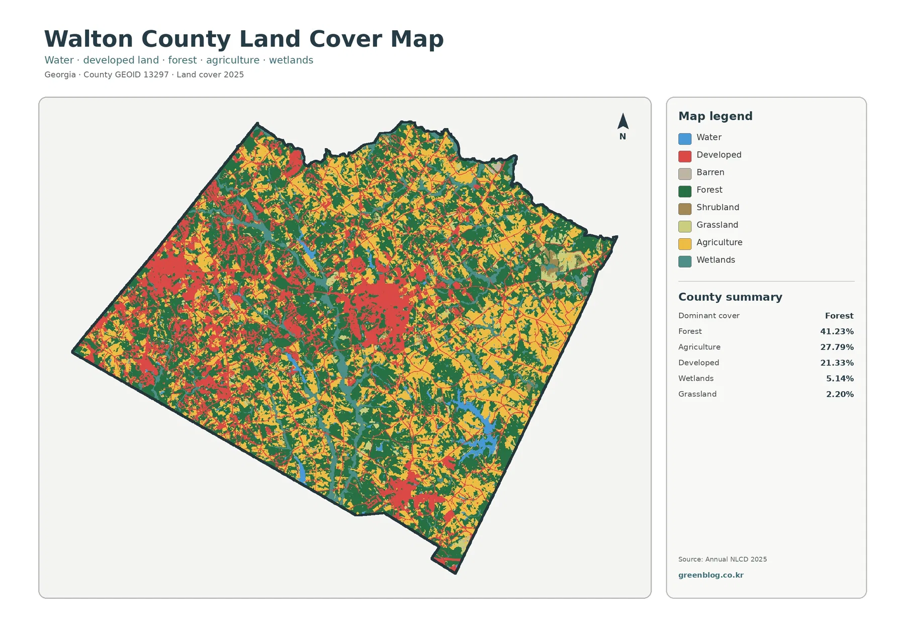
The general map immediately shows why the percentages need a spatial explanation. Dark green forest appears across the county rather than in one isolated corner. Yellow agricultural cover is especially common through the north and east but also continues through the central and southern countryside. Red developed land is more concentrated. It forms a broad western cluster, another strong concentration near the center, and a separate southern group. Between those built areas, forest and working land remain visible, so the county does not form one continuous urban surface.
Forest accounts for 41.23% of the 2025 summary, agriculture 27.79%, and developed land 21.33%. Wetlands are 5.14%, grassland 2.20%, water 1.49%, and shrubland 0.66%. The smaller classes still matter because many appear as narrow bands and small patches rather than large blocks. Water and wetlands, for example, occupy a modest share of the county total but recur along drainage features and around several visible water bodies. Grassland and shrub cover often sit along transitions between fields, woods, and developed areas.
Walton County’s official overview places the county about 45 miles east of Atlanta in Georgia’s Piedmont region and identifies Monroe as the county seat. County planning material also maps Loganville, Monroe, Social Circle, Walnut Grove, and the county’s smaller incorporated communities. The land-cover image itself does not draw those municipal boundaries, so a red patch should not be assigned to a city simply from this graphic. Still, the official place map provides useful context for understanding why several distinct built clusters appear instead of one single urban core.
The vegetation view reveals farmland and woods woven around the built areas
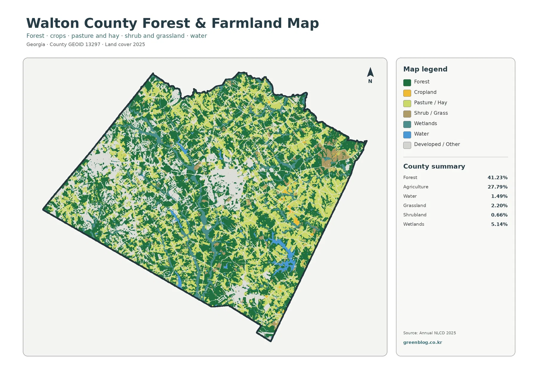
Removing the strong red developed color changes the way Walton County looks. Large forest blocks become easier to follow through the central and eastern parts of the county, while smaller wooded pieces also remain inside the more developed west. Agricultural cover is not one solid eastern belt. It spreads through the north, northeast, east, and southeast and then reappears in strips between wooded areas elsewhere. The result is a patchwork of working land and tree cover rather than a clean urban-rural dividing line.
The agriculture figure of 27.79% should also be read with the legend in mind. Cropland and pasture or hay are separated visually, and grassland has its own category. A field-colored patch therefore does not automatically mean the same crop, management practice, or ownership as another patch. The map is useful for showing where open agricultural cover is concentrated at county scale, but it does not identify farm parcels, producers, legal land use, or whether a field was actively planted on a particular day.
Wetlands cover 5.14% and open water 1.49% in the supplied summary. They are not the largest classes, yet they help explain the fine-grained pattern between forest and agriculture. Narrow wetland bands and small water features interrupt larger green and yellow areas, particularly through the central and southern parts of the map. At this scale, a stream corridor may appear as a chain of different cells rather than a perfectly continuous line. That is one reason the image works better for countywide comparison than for drawing an exact environmental boundary around a property.
Hard surfaces distinguish the western, central, and southern centers from the rural road network
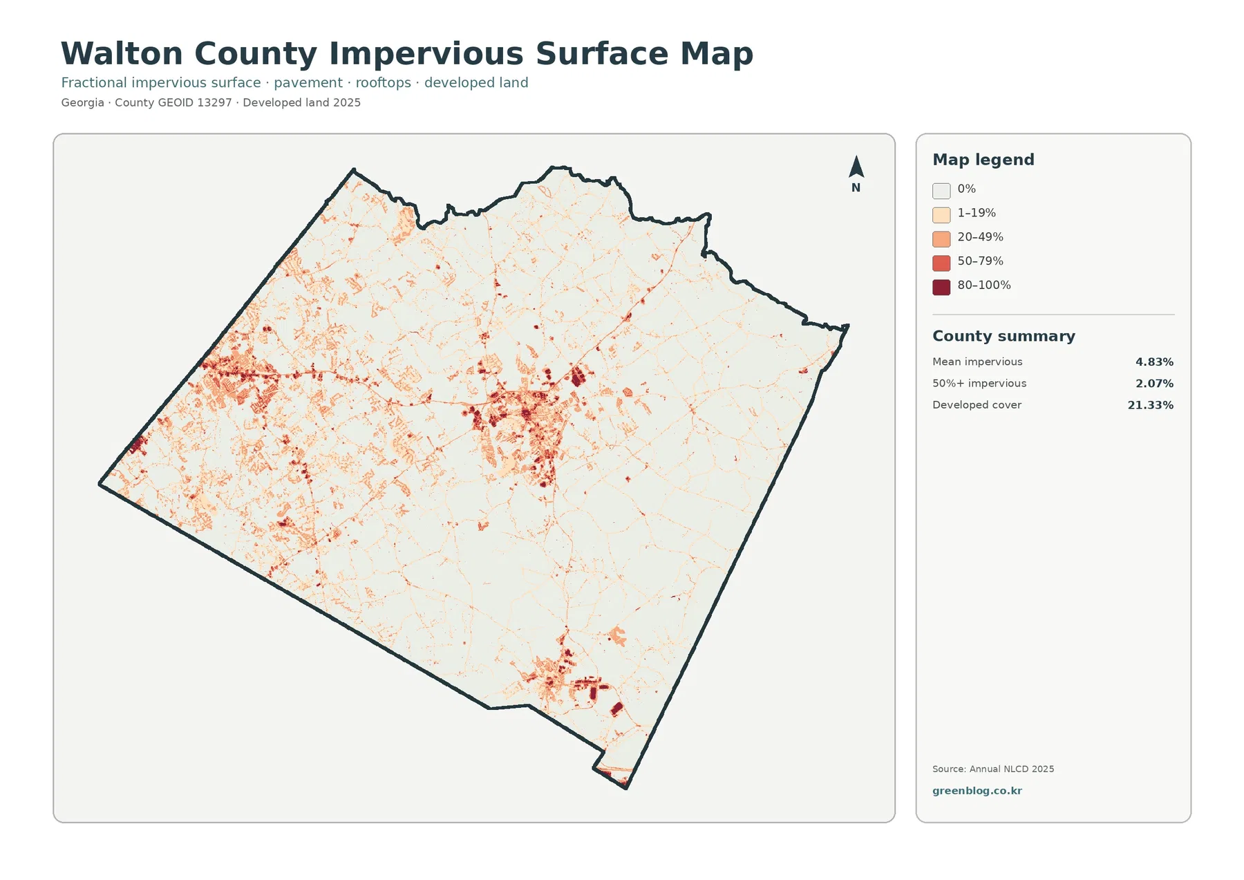
The impervious map strips away most land-cover colors and focuses on rooftops, pavement, parking areas, and other hard surfaces. Walton County’s mean impervious value is 4.83%, and 2.07% of the county is mapped at 50% or greater impervious cover. The largest concentration lies in the west, with another dense cluster near the center and a separate southern concentration. Thin lines connect many smaller patches, showing the road network and dispersed development that extends beyond the main centers.
The eastern and northeastern portions are noticeably lighter. Roads still cross those areas and small built spots are present, but they do not form the same broad, connected hard-surface pattern seen in the west and center. That contrast helps a reader separate two questions that the general map combines: how much land is classified as developed, and where the most intensely paved or roofed surfaces occur. The second question is often more useful when discussing built concentration rather than simply counting all developed classes together.
Developed cover is 21.33%, much higher than the 4.83% countywide mean impervious value. That difference is expected because a developed land-cover class can include lawns, trees, bare ground, and other permeable surfaces around buildings and roads. Impervious percentage isolates the harder materials within that broader developed setting. A subdivision may therefore appear as developed land across a fairly large area while only part of each cell is actually occupied by rooftops, streets, driveways, or parking.
Official Walton County planning maps place Loganville on the western side, Monroe near the middle of the county, and Social Circle to the south. Those locations broadly correspond to the three large concentration zones visible in the impervious map, but the image does not include city-limit lines. It should therefore be used to describe regional concentration, not to decide whether a specific hard-surface cell is inside Loganville, Monroe, Social Circle, or unincorporated Walton County. Parcel or zoning questions need the current local GIS and planning records.
A 31.94% two-date difference includes development, forest loss, and other classification changes
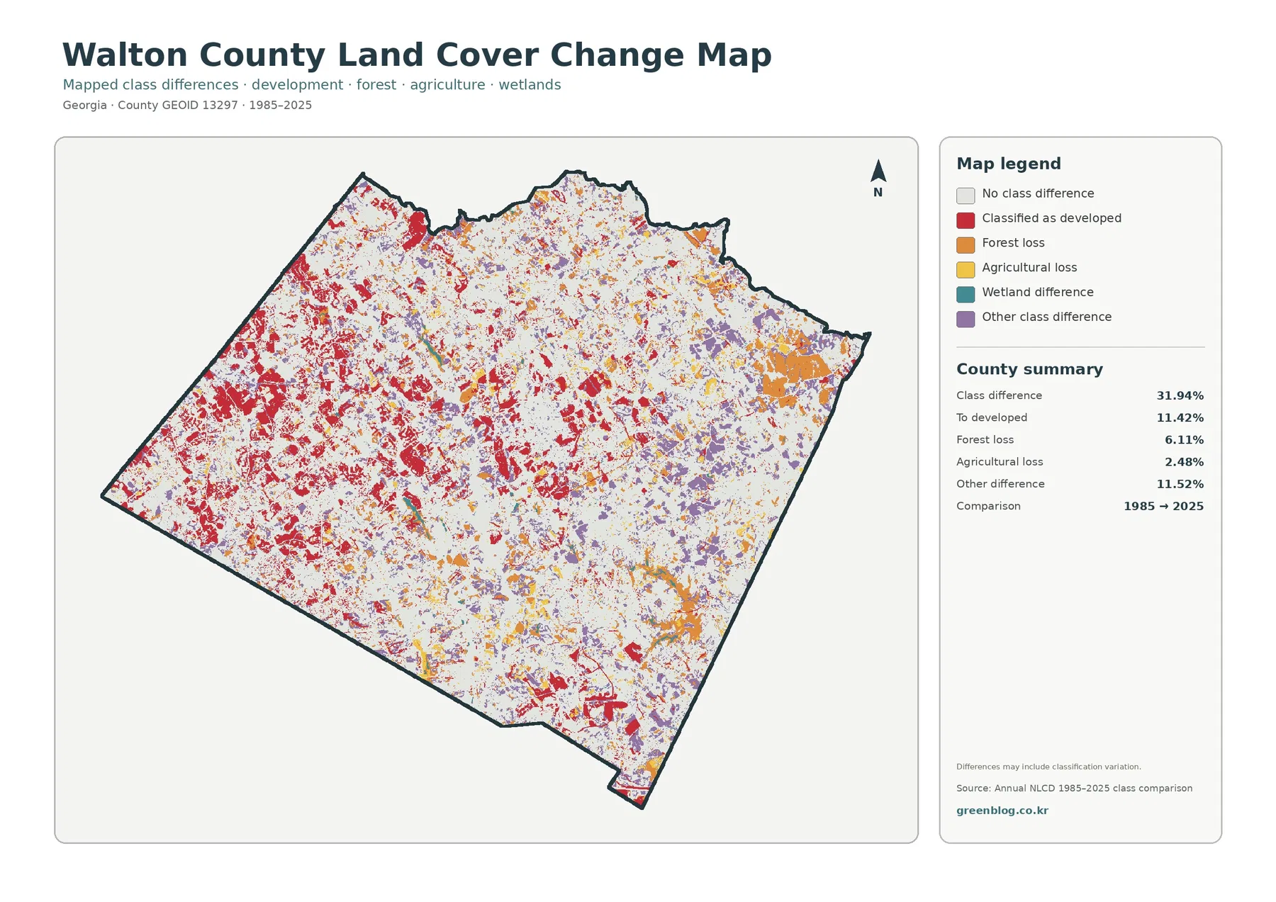
The change map is an endpoint comparison, not a second version of the current land-cover map. Gray areas have no class difference between the 1985 and 2025 endpoints. Colored cells mark a different classification at the two dates. The total class-difference figure is 31.94%. The summary separately lists 11.42% classified to developed, 6.11% forest loss, 2.48% agricultural loss, and 11.52% other difference. Wetland difference is also a legend category, but its exact percentage is not printed in the supplied summary, so no value is inferred here. The 31.94% headline number therefore cannot be interpreted as the share of the county that urbanized.
Red development-classification differences are especially widespread in the western part of the county and also form strong patches in the center and south. Those areas overlap broadly with the present-day hard-surface concentrations. Orange forest-loss cells are more visible in several eastern and northeastern patches as well as smaller areas elsewhere. Purple other-class differences are scattered widely, which is a reminder that land-cover comparison includes more than a simple forest-to-development story.
The map also warns that differences may include classification variation. That matters whenever the colored cells are small or mixed with several neighboring classes. A cell could change because of real land-cover conversion, vegetation condition, agricultural use, water conditions, or differences in how the surface was classified at the two endpoints. Establishing the exact cause requires intermediate imagery and local records rather than relying on the endpoint color alone.
Another limitation is time. A location may have changed more than once between 1985 and 2025 and still end in a class similar to where it started. The two-date map will not show that sequence. It is best used to identify areas where the endpoints differ and to decide where more detailed research might be worthwhile, not as a year-by-year development chronology.
Comparing the four views explains the west-to-east contrast better than any single percentage
Walton County’s western side stands out most clearly when the general, impervious, and change maps are viewed together. The 2025 map has extensive developed cover there, the impervious image shows many high-intensity hard surfaces, and the 1985–2025 comparison contains a dense field of red development-classification cells. Forest and agriculture have not disappeared from the west, but they are broken into smaller pieces around the built network than in much of the east.
The central part of the county forms a second strong built focus rather than merely an extension of the western cluster. It sits within a broader matrix of forest, fields, wetlands, and small water features. That separation is important because it shows that Walton County contains several centers linked by roads and lower-density development. A map that only reported the 21.33% developed total would not show whether that cover occurred in one block or several separate clusters.
To the east and northeast, forest and agricultural cover occupy more of the view, and the impervious map becomes much lighter. The change layer still records forest loss, other class differences, and some development conversion, so this side of the county is not unchanged. It is simply less dominated by connected hard surfaces in the 2025 image. That distinction is useful when comparing current built intensity with long-term land-cover differences.
The southern cluster deserves separate attention because it is physically apart from the major central concentration. Social Circle’s official city information places the community south of Monroe and notes that it extends into both Walton and Newton counties. For that reason, the southern hard-surface pattern should be read in a wider regional setting rather than treated as an isolated patch with no connection beyond the county line. The land-cover maps stop at Walton County’s boundary, while the actual community landscape continues across it.
Choose the map by the question instead of shrinking all four into one crowded figure
For a county profile, the general 2025 image is the best starting point because it shows forest, agriculture, development, wetlands, water, and smaller classes together. It works well when the goal is to explain why Walton County is neither uniformly suburban nor uniformly rural. A second map can then answer the more specific question that follows. This approach keeps the legend readable and prevents the audience from confusing current cover with change categories.
The forest-and-farmland view is the stronger choice for a lesson or report focused on rural land cover. It makes the 41.23% forest and 27.79% agricultural shares easier to interpret spatially and shows how they continue between developed centers. The impervious map is more useful when the question concerns concentrated built surfaces, because the west, center, and south stand out without the distraction of the full land-cover palette.
Use the 1985–2025 comparison when the topic is long-term class difference, but pair it with a current map whenever possible. A red cell on the change layer means that its endpoint classification became developed; it does not use the same meaning as the red developed class on the current map. Keeping the captions visible and stating the observation years avoids one of the easiest mistakes readers can make when the two graphics are shown in the same presentation.
For print, reports, or classroom work, one full-size map plus one comparison figure is usually more legible than four small panels. Preserve the legend, county summary, and map boundary whenever possible. Cropping those elements may save space, but it can remove the information needed to interpret a color correctly. If only a portion of the county is relevant, consider keeping the complete map on one page and using a clearly labeled crop on the next.
Land cover is a surface classification, not a parcel, zoning, or development-rights map
These maps describe what the ground surface was classified as, not what a property is legally allowed to become. Forest does not identify ownership or conservation status. Agriculture does not prove that a parcel is currently enrolled in a farm program. Developed land does not identify residential, commercial, or industrial zoning. Wetland-colored cells do not establish a regulatory wetland boundary. Those questions require current parcel, zoning, environmental, and permitting sources.
The source is raster land-cover data, so each cell represents a generalized predominant surface. Narrow roads, small ponds, tree lines, drainage channels, and mixed residential lots may appear wider, smaller, or less continuous than they do on the ground. Enlarging the JPG can make the legend and pattern easier to see, but it cannot create parcel-level detail that was not present in the source data.
The 2025 map also represents a supplied observation year. Construction, clearing, farming changes, vegetation recovery, or new pavement after that observation will not necessarily appear. For a current property decision, recent aerial imagery and Walton County Planning & Development or municipal GIS records are more appropriate. The land-cover set is strongest for county-scale comparison, education, presentations, background research, and selecting places that deserve closer study.
What to know before using the four original JPG maps
The ZIP contains one original JPG for each map discussed in the article: 2025 land cover, forest and farmland, impervious surface and developed land, and 1985–2025 land-cover change. Each image measures 2480 × 1754 pixels. That size is practical for web layouts, documents, slides, and many ordinary print uses, but the supplied asset manifest does not mark the files as meeting an A3 high-resolution reference. Test a proof before producing a large poster.
Keep the original proportions so the county outline is not stretched, and leave the legend and summary visible when the map is being used as evidence. The change image should be labeled with its 1985–2025 comparison dates because its colors represent endpoint differences rather than current land-cover classes. When a presentation needs both current cover and change, place them close enough to compare but give each map enough space for the small category labels to remain readable.
Frequently Asked Questions
What is the largest land-cover class in Walton County?
Forest is the largest class in the supplied 2025 summary at 41.23%. Agriculture follows at 27.79%, and developed land is 21.33%. Because the second and third categories are also large, Walton County is better described as a mixed forest-agriculture-development landscape than as a county dominated by woods alone.
Why is developed cover 21.33% when mean impervious cover is only 4.83%?
Developed land can include lawns, trees, bare ground, and other permeable surfaces around roads and buildings. Impervious percentage focuses on rooftops, pavement, parking areas, and similar hard surfaces. The two measures describe different parts of the built landscape, so the countywide impervious average can be much lower than the developed-land share.
Does 31.94% class difference mean that 31.94% of Walton County was developed?
No. The 31.94% figure is the total share of cells with different classifications at the 1985 and 2025 endpoints. The summary lists 11.42% classified to developed, 6.11% forest loss, 2.48% agricultural loss, and 11.52% other difference, while wetland difference is also shown as a category. The timing and cause of a particular change require intermediate imagery and local records.
Sources and Reference Data
- MRLC Annual NLCD Data – official access point for annual land-cover and comparison data
- USGS Annual NLCD Land Cover Classification – official descriptions of forest, developed, agricultural, wetland, and other classes
- Walton County: About Walton County – official county background, location, and county-seat information
- Walton County Comprehensive Plan and Land Use Update – official planning material and mapped community context
- UGA Extension Walton County Agriculture & Natural Resources – county-specific agriculture and natural-resources information
Map File Information
The ZIP contains four original JPG maps for comparing Walton County's 2025 land cover, forest and agricultural pattern, concentrated hard surfaces, and 1985–2025 class differences.
- Included Files: Use only the versions confirmed in the article and supplied images
- File Type: Use the confirmed download contents
- Intended Use: Printing, education, presentations, and map-based projects
Related Maps
- Appling County Georgia Land Cover Map
- Atkinson County Georgia Land Cover Map
- Bacon County Georgia Land Cover Map
Green Map creates custom-edited map images using open geographic data sources such as geoBoundaries, Natural Earth, OpenStreetMap, and government open data.
These maps are edited visual materials, not raw data files, and are provided for education, documents, presentations, and graphic reference.