Turner County has a distinctly agricultural 2025 land-cover pattern, but the county is not a solid block of farmland. Agriculture covers 46.08%, while forest and wetlands account for almost equal shares at 19.99% and 19.19%. Green and teal corridors repeatedly cut through the yellow farm areas, and the largest developed cluster sits near the middle of the county around Ashburn. The contrast between that compact built core and the surrounding rural cover is the clearest feature of the map set.
This page includes four views: current land cover, forest and farmland, fractional impervious surface with developed land, and mapped class differences from 1985 to 2025. The body previews are 1800×1273 WebP images. One ZIP download contains all four original 2480×1754 JPG maps, so the maps can be reviewed on screen first and then used at a larger size in a class handout, report, presentation, or county comparison.
Table of Contents
Agriculture covers nearly half of Turner County in 2025
Yellow agricultural cover dominates the current land-cover image. At 46.08%, it is more than twice the share of either forest or wetlands. The yellow area is widespread across the south, east, center, north, and parts of the west rather than confined to one corner. Even so, many farm blocks are interrupted by wooded patches and narrow wetland corridors. That broken pattern matters because the countywide percentage alone can make the landscape sound more uniform than it looks on the map.
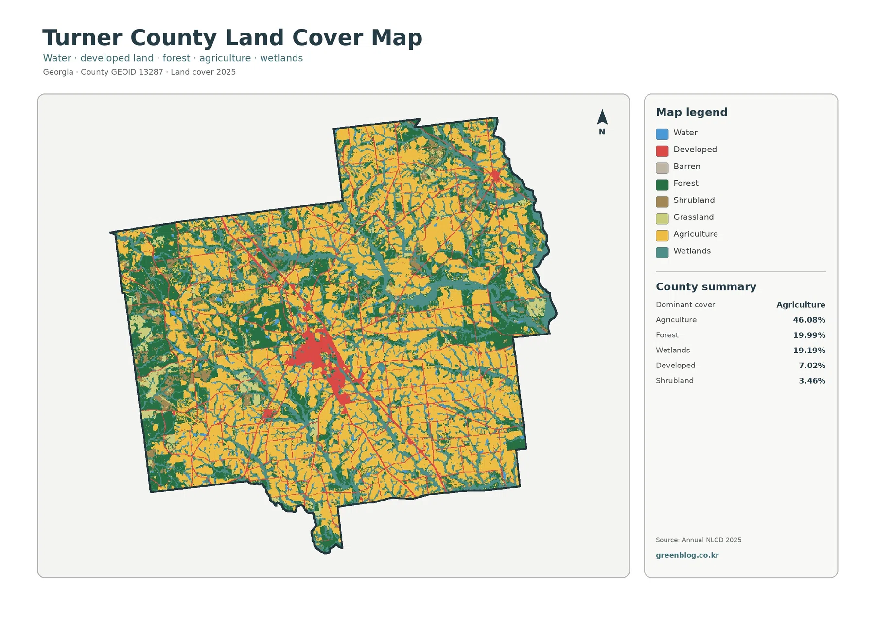
Forest covers 19.99% and wetlands 19.19%, making the two shares remarkably close. Dark green forest forms several larger blocks on the western and southwestern sides and appears again in irregular patches across the north and east. Teal wetlands have a different shape. They often appear as long, narrow, branching bands that pass between agricultural areas and connect to small water features. Those forms make the wetland class visually important even though it does not dominate the county.
Developed cover accounts for 7.02%. Its area is much smaller than agriculture, yet it is easy to find because the red pixels are concentrated instead of evenly scattered. The largest group is in the central part of the county, with thin developed lines extending away from it along transportation corridors. A smaller built concentration appears toward the northeastern side. Because the supplied map does not label municipal limits, the smaller clusters should not be treated as exact city boundaries simply from their color and position.
| 2025 land-cover class | Share |
|---|---|
| Agriculture | 46.08% |
| Forest | 19.99% |
| Wetlands | 19.19% |
| Developed | 7.02% |
| Shrubland | 3.46% |
| Grassland | 2.78% |
| Water | 1.46% |
Forest and wetland corridors break up the farm pattern
The forest-and-farmland version reduces the visual weight of developed land and makes the rural cover easier to compare. Cropland is the broad yellow background, but it is repeatedly divided by forest and wetlands. Pasture or hay and shrub or grass classes add smaller transition areas. The result is a patchwork rather than a single agricultural sheet, with natural cover following irregular shapes through and around the larger farm areas.
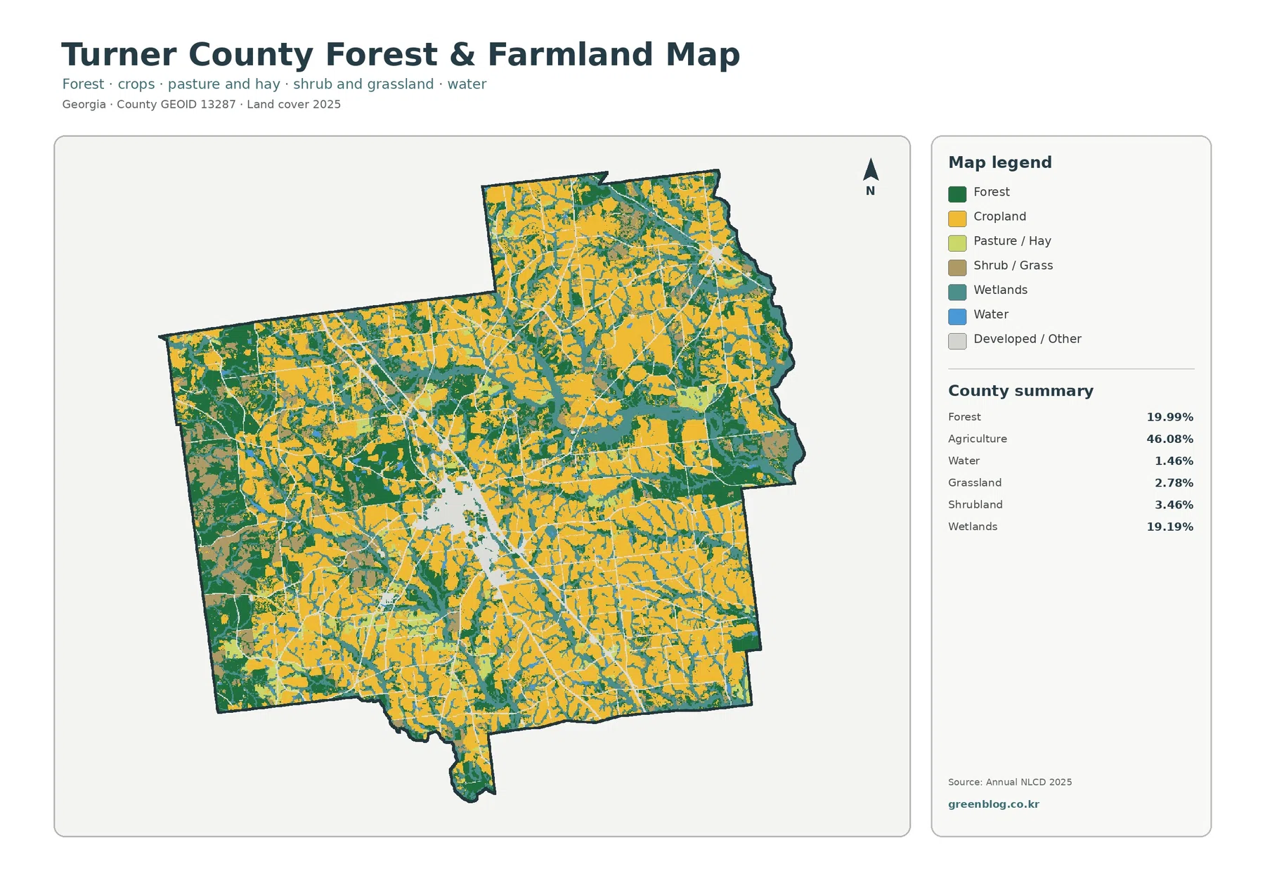
UGA Extension maintains an Agriculture and Natural Resources program for Turner County, which provides a useful local context for the prominence of agricultural land on the map. The supplied NLCD image, however, does not identify specific crops, individual farms, farm ownership, or forestry management units. A yellow pixel cannot be assigned to peanuts, cotton, corn, soybeans, or another crop without a separate dataset. The same caution applies to forest: green cover shows a surface class, not a property boundary or timber-management status.
Ashburn and I-75 stand out on the impervious-surface map
The impervious-surface view strips away most of the agricultural and natural colors. What remains is a sparse countywide network of roads and a much denser central cluster. Turner County’s mean impervious share is only 1.43%, which reflects the large rural area, but the center around Ashburn is visibly different from that average. Darker pixels mark places where pavement, rooftops, parking areas, and other hard surfaces occupy a larger part of each mapped cell.
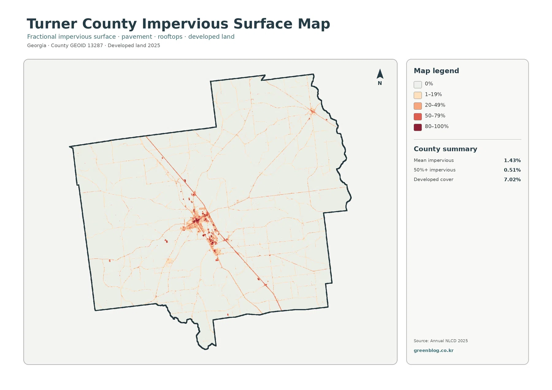
The Georgia Department of Community Affairs comprehensive plan covers Turner County together with Ashburn, Rebecca, and Sycamore and identifies interchange-oriented areas along I-75 as a distinct development setting. A Georgia Department of Transportation city map for Ashburn also shows I-75 and U.S. 41 passing through the city area. That official context helps explain why the central hard-surface cluster and the strong northwest-to-southeast line are meaningful transportation-and-development features. The supplied impervious map itself does not print road names, so exact road identification should still come from a transportation map rather than color alone.
Only 0.51% of the county is mapped at 50% or greater imperviousness. That small share does not mean the central developed area is insignificant. Instead, it shows how compact the highest hard-surface concentrations are compared with the county’s extensive agricultural and natural surroundings. Within the Ashburn cluster, several red and dark-red pixels reach the higher legend ranges, while most of the county remains in the zero or low-percentage classes.
| Impervious/developed summary | Value |
|---|---|
| Mean impervious surface | 1.43% |
| Area at 50%+ impervious | 0.51% |
| 2025 developed cover | 7.02% |
The 1985-2025 change map needs a careful reading
The change map highlights cells whose mapped land-cover class differs between 1985 and 2025. Turner County has a total class difference of 22.07%. Forest loss is listed at 7.97%, agricultural loss at 4.66%, change classified as developed at 1.56%, and other class difference at 6.03%. The legend also includes wetland difference, but the summary panel does not give a separate percentage for that class. No remainder calculation has been used to invent a wetland-change value.
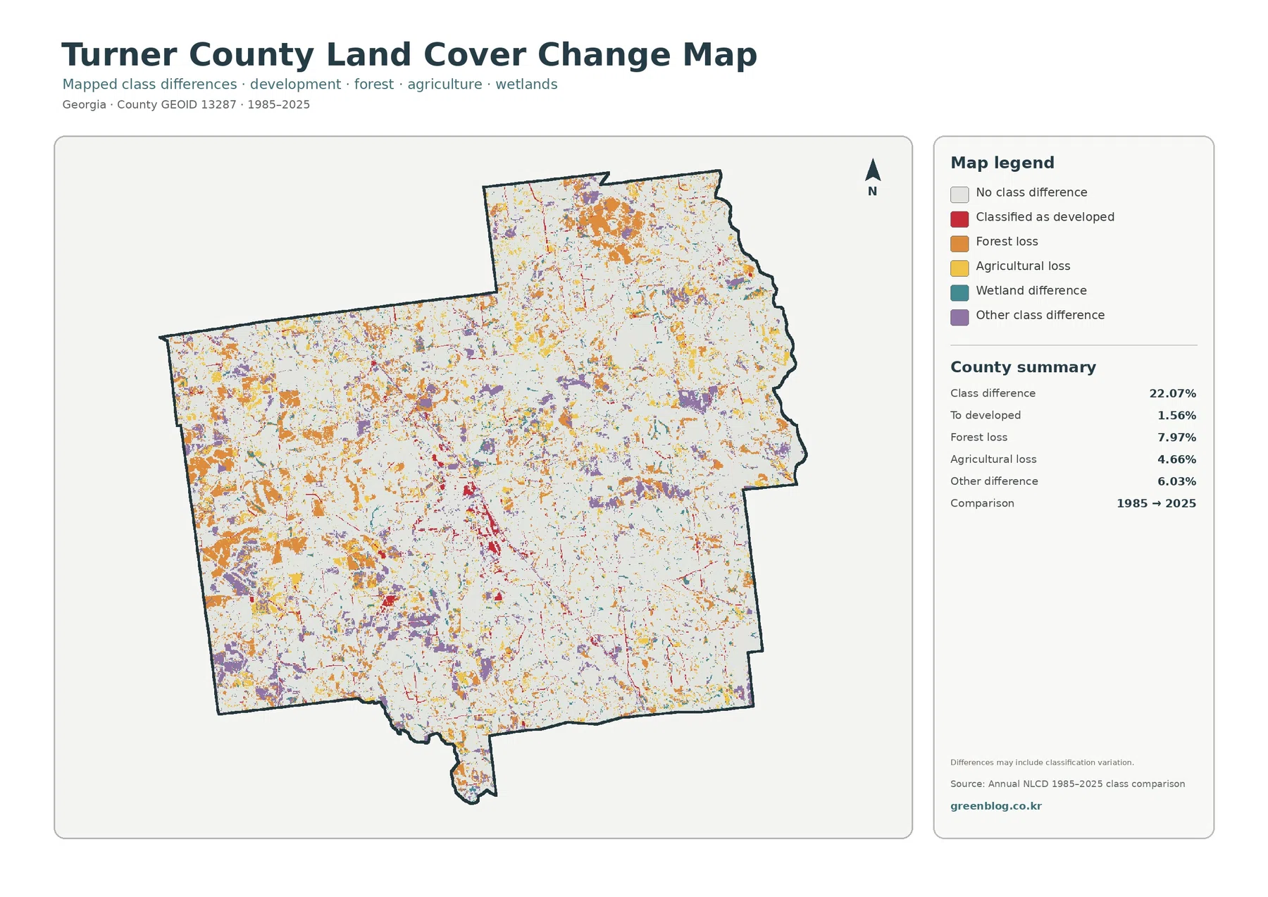
Orange forest-loss patches are scattered across the county, with noticeable groups in the west and north as well as smaller areas elsewhere. Yellow agricultural-loss pixels are also dispersed rather than confined to one zone. Purple other-difference areas appear among rural land-cover patches, while red developed-change pixels are more visually concentrated near the central built area and along a few linear corridors. The different shapes show why the 22.07% total should not be treated as one single type of land transformation.
A 7.97% forest-loss value does not establish that all of those acres were permanently cleared, developed, or converted in the same year. The comparison tells us that the 1985 and 2025 classifications differ in those cells. It does not reveal the exact timing, the cause, or whether a cell passed through several cover states during the forty-year interval. The map itself also notes that differences may include classification variation, so small or isolated changes deserve additional checking before they are used as evidence of a specific event.
What the four maps reveal when read together
The current land-cover map answers the broadest question: agriculture is the dominant surface class. The forest-and-farmland view then shows how wooded and wetland corridors divide that farm-dominated background. The impervious map removes most of the rural detail and makes the compact Ashburn-centered hard-surface pattern easy to see. Finally, the change map adds a time comparison, showing that long-term class differences are spread well beyond the central developed area.
The western and southwestern forest blocks provide a different comparison. They are conspicuous on the current and forest-focused maps, yet the change map still contains orange and purple patches inside and around those areas. In the east and south, agriculture remains the dominant background, but wetland and forest strips repeatedly cross the fields. Turner County is therefore best read as an agricultural county with substantial natural-cover networks and a compact development center, not as a uniform farming surface.
Choosing the right file for printing, reference, and comparison
The WebP images in the article are convenient for quick browser viewing, while the ZIP contains the four original 2480×1754 JPG maps. For a general county overview, the current land-cover map is the clearest starting point. The forest-and-farmland view works better when the question is how farm areas, woods, wetlands, and open cover fit together. The impervious-surface map is the most useful of the four for comparing built intensity, and the change map should be selected when the focus is the 1985-to-2025 difference.
Frequently Asked Questions
What is the largest land-cover class in Turner County?
Agriculture is the largest 2025 class at 46.08%. Forest follows at 19.99% and wetlands at 19.19%. The map is still far from uniform because forest and wetland corridors repeatedly break up the agricultural areas.
Which map best shows development around Ashburn?
The current land-cover map shows the central developed cluster, but the impervious-surface map gives the clearest view of roads, rooftops, parking, and other hard surfaces. Turner County’s mean impervious value is 1.43%, while the highest percentages are concentrated much more tightly around the central built area and along major corridors.
Does the 22.07% change value mean that much of the county was developed?
No. The 22.07% figure is the total share of cells with a different mapped class in 1985 and 2025. The category changed to developed is 1.56%. The rest includes forest loss, agricultural loss, other class differences, and wetland differences, so the total class difference should not be used as an urbanization rate. Map File Information The ZIP contains four original JPG maps for Turner County: 2025 land cover, forest and farmland, impervious/developed land, and 1985-2025 land-cover change.
Map File Information
Download the map files associated with this page for reference, printing, and compatible visual projects.
- Included Files: Use only the versions confirmed in the article and supplied images
- File Type: Use the confirmed download contents
- Intended Use: Printing, education, presentations, and map-based projects
Related Maps
- Appling County Georgia Land Cover Map
- Atkinson County Georgia Land Cover Map
- Bacon County Georgia Land Cover Map
Sources and references
- MRLC Annual NLCD Data – official access to annual land-cover and impervious-surface data.
- USGS Annual NLCD Land Cover Classification – official documentation for land-cover classes and interpretation.
- U.S. Census Bureau TIGER/Line Shapefiles – official geography that can supplement the map with county, municipal, and road boundaries.
- Georgia DCA – Turner County, Ashburn, Rebecca & Sycamore Comprehensive Plan – official local planning context, including the county’s cities and I-75 interchange areas.
- Georgia DOT – City of Ashburn Map – official transportation map showing I-75, U.S. 41, and other roads through the Ashburn area.
- UGA Extension Turner County – Agriculture & Natural Resources – county agriculture and natural-resources information from the University of Georgia Extension.
Green Map creates custom-edited map images using open geographic data sources such as geoBoundaries, Natural Earth, OpenStreetMap, and government open data.
These maps are edited visual materials, not raw data files, and are provided for education, documents, presentations, and graphic reference.