The Gwinnett County Georgia Land Cover Map presents a county where developed cover is the defining 2025 surface class. The supplied summary assigns 74.72% to developed land and 18.78% to forest, while agriculture, wetlands, and water occupy much smaller shares. Forest is still easy to find on the eastern and southeastern side, but the countywide image is primarily a developed suburban landscape rather than a forest or farm county.
Four complementary images are included here: current land cover, forest and farmland, impervious surface, and a 1985–2025 land-cover difference map. The four original 2480 × 1754 JPG files are packaged together in one ZIP for presentations, county profiles, classroom work, and broad landscape comparison. They are not parcel surveys, zoning maps, property-boundary records, or site-specific development approvals.
Table of Contents
Developed cover dominates the 2025 countywide picture
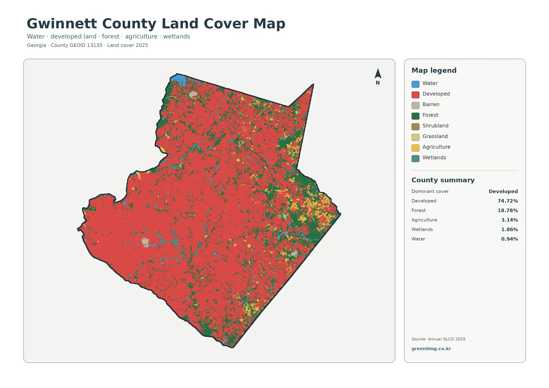
The county summary is unusually clear: developed cover accounts for 74.72%, forest for 18.78%, agriculture for 3.14%, wetlands for 1.86%, and open water for 0.94%. Development is therefore not a small set of isolated town centers. Red cover extends through most of the county, creating a broad continuous background with natural and agricultural classes appearing as smaller pieces within it.
The east and southeast provide the strongest visual contrast to that developed majority. Larger green forest patches remain there, and yellow agricultural areas become more noticeable near the eastern edge. The north also contains forest fragments, but they are repeatedly interrupted by developed cover. Western and southwestern portions are much more heavily filled by the developed class, although scattered green and blue cells remain.
Water has a small countywide percentage, yet several blue areas are easy to recognize, including a larger feature near the northern boundary and smaller interior patches. Wetlands occupy nearly twice the share of water and appear more often near the eastern and southeastern natural-cover patches. Their proximity on the map is a spatial association only; the image does not establish hydrologic cause, legal wetland status, or a regulated buffer.
Land cover answers a simple surface question: what broad type of material or vegetation is represented at a location? It does not answer who owns the land or what a parcel may legally be used for. A developed pixel can contain lawns and trees as well as buildings and pavement, while a forest pixel does not automatically identify public parkland, conservation property, or a protected tract.
Forest and farmland stand out when developed surfaces are muted
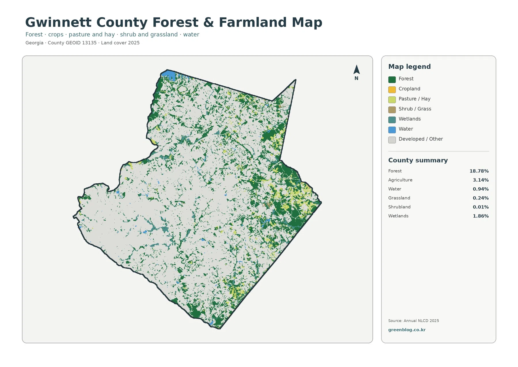
Removing most of the visual weight of development makes the remaining 18.78% forest much easier to trace. The largest connected patches lie toward the east and southeast, with smaller green areas scattered through the north and central parts of the county. The southwest and much of the west appear comparatively pale because developed and other surfaces dominate those locations.
Agriculture represents 3.14% of the county. Yellow areas appear mostly as small, separated pieces rather than one broad farming belt, with more visible concentrations toward the east and southeast. The package reports agriculture as a combined value, so the individual shares of cropland and pasture or hay should not be estimated from color alone even though the legend distinguishes them.
Wetlands at 1.86% and water at 0.94% provide another useful comparison. Both occupy far less area than forest, yet they help break up the developed landscape and are more visible near some of the eastern natural-cover areas. The map is suitable for broad pattern study, not wetland permitting or stream-buffer measurement, because regulatory boundaries come from different datasets and field criteria.
Impervious cover reveals where the developed landscape is hardest
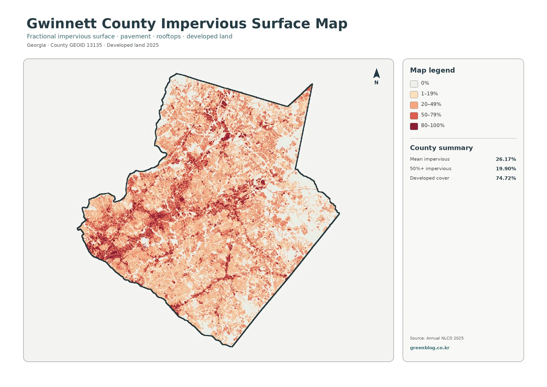
Mean impervious cover is 26.17%, while 19.90% of the county is mapped at 50% impervious or greater. Those values are much lower than the 74.72% developed-land share because the two products measure different things. Developed classes may include trees, lawns, bare soil, and other permeable surfaces around homes and businesses; impervious cover focuses on the harder portions such as roofs and pavement.
The darkest impervious concentrations are prominent in the southwest and central parts of the county, with additional strong patches toward the north. Lighter categories spread far beyond those cores, creating a patchwork of low-, medium-, and high-impervious surfaces. The map contains no road labels, so linear dark traces should be described as visible corridors rather than assigned highway names from appearance alone.
Imperviousness can be useful when discussing surface runoff because water behaves differently on pavement and rooftops than on soil or vegetation. It is not a flood-risk map. Rainfall, slopes, soils, drainage networks, culverts, streams, reservoirs, and engineered stormwater systems all influence flooding, so the image should be used to describe surface hardness rather than predict whether a specific property will flood.
The 1985–2025 comparison records widespread class differences
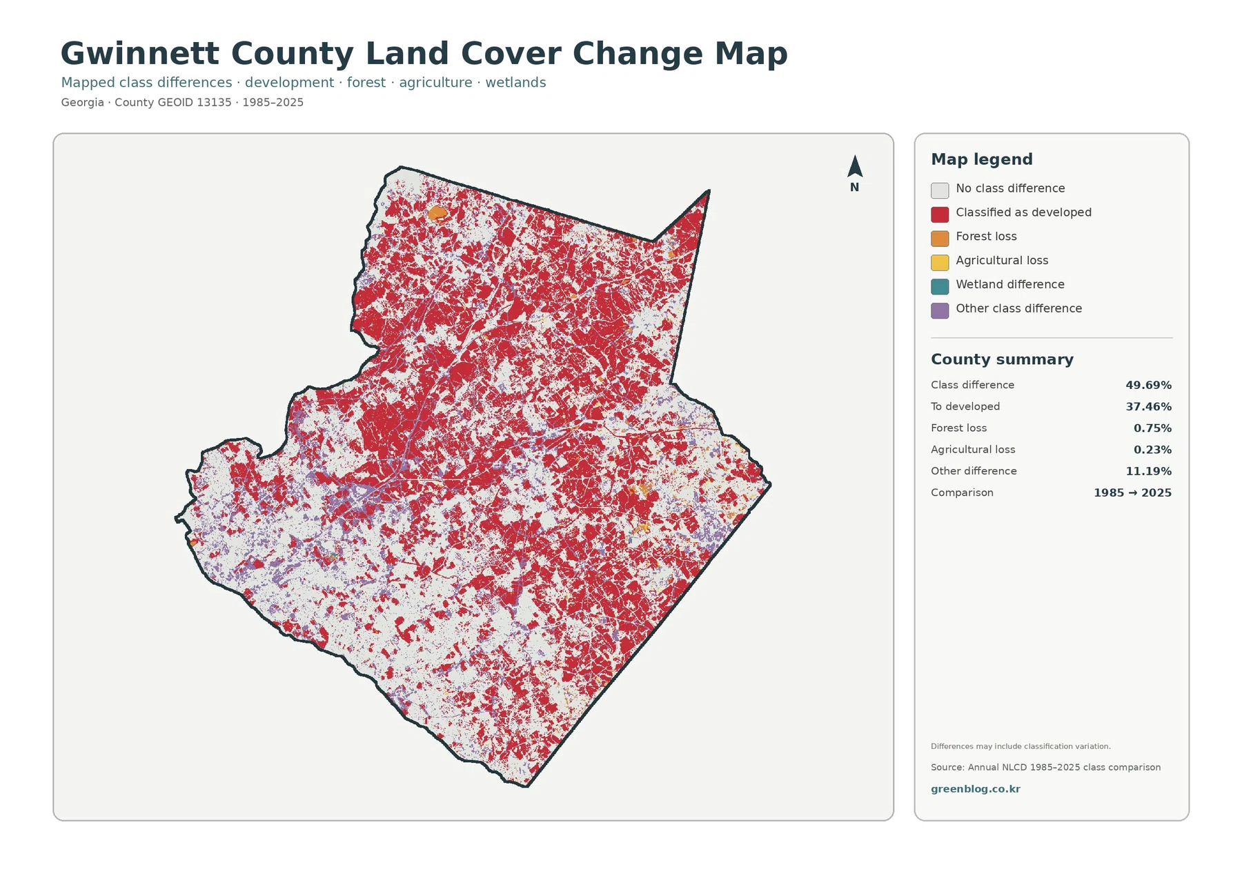
The supplied change summary reports a 49.69% class difference between 1985 and 2025. The largest named component is “to developed” at 37.46%, followed by other difference at 11.19%, forest loss at 0.75%, and agricultural loss at 0.23%. These are endpoint classification results, not an annual development rate and not a statement that every changed pixel experienced the same process.
Red “to developed” cells are widespread through the center, north, and east, while areas with no class difference remain in white patches across the county. Purple other-difference areas are scattered rather than confined to a single corner. Forest-loss and agricultural-loss colors occupy much smaller portions of the map, so they should not be visually generalized into countywide trends beyond the supplied percentages.
The 49.69% total should also be interpreted with the map note in mind: differences may include classification variation. A 30-meter cell along a mixed edge can move between categories when imagery, vegetation condition, or classification outcomes differ. The comparison is therefore best used to locate areas worth further investigation rather than as a parcel-level record of confirmed physical change.
The 37.46% transition to developed is still important for understanding the long-term character of Gwinnett. It signals that developed classification expanded across a large part of the county between the two endpoints. The map by itself does not identify when each change occurred, what type of development followed, or which project was responsible. Intermediate Annual NLCD years, aerial imagery, planning records, and permits are needed for that level of explanation.
Southwestern Gwinnett has a planning context beyond the land-cover pixels
Gwinnett County’s official Park Place Master Plan focuses on a southwestern district around Park Place Boulevard and Stone Mountain Highway. The plan addresses future development and redevelopment together with transportation, housing, open space, placemaking, and other community concerns. That county-specific planning effort provides useful context for a part of the map that already appears heavily developed and strongly impervious, but the plan boundary cannot be inferred from the land-cover pixels.
The county’s 2045 Unified Plan takes an even broader view. Adopted in 2024, it addresses land use, economic development, housing, transportation, sustainable infrastructure, and community resources as parts of a long-term county strategy. Annual NLCD is different: it describes mapped surface cover for a given year. A place shown as developed in 2025 may have a particular future planning designation, but that designation must be checked in the county’s own planning maps.
Gwinnett’s official parks and greenspace page also reports 50 parks and greenspaces totaling more than 10,000 acres of parkland. That helps explain why natural and recreational land remains a significant county resource despite the dominant developed classification. It does not mean that every forest-colored patch on this map is park property. Park boundaries, ownership, and land-cover class are separate pieces of information.
Comparing the four layers prevents several common reading mistakes
A second contrast is current forest versus historical class difference. Forest covers 18.78% in 2025, while the change summary lists forest loss at 0.75%. Those numbers have different definitions and cannot be added or subtracted to reconstruct an earlier forest percentage. The vegetation map is for current distribution; the change map is for categorized differences between two endpoints.
Thirty-meter raster cells simplify small features and mixed landscapes
Annual NLCD is a raster product derived from Landsat imagery at 30-meter spatial resolution. A raster divides the landscape into grid cells, and each cell is assigned a representative value or class. In a dense suburban county such as Gwinnett, one cell can contain a house, lawn, driveway, trees, and part of a road, so the mapped category is necessarily a generalization.
Zooming into the JPG helps with labels, colors, and small patches, but it does not create finer source data. Narrow roads, small ponds, individual buildings, tree rows, and parcel lines may be generalized or mixed with surrounding cover. Property-level work should therefore use parcel GIS, recent aerial photography, surveys, and site information rather than relying on the colored edge of an NLCD cell.
The current maps use the supplied 2025 classification. Construction, demolition, vegetation recovery, clearing, or water-edge changes that happened afterward may not be represented. The 1985–2025 comparison likewise connects two endpoints; it does not show the full sequence of events that occurred during the forty-year interval.
The four original JPGs can be used separately or as a matched sequence
The download contains four JPG images at 2480 × 1754 pixels each: the 2025 land-cover map, forest and farmland map, impervious/developed-land map, and 1985–2025 land-cover change map. The asset manifest does not mark these files as meeting an A3 high-resolution reference, so anyone planning a large print should test the output size and confirm that the legend remains readable before final production.
For a lesson or briefing, start with the full 2025 map so viewers understand that development is the dominant class. Follow with the vegetation-focused map to show where forest and agriculture remain, then use the impervious layer to separate developed extent from hard-surface intensity. The change image works best last because its colors represent a different question and need the earlier context.
Frequently Asked Questions
What is the largest 2025 land-cover class in Gwinnett County?
Developed land is the largest supplied class at 74.72%. Forest follows at 18.78%, with agriculture at 3.14%, wetlands at 1.86%, and water at 0.94%. The countywide image matches that summary: developed cover fills most of the map, while the largest remaining forest patches are more noticeable toward the east and southeast.
Why is developed cover 74.72% while mean impervious cover is only 26.17%?
The measures describe different features. Developed land can include lawns, trees, soil, and other permeable surfaces around homes, businesses, and roads, while the impervious layer emphasizes roofs, pavement, and similar hard surfaces. Gwinnett’s map also reports 19.90% of the county at 50% impervious or greater, showing that developed areas vary considerably in intensity.
Does the 49.69% 1985–2025 class difference equal confirmed physical change?
No. The percentage records cells whose endpoint classifications differ, and the map notes that classification variation may be included. The “to developed” category is 37.46%, but exact timing and causes require intermediate years, aerial imagery, and local planning or permit records. The comparison map is best treated as a guide to where follow-up research may be useful.
Map File Information
The four original JPG maps used for this Gwinnett County land-cover comparison are available together in one ZIP.
- Included Files: Use only the versions confirmed in the article and supplied images
- File Type: Use the confirmed download contents
- Intended Use: Printing, education, presentations, and map-based projects
Related Maps
- Appling County Georgia Land Cover Map
- Atkinson County Georgia Land Cover Map
- Bacon County Georgia Land Cover Map
Sources and References
- MRLC Annual NLCD Data – official access to Annual NLCD land-cover and related products
- USGS Annual NLCD Collection 1.2 – official documentation for the 2025-extended 30-meter Annual NLCD product suite
- USGS EROS – Annual NLCD Spatial Resolution – plain-language explanation of the 30-meter Landsat-based raster resolution
- U.S. Census Bureau TIGER/Line Shapefiles – official boundary data used to identify Gwinnett County
- Gwinnett County 2045 Unified Plan – county planning context for land use, housing, transportation, infrastructure, and community resources
- Gwinnett County Park Place Master Plan – official planning context for the southwestern Park Place district
- Gwinnett County Parks and Greenspace – official information about the county park and greenspace system
Green Map creates custom-edited map images using open geographic data sources such as geoBoundaries, Natural Earth, OpenStreetMap, and government open data.
These maps are edited visual materials, not raw data files, and are provided for education, documents, presentations, and graphic reference.