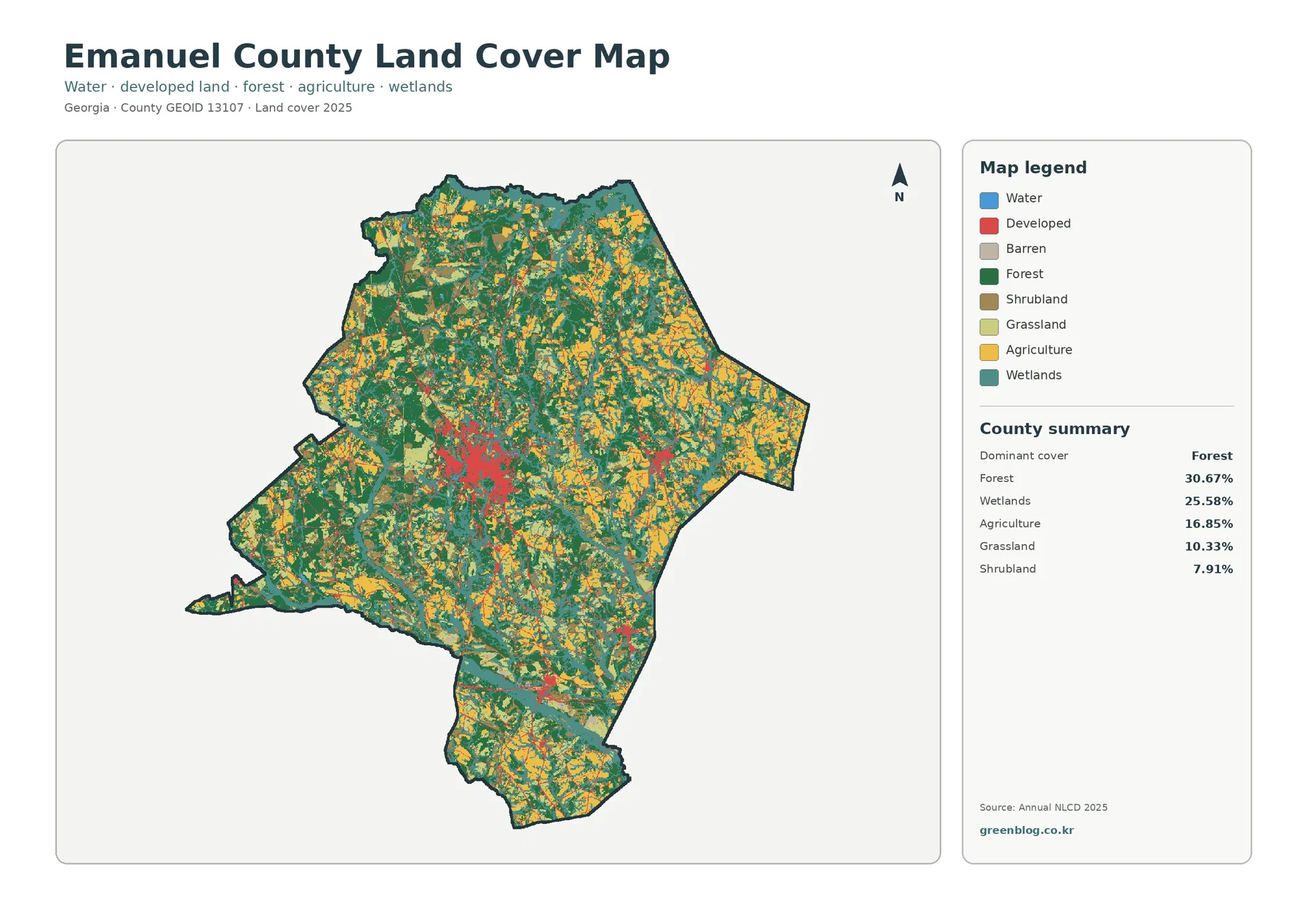
Emanuel County’s 2025 land-cover pattern is not dominated by one continuous block. Forest accounts for 30.67% of the county and wetlands for 25.58%, while agriculture, grassland, shrubland, and small developed areas are interwoven throughout the map. The clearest built cluster sits near the county’s central service hub, creating a strong contrast with the broad rural landscape around it.
The four original JPG maps are available in one download on this page. Use the general land-cover map for the full mix of classes, the forest-and-farmland view for rural patterns, the impervious-surface map for built areas, and the 1985–2025 change map when you need a long-term comparison.
Table of Contents
Wet corridors break up a landscape of forest and working land
The 2025 county summary places forest first at 30.67%, followed closely by wetlands at 25.58%. Agriculture covers 16.85%, grassland 10.33%, and shrubland 7.91%. The impervious map reports developed cover at 7.62%, while the forest-and-farmland summary shows open water at only 0.77%. Those numbers matter because they explain why the map looks green and blue-green even though visible lakes and broad water bodies occupy only a small share.
Wetland color threads through much of the county in narrow bands and broader patches. It repeatedly separates forest blocks from fields and open land. Agriculture is especially noticeable in the eastern half and in scattered northern and southern areas, but it does not form a single uninterrupted farming belt. Forest is similarly fragmented, with larger dark-green blocks connected by smaller pieces around farm and wetland areas.
This is land cover, not a zoning or ownership map. A pixel classified as agriculture describes the surface cover detected by the mapping system; it does not identify a particular crop, farm owner, or legal land use. Likewise, a developed class does not mean a parcel is approved for future construction. The map is best used to compare broad surface patterns across the county.
The forest-and-farmland view reveals a mosaic rather than two simple zones
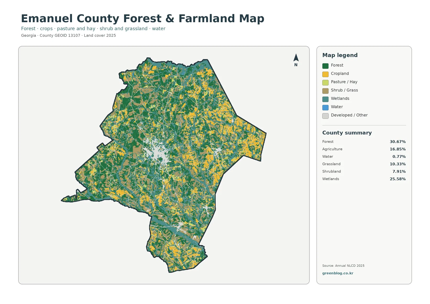
Simplifying the legend makes the rural pattern easier to follow. Dark-green forest is widespread, but the map also shows many yellow agricultural areas, lighter grass or pasture patches, and blue-green wetlands. On the western side, forest often appears in larger blocks. Moving eastward, agriculture becomes more frequent, although forest and wetland cover remain mixed through the same landscape.
The 25.58% wetland share is especially important in this view. Wetlands are not confined to one corner of Emanuel County. They form a branching network that cuts across the larger forest-and-farm pattern. This helps explain why a map centered only on open water would understate the county’s relationship with wet ground and drainage corridors. Water itself is 0.77%, but wetland cover is more than thirty times larger by percentage.
Agriculture at 16.85% should also be kept separate from grassland at 10.33%. A grassy surface may be pasture, hay, an open field, or another grass-dominated cover class, while agricultural pixels are mapped under a different category. Shrubland adds another 7.91%. Together, these classes show that land outside the towns is not simply divided into “woods” and “farms.”
That distinction is useful when preparing a classroom handout or a local reference graphic. A reader can first locate the large forest patches, then trace wetland corridors, and finally compare where agricultural and grass-covered areas interrupt them. The result is a more accurate picture of the county than a single statistic would provide.
Hard surfaces stay concentrated around the main town network
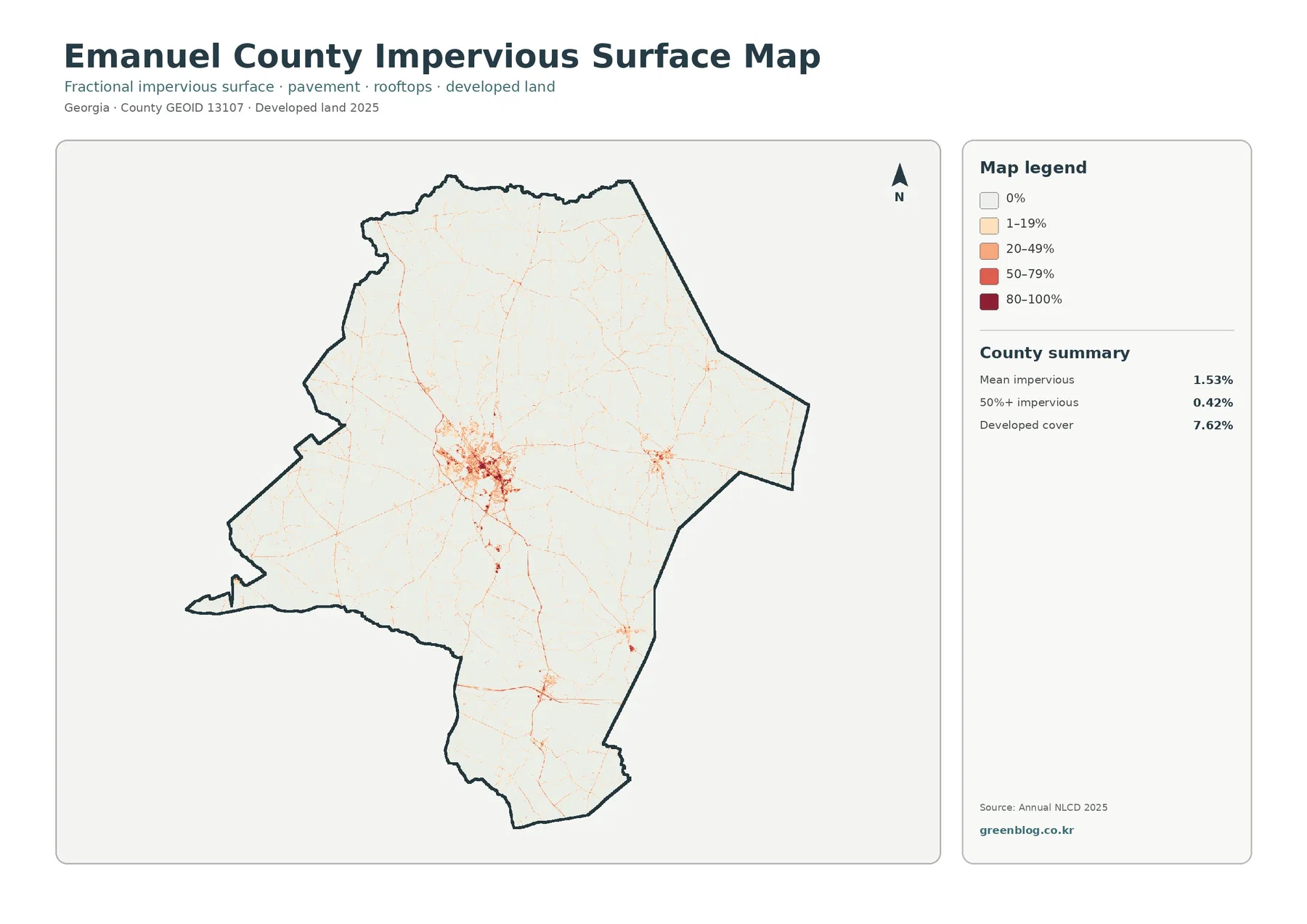
The impervious-surface map strips away most land-cover colors and focuses on roofs, pavement, and other surfaces that shed water rather than letting it soak into the ground. Emanuel County’s mean impervious value is only 1.53%. Areas above 50% impervious cover account for 0.42%, while the broader developed-land class covers 7.62%.
The central cluster stands out immediately. Swainsboro is the county seat and the principal urban reference point, and the densest hard-surface pattern aligns with that central area. Narrower lines extend away from the core along road corridors, while smaller built clusters appear elsewhere. Most of the county remains very light on this map, showing how limited the heavily paved footprint is compared with the full county area.
Swainsboro’s own city history provides a useful transportation reference. U.S. Route 1 and U.S. Route 80 meet in the heart of downtown, a crossroads that has long shaped how the city describes itself. That fact helps orient the central developed cluster, but the map alone cannot prove why each nearby parcel became developed. It shows where hard surfaces are concentrated, not the planning history behind every road or building.
The difference between 7.62% developed cover and 0.42% at 50% or more impervious is also worth noting. Many places counted as developed still contain lawns, trees, open ground, and low-density buildings. The darkest impervious classes isolate a much smaller set of highly paved or roofed locations. This makes the map useful when a general developed-land class feels too broad.
Forty years of mapped differences extend far beyond the urban core
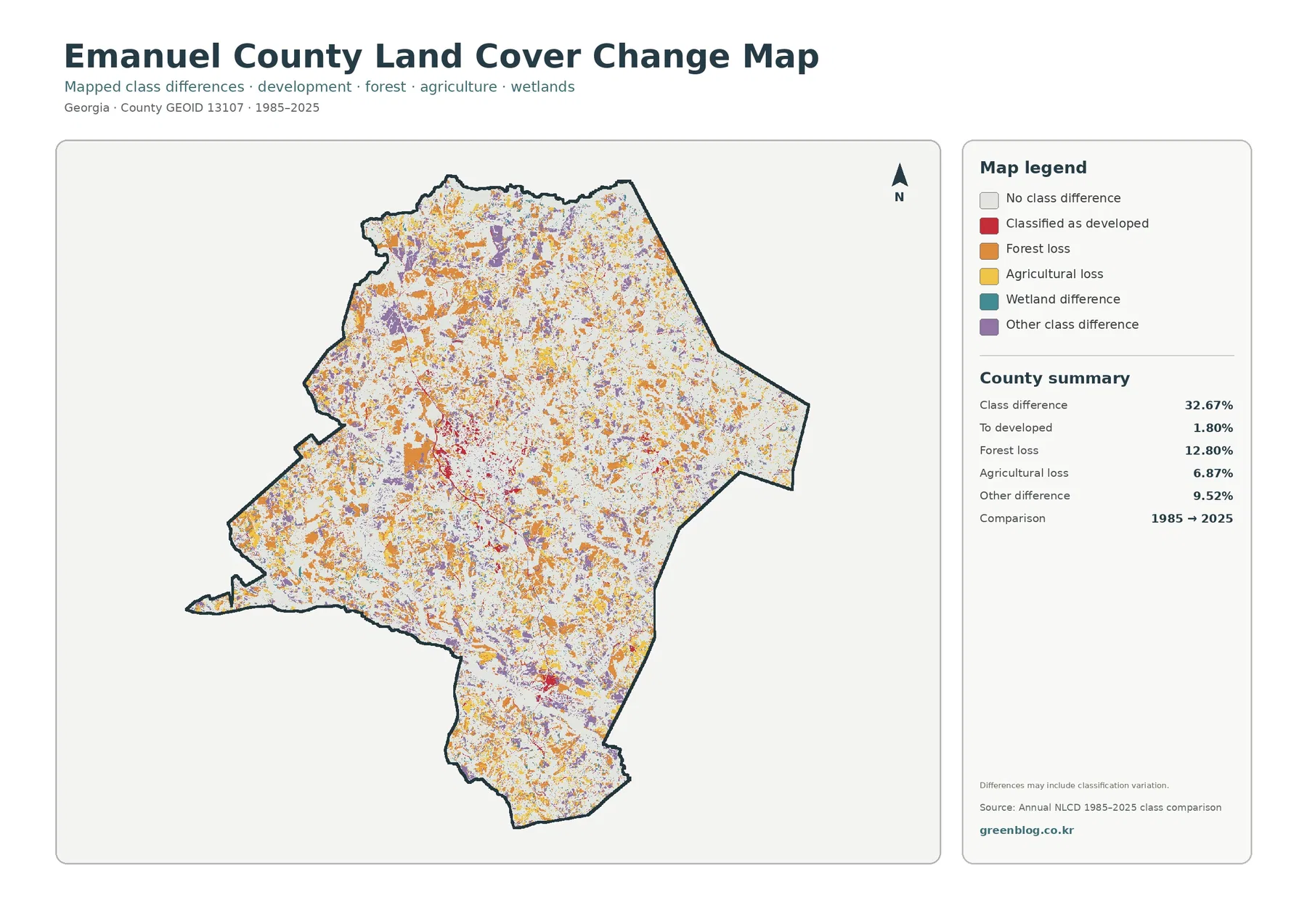
The 1985–2025 change map should not be read as a second version of the current land-cover map. It highlights places where the mapped class differs between the two comparison years. The countywide class-difference share is 32.67%. Forest loss is the largest labeled category at 12.80%, followed by other class differences at 9.52% and agricultural loss at 6.87%. Areas classified as developed account for 1.80% of the comparison.
Orange forest-loss marks are scattered through western, northern, central, and southern parts of the county rather than forming one single front. Agricultural-loss color and the purple “other difference” class are similarly dispersed. Red development differences are more noticeable around the central built area, but they occupy much less of the map than the total set of class changes.
That distinction matters. A 32.67% class difference does not mean one-third of Emanuel County was urbanized. It combines several kinds of mapped changes, and the legend specifically warns that classification variation may be included. Differences in imagery, classification rules, or edge pixels can contribute to the result alongside real changes on the ground.
For a historical presentation, use this map to identify areas worth investigating rather than treating every colored pixel as a documented land-use event. If a specific site matters, compare additional years, higher-resolution imagery, local records, or field information before assigning a cause. The county-level map is strongest as a screening and comparison tool.
Swainsboro gives the central built cluster a clear geographic reference
Knowing a few verified local reference points makes the thematic maps easier to interpret. Swainsboro sits near the center of county activity and is the county seat. The city notes that U.S. 1 and U.S. 80 intersect downtown. On the impervious map, the largest compact cluster of hard surfaces occupies the same broad central part of the county, while lines of lower-intensity development extend outward.
This does not turn the land-cover image into a road map. Individual street names are not labeled, and the thin developed traces should not be used for navigation. Instead, the transportation context explains why the central cluster is a useful anchor when comparing the four map views. The same area appears as red developed land on the general map, pale “developed/other” on the forest-and-farmland view, and a stronger red concentration on the impervious map.
Outside that center, the map returns quickly to forest, wetland, farm, and grass-dominated surfaces. That contrast is one of Emanuel County’s most useful visual characteristics: a recognizable town core exists, but it does not erase the county’s large rural and wetland footprint.
The Twin City side adds a wetland and mill-pond context
George L. Smith State Park near Twin City provides another verified local reference for the eastern side of the county. Georgia’s Department of Natural Resources describes the park’s cypress-filled mill pond, wooded setting, and historic Parrish Mill. DNR history also identifies the park with Emanuel and Candler counties, which is useful context when looking near the county’s eastern boundary.
The park should not be treated as a labeled polygon on these maps because the land-cover images do not draw the park boundary. Still, its wet setting helps explain why a county with only 0.77% open water can have 25.58% wetland cover. Wet ground, forested wetland, and drainage corridors can occupy much more area than the visible surface water of a pond or channel.
UGA Extension in Emanuel County adds a second rural reference by providing agriculture and environmental programs locally. That does not verify the location of every field on the map, but it confirms that agriculture and natural-resource management are active parts of the county context. The thematic maps can help a reader see where those broad land-cover categories occur before consulting more detailed agricultural or environmental data.
Choose the file that matches the question you are asking
Use the general land-cover map when you need one overview that includes forest, agriculture, wetlands, developed land, grassland, shrubland, water, and smaller classes. It is the best starting point, but it is also the busiest image. When the goal is to explain the rural landscape, the forest-and-farmland version is easier to scan because it reduces the visual competition among classes.
The impervious map is the better choice for a discussion of built surfaces. It narrows attention to pavement and rooftops, so the Swainsboro core and connecting road traces stand out. The change map serves a different purpose again: it compares 1985 and 2025 classifications and should be introduced with its legend and classification warning.
For a printed handout, using one or two maps with a clear purpose usually works better than placing all four at a small size. For a presentation, the four-map sequence can be effective because it moves from current overall cover to rural classes, hard surfaces, and then historical difference. The original JPGs provide room for cropping or adding your own labels in a separate editing program.
How to use the maps without over-reading them
Annual NLCD products generalize the landscape into raster cells and mapped classes. A small creek, a narrow roadside strip, or a house surrounded by trees may be absorbed into the dominant class of nearby pixels. These maps are therefore strong for countywide comparison, but they are not parcel surveys or legal boundary documents.
Wetlands and open water also need to be kept separate. Emanuel County’s open-water share is 0.77%, while wetlands cover 25.58%. A reader who looks only for blue water may miss the much larger blue-green wetland network. The two categories describe different surface conditions and should not be combined without a specific reason.
The change map deserves the most caution. Forest loss at 12.80% is a mapped class transition, not a direct measurement of timber harvesting or permanent clearing. Agricultural loss at 6.87% has the same limitation. More detailed imagery, local planning records, or land-management data are needed before assigning a cause to a specific place.
Finally, the supplied JPGs are 2480 × 1754 pixels. The package does not mark them as meeting its A3 high-resolution reference, so very large prints should be tested before final use. For ordinary documents, presentations, and countywide reference work, the files still provide a practical way to compare the four themes at the same geographic extent.
Frequently Asked Questions
What is the largest land-cover class in Emanuel County?
Forest is the largest 2025 class at 30.67%. Wetlands are close behind at 25.58%, so the county is better understood by looking at the interaction of forest and wet corridors rather than treating forest as an isolated dominant block.
Why does the Swainsboro area look much stronger on the impervious map?
The impervious map emphasizes rooftops, pavement, and other hard surfaces. Emanuel County’s mean value is only 1.53%, but those surfaces are concentrated around the central built area and road network, making Swainsboro stand out more sharply than it does on the multi-class land-cover map.
Does the 32.67% class difference mean one-third of the county was developed?
No. The 32.67% figure includes forest loss, agricultural loss, other class differences, wetland differences, and areas classified as developed. The “to developed” category is 1.80% of the county in this comparison, and the map warns that classification variation may also contribute to the total.
Sources and Reference Material
- MRLC Annual NLCD Data – annual land-cover datasets used for broad land-cover comparison.
- USGS Annual NLCD Land Cover Classification – definitions and background for the mapped land-cover classes.
- U.S. Census Bureau TIGER/Line Shapefiles – official geographic boundary data used for county reference.
- City of Swainsboro – Crossroads of the Great South – local reference for the U.S. 1 and U.S. 80 intersection in downtown Swainsboro.
- UGA Extension Emanuel County – county-level agriculture, environment, and community educational resources.
- Georgia DNR – George L. Smith State Park – official information about the Twin City-area park, mill pond, and natural setting.
Map File Information
The ZIP contains four original Emanuel County JPG maps: general land cover, forest and farmland, impervious and developed land, and the 1985–2025 land-cover change comparison.
- Included Versions: Land Cover, Forest & Farmland, Impervious & Developed Land, Land Cover Change
- File Type: JPG
- Intended Use: Printing, classroom materials, presentations, local reference, and custom editing
Related Maps
- Appling County Georgia Land Cover Map
- Atkinson County Georgia Land Cover Map
- Bacon County Georgia Land Cover Map
Green Map creates custom-edited map images using open geographic data sources such as geoBoundaries, Natural Earth, OpenStreetMap, and government open data.
These maps are edited visual materials, not raw data files, and are provided for education, documents, presentations, and graphic reference.