
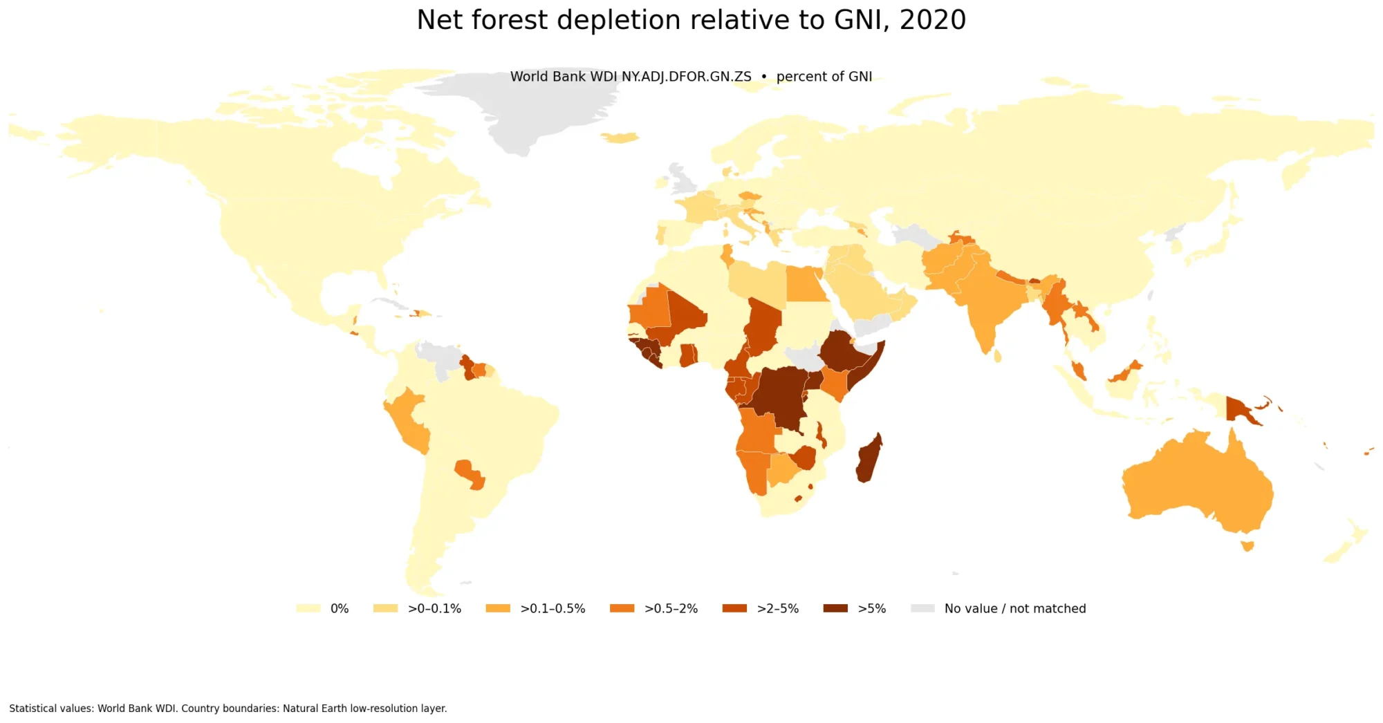
Net Forest Depletion Map – 2020 Share of GNI by Country
A country comparison of net forest depletion relative to gross national income (GNI) looks very different from a map of
Net Forest Depletion Map – 2020 Share of GNI by Country Read More »
A country comparison of net forest depletion relative to gross national income (GNI) looks very different from a map of
Net Forest Depletion Map – 2020 Share of GNI by Country Read More »
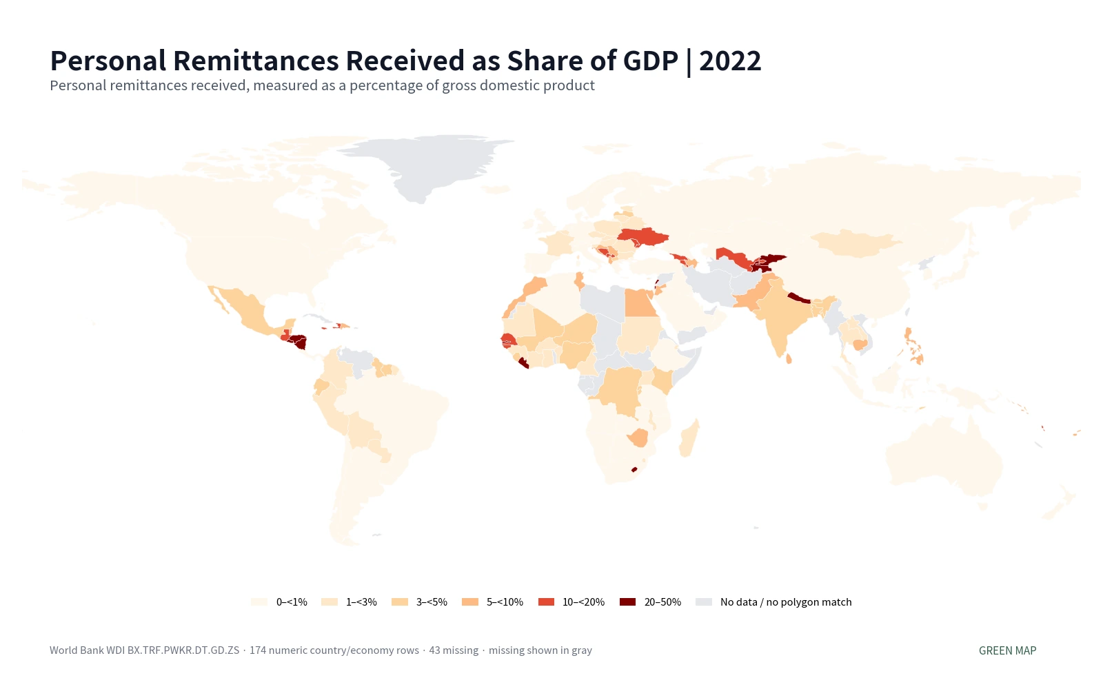
The 2022 map of personal remittances received as a share of GDP shows how differently cross-border personal transfers and certain
Personal Remittances Received as Share of GDP Map | 2022 Read More »
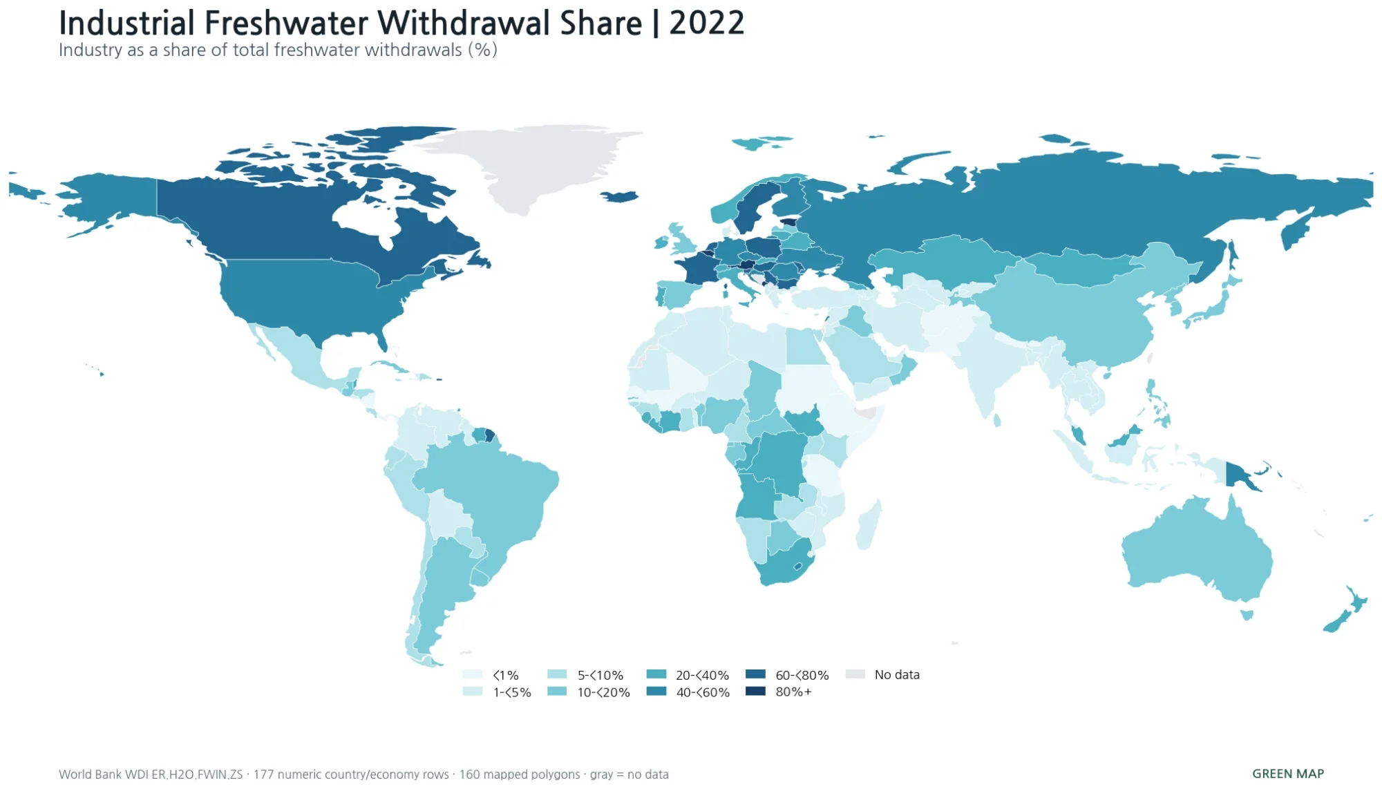
The 2022 map of industrial freshwater withdrawal share shows a strongly uneven pattern. Several European economies and Canada report very
Industrial Freshwater Withdrawal Share Map – 2022 Country Comparison Read More »
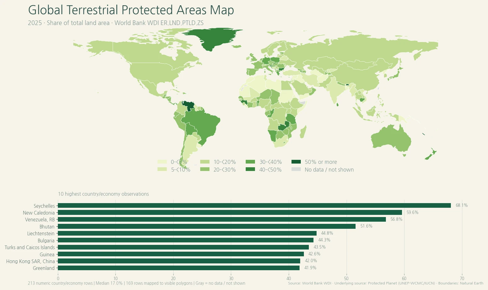
The global terrestrial protected areas map compares the share of land area reported as terrestrial protected area across countries and
Terrestrial Protected Areas Map – 2025 Country Comparison Read More »
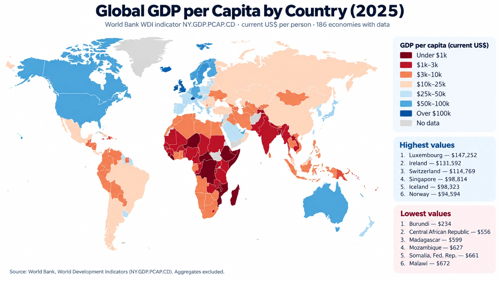
A 2025 global GDP per capita map reveals an unusually wide gap between countries and economies even when every observation
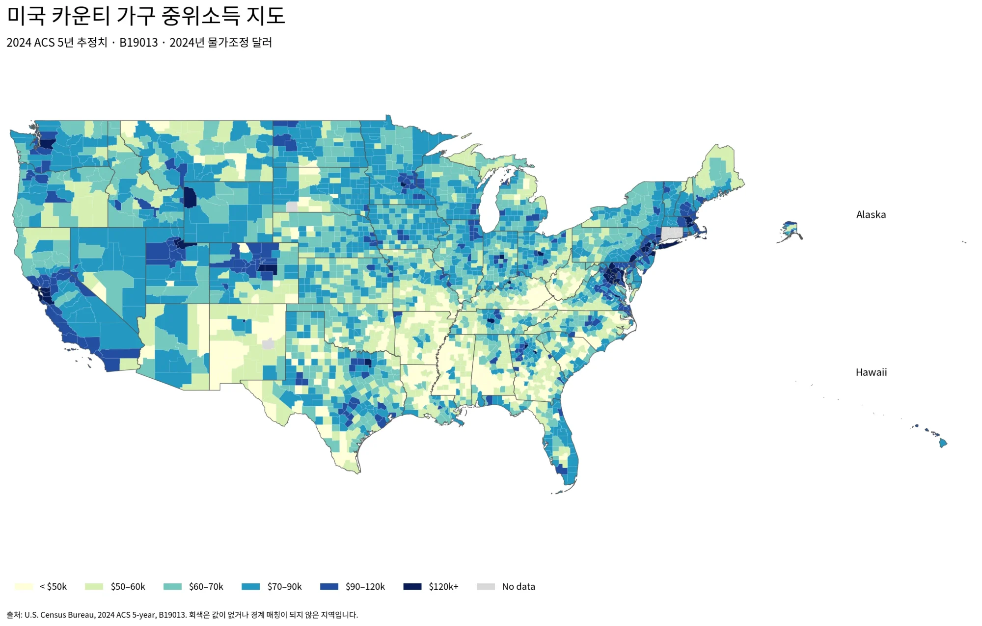
A county-level view of 2024 ACS median household income, including top and bottom counties, connected regional clusters, neighboring contrasts, and reliability notes.
U.S. County Household Income in 2024 – ACS Regional Patterns Read More »
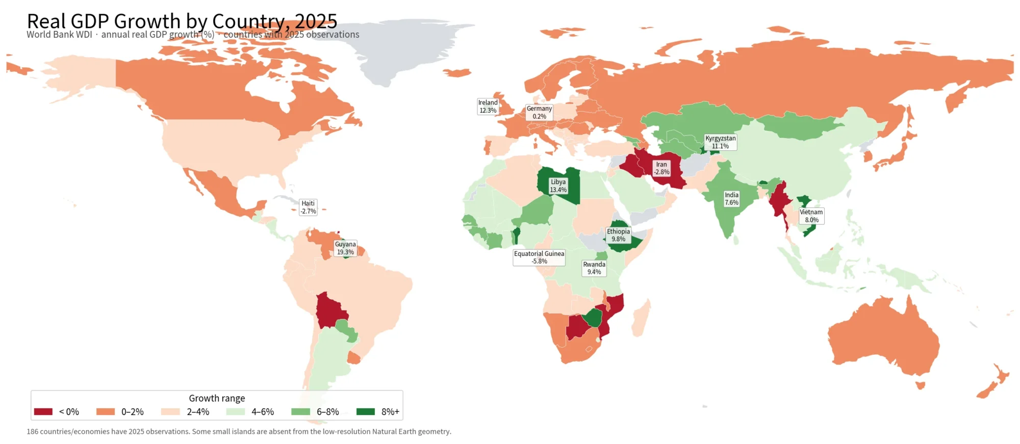
A 2025 World Bank country comparison of real GDP growth, highlighting fast-growth outliers, contractions, regional patterns, and large-economy differences.