Vulnerable employment is a specific employment-status indicator, not a direct score of job safety, wages, or working conditions. The World Bank series SL.EMP.VULN.ZS, based on modelled ILO estimates, measures own-account workers plus contributing family workers as a percentage of total employment. The latest-available file covers 187 countries and areas. Of those observations, 182 are from 2025, while five economies use their latest available values from 2021–2023. Because every value is expressed as a share of total employment, the percentages are directly comparable across countries, subject to the year differences for those five observations.
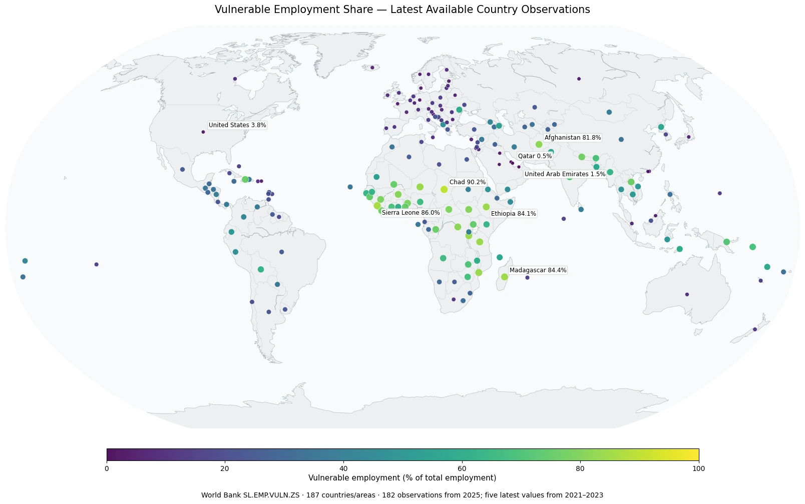
Table of Contents
What vulnerable employment measures
The numerator combines two employment-status categories. Own-account workers operate their own economic activity without employing others on a continuing basis. Contributing family workers participate in a family business, farm, or similar activity without being classified as regular paid employees. The denominator is total employment. A value of 60% therefore means that about six out of every ten employed people fall into one of those two categories.
The label should not be stretched beyond that definition. The indicator does not directly measure earnings, contract type, access to social insurance, workplace safety, hours worked, poverty, or whether an individual worker feels economically secure. Own-account work itself spans a wide range of activities, from very small subsistence businesses to highly productive professional work. The measure is most useful as a structural description of employment status.
How wide is the global distribution
Across the 187 latest observations, the mean is 34.7% and the median is 28.4%. The first quartile is 11.8% and the third quartile is 56.1%, showing a broad spread rather than a tight cluster. 12 countries or areas are at 80% or above, 39 are at 60% or above, and 53 are at or above 50%. At the lower end, 70 are below 20% and 38 are below 10%.
The mean is higher than the median because a group of very high observations extends the upper tail of the distribution. On the map, high shares appear repeatedly across parts of Sub-Saharan Africa and in Afghanistan, while very low shares appear in several Gulf economies as well as a number of European and North American economies. Those patterns describe where the employment-status mix differs; the map alone does not establish why those differences exist.
Countries with the highest vulnerable-employment shares
| Country/area | Share | Observation year |
|---|---|---|
| Chad | 90.22% | 2025 |
| Sierra Leone | 86.04% | 2025 |
| Madagascar | 84.42% | 2025 |
| Ethiopia | 84.15% | 2025 |
| Niger | 83.73% | 2025 |
| Mozambique | 83.68% | 2025 |
| Burundi | 83.66% | 2025 |
| Tanzania | 83.65% | 2025 |
| Afghanistan | 81.77% | 2025 |
| Congo, Dem. Rep. | 81.51% | 2025 |
The highest observation is Chad at 90.22%. Sierra Leone is at 86.04%, Madagascar at 84.42%, and Ethiopia at 84.15%. Niger, Mozambique, Burundi, and Tanzania are also above 83%, while Afghanistan and the Democratic Republic of the Congo exceed 80%. In these economies, own-account workers and contributing family workers make up a very large majority of total employment.
This ranking should not be treated as a league table of overall job quality. A high share can reflect the structure of employment, including the importance of small-scale self-employment and family-based economic activity. Explaining the pattern requires additional evidence on industry composition, urbanization, institutions, productivity, income, and other labor-market conditions.
What the lowest observations mean
| Country/area | Share | Observation year |
|---|---|---|
| Qatar | 0.46% | 2025 |
| Bahrain | 0.75% | 2025 |
| United Arab Emirates | 1.50% | 2025 |
| Saudi Arabia | 1.66% | 2025 |
| Kuwait | 2.40% | 2025 |
| Macao SAR, China | 3.33% | 2025 |
| United States | 3.81% | 2025 |
| Oman | 3.81% | 2025 |
| Norway | 4.17% | 2025 |
| Channel Islands | 4.17% | 2025 |
Qatar has the lowest observation at 0.46%, followed by Bahrain at 0.75%, the United Arab Emirates at 1.50%, and Saudi Arabia at 1.66%. Kuwait is also below 3%, and the United States is at 3.81%. These low values mean that own-account workers and contributing family workers account for a small share of employment; they do not mean that every other dimension of the labor market is favorable.
A low vulnerable-employment share can coexist with other labor-market challenges because the indicator says nothing directly about unemployment, wages, involuntary part-time work, job security, or social protection. It mainly tells us that other employment statuses, especially paid employment and employers, make up a larger portion of the employed population.
Most observations are from 2025, but five are older
182 of 187 observations are from 2025. The remaining 5 consist of one 2021 value, two 2022 values, and two 2023 values. Those older observations are retained as the latest non-empty values available for their economies; they are not imputed or relabeled as 2025. The year mismatch is small relative to the full coverage, but it still matters when interpreting countries that may have experienced recent labor-market changes.
The series is a modelled ILO estimate. Modelled international series are designed to improve comparability and coverage across economies and years, so they can differ from a figure published in a country’s most recent national labor-force release. For a global comparison, using one consistent series is useful; for a detailed country-specific assessment, the relevant national statistical source can provide additional context.
Spatial patterns visible on the map
Many of the highest values are geographically clustered across central, eastern, and western parts of Africa, where multiple neighboring economies fall in the 70–90% range. Afghanistan also stands out above 80%. At the opposite end, Qatar, Bahrain, the United Arab Emirates, Saudi Arabia, and Kuwait form a low-share cluster in the Gulf. Several northern and western European economies and the United States also sit near the low end.
Geographic clustering should not be confused with geographic causation. Countries in the same region can have very different labor structures, and a single factor such as income or agriculture cannot explain every observation. The map is a strong tool for identifying where the employment-status mix differs and where follow-up analysis may be useful, but causal interpretation requires additional indicators.
How this differs from other labor indicators
The employment-to-population ratio asks how much of a population is employed. Vulnerable employment asks how the employed population is divided by employment status. A country can therefore have a high employment rate and a high vulnerable-employment share at the same time. Another country can have a lower employment rate but a small vulnerable-employment share among the people who are employed.
Industry shares answer a different question again. Employment in services, agriculture, or industry describes the sector in which people work, while vulnerable employment describes whether they are own-account workers or contributing family workers. A service worker can be a salaried employee or an own-account worker, so industry structure and employment status should be analyzed as separate dimensions before they are combined.
Four checks before using the numbers
First, confirm that the unit is a percentage of total employment. Second, keep the definition—own-account workers plus contributing family workers—attached to the label. Third, note that five observations predate 2025. Fourth, avoid treating the indicator as a comprehensive score of living standards or job quality. These checks preserve the value of the comparison without assigning meaning that the series does not contain.
Used this way, the map makes a striking structural difference visible: the latest observations range from about 0.46% to 90.22%. That wide range is informative precisely because the denominator and employment-status definition are consistent. Interpretation becomes misleading only when “vulnerable” is allowed to stand in for every possible aspect of work.
Source and scope
The source is the World Bank indicator “Vulnerable employment, total (% of total employment) (modeled ILO estimate)”, code SL.EMP.VULN.ZS. The file contains one latest non-empty observation for each of 187 countries and areas. Missing observations are not converted to zero. The observed values range from 0.46% to 90.22%, with 182 observations from 2025 and five from 2021–2023.
Frequently Asked Questions
What does vulnerable employment mean in this indicator?
It is the share of total employment made up of own-account workers and contributing family workers. It is not a direct measure of wages, contracts, safety, or social protection.
Are all country observations from 2025?
No. 182 of 187 observations are from 2025. Five economies use their latest available observations from 2021–2023.
Does a high vulnerable-employment share imply high unemployment?
No. Vulnerable employment describes the status composition of people who are employed, while unemployment is measured with a different denominator and concept.
Related Articles
Green Map creates custom-edited map images using open geographic data sources such as geoBoundaries, Natural Earth, OpenStreetMap, and government open data.
These maps are edited visual materials, not raw data files, and are provided for education, documents, presentations, and graphic reference.