The global Multidimensional Poverty Index (global MPI), produced by UNDP and the Oxford Poverty and Human Development Initiative (OPHI), does not define poverty by income alone. It identifies overlapping deprivations in health, education, and living standards at the household level. When the weighted deprivation score reaches at least one third, the household and its members are classified as multidimensionally poor. World Bank World Development Indicators series SI.POV.MPUN reports the percentage of the population classified as multidimensionally poor under this UNDP–OPHI framework.
The latest-available dataset contains 109 countries, but the observations are not synchronized. Survey years range from 2013 to 2023, and only 12 countries have a 2023 value. The map should therefore be read as a country-by-country view of the latest retained UNDP–OPHI multidimensional poverty headcount, not as a 2023 world ranking. Countries whose latest observation predates 2018 are outlined so the oldest evidence is visible.
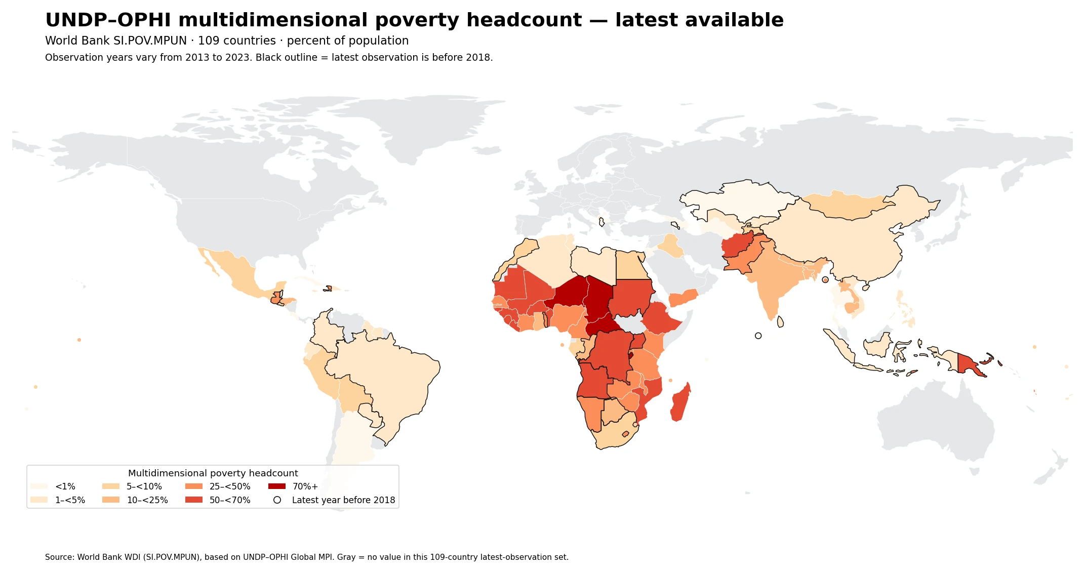
Across the 109 latest observations, the unweighted median is 9.8% and the unweighted mean is 23.4%. Values range from 0.1% to 84.2%. The mean is more than twice the median because a sizeable group of countries has very high headcount ratios. These summary statistics give every country equal weight; they are not a population-weighted global poverty rate.
Table of Contents
The global MPI combines ten indicators across three dimensions
The three dimensions are health, education, and standard of living. Health contains nutrition and child mortality. Education contains years of schooling and school attendance. The standard-of-living dimension contains cooking fuel, sanitation, drinking water, electricity, housing, and assets. The two health indicators and two education indicators each receive a weight of one sixth. Each of the six standard-of-living indicators receives a weight of one eighteenth, giving each dimension one third of the total weight.
A household is identified as multidimensionally poor when its weighted deprivation score is at least 33.3%. A score from 20% to below 33.3% is described as vulnerable to multidimensional poverty, while 50% or more indicates severe multidimensional poverty. The series used here is the headcount ratio H: the share of people who meet the multidimensional-poverty cutoff. It is not the MPI index value itself. The MPI index combines incidence with the average intensity of deprivations among poor people, so the two measures should not be treated as interchangeable.
The distribution has many very low values and many very high values
Eighteen of the 109 latest observations are below 1%, and another 22 are from 1% to below 5%. At the other end, 17 countries are between 50% and below 70%, and four are at least 70%. That split explains why the median is only 9.8% while the unweighted mean rises to 23.44%. The dataset does not have a single compact center: it contains both a large low-headcount group and a substantial high-headcount group.
| Multidimensional poverty headcount | Countries |
|---|---|
| <1% | 18 |
| 1–<5% | 22 |
| 5–<10% | 15 |
| 10–<25% | 12 |
| 25–<50% | 21 |
| 50–<70% | 17 |
| 70%+ | 4 |
A near-zero value should also be interpreted narrowly. It means that very few people in that survey meet this specific global MPI deprivation cutoff. It does not demonstrate the absence of monetary poverty, housing stress, health costs, unemployment, inequality, or every other form of hardship. Conversely, a high value identifies widespread overlapping deprivation under the global MPI rules but does not, by itself, identify which policy or event caused it.
High latest values form a strong Sahel and central/eastern African cluster
The highest latest observation is Chad at 84.2% in 2019, followed by the Central African Republic at 80.4% in 2018, Niger at 79.9% in 2021, and Burundi at 75.1% in 2016. Ethiopia records 68.7% in 2019, Madagascar 68.4% in 2021, Mali 68.3% in 2018, Guinea 66.2% in 2018, and Burkina Faso 64.5% in 2021. The map shows a broad high-headcount concentration across the Sahel and parts of central and eastern Africa.
| Country | Observation year | Headcount ratio |
|---|---|---|
| Chad | 2019 | 84.2% |
| Central African Republic | 2018 | 80.4% |
| Niger | 2021 | 79.9% |
| Burundi | 2016 | 75.1% |
| Ethiopia | 2019 | 68.7% |
| Madagascar | 2021 | 68.4% |
| Mali | 2018 | 68.3% |
| Guinea | 2018 | 66.2% |
| Afghanistan | 2022 | 64.9% |
| Burkina Faso | 2021 | 64.5% |
The year column is essential. Burundi is from 2016, while Niger is from 2021, so small differences between them are not a precise current ranking. The table is most useful for locating countries with very high latest observations and recognizing regional concentration. Explaining those patterns requires the underlying deprivation indicators and comparable survey timing, not the headcount map alone.
South Asia also contains large within-region differences
The latest values in South Asia and nearby countries span a wide range. Afghanistan is at 64.9% in 2022 and Pakistan at 38.3% in 2017. Nepal is at 20.1% in 2022, Bangladesh at 14.9% in 2022, Bhutan at 9.8% in 2022, India at 16.4% in 2019, and Sri Lanka at 2.9% in 2016. Geographic proximity therefore does not imply a common multidimensional-poverty level, especially when survey years differ.
Even the same-year 2022 observations vary sharply: Afghanistan 64.9%, Nepal 20.1%, Bangladesh 14.9%, and Bhutan 9.8%. Same-year comparisons reduce one important source of ambiguity, but they still do not show which deprivations are driving the headcount. Nutrition, schooling, sanitation, electricity, housing, and other component indicators need to be examined to understand the composition behind the headline percentage.
Only twelve countries have observations from 2023
The newest year in the supplied series is 2023, but it covers only 12 countries. Senegal records 45.1%, Vanuatu 27.8%, Lesotho 25.0%, and Lao PDR 17.8%. At the low end, Azerbaijan is 0.2%, Jordan 0.8%, and the Kyrgyz Republic and Tunisia are both 1.0%. Bolivia, Peru, and Mexico cluster near 5% to 6%.
| Country | 2023 headcount ratio |
|---|---|
| Senegal | 45.1% |
| Vanuatu | 27.8% |
| Lesotho | 25.0% |
| Lao PDR | 17.8% |
| Naoero | 6.8% |
| Bolivia | 5.8% |
| Peru | 5.6% |
| Mexico | 5.3% |
| Kyrgyz Republic | 1.0% |
| Tunisia | 1.0% |
| Jordan | 0.8% |
| Azerbaijan | 0.2% |
The median across those 12 observations is 5.7% and the mean is 11.9%. Neither statistic should be compared with another year as if it were a global trend because the country composition changes from year to year. A trend claim requires repeated comparable observations for the same countries, not cross-sections built from different sets of surveys.
Survey-year differences are the main limitation of the map
There are 12 observations from 2023 and 13 from 2022. Eleven come from 2020–2021, 41 from 2018–2019, 16 from 2016–2017, and 16 from 2013–2015. More than half of the latest observations therefore date from 2019 or earlier. Household-survey measures do not update on a single annual calendar, and the global MPI requires all component indicators to come from the same survey, which limits how quickly a complete comparable observation can be refreshed.
| Latest observation year | Countries |
|---|---|
| 2023 | 12 |
| 2022 | 13 |
| 2020–2021 | 11 |
| 2018–2019 | 41 |
| 2016–2017 | 16 |
| 2013–2015 | 16 |
For older observations, “latest available value in this series” is more accurate than “current poverty rate.” The map is useful for showing broad geographic structure and identifying where very high or very low latest values occur. It is less suitable for fine-grained current rankings when one country may be represented by a 2015 survey and another by a 2023 survey.
This is not the same indicator as the World Bank MPM
The name is easy to confuse with the World Bank Multidimensional Poverty Measure (MPM), but the frameworks are different. The UNDP–OPHI global MPI uses ten indicators across health, education, and standard of living. The World Bank MPM combines monetary poverty, education, and basic infrastructure services using a different set of indicators and thresholds. The resulting headcount ratios should not be merged into one series or interpreted as two editions of the same measure.
The cleanest way to distinguish them is by source and indicator code. This article uses SI.POV.MPUN, the UNDP–OPHI global MPI headcount ratio. The previously published World Bank MPM article uses SI.POV.MPWB. Both approaches attempt to describe overlapping disadvantages beyond a single monetary line, but they answer related rather than identical questions.
Four checks before using the map
- The value is the share of the population classified as multidimensionally poor under the UNDP–OPHI global MPI framework.
- The map uses latest available observations for 109 countries, with survey years ranging from 2013 to 2023. Black outlines mark latest observations before 2018.
- Gray areas are not 0%. They indicate no value in this 109-country latest-observation set; missing values were not converted to zero.
- The headcount ratio is neither the MPI index value nor a standard income-poverty rate. Survey year and methodology should be checked before comparing countries.
The numeric source is World Bank World Development Indicators series SI.POV.MPUN, which reports the UNDP–OPHI multidimensional poverty headcount ratio. The dimensions, ten indicators, weights, and one-third poverty cutoff are documented by UNDP Human Development Reports. The statistics here use each country’s most recent non-empty observation in the supplied series and do not calculate a population-weighted global average.
Frequently Asked Questions
What does the UNDP–OPHI global MPI headcount ratio measure?
It is the share of people living in households whose weighted deprivations across health, education, and living standards reach at least one third of the total possible score.
Can these data be treated as a 2023 country ranking?
No. The 109 latest observations span 2013–2023, and only 12 are from 2023. The map is a latest-available spatial comparison rather than a synchronized 2023 ranking.
Is this the same as the World Bank Multidimensional Poverty Measure?
No. The UNDP–OPHI global MPI and the World Bank MPM use different dimensions, component indicators, and thresholds. This series is SI.POV.MPUN; the World Bank MPM series is SI.POV.MPWB.
Related Articles
Green Map creates custom-edited map images using open geographic data sources such as geoBoundaries, Natural Earth, OpenStreetMap, and government open data.
These maps are edited visual materials, not raw data files, and are provided for education, documents, presentations, and graphic reference.