The share of firms monitoring their own carbon dioxide (CO₂) emissions measures a management practice inside firms rather than a country’s total emissions. This comparison uses the most recent non-empty World Bank IC.FRM.CO2.ZS observation for 160 economies. The percentage refers to firms reporting that they monitor their own CO₂ emissions, not to the amount of CO₂ emitted by the national economy.
That distinction changes how the map should be read. A high value does not mean emissions are low, and a low value does not prove that climate policy is weak. The indicator is narrower: it shows how common firm-level emissions monitoring is within the survey evidence represented by the World Bank series.
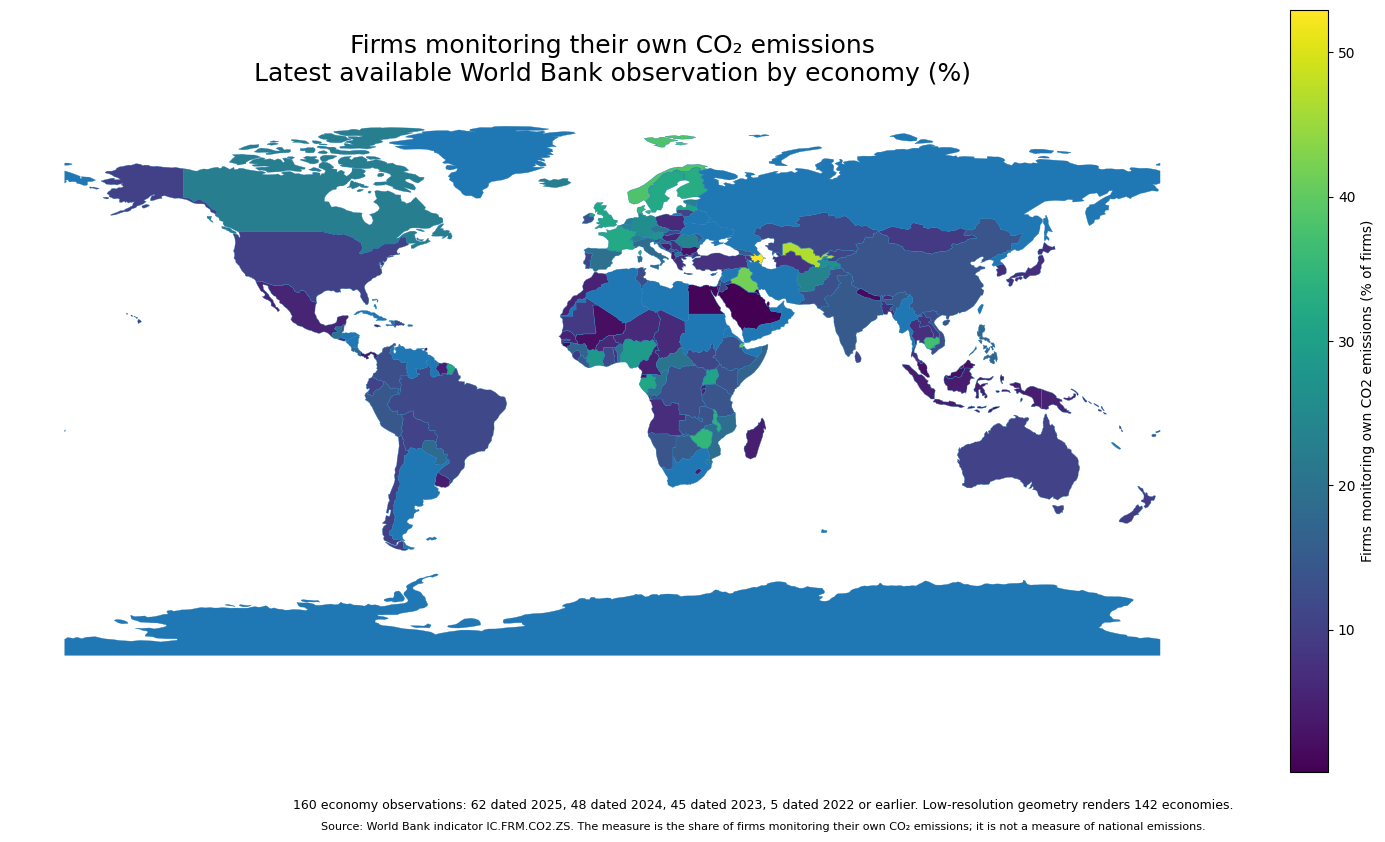
Table of Contents
What this indicator measures
The indicator is named “Firms monitoring own CO2 emissions (% of firms).” The supplied World Bank description states that it represents the percentage of firms tracking their own CO₂ emissions over the past three years. Because the unit is percent, a value of 50 means roughly half of firms in the relevant survey evidence reported that monitoring practice.
It should not be confused with national greenhouse-gas inventories, CO₂ emissions per capita, industrial emissions, energy intensity, or the carbon content of electricity. A firm can measure its emissions and still have high emissions, while another firm can have low emissions without maintaining a formal monitoring process. Measurement practice and emissions outcome are related questions but not the same metric.
The underlying values come from the World Bank API for IC.FRM.CO2.ZS. The extraction retains the most recent non-empty observation for each economy. That improves country coverage, but it also means the comparison is latest-available rather than a perfectly synchronized single-year cross-section.
Most observations are from 2023–2025
Among the 160 observations, 62 are dated 2025, 48 are from 2024, and 45 are from 2023. Only 5 are dated 2022 or earlier. In total, 96.9% of the observations fall in 2023–2025, so the dataset is predominantly recent even though the year is not identical everywhere.
The 2024–2025 subset contains 110 economies, or 68.8% of the full table. Timing matters most when two values are close. A one- or two-year gap can make a precise ranking look more exact than the evidence supports, so the map is better suited to broad differences and current available levels than to tiny rank gaps.
Iraq’s latest supplied observation is from 2022 and Timor-Leste’s is from 2021. Many other entries are from 2024 or 2025. Keeping the year beside each value prevents an older latest observation from being silently treated as if it were measured in 2025.
Economies with the highest latest shares
Azerbaijan has the highest latest observation at 52.94%. Uzbekistan follows at 46.60%, Iraq at 41.78%, Djibouti at 39.33%, and Norway at 38.23%. Cambodia, Zimbabwe, Denmark, Malawi, and Finland also appear in the top ten, all above roughly one-third except Finland just below that threshold.
| Rank | Economy | Observation year | Firms monitoring own CO₂ emissions |
|---|---|---|---|
| 1 | Azerbaijan | 2024 | 52.94% |
| 2 | Uzbekistan | 2024 | 46.60% |
| 3 | Iraq | 2022 | 41.78% |
| 4 | Djibouti | 2025 | 39.33% |
| 5 | Norway | 2025 | 38.23% |
| 6 | Cambodia | 2023 | 37.05% |
| 7 | Zimbabwe | 2025 | 34.99% |
| 8 | Denmark | 2025 | 34.46% |
| 9 | Malawi | 2025 | 33.96% |
| 10 | Finland | 2025 | 32.97% |
The top group is geographically mixed. Central Asia, Europe, Africa, and Southeast Asia are all represented. That diversity is a warning against assuming one regional explanation. The indicator by itself cannot tell us whether regulation, customer requirements, supply-chain standards, firm size, export exposure, or survey composition is responsible for a high value.
The low end among 2024–2025 observations
To keep old observations from dominating the bottom ranking, the table below is limited to economies whose latest value is dated 2024 or 2025. Saudi Arabia is at 0.15%, Kuwait at 0.21%, and Qatar at 0.33%. Egypt and Antigua and Barbuda are also below 1%, while Guinea-Bissau and Kiribati are in the 1% range.
| Economy | Observation year | Firms monitoring own CO₂ emissions |
|---|---|---|
| Saudi Arabia | 2025 | 0.15% |
| Kuwait | 2025 | 0.21% |
| Qatar | 2025 | 0.33% |
| Egypt, Arab Rep. | 2025 | 0.89% |
| Antigua and Barbuda | 2025 | 0.93% |
| Guinea-Bissau | 2025 | 1.29% |
| Kiribati | 2025 | 1.47% |
| Mali | 2024 | 2.02% |
| Trinidad and Tobago | 2025 | 2.09% |
| Malaysia | 2024 | 2.26% |
These low percentages are not a national climate score. They describe only the reported prevalence of firm-level CO₂ monitoring captured by this indicator. They do not incorporate national emissions inventories, power-sector policy, public-sector reporting, or every disclosure practice used by large corporations.
The middle of the distribution is around 11%
Across all 160 latest observations, the simple mean is 13.42% and the median is 11.29%. The first quartile is 6.00% and the third quartile is 18.42%, so the middle half of economies lies between about 6.0% and 18.4%. The upper tail above 30% pulls the mean above the median.
When the sample is restricted to the 110 observations from 2024 or 2025, the median is 11.61%. That is close to the full-sample median, suggesting that the center of the distribution is not being driven mainly by the few older observations. The subset is still a different sample, however, because economies without recent data drop out.
A median around eleven percent also shows why the top values stand out. In many economies, emissions monitoring is far from universal among firms represented by the indicator, while a smaller group reports rates above 30% or even 50%. That wide spread is the main descriptive result of the data.
Europe contains several high values, but not a uniform pattern
Several European economies record relatively high latest shares: Norway 38.23%, Denmark 34.46%, Finland 32.97%, Sweden 32.05%, France 32.05%, and the United Kingdom 31.50%. Austria is at 27.22%, Germany at 25.92%, Belgium at 24.38%, and the Netherlands at 23.31%.
The same region also contains much lower figures. Hungary is at 5.80%, Poland at 6.44%, Greece at 6.60%, and Türkiye at 7.67%. Country-level variation therefore remains substantial even within a broadly connected region. The map describes that variation but does not establish the institutional reasons behind it.
Asia and the Middle East span almost the full range
The Asian data show particularly wide dispersion. Uzbekistan is at 46.60% and Cambodia at 37.05%, while Tajikistan reaches 26.93%. China records 13.80%, India 14.91%, Japan 7.13%, Indonesia 4.28%, and Malaysia 2.26%. At the bottom, Saudi Arabia, Kuwait, and Qatar are all below 0.5% in their latest 2025 observations.
A broad label such as “Asia” therefore hides more than it explains. Neighboring or economically connected countries can still occupy very different parts of the distribution. Country values should be treated as individual survey-based observations first, with regional summaries used only after checking the underlying variation.
African economies also appear at both ends
Africa is similarly heterogeneous. Djibouti reaches 39.33%, Zimbabwe 34.99%, Malawi 33.96%, Gabon 31.54%, Uganda 30.70%, and Nigeria 28.91%. At the other end, Guinea-Bissau is at 1.29%, Mali at 2.02%, Rwanda at 4.74%, and Cameroon at 4.80%.
This spread is another reason not to use the indicator as a continental scorecard. It is better understood as a starting point for asking why firm-level monitoring is common in some survey environments and uncommon in others. Answering that next question would require evidence on firm characteristics, sectors, regulation, financing, exports, and survey design.
Some small economies are not visible on the world map
The source table includes 160 economies, while the low-resolution world boundary layer can join and render 142, or about 88.8% of them. The unmatched rows are mainly very small islands, microstates, or territories that are absent from the simplified geometry or too small to appear clearly at world scale.
Those rows were not converted to zero and were not removed from the descriptive statistics. A blank or invisible location on the map should therefore never be read as a zero value. Use the map for broad spatial patterns and the tables for exact comparisons, especially for small economies.
What the map can and cannot tell us
The data can show where firm-level CO₂ monitoring is relatively common or uncommon, how wide the latest country distribution is, and where the most recent observations are older than others. It can also highlight the large amount of variation inside regions that might otherwise be treated as homogeneous.
It cannot by itself measure national emissions, emissions reductions, corporate disclosure quality, carbon-neutrality progress, or the effectiveness of a specific climate policy. The strongest interpretation stays close to the definition: the percentage of firms reporting that they monitor their own CO₂ emissions, using the latest available observation for each economy.
Frequently Asked Questions
What does the share of firms monitoring their own CO₂ emissions mean?
It is the percentage of firms reporting that they have monitored their own CO₂ emissions over the past three years. It is not a measure of national emissions.
Are all values from 2025?
No. Of the 160 latest observations, 62 are from 2025, 48 from 2024, and 45 from 2023. The remaining observations are older latest-available values.
Does a high monitoring percentage mean actual emissions are low?
No. The indicator measures monitoring practice, not the amount of CO₂ emitted or the reduction achieved.
Why are some small economies hard to see on the map?
The simplified world boundary layer does not render every microstate or small territory as a visible polygon. Their values remain in the tables and statistics and are not treated as zero.
Related Articles
Green Map creates custom-edited map images using open geographic data sources such as geoBoundaries, Natural Earth, OpenStreetMap, and government open data. These maps are edited visual materials, not raw data files, and are provided for education, documents, presentations, and graphic reference.