Income is not distributed evenly across households, and one compact way to describe the concentration at the top is to ask how much of total income or consumption goes to the highest tenth of the distribution. The World Bank indicator SI.DST.10TH.10 reports that share as a percentage. A larger value means that the highest 10% receive or consume a larger fraction of the total measured amount.
The comparison here contains the latest non-missing observation for 171 countries and areas. It is not a synchronized 2025 cross-section. Only four latest observations are from 2025 and 21 are from 2024, while the full observation-year range runs from 1992 to 2025. The map should therefore be read as a latest-available snapshot through 2025, with the year attached to each economy kept in view.
Across the 171 latest values, the median is 27.5% and the unweighted country average is 28.36%. The lowest latest value is 18.8% in the Slovak Republic in 2023, while the highest is 47.2% in Namibia in 2015. Seven economies are at 40% or above and 58 are at 30% or above. Those figures summarize top-end concentration; they do not by themselves measure poverty, average income, or wealth.
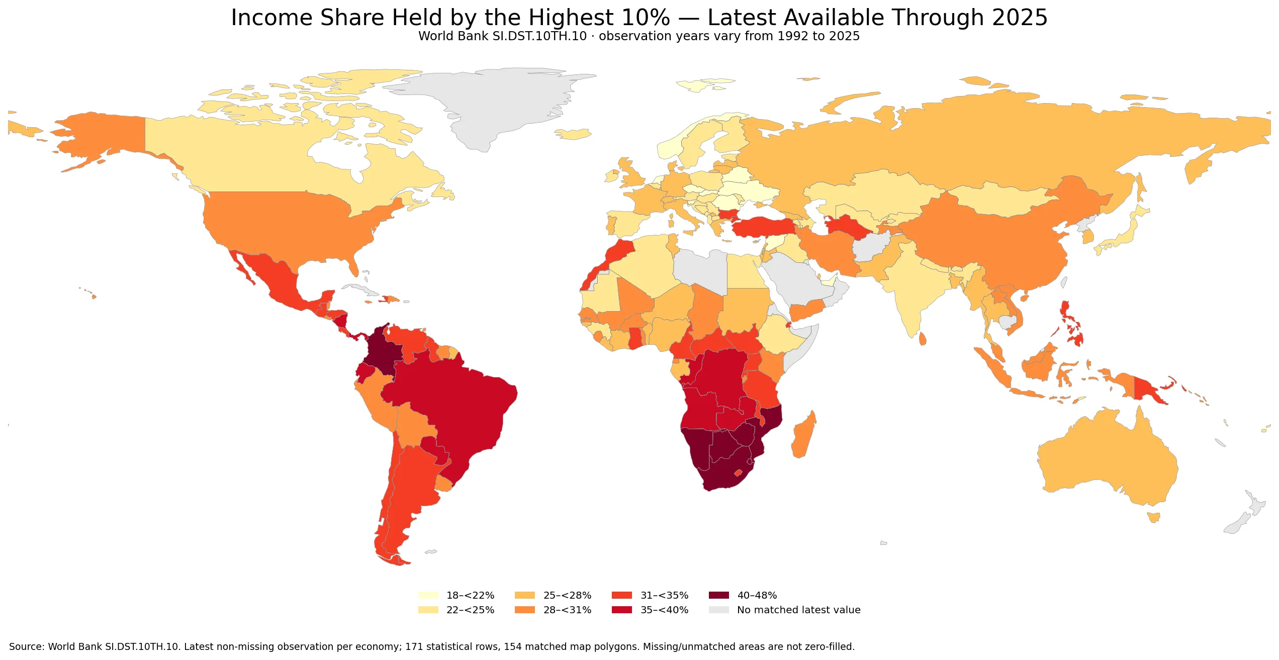
Table of Contents
What the highest 10% income share measures
The numerator is the income or consumption attributed to the top decile of the distribution, and the denominator is the total income or consumption measured by the underlying household survey. A value of 35% means that the highest 10% account for about 35% of the measured total. The remaining 90% share the other 65%, but that fact does not tell us how the remainder is divided between middle-income and lower-income groups.
This is also not a direct measure of wealth concentration. Net wealth includes assets and liabilities such as housing, land, business ownership, securities, and debt. Income or consumption can be related to wealth, but the two distributions are not interchangeable. A country can have a comparatively modest top-decile income share and still have substantial concentration of assets, or the reverse.
Cross-country comparisons also inherit differences in survey design, the use of income versus consumption concepts, household coverage, treatment of taxes and transfers, and the ability of household surveys to capture very high incomes. For that reason, small decimal differences should not be read as exact league-table positions. The broad level, observation year, and geographic pattern are more informative than a one-place change in rank.
The distribution of latest available values
The 25th percentile is 24.6% and the 75th percentile is 31.1%, so the middle half of economies falls within that interval. The 10th percentile is 22.7% and the 90th percentile is 34.4%. Most observations therefore sit from the low twenties into the mid-thirties, with a smaller upper tail extending above 40%. That upper tail is one reason the mean is slightly higher than the median.
A threshold such as 30% is only a convenient descriptive breakpoint, not an official line separating good and bad outcomes. Still, the count helps describe the shape of the data: 58 economies have latest values at or above 30%, while 53 are below 25%. This shows that a top-decile share around one-third of the total is not unusual in the dataset, but there is also a broad group where the measured share is closer to one-fifth or one-quarter.
| Country or area | Observation year | Highest 10% share |
|---|---|---|
| Namibia | 2015 | 47.2% |
| Botswana | 2015 | 42.9% |
| Colombia | 2024 | 42.7% |
| Eswatini | 2016 | 42.7% |
| South Africa | 2022 | 42.1% |
| Mozambique | 2022 | 40.8% |
| Zimbabwe | 2019 | 40.5% |
| Angola | 2018 | 39.6% |
| Brazil | 2024 | 39.3% |
| Zambia | 2022 | 39.1% |
Several of the highest observations are in Southern Africa. Namibia is at 47.2% in 2015, Botswana at 42.9% in 2015, Eswatini at 42.7% in 2016, South Africa at 42.1% in 2022, and Mozambique at 40.8% in 2022. Latin America also contributes a number of high latest values, including Colombia at 42.7% in 2024, Brazil at 39.3% in 2024, Panama at 37.6% in 2024, and Paraguay at 35.0% in 2024. The observation years matter when comparing these numbers directly.
Countries with lower latest top-decile shares
| Country or area | Observation year | Highest 10% share |
|---|---|---|
| Slovak Republic | 2023 | 18.8% |
| United Arab Emirates | 2018 | 20.5% |
| Slovenia | 2023 | 20.6% |
| Belarus | 2020 | 20.7% |
| Kiribati | 2023 | 20.9% |
| Syrian Arab Republic | 2022 | 20.9% |
| Netherlands | 2021 | 21.4% |
| Czechia | 2023 | 21.5% |
| Norway | 2023 | 21.6% |
| Ukraine | 2020 | 21.7% |
At the lower end, the Slovak Republic records 18.8% in 2023. The United Arab Emirates is at 20.5% in 2018, Slovenia at 20.6% in 2023, Belarus at 20.7% in 2020, and both Kiribati and the Syrian Arab Republic at 20.9% in their latest listed years. The Netherlands, Czechia, Norway, and Romania are also in the low-twenties group. These values indicate a smaller measured top-decile share, but they should not be interpreted as a complete measure of living standards or social outcomes.
Two economies can have similar top-10% shares and still differ substantially in what happens to the bottom and middle of the distribution. The bottom 20% share, median income, poverty rate, tax and transfer system, labor-market participation, and cost of living can all differ. This is why top-decile concentration works best as one component of a wider distributional profile rather than as a single score for equality.
Geographic patterns on the map
The most visible cluster of high values appears in Southern Africa. Namibia, Botswana, South Africa, Eswatini, and Mozambique all occupy high map classes, while Zimbabwe and Zambia are also elevated at 40.5% in 2019 and 39.1% in 2022. The spatial continuity is informative because it shows that high top-end concentration is not limited to one isolated country. It does not, however, prove a common cause, especially because the observation years and national institutions differ.
Parts of Latin America form another cluster above the global median. Colombia and Brazil have high 2024 values, and Panama, Paraguay, Ecuador, and Chile are also above the center of the distribution. By contrast, many European economies appear in the low-to-mid twenties. These broad patterns can guide deeper analysis, but regional averages should not replace country-level values because neighboring economies can still differ by several percentage points.
The statistical dataset has 171 latest observations, while 154 of them match polygons in the low-resolution world boundary used for the map. Small islands and territories may have valid numerical observations without a separately visible polygon at this scale. Gray areas are therefore not zeros. They represent missing map joins or no displayed polygon, and those cases remain in the statistical calculations rather than being silently assigned a value of zero.
Why observation years matter
| Latest observation year group | Number of economies |
|---|---|
| 2025 | 4 |
| 2024 | 21 |
| 2023 | 37 |
| 2021–2022 | 45 |
| 2016–2020 | 40 |
| 1992–2015 | 24 |
Household distribution data do not arrive for every economy on the same annual schedule. In this dataset, only four latest observations are from 2025, 21 are from 2024, and 37 are from 2023. Another 45 are from 2021 or 2022. A sizable group is older still. The concentration of many observations in recent years makes the map useful, but it does not eliminate the comparability problem created by older survey years.
Some latest observations reach back into the 1990s or 2000s. Those values remain the latest non-missing records for the corresponding economies in this extract, but they should not be presented as if they describe conditions in 2025. To analyze change over time, the appropriate approach is to use a country time series with comparable survey observations, not to compare one old latest value with another country’s recent value and label the difference a recent trend.
What a high top-10% share can and cannot tell us
A high value directly tells us that the top tenth receives or consumes a large share of the measured total. It does not identify the cause. Tax systems, transfers, labor-market institutions, sector composition, education, capital income, informality, and survey coverage can all shape the distribution. The indicator also does not reveal whether total national income is rising or falling, because the share can change even when the size of the income pool changes in a different direction.
The same caution applies to low values. A smaller top-decile share is evidence of less concentration at the top under the survey definition, but it is not proof that poverty is low, that average income is high, or that every group is doing equally well. Distribution and absolute living standards answer different questions. For policy analysis, the strongest interpretation combines distribution shares with poverty measures, median income, labor outcomes, and information about taxes and social transfers.
How to use top-20% and bottom-20% shares alongside this measure
The highest 10% share focuses more narrowly on the top of the distribution than a highest 20% measure. If both indicators are available for the same country and survey year, their relationship helps describe how concentrated income is within the upper fifth itself. A large gap between the highest-20% share and the highest-10% share implies that the next 10% below the top decile also accounts for a meaningful part of the total. Comparisons should be aligned by survey year and definition before making that calculation.
The lowest 20% share answers the mirror-image question at the bottom of the distribution. A country can have a high top-decile share and a low bottom-quintile share, suggesting a wide spread between the ends, but the exact shape still depends on the middle 70%. Because no single percentile share captures the entire distribution, pairing several shares with a summary measure such as the Gini index usually produces a more complete picture.
Common interpretation mistakes
- Do not confuse a distribution share with average income. The indicator describes who gets what fraction of the total, not how large the total is.
- Do not treat income and wealth as identical. SI.DST.10TH.10 measures income or consumption distribution, not net-asset ownership.
- Do not ignore survey years. Latest observations span 1992–2025, so the map is not one synchronized year.
- Do not read gray map areas as zero. Missing or unmatched polygons are kept separate from genuine numerical values.
- Do not turn a rank into a causal explanation. Explaining a country’s position requires additional evidence about institutions, markets, taxes, transfers, and survey methodology.
Used with those cautions, the map is more valuable as an exploration tool than as a scoreboard. It can reveal clusters, neighboring contrasts, and outliers that deserve further investigation. The next step for a specific economy is to check its observation year and then look at related distribution indicators from a comparable survey, rather than relying on map color alone.
Data source and calculation
The source is the World Bank indicator Income share held by highest 10% (SI.DST.10TH.10). One latest non-missing observation is retained for each economy. Summary statistics use all 171 rows with equal weight, so the 28.36% average is an unweighted average of economies rather than a population-weighted world share. The median is often a useful companion because it describes the middle economy without giving extra influence to large or small populations.
The choropleth joins ISO country codes to a low-resolution world boundary. France, Norway, and Kosovo require name-based repairs because the boundary file uses nonstandard ISO placeholders for them. After those repairs, 154 observations match visible polygons. Values for small states or territories without a suitable polygon remain in the calculations and tables but are not invented on the map. Missing joins are not filled with zero.
Map classes are 18–22%, 22–25%, 25–28%, 28–31%, 31–35%, 35–40%, and 40–48%. These are visualization bins chosen to make the distribution readable; they are not policy thresholds. For exact country values, the numerical tables and observation years take precedence over color categories. The official series can be checked on the World Bank SI.DST.10TH.10 indicator page.
Main takeaways from the comparison
First, the latest top-decile share varies widely, from 18.8% to 47.2%, a range of 28.4 percentage points. Second, high observations are geographically clustered in parts of Southern Africa and Latin America, while many European economies sit in lower classes. Third, the observation years differ substantially, so these are latest available values rather than a same-year ranking. Fourth, the indicator is specific: it describes concentration in the highest tenth of the income or consumption distribution and should not be substituted for poverty, wealth, or average income.
The most useful workflow is therefore to locate an economy in the overall distribution, check its survey year, compare it with nearby economies only with the year caveat in mind, and then add complementary indicators if a fuller assessment is needed. Read this way, the map becomes a starting point for understanding the shape of income distribution across countries rather than a single-number verdict on economic performance.
Frequently Asked Questions
Are all 171 observations from 2025?
No. Only four latest observations are from 2025 and 21 are from 2024. The full observation-year range is 1992–2025, so this is a latest-available snapshot through 2025.
What does a high highest-10% income share mean?
It means the top tenth of the measured income or consumption distribution accounts for a large share of the total. It does not directly measure poverty, average income, or wealth concentration.
How is the highest-10% share different from the highest-20% share?
The highest-10% indicator focuses more narrowly on the very top of the distribution, while the highest-20% indicator covers a broader upper group. Comparing them is most useful when the survey year and definition match.
Does gray on the map mean 0%?
No. Gray indicates no displayed matched polygon or no mapped value at this boundary scale. Missing or unmatched areas were not filled with zero.
Related Articles
Green Map creates custom-edited map images using open geographic data sources such as geoBoundaries, Natural Earth, OpenStreetMap, and government open data.
These maps are edited visual materials, not raw data files, and are provided for education, documents, presentations, and graphic reference.