A single fixed international poverty line answers an important question, but it does not capture every way that poverty changes as national living standards rise. The World Bank’s Societal Poverty Line is designed to add that dimension by letting the threshold rise with a country’s median level of income or consumption, while retaining a minimum floor.
The latest non-missing observations for World Bank indicator SI.POV.SOPO cover 171 countries and areas. They are not a 2025 cross-section. Only four observations are from 2025 and 21 are from 2024; the full set ranges from 1992 to 2025. The map therefore shows the latest available observation through 2025 for each economy, not one synchronized survey year.
Across these 171 latest values, the median is 22.6% and the unweighted country average is 26.41%. Slovenia has the lowest reported latest value at 7.0% in 2023, while the Democratic Republic of the Congo has the highest at 85.3% in 2020. Those endpoints are useful for understanding the spread, but the different observation years mean they should not be read as a same-year league table.
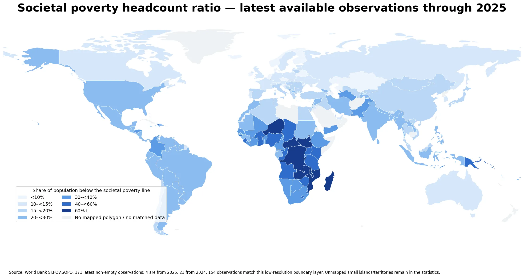
Table of Contents
What the societal poverty line measures
The supplied World Bank description defines the Societal Poverty Line in 2021 purchasing-power-parity dollars as max($3.00, $1.30 + 0.5 × the national median). In countries with a sufficiently low median level of welfare, the $3.00 floor determines the line. As the median rises, the second part of the formula can raise the threshold. The measure therefore combines an absolute floor with a component that reflects differences in typical national living standards.
The indicator is a headcount ratio. A value of 30% means that about 30% of the population in that observation year is estimated to live below the applicable societal poverty line. It does not show how far below the line poor households are, so it is not a poverty-gap measure. It is also not an inequality index: two countries can have similar headcount ratios while having very different distributions of income or consumption above and below the threshold.
The country observations come from the official World Bank SI.POV.SOPO series, with the most recent non-empty value retained for each real economy. That retrieval method makes the observation year an essential part of every comparison.
The latest observations span more than three decades
The data are recent for many countries, but not for all of them. There are four observations from 2025, 21 from 2024, 37 from 2023, 22 from 2022 and 23 from 2021. Another 40 fall between 2016 and 2020, 16 between 2011 and 2015, and eight are from 2010 or earlier. In total, 107 of the 171 rows are from 2021 onward.
| Latest observation period | Countries and areas |
|---|---|
| 2025 | 4 |
| 2024 | 21 |
| 2023 | 37 |
| 2022 | 22 |
| 2021 | 23 |
| 2016–2020 | 40 |
| 2011–2015 | 16 |
| 2010 or earlier | 8 |
Some stale observations are striking. Trinidad and Tobago’s latest value in this series is from 1992, while Guyana and Turkmenistan are represented by 1998 observations. Papua New Guinea’s 52.2% value is from 2009. These rows remain useful as the latest available values in the source, but they should not be interpreted as direct estimates of conditions in 2025.
A median of 22.6% sits below the unweighted mean
The median latest observation is 22.6%, meaning half of the 171 reported values are below that level and half are above it. The unweighted mean is higher, at 26.41%, because a smaller group of countries has very high headcount ratios. Nine observations are at least 60%, and 27 are at least 40%.
| Societal poverty headcount ratio | Countries and areas |
|---|---|
| Below 10% | 13 |
| 10–<15% | 23 |
| 15–<20% | 34 |
| 20–<30% | 51 |
| 30–<40% | 23 |
| 40–<60% | 18 |
| 60% or more | 9 |
The largest group is the 20–30% range, with 51 countries and areas. Seventy observations are below 20%, while 121 are below 30%. The difference between the mean and median is therefore not caused by a uniformly high level across the world; it reflects a distribution with a substantial upper tail.
The highest latest values cluster in Sub-Saharan Africa
The Democratic Republic of the Congo has the highest latest value at 85.3% in 2020, followed by Mozambique at 81.4% in 2022. South Sudan records 76.5% in 2016, Malawi 75.4% in 2019 and Burundi 74.2% in 2020. Zambia, the Central African Republic and Madagascar are all above 69% in their latest observations, while Niger is at 60.5% and Uganda at 59.8%.
| Country | Latest year | Headcount ratio |
|---|---|---|
| Democratic Republic of the Congo | 2020 | 85.3% |
| Mozambique | 2022 | 81.4% |
| South Sudan | 2016 | 76.5% |
| Malawi | 2019 | 75.4% |
| Burundi | 2020 | 74.2% |
| Zambia | 2022 | 71.7% |
| Central African Republic | 2021 | 71.6% |
| Madagascar | 2021 | 69.2% |
| Niger | 2021 | 60.5% |
| Uganda | 2019 | 59.8% |
The map shows a broad concentration of darker categories across parts of central, eastern and southeastern Africa. Yet the pattern is not a single uniform block. Neighboring countries can differ markedly, and their survey years can differ too. Burundi is at 74.2% in 2020, Rwanda at 39.9% in 2023, Uganda at 59.8% in 2019, Tanzania at 51.3% in 2018 and Kenya at 45.5% in 2022. Those contrasts reflect both real differences and the fact that the snapshot mixes observation dates.
Many of the lowest values are in Europe
At the low end, Slovenia reports 7.0% in 2023. Denmark is at 7.4% in 2023, Iceland at 7.4% in 2019, Azerbaijan at 8.1% in 2005, Czechia at 8.3% in 2023, Kazakhstan at 8.3% in 2021 and Belarus at 8.4% in 2020. Norway, Ireland, Cyprus and Finland are also below 9% in their latest observations.
Several European observations at the low end are from 2023, which makes comparisons among those particular countries more temporally aligned. Azerbaijan is a clear exception because its latest row is much older. This illustrates why the color category and the observation year should be read together rather than treating every light-colored country as a contemporaneous result.
A recent-year subset produces a different ranking
If the comparison is restricted to observations from 2023 onward, only 62 countries and areas remain. Rwanda is highest in that subset at 39.9% in 2023, followed by Pakistan at 32.8% in 2024, Honduras at 32.3% in 2024, Colombia at 30.0% in 2024 and Guatemala at 29.0% in 2023. That ordering is very different from the top of the full latest-observation set because many countries with higher ratios have older surveys.
The four 2025 observations are Ecuador at 26.3%, Costa Rica at 23.6%, Indonesia at 22.2% and Uzbekistan at 17.2%. They should not be treated as a representative sample of the world in 2025; they are simply the economies for which the source currently provides a 2025 value. A robust same-year comparison requires a sufficiently broad set of countries reporting for that year.
Societal poverty is not the same as extreme poverty
Because the societal line can rise with the national median, a country can have a low extreme-poverty rate while still recording a meaningful societal-poverty headcount. The two indicators ask different questions. A fixed international line focuses on whether people fall below a common absolute threshold, while the societal line adds a benchmark related to the living standard typical of each country.
For the same reason, SI.POV.SOPO should not be substituted for a national poverty rate without checking the national methodology. National poverty lines can reflect domestic consumption baskets, administrative rules and policy choices that differ from the World Bank’s international methodology. The societal line is most useful as a standardized analytical measure for cross-country work, with its definition kept explicit.
What the map can and cannot explain
The map is effective at showing broad spatial concentrations and outliers, but it cannot establish why a country has a particular poverty ratio. Growth, employment, social protection, demographic structure, prices, conflict, disasters, inequality and survey design can all matter. A single headcount indicator does not isolate those mechanisms or prove that one policy caused a change.
It also does not measure the severity of poverty below the threshold. Two countries can both report a 30% headcount ratio even if poor households in one country are concentrated just below the line and those in the other are far below it. Poverty-gap and distributional measures are needed to answer that deeper question.
Seventeen statistical rows are not directly colored on the map
The source contains 171 country and area observations, of which 154 can be joined to the low-resolution world boundary layer used for the choropleth. The 17 unmatched rows are Barbados, Comoros, Cabo Verde, the Federated States of Micronesia, Grenada, Kiribati, St. Lucia, Maldives, Marshall Islands, Malta, Mauritius, Nauru, Sao Tome and Principe, Seychelles, Tonga, Tuvalu and Samoa.
Those rows remain part of every numerical summary. They were not converted to zero and were not assigned to a neighboring polygon. The map should therefore be read as a spatial view of the matched countries, while the tables and summary statistics refer to the full set of 171 latest observations.
Three checks make the comparison more reliable
First, check the observation year before comparing two countries. “Latest” does not mean “same year.” Second, check the poverty-line definition; the societal line is not interchangeable with a fixed extreme-poverty threshold. Third, check the weighting behind any average. The 26.41% mean reported here gives every country or area equal weight and is not a world population-weighted poverty estimate.
With those limits in view, the indicator is useful for seeing where poverty remains high relative to a threshold that moves partly with national living standards. It also highlights a practical data issue: international poverty comparisons often involve uneven survey timing, so a map of latest available values and a strict same-year comparison are different analytical products.
Frequently Asked Questions
Are all 171 observations from 2025?
No. Only four latest observations are from 2025 and 21 are from 2024. The full set spans 1992–2025, so this is a latest-available snapshot through 2025 rather than a single-year cross-section.
Is the Societal Poverty Line the same as the $3.00-a-day line?
Not always. The supplied World Bank definition uses max($3.00, $1.30 + 0.5×the national median) in 2021 PPP dollars, so the societal threshold can rise as the national median rises.
Does the 26.41% average mean 26.41% of the world population is poor?
No. It is an unweighted average of 171 country and area percentages. A global population-weighted poverty rate would require weighting each observation by population and aligning the methodology and reference periods.
Does gray on the map mean a 0% poverty rate?
No. Gray indicates that the low-resolution boundary layer has no matched polygon or matched data for that area. Unmatched statistical observations remain in the tables and summaries and were not zero-filled.
Related Articles
Green Map creates custom-edited map images using open geographic data sources such as geoBoundaries, Natural Earth, OpenStreetMap, and government open data.
These maps are edited visual materials, not raw data files, and are provided for education, documents, presentations, and graphic reference.