Employment in industry as a share of total employment shows how jobs are distributed across broad sectors of an economy. The indicator is wider than manufacturing alone. In the World Bank series SL.IND.EMPL.ZS, based on ILO modelled estimates, industry includes mining and quarrying, manufacturing, construction, and public utilities such as electricity, gas, and water. Reading the measure as a manufacturing-employment rate would therefore understate what the indicator actually covers.
The 2025 dataset contains values for 182 reporting economies, while 35 economies remain source-missing. Among the observed values, the median is 18.88% and the mean is 19.59%. The first quartile is 15.20% and the third quartile is 24.54%. Oman records the highest observed share at 39.44%, while Burundi has the lowest at 3.10%.
The denominator is total employment, not the working-age population or the total population. A value of 30% means that about 30 of every 100 employed people work in industry. It does not mean that 30% of all adults work in industry, and it does not mean that industry produces 30% of GDP. Employment shares and value-added shares can differ substantially because productivity varies across sectors.
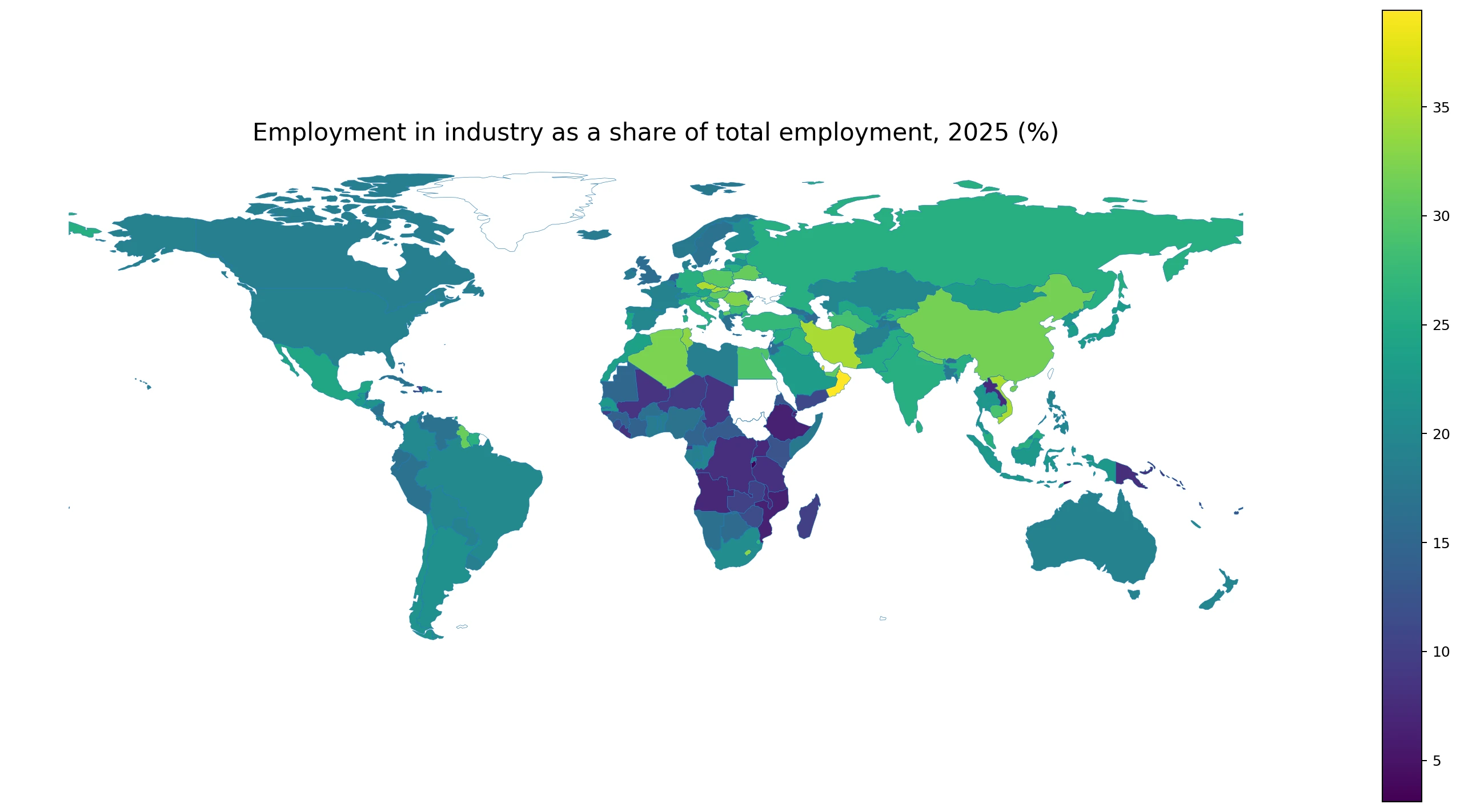
Table of Contents
The median is 18.88%, but the distribution is wide
Of the 182 observed economies, 22 are below 10%, 22 are from 10% to under 15%, 63 are from 15% to under 20%, 33 are from 20% to under 25%, 21 are from 25% to under 30%, and 21 are at 30% or more. The largest group lies between 15% and 20%, yet a substantial number of economies have industry-employment shares above 30%.
This is a structural indicator rather than a score of how industrialized or successful an economy is. A high share can reflect manufacturing employment, construction, mining, utilities, or some combination of those activities. A low share can appear in economies where agriculture employs many workers, where services dominate employment, or where industry is highly productive but uses relatively little labor.
The indicator becomes much more informative when paired with employment in agriculture and employment in services. Together, the three broad sectors describe how workers are distributed across the economy, although unclassified workers and differences in statistical treatment can prevent the categories from summing exactly to 100% in every case.
| Industry-employment share | Economies |
|---|---|
| Below 10% | 22 |
| 10% to under 15% | 22 |
| 15% to under 20% | 63 |
| 20% to under 25% | 33 |
| 25% to under 30% | 21 |
| 30% or more | 21 |
The highest shares span the Gulf, Central Europe, Southeast Asia, and other regions
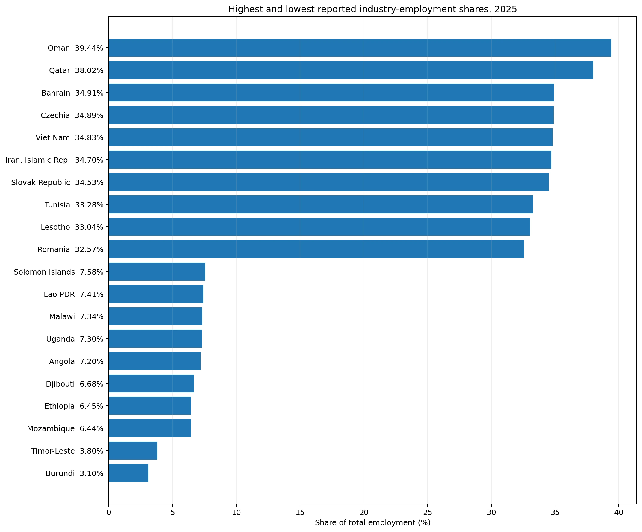
Oman leads at 39.44%, followed by Qatar at 38.02%. Bahrain is at 34.91%, Czechia 34.89%, Viet Nam 34.83%, Iran 34.70%, the Slovak Republic 34.53%, Tunisia 33.28%, Lesotho 33.04%, and Romania 32.57%. The top group is geographically diverse, appearing across the Gulf, Central and Eastern Europe, Southeast Asia, North Africa, and Southern Africa.
Similar percentages do not imply similar industrial structures. In one economy the share may be driven heavily by manufacturing, while in another construction, mining, or utilities may be more important. The broad industry indicator does not show the internal composition of industrial employment, so sector-specific data are needed before attributing a high value to any one activity.
The high values in Oman and Qatar should also not be read as the industry sector producing around 40% of GDP. The measure concerns people who are employed, not the value of output. An economy can have a large industrial workforce and moderate industrial value added, or a smaller industrial workforce and very high value added if productivity and capital intensity are high.
| Highest observations | Industry-employment share |
|---|---|
| Oman | 39.44% |
| Qatar | 38.02% |
| Bahrain | 34.91% |
| Czechia | 34.89% |
| Viet Nam | 34.83% |
| Iran, Islamic Rep. | 34.70% |
| Slovak Republic | 34.53% |
| Tunisia | 33.28% |
| Lesotho | 33.04% |
| Romania | 32.57% |
Low shares can reflect agriculture-heavy or service-heavy employment structures
Burundi has the lowest observation at 3.10%, followed by Timor-Leste at 3.80%, Mozambique at 6.44%, Ethiopia at 6.45%, Djibouti at 6.68%, Angola at 7.20%, Uganda at 7.30%, Malawi at 7.34%, Lao PDR at 7.41%, and Solomon Islands at 7.58%. In much of the lower group, fewer than one in ten employed people work in industry.
A low value does not have one universal explanation. Some economies may have large agricultural workforces, while others may be dominated by services. Industry can also be capital-intensive, generating significant output with relatively few workers. The indicator therefore should not be turned into a simple judgment that an economy ‘has no industry’ or has failed to industrialize.
Luxembourg, at 7.64%, illustrates why income level is not the same thing as an industry-employment share. A high-income economy with a very large financial and professional-services sector can have a low industrial share, while a lower-income economy with labor-intensive manufacturing or construction can have a much higher one. This is a ranking of employment structure, not national income.
| Lowest observations | Industry-employment share |
|---|---|
| Burundi | 3.10% |
| Timor-Leste | 3.80% |
| Mozambique | 6.44% |
| Ethiopia | 6.45% |
| Djibouti | 6.68% |
| Angola | 7.20% |
| Uganda | 7.30% |
| Malawi | 7.34% |
| Lao PDR | 7.41% |
| Solomon Islands | 7.58% |
Industry is broader than manufacturing
The definition used for this indicator includes mining and quarrying, manufacturing, construction, electricity, gas, and water. That matters because construction booms and large mining workforces can lift the industry-employment share even when manufacturing is not the dominant activity. Researchers who want to isolate factory employment need a more specific measure.
Two economies can both report an industry-employment share of 30% while having completely different internal structures. One might be dominated by factories and export manufacturing, another by construction and extractive industries. The broad measure is useful for identifying where industrial-sector employment is large, but it cannot by itself describe what those industrial jobs actually are.
A practical way to use the map is to treat it as a starting point. After identifying high- and low-share economies, manufacturing value added, mining dependence, construction activity, service employment, and agricultural employment can help explain why the broad industry share takes the value it does.
ILO modelled estimates support comparison, but they are not identical to every national survey result
The World Bank series is based on ILO modelled estimates. The purpose of a harmonized international series is to improve comparability across countries that use different survey schedules, definitions, and data availability. For that reason, the value shown here can differ from a headline figure published directly by a national statistical office for a particular survey period.
For cross-country comparison, it is important to keep the source and reference year consistent. Mixing a modelled estimate for one country with a national survey estimate for another can introduce methodological differences. This article therefore uses the same 2025 indicator across all reporting economies. Detailed country analysis can then return to national labor-force surveys for additional context.
The 35 source-missing economies are kept as missing rather than being set to zero. A missing value does not mean that nobody works in industry; it means there is no 2025 observation available in this comparison. Converting missing data to zero would distort both the map and the distribution.
Industry-employment shares should not be treated as a development ranking
Economic development is often associated with shifts in employment from agriculture toward industry and later toward services, but real economies do not all follow one identical path. Some move quickly from agriculture into services. Others maintain large manufacturing sectors for long periods. Automation can also allow industrial output to rise without a parallel increase in industrial employment.
A very high industry-employment share is therefore not automatically better, and a low share is not automatically worse. Concentration in a narrow set of industrial activities can expose employment to sector-specific shocks, while a service-heavy economy can be highly productive and prosperous. The measure is most useful as a coordinate describing economic structure rather than a quality score.
Policy or investment analysis should combine this measure with industry value added, labor productivity, wages, exports, firm size, and occupational data. Employment tells us where people work; output and productivity tell us how much economic value those jobs generate. Keeping those questions separate prevents misleading conclusions.
Adjacent labor indicators reveal the structure more clearly
Employment in agriculture and employment in services are the most direct companion indicators. A low industry share with a high agricultural share describes a very different economy from a low industry share with a very high service share. Looking at the three sectors together provides a fuller picture of labor allocation.
The employment-to-population ratio and labor-force participation rate answer another missing question: how many adults are actually working or active in the labor market. Industry employment is measured as a share of people who already have jobs. Two economies can both record a 25% industry share while having very different overall employment rates.
Sex- and age-specific industry-employment indicators can also reveal patterns hidden by the total. An economy may have a high overall share because industrial employment is concentrated among men or certain age groups. A broad national total is useful for the first comparison, but it does not show how industrial jobs are distributed within the workforce.
The 2025 comparison is a snapshot, not a trend
All values in this comparison refer to 2025. Oman being the highest observed economy does not mean its industry-employment share has recently increased. Establishing direction requires a multi-year series for the same indicator. A one-year map shows spatial differences; it does not measure the pace of structural change.
Construction cycles, manufacturing investment, mining projects, economic crises, and migration can all alter industrial employment over time. A strong long-term analysis should therefore compare several years and investigate economies where the share changes sharply rather than assuming that the 2025 ranking represents a permanent structure.
Key takeaways
Across the 182 economies with 2025 observations, industry employment ranges from 3.10% to 39.44% of total employment. The median is 18.88%. There are 21 economies at 30% or more and 22 below 10%. The highest values are spread across several regions, while the lowest group includes economies with very different agricultural and service-sector structures.
The key interpretation rule is that industry includes more than manufacturing and the denominator is total employment. The indicator does not measure industry’s share of GDP or the absolute number of industrial workers. Used together with agriculture, services, employment rates, productivity, and value-added data, it becomes a strong tool for comparing labor-market structure across economies.
Frequently Asked Questions
What does employment in industry as a share of total employment mean?
It is the percentage of employed people working in mining and quarrying, manufacturing, construction, electricity, gas, water, and related industrial activities.
Is industry the same as manufacturing in this indicator?
No. Manufacturing is only one part of the broader industry sector used in the indicator.
Does a high industry-employment share mean industry has the same share of GDP?
No. Employment shares measure where people work, while GDP shares measure value added. Productivity differences can make the two measures very different.
Are missing observations treated as zero?
No. A missing 2025 observation is kept as missing and does not imply zero industry employment.
Related Articles
Green Map creates custom-edited map images using open geographic data sources such as geoBoundaries, Natural Earth, OpenStreetMap, and government open data.
These maps are edited visual materials, not raw data files, and are provided for education, documents, presentations, and graphic reference.