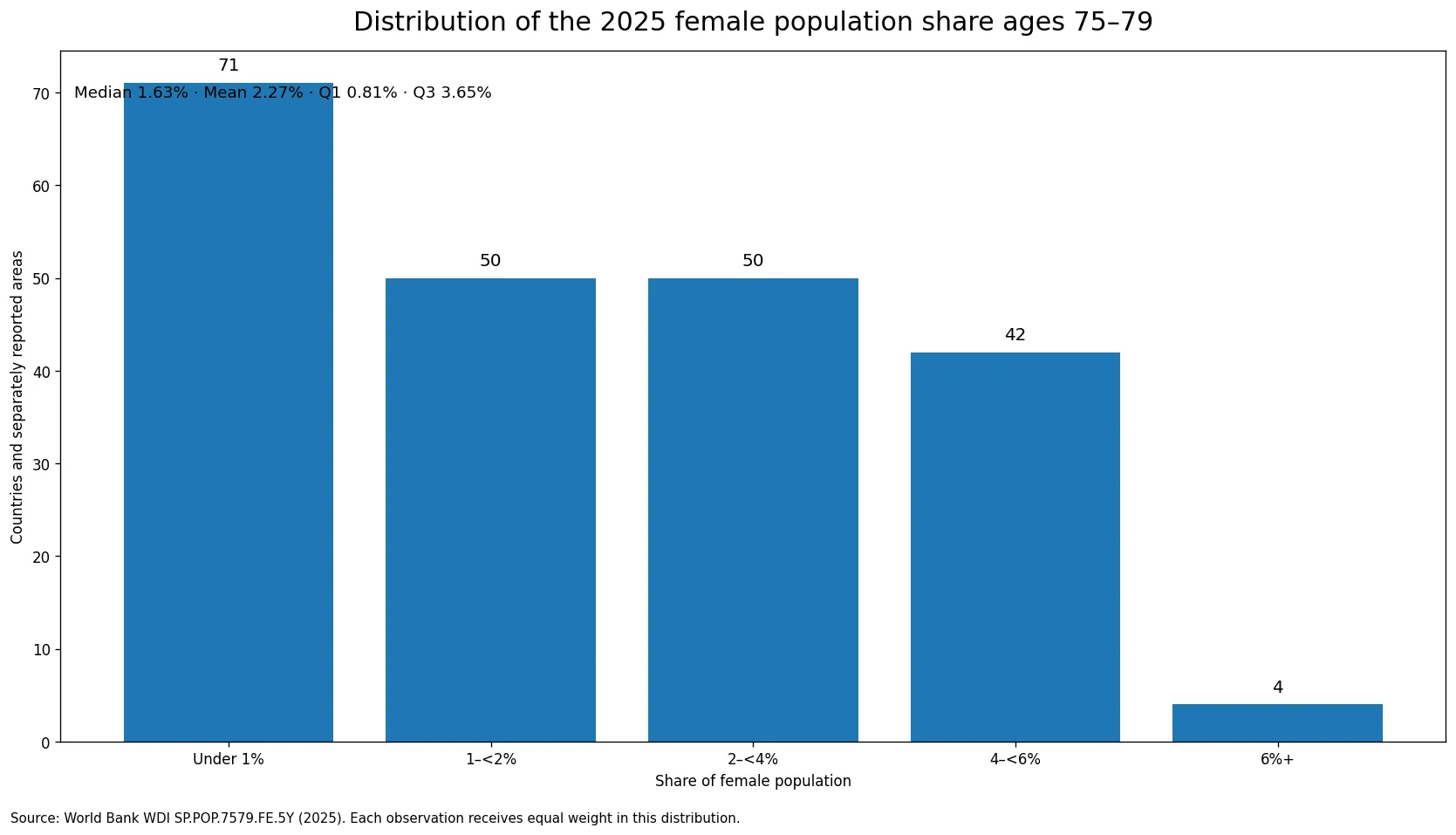
The 2025 share of women ages 75–79 is best read as a narrow view of age structure, not as a single ranking of how “old” a country is. Across 217 countries and separately reported areas, the median is 1.63% and the simple mean is 2.27%. The observed range runs from 0.32% to 7.49%. The distribution is strongly uneven: 71 observations are below 1%, while only four reach 6% or more. That shape matters because an average alone would make the typical country or area look older in this age band than the median actually indicates.
The World Bank indicator is Population ages 75-79, female (% of female population), code SP.POP.7579.FE.5Y. Its numerator is the number of females ages 75 through 79, while the denominator is the female population of all ages. A value of 4% therefore means roughly four of every 100 females are ages 75–79. It is not the percentage of the total population in that age range, and it does not report how many women are in the group. World Bank metadata identifies the UN Population Division’s World Population Prospects as the source and describes the figures as annual midyear estimates.
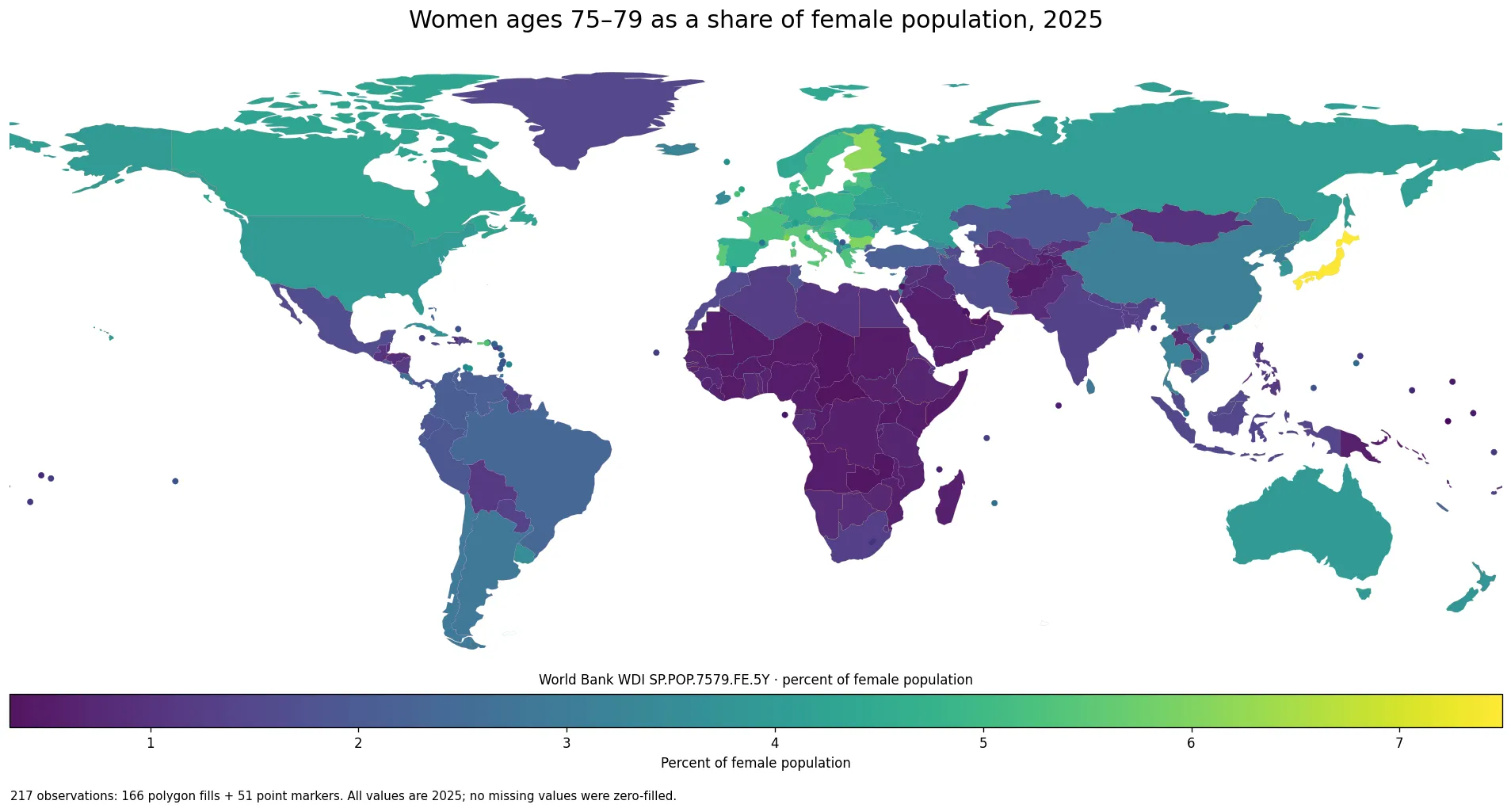
Table of Contents
A five-year age band is not the same thing as the whole older population
Women ages 75–79 are part of the older population, but this series covers only one five-year slice. A country may have a large population ages 65–69 or 70–74 and a smaller share ages 75–79. Another may have a relatively large 80-plus population even if the 75–79 share is moderate. For that reason, the map is useful for comparing the position of one cohort within the female population, while broader questions about population aging require additional age groups or indicators such as the old-age dependency ratio.
Share and headcount also answer different questions. A populous country can have millions of women ages 75–79 and still show a middle-range percentage because its female population is very large. A small territory can record a high percentage with far fewer people if that cohort occupies a large share of its female population. Anyone estimating demand for health care, long-term care, housing, or local services would need the actual age-group population in addition to this percentage.
The middle half of observations lies between 0.81% and 3.65%
Giving each country or area equal weight, the first quartile is 0.81%, the median is 1.63%, and the third quartile is 3.65%. Half of the 217 observations therefore falls inside a band of roughly 0.81% to 3.65%. The simple mean of 2.27% sits above the median because a smaller group of observations in the 5–7% range pulls the average upward. This is an unweighted mean of country and area percentages, not a global female-population-weighted share.
| 2025 female share ages 75–79 | Countries and areas |
|---|---|
| Under 1% | 71 |
| 1 to <2% | 50 |
| 2 to <4% | 50 |
| 4 to <6% | 42 |
| 6% or more | 4 |
The two lowest bands together contain 121 observations, more than half of the dataset. Another 50 fall between 2% and 4%, while 42 are between 4% and 6%. Only four reach at least 6%. In other words, a share above 5% is relatively unusual for this particular age band, even though such values occur across several places with older age structures.
Higher shares cluster in Japan and across several parts of Europe
The highest 2025 observation is Japan at 7.49%. Finland follows at 6.17%, Monaco at 6.08%, and Bulgaria at 6.03%. Puerto Rico is 5.64%, Czechia 5.63%, and both Italy and Portugal are about 5.48%. The map also shows many mid-to-high values across Europe, although the pattern is not uniform from one country to the next.
France is 5.22%, Spain 4.63%, Germany 4.48%, and Canada 4.25%. These percentages describe the size of the 75–79 cohort relative to all females in each place. They do not show whether older women have better health, higher incomes, longer healthy life expectancy, or stronger social protection. Those questions require different datasets.
Very low shares are common across much of Sub-Saharan Africa and appear in some Gulf states
At the low end, the Central African Republic is 0.32%, Qatar 0.33%, Chad 0.36%, Zambia 0.36%, and the United Arab Emirates 0.36%. Uganda is 0.43%, Côte d’Ivoire 0.45%, Mali 0.47%, Sudan 0.47%, and Burundi 0.48%. The map makes the broader pattern easier to see: many Sub-Saharan African countries fall into the lowest bands, while several Gulf economies also have very small 75–79 shares.
Similar percentages do not imply the same demographic mechanism. A young population can produce a small older-age share because younger cohorts are much larger. A place with substantial working-age migration can also have an unusual denominator. Past fertility, survival, and migration all contribute to age structure, but this one indicator does not identify how much each factor matters. Its safest use is descriptive: it shows how large the 75–79 female cohort is relative to all females.
| Highest observations | Share | Lowest observations | Share |
|---|---|---|---|
| Japan | 7.49% | Central African Republic | 0.32% |
| Finland | 6.17% | Qatar | 0.33% |
| Monaco | 6.08% | Chad | 0.36% |
| Bulgaria | 6.03% | Zambia | 0.36% |
| Puerto Rico | 5.64% | United Arab Emirates | 0.36% |
Large-population countries show why composition and headcount must be separated
Among larger populations, Japan stands at 7.49%, Italy at 5.48%, France at 5.22%, Spain at 4.63%, Germany at 4.48%, Canada at 4.25%, the United States at 3.97%, Australia at 3.92%, and China at 3.12%. Brazil is 2.35%, Mexico 1.67%, India 1.35%, South Africa 1.30%, and Nigeria 0.55%.
A 3% share in a very large country can correspond to far more women than a 6% share in a small territory. That is why a composition map should not be treated as a map of service demand or market size. The percentage is most useful when the question is how the female age structure differs across places, because it removes much of the effect of total population size from the comparison.
What the 75–79 share can and cannot say about aging
The group represented here is a specific cohort that has moved through earlier age bands over time. Its relative size reflects a long history of births, survival, and migration. A high share can be consistent with an older population, but it is not identical to life expectancy, the percentage age 65 and over, or the number of people requiring care. Those measures have different numerators, denominators, and policy meanings.
Adjacent age bands help place the result in context. Comparing women ages 70–74, 75–79, and 80 and above can show whether the older female population is concentrated more heavily in the early or later old-age groups. The old-age dependency ratio answers another question again, usually comparing older people with a working-age population. Matching the age range, sex, and denominator is essential before two percentages are compared directly.
A common 2025 reference year removes a major comparison problem
All 217 observations used here are dated 2025, and the source table contains no missing values. International datasets often combine the latest available observation for each country even when those observations come from different years. That is not the case in this comparison. A darker or lighter value is therefore not the result of one place being represented by 2021 data and another by 2025 data.
The 217 rows should not be read as 217 sovereign states. The World Bank also reports some territories and separately listed areas. In the low-resolution map, 166 observations can be connected to country polygons and 51 small or separately reported areas are shown with point markers. All 217 values remain in the summary statistics and distribution, regardless of whether the visual representation is a polygon or a point.
Source and interpretation notes
The definition and methodology are documented in the World Bank WDI metadata. The indicator is the percentage of the female population that is ages 75–79, with the UN Population Division’s World Population Prospects identified as the source. Because population estimates are demographic estimates rather than exact performance scores, broad bands, quartiles, and geographic patterns are more informative than attaching meaning to differences of only a few hundredths of a percentage point.
A practical way to use the map is to begin with the broad distribution, see whether a country or area falls below 1%, around the middle, or above 4%, and then compare it with nearby places or other age bands. If the question shifts to the number of older women, actual headcounts are needed. If the question is population aging as a whole, wider age groups and dependency measures should be added rather than asking a single five-year band to answer everything.
Frequently Asked Questions
What does a 2% share for women ages 75–79 mean?
It means about two of every 100 females in that country or area are ages 75–79. It is not the share of the total population and not a headcount.
Are all 217 observations from 2025?
Yes. Every observation used in this comparison is dated 2025, and the source table contains no missing values.
Does a high 75–79 female share mean life expectancy is higher?
Not by itself. The indicator measures the size of one five-year age band relative to the female population and does not directly measure life expectancy or health.
Is the 2.27% mean a population-weighted global female share?
No. 2.27% is the simple unweighted mean of 217 country and area percentages, giving each observation equal weight.
Related Articles
These broader population-structure measures provide useful context for the 75–79 female age share.
- Old-Age Dependency Ratio by Country – 2025
- Age Dependency Ratio by Country – 2025
- Young-Age Dependency Ratio by Country – 2025
Green Map creates custom-edited map images using open geographic data sources such as geoBoundaries, Natural Earth, OpenStreetMap, and government open data.
These maps are edited visual materials, not raw data files, and are provided for education, documents, presentations, and graphic reference.