Poverty is not only about whether household income or consumption falls below a monetary threshold. A household can also face overlapping disadvantages in schooling, drinking water, sanitation, electricity and other basic services. The World Bank Multidimensional Poverty Measure (MPM) combines monetary poverty, education and basic infrastructure services to show the share of people facing sufficiently large overlapping deprivations. Across the 157 latest available country and area observations used here, values range from 0.0% to 88.0%, with a median of 4.3% and an unweighted mean of 18.62%.
The most important limitation is time. This is not a 2025 cross-section in which all 157 places were measured in the same year. The file keeps the most recent non-missing observation available for each country or area, and those observation years range from 2009 through 2025. Only Costa Rica, Ecuador, Indonesia and Uzbekistan have 2025 observations. The map should therefore be read as a spatial view of each place’s latest retained value, not as a synchronized global ranking for 2025.
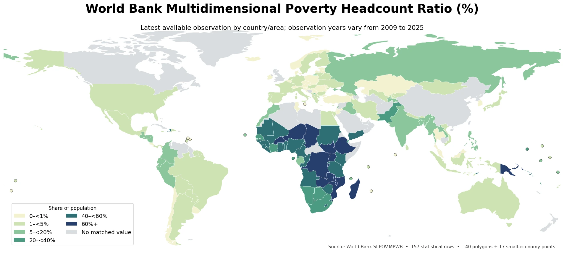
Table of Contents
The measure combines monetary poverty, education and basic infrastructure
The World Bank’s current MPM framework gives equal weight to three dimensions: monetary poverty, education and basic infrastructure services. Six indicators sit underneath those dimensions: income or consumption, educational attainment, educational enrollment, drinking water, sanitation and electricity. In the current methodology, the monetary component uses the $3.00-a-day international poverty line in 2021 purchasing-power-parity terms. A household is classified as multidimensionally poor when its weighted deprivations add up to at least one-third of the total.
That makes the MPM different from a standard monetary poverty headcount. A household can be above the monetary line yet still be classified as multidimensionally poor if disadvantages in education and infrastructure overlap strongly enough. The reverse interpretive warning also matters: this single percentage does not directly measure inequality, housing affordability, medical hardship, unemployment, wealth or every form of social exclusion. It answers a narrower question about the share of the population meeting the World Bank’s combined deprivation threshold.
The median is 4.3%, but the distribution has a very long upper tail
Giving each of the 157 observations equal weight, the median is 4.3%, the first quartile is 1.1% and the third quartile is 34.9%. The unweighted mean is much higher at 18.62%. That gap between mean and median shows how strongly the upper tail pulls the average upward. Thirty-five observations are below 1%, another 50 are from 1% to below 5%, while 49 are at least 20%, 37 are at least 40% and 13 are 60% or higher.
For that reason, a single world average would hide most of the structure in the data. Half of the observations are at or below 4.3%, yet a substantial group records values above 40% and some exceed 80%. The choropleth’s strong contrast between light and dark areas reflects this highly uneven distribution.
The highest retained observation is 88.0% in the Democratic Republic of the Congo
The Democratic Republic of the Congo has the highest latest retained value at 88.0% in 2020. South Sudan follows at 87.5% in 2016, Mozambique at 85.0% in 2022, Burundi at 84.2% in 2020 and Malawi at 80.6% in 2019. Nine of the ten highest observations are in Sub-Saharan Africa; Papua New Guinea is the only top-ten observation outside Africa. On the map, high values form a broad concentration across parts of central, eastern and southeastern Africa.
| Rank | Country/area | Observation year | Multidimensional poverty rate |
|---|---|---|---|
| 1 | Congo, Dem. Rep. | 2020 | 88.0% |
| 2 | South Sudan | 2016 | 87.5% |
| 3 | Mozambique | 2022 | 85.0% |
| 4 | Burundi | 2020 | 84.2% |
| 5 | Malawi | 2019 | 80.6% |
| 6 | Madagascar | 2021 | 79.1% |
| 7 | Niger | 2021 | 78.6% |
| 8 | Chad | 2018 | 75.8% |
| 9 | Papua New Guinea | 2009 | 75.4% |
| 10 | Zambia | 2022 | 72.7% |
These rows should not be interpreted as a precise current league table. South Sudan’s value is from 2016 and Papua New Guinea’s is from 2009, while Mozambique’s is from 2022. The table is useful for identifying where very high latest observations occur, but differences of a few percentage points cannot be treated as current performance gaps when the survey years are different.
Very low values also need their observation year and rounding context
At the low end, Czechia (2023), Maldives (2019), Poland (2019), Romania (2021) and Slovenia (2023) are recorded at 0.0%. Kazakhstan, Iceland, Korea and Thailand are at 0.1% in their respective retained years. A displayed value of 0.0% should not be expanded into a claim that poverty or hardship of every kind has disappeared. It is the rounded estimate for this particular multidimensional measure and threshold.
| Rank | Country/area | Observation year | Multidimensional poverty rate |
|---|---|---|---|
| 1 | Czechia | 2023 | 0.0% |
| 2 | Maldives | 2019 | 0.0% |
| 3 | Poland | 2019 | 0.0% |
| 4 | Romania | 2021 | 0.0% |
| 5 | Slovenia | 2023 | 0.0% |
| 6 | Iceland | 2019 | 0.1% |
| 7 | Kazakhstan | 2018 | 0.1% |
| 8 | Korea, Rep. | 2021 | 0.1% |
| 9 | Thailand | 2024 | 0.1% |
| 10 | Moldova | 2023 | 0.2% |
Countries with very low MPM values can still have monetary poverty under other thresholds, unequal incomes, high housing or health costs, or vulnerable groups facing specific deprivations. The MPM is a compact summary of overlapping disadvantages across its defined dimensions, not an all-purpose score of social conditions.
Neighboring countries can differ sharply, but same-year examples are the safest to compare
Large contrasts can appear across borders even when the observation year is the same. Niger is at 78.6% and neighboring Cameroon at 42.7%, both in 2021, a difference of 35.9 percentage points. Burkina Faso is at 60.0% and Côte d’Ivoire at 34.9%, also both in 2021, a difference of 25.1 points. In South Asia, the 2022 values are 17.7% for India, 7.4% for Bangladesh and 4.4% for Nepal. These examples show that broad regional clustering does not mean every neighboring country sits at the same level.
The biggest map contrast across a border is not necessarily the best analytical comparison. Indonesia is at 4.3% in 2025, while neighboring Papua New Guinea is at 75.4% in 2009. The numerical gap is 71.1 percentage points, but the observations are sixteen years apart. Spatial proximity can identify an interesting contrast; the observation year determines whether the values are suitable for a direct comparison.
The observation-year distribution explains why this is not a single-year world ranking
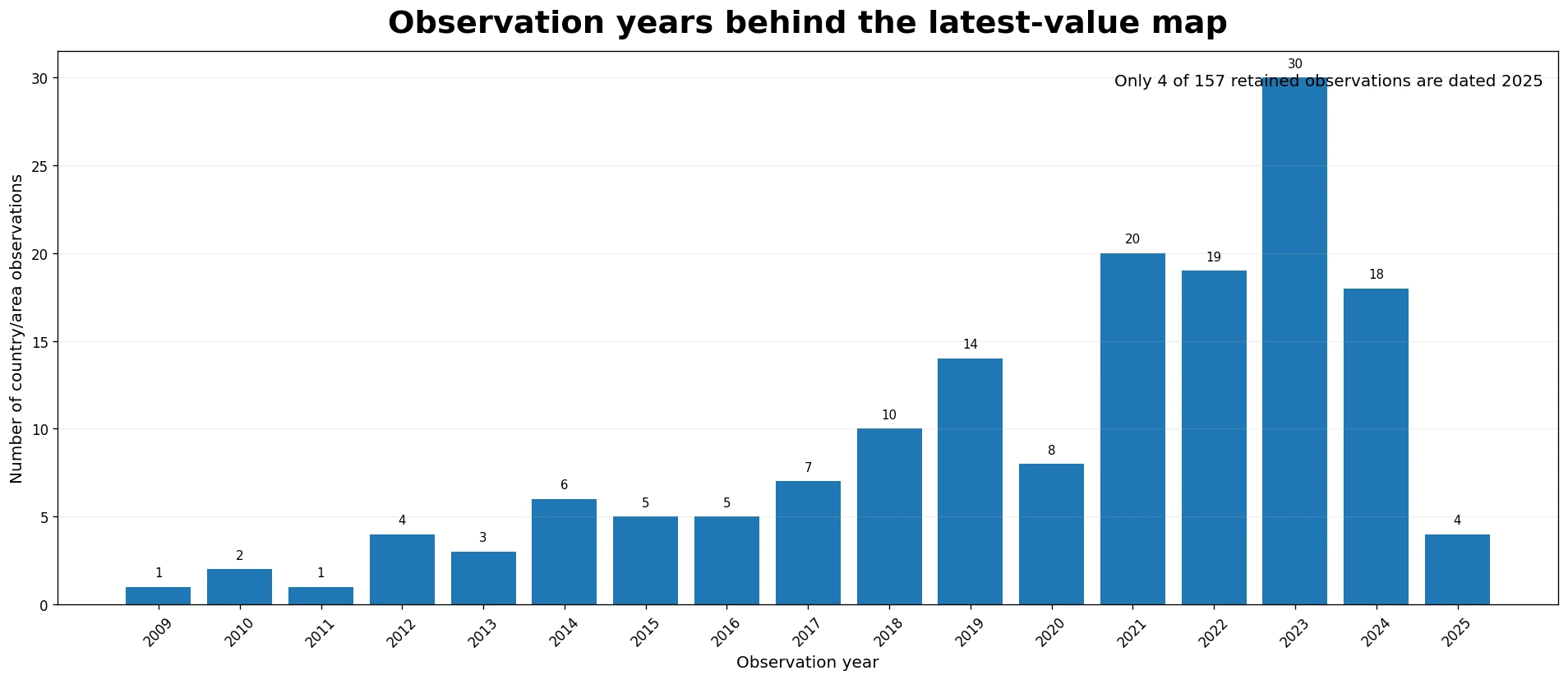
Ninety-one of the 157 observations, about 58%, are dated 2021 or later. Fifty-two, about 33%, are from 2023 onward. At the same time, 44 observations, about 28%, are from 2018 or earlier. The largest single-year group is 2023 with 30 observations, followed by 2021 with 20, 2022 with 19 and 2024 with 18. The pattern reflects the fact that nationally representative household surveys do not arrive on one synchronized annual calendar.
An old latest observation should therefore be described as the last value retained for that place in this series, not automatically as its current poverty rate. A new household survey or World Bank update can materially change both the value and the visual pattern. For mixed-year data, the safest reading combines the percentage, observation year and geographic pattern rather than relying on rank alone.
What the map can and cannot tell you
- It can show the latest retained MPM value for each country or area, where high values cluster, and where nearby places differ.
- It cannot by itself identify which policy caused a high or low value, measure changes in the last year or two, or describe every household’s experience of poverty.
- Direct comparisons are strongest when observation years are close. Explaining a gap requires additional same-period data on income, schooling, water, sanitation, electricity and population structure.
- A 0.0% displayed value refers only to this measure at its reported precision; it is not proof that all poverty and vulnerability have disappeared.
The MPM is most useful as a structured indicator of overlapping deprivation, not as a one-number verdict on a country’s overall development. To understand why the headcount is high or low, the component indicators and their survey context need to be examined separately.
Source and mapping method
The numeric source is World Bank World Development Indicators series SI.POV.MPWB. The World Bank states that the data are based on primary household surveys obtained from government statistical agencies and World Bank country departments, with high-income economy data relying largely on the Luxembourg Income Study. The concept and current methodology are described on the World Bank’s Multidimensional Poverty Measure page.
All descriptive statistics use the 157 most recent non-missing country and area observations in the supplied series. Missing values were not converted to zero and no observation year was imputed. ISO-3 codes were joined to a Natural Earth low-resolution country layer: 140 values are shown as filled polygons, while 17 small island economies without a separate polygon at this scale are plotted as points using offline country-center coordinates. The points use the same value classes as the polygons, so all 157 statistical rows are represented visually.
The map classes are 0 to below 1%, 1 to below 5%, 5 to below 20%, 20 to below 40%, 40 to below 60%, and 60% or higher. Gray does not mean a poverty rate of zero; it means that the map area has no matched value in this 157-row latest-observation set. The mean, median, quartiles, class counts, top and bottom tables, year distribution and neighboring-country differences were calculated directly from those observations.
Frequently Asked Questions
Is the multidimensional poverty rate the same as the monetary poverty rate?
No. The World Bank MPM combines monetary poverty with deprivations in education and basic infrastructure services.
Can this dataset be treated as a 2025 country ranking?
No. It uses each country or area’s latest non-missing observation, with years ranging from 2009 to 2025. Only four retained observations are dated 2025.
Does a value of 0.0% mean there is no poverty?
No. It means this specific multidimensional measure is reported as 0.0% at the displayed precision. Other forms of poverty or vulnerability can still exist.
What is the main caution when comparing countries?
Check the observation year. Even under the same MPM framework, large differences in survey timing make small current-rank comparisons unreliable.
Related Articles
- Out-of-pocket health spending and movement below a relative poverty line
- Bottom 40% real income and consumption growth
- Per-capita real consumption or income growth
Green Map creates custom-edited map images using open geographic data sources such as geoBoundaries, Natural Earth, OpenStreetMap, and government open data.
These maps are edited visual materials, not raw data files, and are provided for education, documents, presentations, and graphic reference.