Out-of-pocket payments for doctor visits, medicines, hospital care, and other health services can reduce the resources a household has left for everyday consumption. The World Bank indicator HF.UHC.CONS.ZS focuses on a specific consequence: the share of the population that was above a poverty line equal to 60% of national median consumption before out-of-pocket health spending, but falls below that line after the spending is taken into account. Across the 143 latest non-missing observations in this dataset, values range from 0% to 5.01%, with a median of 1.44% and an unweighted mean of 1.71%.
These observations are not a current same-year global ranking. Their reference years span 1993 to 2018, and only the United States is dated 2018. Seventy-one of the 143 observations are from 2010–2014. The map should therefore be read as the spatial distribution of the last observation retained for each country or separately reported economy, not as a snapshot in which every country is measured at the same time.
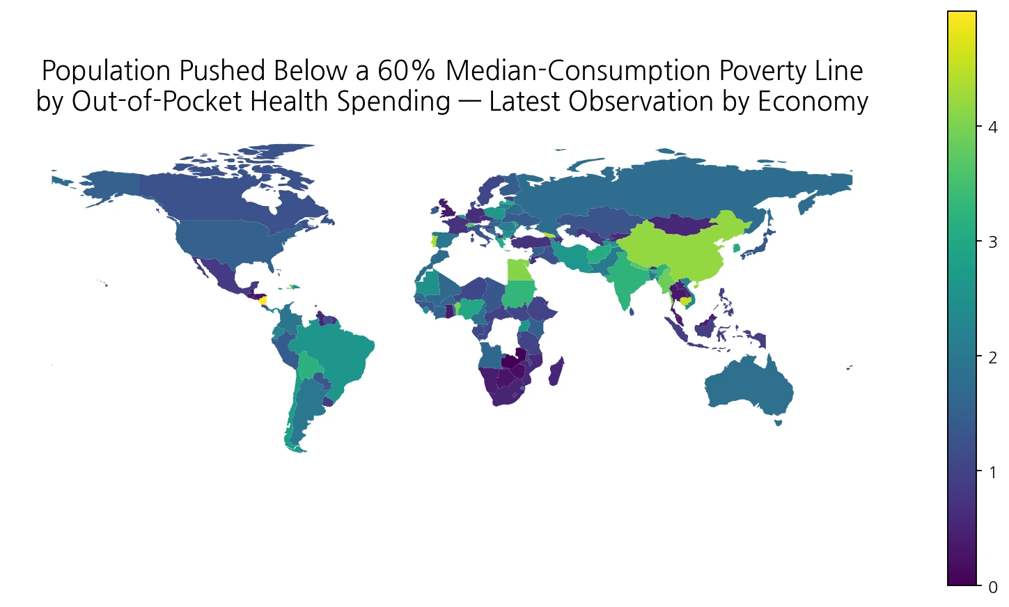
Table of Contents
What this indicator actually measures
The poverty threshold here is not a common global dollar poverty line. It is a relative poverty line set at 60% of the country’s median consumption. The measure identifies people whose household consumption is above that threshold before out-of-pocket health payments but below it after those payments are deducted. A value of 3% therefore does not mean that only 3% of the country is poor. It means that roughly 3% of the population is estimated to cross this particular relative-poverty threshold because of direct health spending.
Out-of-pocket health spending refers to payments households make directly when using health goods and services. It is different from an insurance premium and different from amounts reimbursed by a third party. It is also not the same as the catastrophic-health-spending indicators that ask whether health payments exceed 10% or 25% of household consumption or income. This series asks a threshold-crossing question: did direct health spending move the household from above to below a relative poverty line?
The wording “pushed below” also matters. It captures people who cross the line from above to below. People who were already below the line and are made even poorer by health payments belong to a different “pushed further below” concept. As a result, this indicator is one measure of financial protection in health, not a complete estimate of every hardship caused by medical bills.
About 70% of the 143 observations are at least 1%
With every country or economy given equal weight, the median is 1.44% and the mean is 1.71%. Exactly 100 of 143 observations (69.9%) are at least 1%, while 44 (30.8%) are at least 2%. Twenty-one are at least 3%, and eight are 4% or higher. Fourteen observations are below 0.5%. The mean sits above the median because a smaller group of observations in the 4–5% range extends the upper tail.
| Observation range | Countries/economies | Share of 143 |
|---|---|---|
| Below 0.5% | 14 | 9.8% |
| 0.5% to <1% | 29 | 20.3% |
| 1% to <2% | 56 | 39.2% |
| 2% to <3% | 23 | 16.1% |
| 3% to <4% | 13 | 9.1% |
| 4% or more | 8 | 5.6% |
The 1.71% mean is not a population-weighted world rate. China and a small island economy each contribute one observation to this simple average. It should therefore be used only to describe the distribution across the 143 reported geographic units, not as a statement that 1.71% of the world population was impoverished by health spending. A global population share would require appropriate population weights and harmonized reference years.
The highest retained observations are Malta, Nicaragua, and Cambodia
Among all 143 latest retained observations, Malta is highest at 5.01% in 2010, followed by Nicaragua at 5.00% in 2014 and Cambodia at 4.55% in 2009. Georgia is 4.46%, Portugal 4.39%, China 4.19%, Egypt 4.08%, and Benin 4.00%. Myanmar is 3.87% in 2015 and Haiti 3.82% in 2013.
| Country/economy | Observation year | Population share |
|---|---|---|
| Malta | 2010 | 5.01% |
| Nicaragua | 2014 | 5.00% |
| Cambodia | 2009 | 4.55% |
| Georgia | 2013 | 4.46% |
| Portugal | 2010 | 4.39% |
| China | 2013 | 4.19% |
| Egypt, Arab Rep. | 2012 | 4.08% |
| Benin | 2011 | 4.00% |
| Myanmar | 2015 | 3.87% |
| Haiti | 2013 | 3.82% |
This table should not be described as a current league table. Malta’s observation is from 2010 and Cambodia’s from 2009, while other entries use different survey years. Health coverage, household income, service use, prices, and the design of the underlying household data can all change over time. Ranking observations from 2009 and 2016 to two decimal places would imply a degree of comparability that the time structure does not support.
Restricting the view to 2015–2018 changes the comparison
If the data are restricted to observations dated 2015–2018, 33 countries and economies remain. Their median is 1.53% and their unweighted mean is 1.63%. Myanmar is highest in this narrower group at 3.87% in 2015, followed by Moldova at 3.05%, Chile at 2.77%, Poland at 2.67%, and Uganda at 2.62%, all in 2016 except Myanmar. Viet Nam is 2.36%, Romania 2.14%, Bangladesh 2.07%, and Pakistan 2.06%.
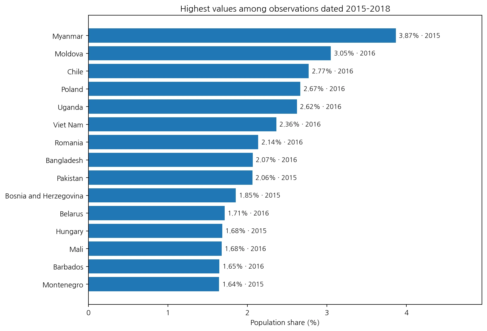
This narrower period reduces the influence of very old observations but does not solve the same-year problem. Coverage falls sharply from 143 to 33 economies, there are no 2017 observations in the retained table, and 2018 contains only the United States. The recent subset is therefore best used as a sensitivity check rather than a replacement global ranking.
Large differences appear within Europe, Asia, and Latin America
The map does not show a simple continent-wide pattern. In Europe, retained observations are high for Malta (5.01%), Portugal (4.39%), Cyprus (3.54%), and Greece (3.06%), while the United Kingdom is 0.35%, Germany 0.65%, and France 0.71%. The wide within-Europe range is a reminder that this indicator should not be reduced to a statement that high-income economies are always low or that one region is uniformly protected.
Asia is similarly mixed. China is 4.19% in 2013, India 3.23% in 2011, Nepal 3.72% in 2010, and Myanmar 3.87% in 2015, while Indonesia is 0.90% in 2015, Thailand 0.32% in 2009, and Malaysia 0.44% in 2004. In Latin America, Nicaragua is 5.00% in 2014, but El Salvador is 0.25% and Guatemala 0.35% in the same year, while Mexico is 0.86% in 2012.
Those geographic contrasts do not establish a cause. Insurance design, service prices, utilization, household income distributions, survey methods, and many other factors could matter, but those explanatory variables are not contained in this one indicator column. The map is useful for identifying where high or low values were observed and where neighboring countries differ, not for assigning the reason for those differences.
Korea is 3.05% in 2012; the United States is 1.53% in 2018
Selected large economies illustrate why the year must travel with the value. Korea is 3.05% in 2012, the United States 1.53% in 2018, Japan 1.35% in 2015, China 4.19% in 2013, and India 3.23% in 2011. Germany is 0.65% in 2010, France 0.71% in 2010, and the United Kingdom 0.35% in 2013. Brazil is 2.62% in 2008, Mexico 0.86% in 2012, and Indonesia 0.90% in 2015.
| Country/economy | Observation year | Population share |
|---|---|---|
| Korea, Rep. | 2012 | 3.05% |
| United States | 2018 | 1.53% |
| Japan | 2015 | 1.35% |
| China | 2013 | 4.19% |
| India | 2011 | 3.23% |
| Indonesia | 2015 | 0.90% |
| Brazil | 2008 | 2.62% |
| Mexico | 2012 | 0.86% |
| Germany | 2010 | 0.65% |
| France | 2010 | 0.71% |
| United Kingdom | 2013 | 0.35% |
| Canada | 2010 | 1.24% |
| Australia | 2010 | 1.81% |
| Nigeria | 2012 | 2.98% |
| South Africa | 2010 | 0.50% |
| Egypt, Arab Rep. | 2012 | 4.08% |
Korea’s 3.05% should not be read as proof that Korea had worse financial protection than the United States in 2018. Their observations are six years apart, and the indicator captures only one form of impoverishment relative to each country’s own consumption distribution. Cross-country interpretation is safest when the observation year, indicator definition, and broader health-financing context are kept visible.
The 25-year spread in observation dates is the main limitation
Using the last available observation for each economy improves geographic coverage but weakens temporal comparability. Fourteen observations are from 1993–2004, 25 from 2005–2009, 71 from 2010–2014, and 33 from 2015–2018. In other words, 72.7% of the table falls in 2010–2018, but roughly 27% is from 2009 or earlier. The oldest retained observation is Guyana in 1993.
| Observation-year band | Countries/economies | Share of 143 |
|---|---|---|
| 1993–2004 | 14 | 9.8% |
| 2005–2009 | 25 | 17.5% |
| 2010–2014 | 71 | 49.7% |
| 2015–2018 | 33 | 23.1% |
A dark area on the map therefore should not be converted directly into a claim that financial hardship is still high there today. The dataset answers a more limited question: what is the last retained observation for this measure in each country or economy? A current comparison would require checking newer WHO or World Bank financial-protection series and looking for a common year or a sufficiently narrow recent period.
A zero value does not mean there is no medical financial hardship
Zambia is recorded at 0.00% in 2010. That does not mean households faced no health costs or that financial protection was complete. The indicator captures one very specific transition: moving from above to below a poverty line equal to 60% of median consumption because of out-of-pocket health payments. People who were already poor, people who paid a large medical bill without crossing this line, and people who could not obtain care and therefore did not incur the same spending may not be represented by this percentage in the way a casual reading would suggest.
The reverse caution also applies to observations around 4–5%. A high value is an important sign that this form of health-related impoverishment was more common in the observation, but it is not a complete score for the country’s health system. Universal health coverage also involves service access and other dimensions of financial protection. Catastrophic spending, coverage of needed services, health outcomes, and public financing should be examined separately.
Data source and calculation method
The statistical source is the World Bank indicator HF.UHC.CONS.ZS, formally titled “Proportion of population pushed below the 60% median consumption poverty line by out-of-pocket health care expenditure (%).” The World Bank’s health-data framework groups impoverishing and catastrophic out-of-pocket spending measures under the financial-protection dimension of universal health coverage.
All summary statistics, ranges, tables, and charts on this page are calculated directly from the 143 country/economy observations. World Bank regional and income-group aggregates are not included. ISO-3 codes are joined to a Natural Earth low-resolution country layer for the map, where 135 polygons match directly; some small islands and separately reported areas can remain in the statistical table without a distinct polygon at this scale.
Frequently Asked Questions
What does the 60% poverty line mean in this indicator?
It is a relative poverty line set at 60% of each country's median consumption, not a single global dollar poverty threshold.
Does a value of 3% mean only 3% of the country is poor?
No. It means about 3% of the population is estimated to move from above to below this specific relative poverty line after out-of-pocket health payments.
Can the 143 observations be treated as a current country ranking?
No. Observation years range from 1993 to 2018, so each percentage must be read together with its year.
Does a 0% value mean there is no medical financial hardship?
No. It only refers to this specific threshold-crossing measure and does not rule out catastrophic spending, unmet care, or deeper hardship among households already below the line.
Related Articles
Health-spending impoverishment is not the same measure as a general poverty rate or a health survey outcome. The related pages below provide complementary poverty and health-data context while keeping those definitions separate.
- U.S. County Poverty Rate Map – 2024 ACS Regional Gaps
- Tanzania 2022 TDHS-MIS Guide
- Ethiopia High Frequency Phone Survey 2020–2024 Guide
Green Map creates custom-edited map images using open geographic data sources such as geoBoundaries, Natural Earth, OpenStreetMap, and government open data.
These maps are edited visual materials, not raw data files, and are provided for education, documents, presentations, and graphic reference.