A country can post strong output growth without households experiencing the same change in the resources they consume or receive as income. World Bank indicator SI.SPR.PCAP.ZG approaches the question from household surveys: it reports the annualized change in mean real consumption or income per person for the total population over a period of roughly five years. Positive values indicate growth in the survey welfare mean; negative values indicate contraction.
The latest-value table is useful, but it is not synchronized in time. The 122 retained observations have final survey reference years ranging from 2010 to 2025. Only three are dated 2025. For that reason the first map is a map of the latest available observation for each economy, not a 2025 world ranking.
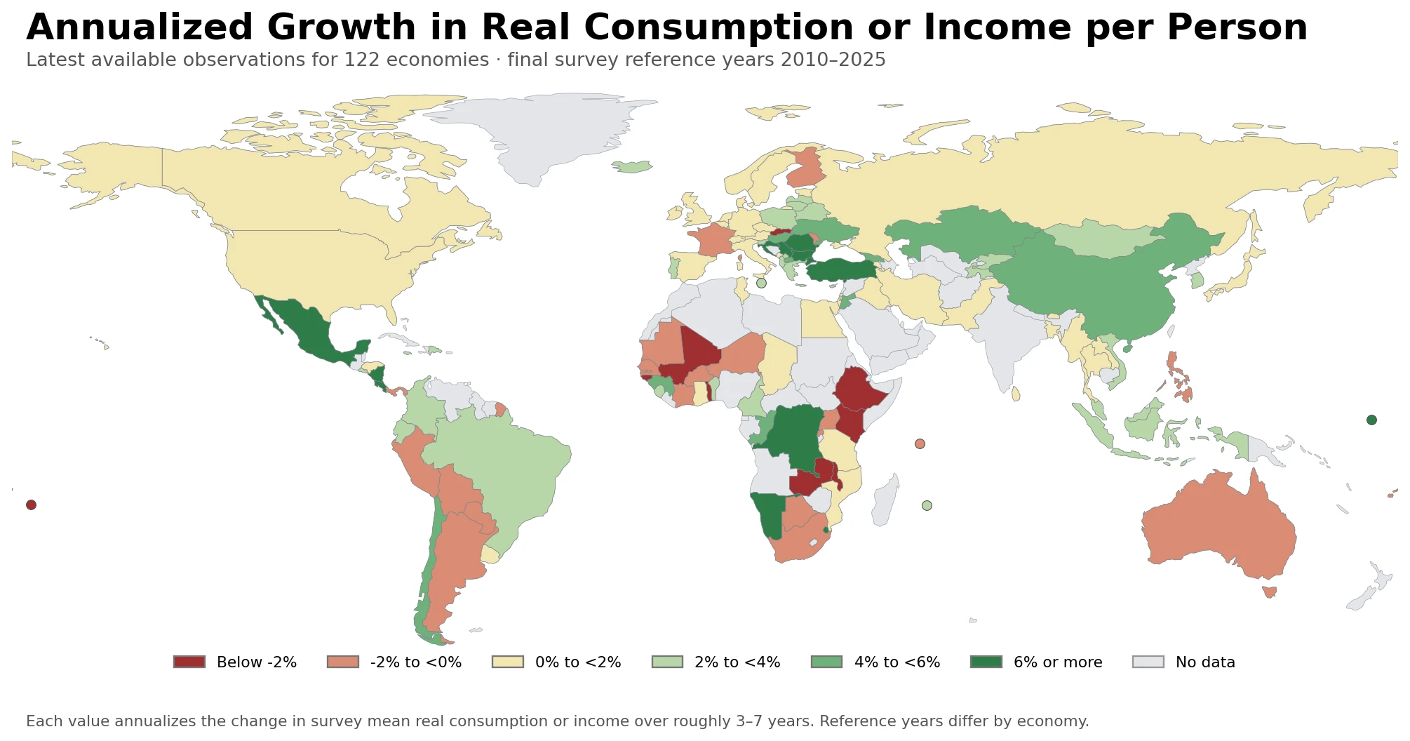
Table of Contents
What the annualized survey-growth measure actually calculates
The official series is titled Annualized average growth rate in per capita real survey mean consumption or income, total population (%). The World Bank compares the mean welfare aggregate in a final household survey with a comparable survey near five years earlier. The initial survey is selected from surveys roughly three to seven years before the final one, and the change is converted to an annualized compound rate.
Conceptually, the calculation is (final mean ÷ initial mean)1/(years between surveys) − 1. A value of 4% therefore does not mean that survey income rose 4% in the single reference year. It means that the real per-person survey mean increased at an annualized pace of about 4% across the underlying comparison interval.
The welfare aggregate is not identical everywhere. Depending on the country and survey system, the underlying measure may be consumption or income. The World Bank checks comparability between the two surveys used within each economy, but its metadata cautions that household surveys are infrequent and not aligned across countries. Small cross-country differences should therefore not be treated like a precisely synchronized league table.
The date distribution explains why the latest map needs a companion map
| Final survey reference year | Number of observations |
|---|---|
| 2025 | 3 |
| 2024 | 17 |
| 2023 | 34 |
| 2020–2022 | 35 |
| 2010–2019 | 33 |
Fifty-four of the 122 observations are dated 2023–2025. Another 35 are from 2020–2022, while 33 have final survey years in 2010–2019. In other words, “latest available” does not mean “recent to the same degree” for every country. This is a feature of household-survey data availability rather than a missing-value problem that can safely be solved by pretending older observations are current.
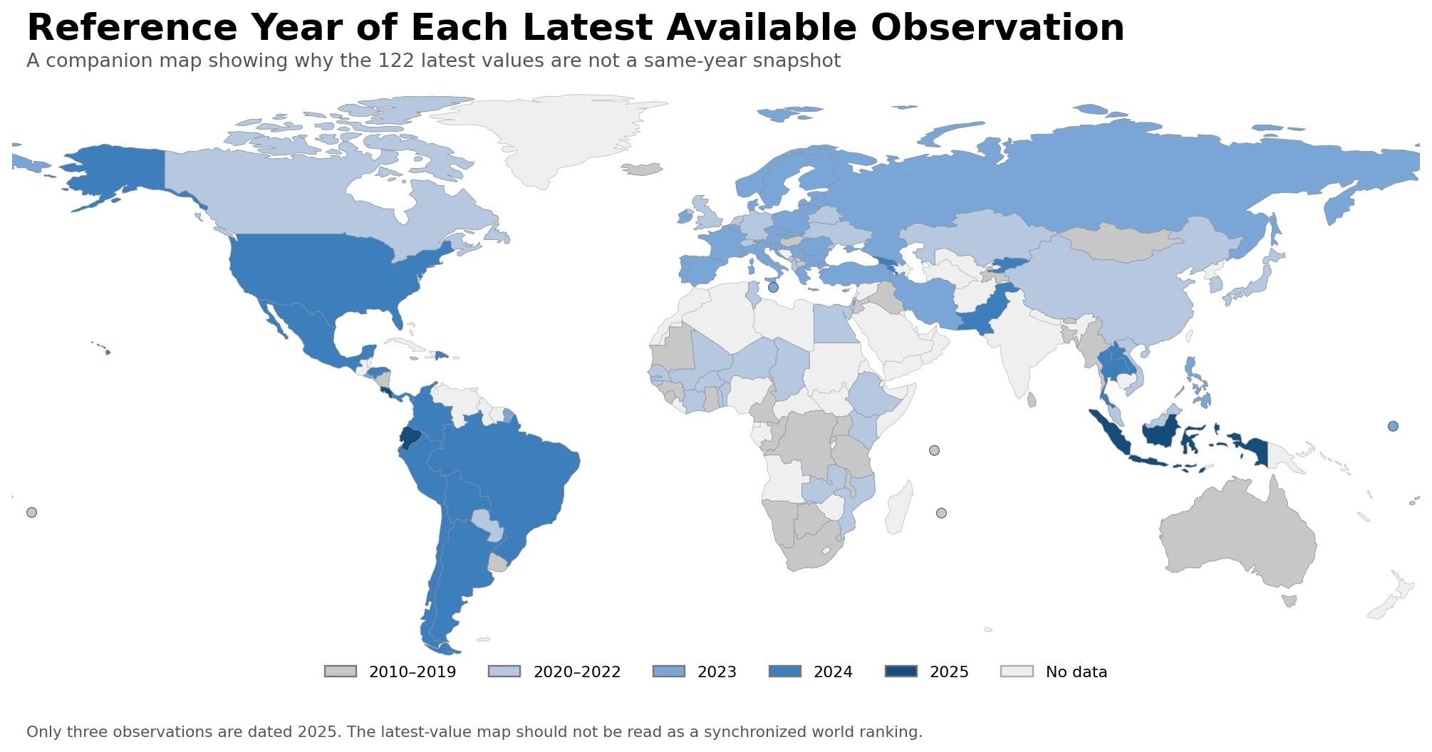
The year map is therefore part of the interpretation, not merely a data-quality footnote. A 2012 observation summarizes a survey-to-survey interval ending in 2012; it cannot be used as evidence about household welfare growth in 2025. The two maps together separate the size of the annualized change from the recency of the underlying survey pair.
The distribution of all 122 latest values is descriptive, not a world rate
Giving every observation equal weight, the median latest value is 1.35% and the simple mean is 1.75%. The middle half of the observations lies from about -0.01% to 3.23%. There are 89 positive values, 31 negative values, and two zeros. These statistics describe the cross-sectional distribution of the retained latest observations; they are not a population-weighted world growth rate and they do not refer to one common period.
Some of the largest latest values also illustrate why year labels matter. Turkiye is 10.32% with a 2023 final survey year, while the Democratic Republic of the Congo is 9.78% with a 2012 final year. At the low end, Malawi is -6.11% for 2019 and Mali is -3.99% for 2021. Sorting these values without their dates would create a visually simple table but a weak current comparison.
The 2023 subset gives the largest same-reference-year comparison
The largest group sharing one final survey reference year is 2023, with 34 observations. Within this subset the median is 1.85%, the simple mean is 2.46%, 29 observations are positive and five are negative. Restricting the ranking to this group removes one major source of mismatch: the final reference year.
| Economy, 2023 final survey year | Annualized growth |
|---|---|
| Turkiye | 10.32% |
| Romania | 7.87% |
| Serbia | 6.97% |
| Kiribati | 6.69% |
| Croatia | 6.49% |
| Slovak Republic | -2.28% |
| Moldova | -1.53% |
| France | -0.44% |
| Finland | -0.20% |
| Philippines | -0.05% |
Turkiye, Romania, Serbia, Kiribati and Croatia occupy the high end of the 2023 subset. The Slovak Republic, Moldova, France, Finland and the Philippines are at the low end. Even this is not a perfectly standardized performance ranking: the earlier survey year can differ within the allowed 3–7 year interval, and the welfare aggregate may be consumption in one country and income in another. The table is best used for broad differences rather than fine rank ordering.
The 2024 subset has only 17 observations. Mexico is 6.75%, Georgia 4.69%, Chile 4.60% and Colombia 3.76%, while Peru is -1.64%, Argentina -1.44% and Panama -1.13%. The 2025 subset is narrower still: Costa Rica 7.03%, Ecuador 3.25% and Indonesia 2.26%. Three rows are not enough to describe a global 2025 pattern.
Major economies show how uneven “latest” can be
| Economy | Final survey year | Annualized growth |
|---|---|---|
| Indonesia | 2025 | 2.26% |
| United States | 2024 | 0.31% |
| Mexico | 2024 | 6.75% |
| Brazil | 2024 | 2.00% |
| Argentina | 2024 | -1.44% |
| France | 2023 | -0.44% |
| Germany | 2022 | 1.37% |
| United Kingdom | 2021 | 0.56% |
| China | 2021 | 5.19% |
| Korea, Rep. | 2021 | 3.71% |
| Japan | 2020 | 0.36% |
| Australia | 2018 | -0.26% |
The United States, Mexico, Brazil and Argentina reach 2024 in this extract. France is dated 2023 and Germany 2022. The United Kingdom, China and Korea are 2021, Japan is 2020, Australia is 2018, while Indonesia reaches 2025. The table is intentionally ordered as a reference list rather than a ranking because the observation windows are not synchronized.
This timing difference also changes what a comparison can support. Mexico at 6.75%, China at 5.19% and Korea at 3.71% are numerically above the United States at 0.31%, but those values summarize different survey intervals. They can identify candidate cases for deeper research; they should not be converted into a claim that one country is currently improving household welfare faster than another without aligning the periods.
This is not GDP growth, wage growth, or the poverty rate
Real GDP growth measures the change in economy-wide output. SI.SPR.PCAP.ZG measures the change in a household-survey welfare mean per person. Those concepts can move together, but they need not. Population change, the distribution of income, transfers, labor-market outcomes, survey design and the way national accounts differ from household surveys can all contribute to a gap between the two measures. This dataset alone does not identify which factor caused a country’s rate.
The indicator is also an average for the total population. A rising mean does not establish that every household gained, nor does it show how gains were distributed. The World Bank publishes related shared-prosperity measures for the bottom 40 percent, and poverty or inequality questions require their own indicators. Likewise, the rate says nothing directly about the level of income, the cost of living, household wealth, wages, or GDP per capita.
What the two maps can and cannot answer
The growth map is useful for locating large positive and negative latest observations and for seeing where data are available. The reference-year map adds the missing temporal dimension. Together they answer two practical questions: where does the latest household-survey welfare growth rate look high or low, and how recent is the survey pair behind that value? That combination is more informative than a single color map that hides the dates.
They cannot create a synchronized 2025 comparison where the surveys do not exist. Nor can they show why an economy changed, whether median households shared the average gain, or whether the same rate would appear in national accounts. Those questions require either aligned survey microdata or additional official indicators joined on a compatible period and geography.
Source and method
The statistical source is the World Bank World Development Indicators series SI.SPR.PCAP.ZG. The underlying source is the World Bank Poverty and Inequality Platform (PIP), drawing on primary household surveys from government statistical agencies and World Bank country departments; high-income economies are often based on Luxembourg Income Study data. The welfare means are expressed in real terms at 2021 purchasing power parity.
The dataset retains the latest non-empty country-level observation available for 122 economies and excludes World Bank regional and income-group aggregates. All counts, medians, means, quartiles, signs, year distributions and same-year comparisons in this page are calculated directly from those 122 observations. The world map uses a low-resolution country boundary layer, with point markers added for Kiribati, Malta, Mauritius, Seychelles and Tonga so that all 122 statistical observations are represented visually.
The formal definition, annualization formula and cross-country comparability warning are available in the World Bank WDI metadata glossary. Because the source itself warns about infrequent and asynchronous household surveys, this page keeps the mixed-year map but pairs it with an explicit reference-year map and avoids presenting the 122 rows as a current same-year ranking.
Frequently Asked Questions
Are all observations on this map from 2025?
No. The 122 latest observations have final survey reference years from 2010 through 2025, and only three are dated 2025. The companion reference-year map makes that timing difference explicit.
Does a value of 3% mean income rose 3% from the previous year?
No. The indicator compares two broadly comparable household surveys roughly 3–7 years apart and annualizes the change in mean real consumption or income per person. It is not a one-year year-over-year income rate.
Why does the indicator say consumption or income?
Countries do not all use the same welfare aggregate in household surveys. Some rely on consumption and others on income. The World Bank selects comparable survey pairs within each economy, but cross-country comparisons still require caution.
Is this a better measure of living standards than GDP growth?
It answers a different question. GDP growth measures economy-wide real output, while SI.SPR.PCAP.ZG measures the annualized change in a household-survey welfare mean per person. Neither measure substitutes for the other.
Related Articles
These related maps answer different economic questions with clearly defined metrics. They are useful companions when separating household-survey welfare growth from output levels, output growth and labor-market conditions.
- Global GDP Growth Map – Country Patterns in 2025
- Global GDP per Capita Map – Country Levels in 2025
- Global Unemployment Rate Map – Country Patterns in 2025
Green Map creates custom-edited map images using open geographic data sources such as geoBoundaries, Natural Earth, OpenStreetMap, and government open data.
These maps are edited visual materials, not raw data files, and are provided for education, documents, presentations, and graphic reference.