The U.S. County Poverty Rate Map shows a local pattern that disappears when the country is summarized with a single national number. This article uses the 2024 American Community Survey (ACS) 5-year Subject Table S1701 from the U.S. Census Bureau. The mapped measure is S1701_C03_001E: the percentage below the poverty level among the population for whom poverty status is determined. It is a percentage, and it is not interchangeable with family poverty, child poverty, deep poverty, median household income, or housing-cost burden.
The verified source file contains 3,222 county-level or county-equivalent rows. Of these, 3,144 belong to the 50 states and District of Columbia; another 78 are Puerto Rico municipios retained in the source extract. The national distribution and Census-region comparisons below use the 3,144 rows from the 50 states and DC. The 2024 ACS 5-year estimates pool 60 months of data collected from January 2020 through December 2024, so they should be read as period estimates rather than a one-year snapshot of 2024 alone.
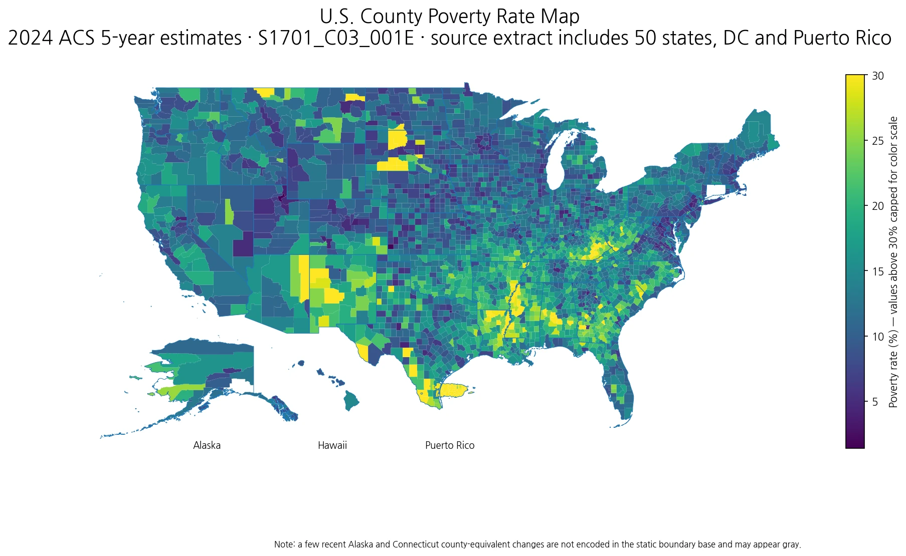
Table of Contents
The median county poverty estimate is 13.2%
Across the 3,144 county-level estimates in the 50 states and DC, the 25th percentile is 10.0%, the median is 13.2%, and the 75th percentile is 17.3%. The bottom-decile cutoff is 7.7% and the top-decile cutoff is 21.8%. The simple unweighted mean is 14.2%, slightly above the median. These are summaries of the geography of county estimates, not a population-weighted U.S. poverty rate. A county with a few thousand residents receives the same one-observation weight as a county with several million residents.
That distinction determines how the numbers should be used. The county median is useful for asking what a typical county-level estimate looks like, but it does not answer what share of all U.S. residents are below the poverty level. A national population rate requires the Census national estimate or a correctly aggregated numerator and denominator. This analysis intentionally gives each county equal weight because its purpose is to describe geographic variation.
The South has the highest county median among the four Census regions
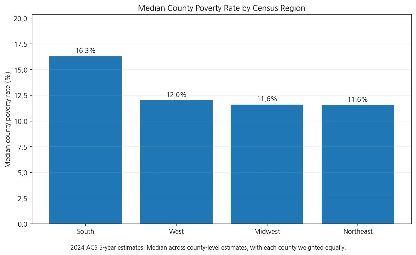
Grouping counties into the four standard Census regions produces a clear but incomplete regional contrast. The county median is 16.3% in the South, 12.0% in the West, 11.6% in the Midwest, and about 11.6% in the Northeast. This does not mean every Southern county has a higher poverty estimate than every county elsewhere. The distributions overlap substantially. What the map adds is the ability to see where higher values continue across multiple neighboring counties rather than treating a region as one uniform block.
State-level medians of county estimates reinforce the pattern without replacing the county map. Louisiana has a county median of 21.15%, Mississippi 20.95%, New Mexico 19.50%, Arkansas 18.70%, Kentucky 18.10%, Alabama 17.90%, South Carolina 17.50%, and Georgia 17.30%. At the lower end are Rhode Island at 8.20%, New Hampshire 8.60%, New Jersey 8.70%, Hawaii 9.20%, Wyoming 9.40%, Utah 9.50%, Nebraska 9.70%, and Maryland 9.75%. These figures are medians of county estimates within each state, not state population poverty rates.
High-poverty counties form connected geographic clusters, not just isolated extremes
Using the national county top-decile threshold of 21.8% and connecting only counties that share a boundary, the largest high-poverty component in the static boundary analysis contains 61 counties or parishes across Louisiana, Mississippi, and Arkansas. It includes 27 Louisiana parishes, 26 Mississippi counties, and 8 Arkansas counties, with a component median of 27.0%. The next-largest connected components contain 38 counties in Georgia and 31 in Kentucky. These components are original spatial groupings created for this analysis; they are not Census metropolitan areas or official economic regions.
This is why a county map answers more than a top-ten ranking. A single high estimate may be geographically isolated, while a long chain of neighboring high estimates indicates a broader local pattern that a state average can conceal. At the other end, the bottom-decile cutoff is 7.7%. The largest connected low-poverty component in the static boundary analysis contains 30 Virginia counties or independent cities. Other low-poverty components include 12 counties in Kansas, 11 in Minnesota, and 10 in Colorado.
The highest point estimates carry very different margins of error
| County or county-equivalent | Poverty rate | ACS MOE |
|---|---|---|
| Oglala Lakota County, South Dakota | 57.6% | ±7.7 pp |
| Todd County, South Dakota | 48.4% | ±6.6 pp |
| Corson County, South Dakota | 44.2% | ±4.6 pp |
| Sioux County, North Dakota | 43.3% | ±5.9 pp |
| Jackson County, South Dakota | 42.4% | ±11.9 pp |
| Mellette County, South Dakota | 41.7% | ±8.7 pp |
| Dimmit County, Texas | 41.1% | ±8.9 pp |
| Greene County, Alabama | 40.1% | ±6.9 pp |
| Lee County, Arkansas | 39.4% | ±4.5 pp |
| McCreary County, Kentucky | 38.9% | ±5.3 pp |
Oglala Lakota County, South Dakota has the highest point estimate in the 50-state-plus-DC file at 57.6%. Todd County is 48.4%, Corson County 44.2%, Sioux County, North Dakota 43.3%, and Jackson County, South Dakota 42.4%. These values identify very high measured rates, but the ranking should not be read as exact. Jackson County, for example, has a margin of error of ±11.9 percentage points, while several other small counties also have wide uncertainty intervals.
The ACS margin of error is essential when comparing point estimates. If two counties differ by only a few percentage points and their uncertainty intervals overlap substantially, an exact rank order can be misleading. A map is still useful because broad clusters can remain visible even when individual ranks are uncertain, but small-population places deserve more caution than a simple sorted table suggests.
Some neighboring counties differ by more than 30 percentage points
| Adjacent area A | Rate | Adjacent area B | Rate | Gap |
|---|---|---|---|---|
| Campbell County, South Dakota | 7.7% | Corson County, South Dakota | 44.2% | 36.5 pp |
| Morton County, North Dakota | 8.0% | Sioux County, North Dakota | 43.3% | 35.3 pp |
| Jackson County, South Dakota | 42.4% | Haakon County, South Dakota | 7.7% | 34.7 pp |
| Sioux County, North Dakota | 43.3% | Emmons County, North Dakota | 9.1% | 34.2 pp |
| Jackson County, South Dakota | 42.4% | Pennington County, South Dakota | 11.2% | 31.2 pp |
The shared-boundary analysis also finds unusually large local contrasts in the Dakotas. Campbell County, South Dakota is 7.7% while adjacent Corson County is 44.2%, a 36.5-point gap. Morton County, North Dakota is 8.0% next to Sioux County at 43.3%, a 35.3-point gap. Jackson County, South Dakota is 42.4% while Haakon County is 7.7%, a 34.7-point difference. These examples show why a state mean or state median can miss sharp transitions that occur across a single county line.
The poverty file does not by itself explain those differences. Employment structure, age composition, education, housing costs, migration, tribal and reservation geographies, local industry, and other factors may matter, but causal claims require separate official datasets aligned to the same geography and reference period. This map identifies where the gaps are; it does not prove why they exist.
Poverty rate is not the same thing as income or housing-cost burden
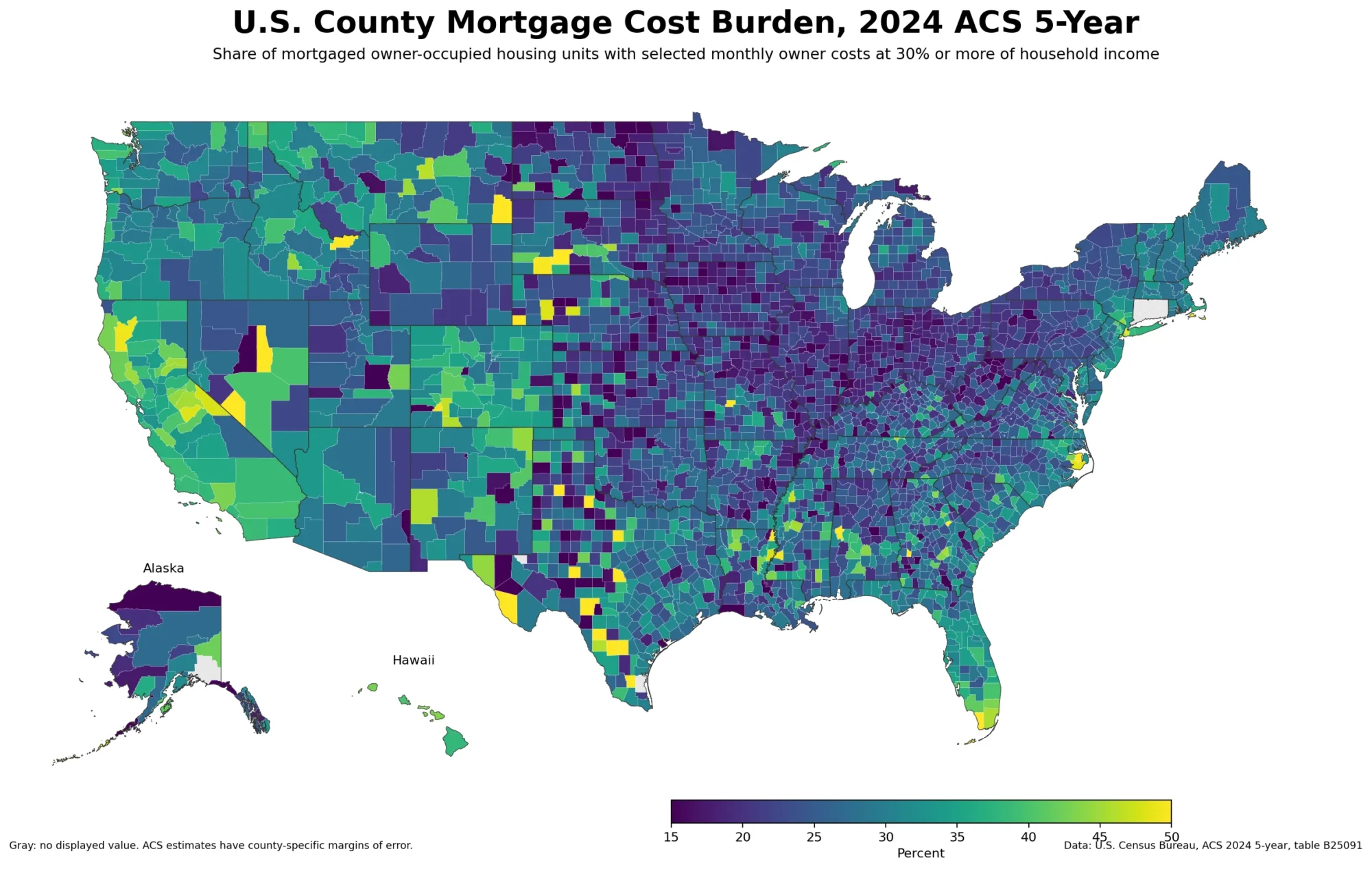
The poverty rate compares income resources with Census poverty thresholds for people whose poverty status can be determined. Median household income answers a different question: it is the midpoint of the household-income distribution. Severe rent burden answers another: it is the share of relevant renter households spending at least half of household income on gross rent. These measures can move in related directions, but they have different populations, denominators, and definitions.
That distinction matters when the maps are used together. A county may have a relatively high median household income but still contain a meaningful population below the poverty threshold, or it may have moderate poverty alongside high housing-cost burden. Combining the maps can reveal where different forms of economic pressure overlap, but one indicator should not be substituted for another or treated as the direct cause of another without additional evidence.
How to interpret the 2024 ACS 5-year period and boundary changes
The 2024 ACS 5-year product combines data collected from 2020 through 2024. The Census Bureau does not simply average five separate annual estimates; the responses collected over 60 months are pooled, weighted, and processed as a multiyear period estimate. The label “2024 ACS 5-year” is therefore a release-vintage shorthand, not a claim that every measured condition occurred only in calendar year 2024.
The geography also needs a technical note. The current ACS file includes newer Connecticut planning regions and recent Alaska census-area changes. The statistical analysis uses all 3,222 rows in the cleaned source file, but the static mapping boundary available for this generated image does not fully encode every recent county-equivalent change. Those unmatched polygons are left unfilled rather than assigned an approximate value. A gray area on the map can therefore reflect a boundary-vintage mismatch rather than missing ACS data.
Data source and method
The official source is the U.S. Census Bureau 2024 ACS 5-year Subject Table S1701, Poverty Status in the Past 12 Months. The analysis uses S1701_C03_001E, “Percent below poverty level, population for whom poverty status is determined,” and S1701_C03_001M as its margin of error. The official table is available at data.census.gov, ACSST5Y2024.S1701.
All percentiles, state medians, Census-region medians, top-value tables, neighboring-county gaps, and connected high- or low-poverty components were calculated from the verified cleaned CSV supplied with this package. The spatial components connect counties only when they share a boundary. No article or third-party ranking was used to construct the numbers or the map.
Frequently Asked Questions
Does the 2024 ACS county poverty rate describe only calendar year 2024?
No. The 2024 ACS 5-year estimate pools 60 months of data collected from 2020 through 2024, so it is a multiyear period estimate.
What poverty measure is used on this map?
The map uses ACS S1701_C03_001E, the percentage below the poverty level among the population for whom poverty status is determined. It is not median income, child poverty, or housing-cost burden.
Should the highest county poverty estimates be treated as exact rankings?
No. ACS estimates have margins of error, and several small counties have wide uncertainty intervals. Broad spatial patterns are more robust than small differences in rank.
Related Articles
These Green Map county-level articles answer related but distinct questions about local income, housing costs, and labor-market conditions.
- U.S. County Household Income Map: 2024 ACS Patterns Across America
- U.S. County Severe Rent Burden Map – Where Rent Takes Half of Income
- U.S. County Employment Growth Map: 2025 QCEW Annual Average Change
Green Map creates custom-edited map images using open geographic data sources such as geoBoundaries, Natural Earth, OpenStreetMap, and government open data.
These maps are edited visual materials, not raw data files, and are provided for education, documents, presentations, and graphic reference.