Clay County is clearly agricultural in the 2025 data, but the county is not one continuous field landscape. Agriculture accounts for 61.37%, forest for 25.95%, and developed land for 10.05%. The largest built cluster sits around Brazil in the north, while wooded areas become more prominent through the eastern projection and across parts of the northern interior. This Clay County Indiana Land Cover Map is designed to make those differences visible rather than reducing the county to a single percentage.
The page includes a current land-cover overview, a forest-and-farmland image, an impervious-surface map, and a 1985–2025 class-difference comparison. The WebP previews are placed beside the explanation, and four original 2480 × 1754-pixel JPG maps are available together in one ZIP for county profiles, classes, presentations, and other reference work.
Table of Contents
Farm blocks dominate the south while woods interrupt the pattern farther north and east
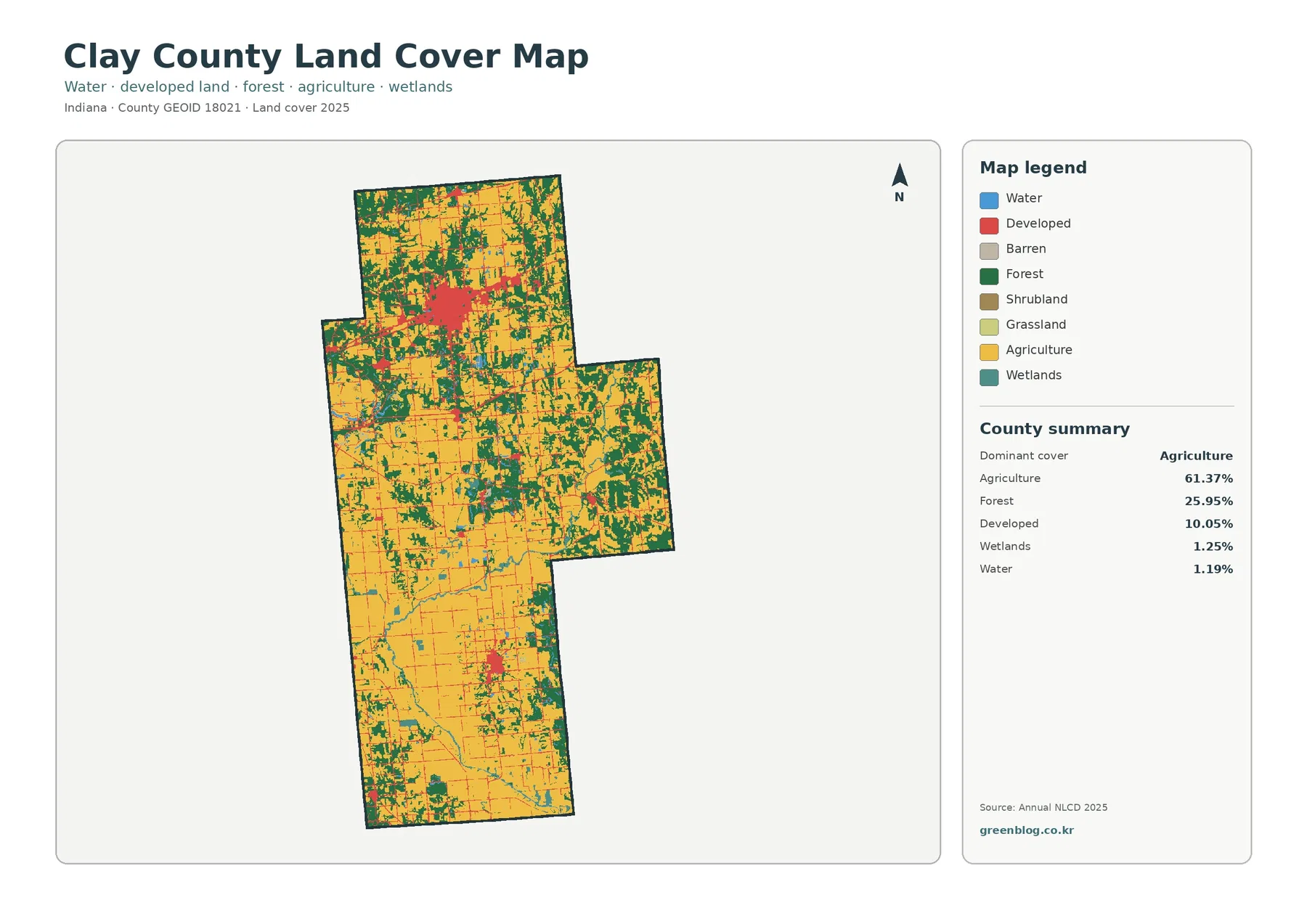
Yellow agricultural cells cover most of the county, especially through the southern half and broad parts of the central interior. In those areas, fields form relatively large, continuous blocks. The pattern becomes more broken in the north, where forest patches and developed surfaces appear more often between agricultural cells. The eastern projection also carries a strong wooded presence that makes it look different from the open farm country farther south.
The county summary records 61.37% agriculture and 25.95% forest. Developed land adds another 10.05%, while wetlands and water account for 1.25% and 1.19%. The forest-and-farmland view lists grassland at 0.10% and shrubland at 0.03%. Those small categories do not drive the countywide pattern, but they help explain fine transitions at field edges, wet areas, and scattered openings.
The main red developed area is concentrated around Brazil, the county seat. Smaller built clusters appear farther south and in the central part of the county, with thin developed traces linking many rural locations. This arrangement is important because a 10.05% developed share does not mean that one-tenth of every township looks urban. Most hard and built surfaces are grouped around a few settlements and transportation lines.
Land cover describes the surface class assigned from imagery and related data. It is not a zoning map, property map, parcel survey, or record of what can legally be developed. A developed cell may contain trees and lawns, and an agricultural cell does not define a farm boundary or identify a crop. The maps are best used for county-scale comparison rather than parcel decisions.
Removing the bright developed layer exposes a surprisingly wooded eastern side
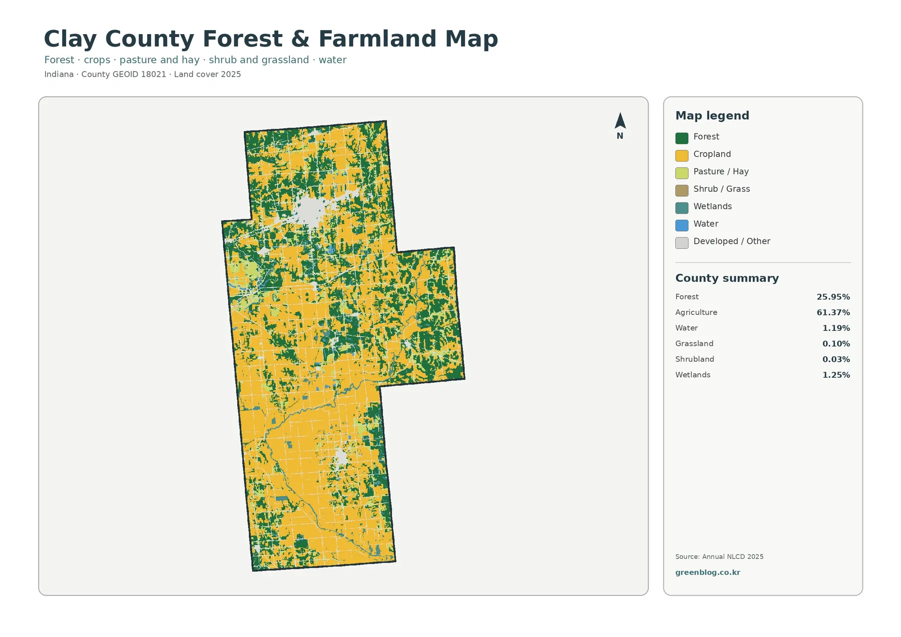
The forest-and-farmland image makes the east-west differences easier to see. Large yellow areas continue through the south and southwest, but the eastern projection contains much more dark green. Northern Clay County also has numerous wooded blocks, many of them separated by farmland rather than forming one unbroken forest. The middle of the county is a mixed zone where fields and woods alternate at relatively short distances.
Forest at 25.95% is substantial for a county whose dominant class is agriculture. It is large enough to shape the visual character of whole sections rather than appearing only as narrow tree lines. At the same time, the map does not identify forest ownership, tree species, timber status, or management boundaries. A dark green cell only says that forest was the predominant mapped cover at the observation date.
Water and wetlands occupy 1.19% and 1.25% respectively. Blue water cells are limited, while teal wetland cells appear in small bands and patches through parts of the interior and south. These two classes should not be combined. Water generally marks exposed water surfaces, while wetlands can include vegetation and saturated ground. Neither color should be treated as a regulatory wetland boundary without current official wetland information.
The straight edges of many yellow farm blocks can resemble property lines, but Annual NLCD is built from 30-meter raster cells. A single cell can contain crops, a drainage ditch, a tree row, a farm lane, and part of a building while still receiving one predominant class. The map therefore simplifies small features that would be visible in higher-resolution aerial imagery or a parcel system.
Brazil carries the strongest impervious signal, with a smaller southern center near Clay City
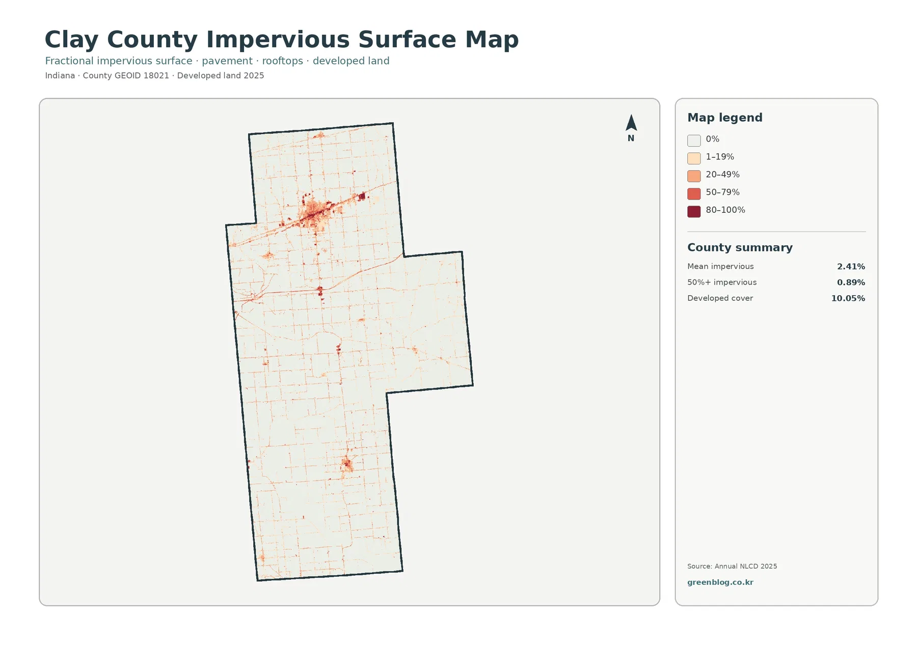
Mean impervious cover is 2.41%, and 0.89% of the county is mapped at 50% impervious or greater. The darkest and most continuous concentration is around Brazil in the northern portion of Clay County. Dense marks fill the central part of that cluster, while thinner lines extend outward. The overall shape matches the major developed concentration on the current land-cover map, but the impervious layer isolates hard surfaces more closely.
A second, much smaller concentration appears in the southern interior near Clay City. Other points and thin traces occur across the rural grid. Indiana’s state county directory identifies Brazil as the county seat and lists Clay City, Carbon, Center Point, Harmony, Knightsville, and Staunton among the county’s cities and towns. Those names provide useful context, but the image does not draw municipal boundaries, so a small impervious cluster should not be treated as an exact city footprint.
The gap between 10.05% developed land and a 2.41% countywide impervious mean is expected. Developed classes may include lawns, trees, bare soil, and other permeable surfaces around buildings. Impervious cover focuses on materials such as rooftops and pavement. A low-density residential area can therefore be classified as developed while still containing a large share of ground where water can soak in.
Impervious cover is useful for discussing settlement intensity and for identifying places that deserve closer runoff study, but it is not a flood-risk map. Rainfall, soil, slope, drainage systems, streams, wetlands, and floodplain position all influence water movement. The map answers where hard surfaces are concentrated; it does not by itself determine where flooding will occur.
Small water and wetland shares still matter where they cut across the farm landscape
The countywide percentages for water and wetlands are small compared with agriculture and forest, yet their location can matter more than their total area. Narrow blue and teal traces interrupt farm blocks in several parts of the county, and some wooded patches follow the same general low-area pattern. These relationships are useful for watershed lessons or landscape comparison, but the preview does not label streams, drainage ditches, or lakes.
Because no hydrography names are printed on the maps, a visible blue or teal line should not be assigned a stream name from appearance alone. A separate official hydrography layer is needed for named channels. The same caution applies to wetland regulation: an NLCD wetland cell describes mapped surface cover and is not a jurisdictional determination, permit boundary, or floodplain designation.
The 9.78% endpoint difference is driven more by other class changes than by new development
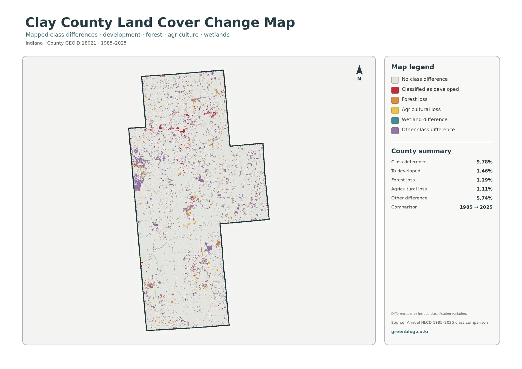
Total class difference between the two endpoints is 9.78%. The printed components are 1.46% classified to developed, 1.29% forest loss, 1.11% agricultural loss, and 5.74% other difference. Wetland difference appears in the legend but does not have a separate printed percentage. It should not be estimated visually or calculated as an official residual.
Red developed-conversion cells are noticeable around Brazil and along several northern traces, with smaller concentrations in the southern settlement area. Orange forest-loss and yellow agricultural-loss cells are scattered more widely. The most striking feature in parts of the west and west-central county is purple other difference, which forms broader patches than many of the red development cells.
That distribution is why the 9.78% total should not be described as a development rate. Only 1.46% is listed in the supplied summary as classified to developed. Other difference is much larger at 5.74%, and the map also contains forest, agriculture, and wetland categories. The endpoint comparison records classification differences, not a single process moving every changed cell toward urban land.
“Forest loss” and “agricultural loss” mean that cells classified as those categories in 1985 received a different class in 2025. They do not identify logging, construction, abandonment, mining, flooding, or another cause. Classification variation, mixed pixels, and seasonal conditions can also affect a long-term comparison. Intermediate-year imagery and local records are needed to establish timing and cause.
Local place names help orient the maps, but the colors do not follow municipal limits
Brazil is the county seat and the largest built cluster visible in the map set. Clay City provides a useful reference for the smaller southern concentration. The Indiana county directory also lists several smaller towns, which helps explain why small developed and impervious points occur outside the Brazil area. Even so, Annual NLCD does not use city limits as class boundaries.
A city can contain forest, grass, water, or agricultural cells, and development can extend outside an incorporated boundary. This is especially important when comparing land cover with planning or tax records. Use Census or local government boundaries for jurisdiction, and use the land-cover maps to describe the surface pattern observed in the dataset.
Purdue Extension adds local agriculture context without replacing the mapped percentages
Purdue Extension Clay County states that it offers Agriculture and Natural Resources programs along with its other county services. That local office is a useful place to look for practical agricultural and natural-resource information. Its programs should not be used to reinterpret the NLCD percentages, however. The 61.37% agricultural figure is a land-cover statistic from the supplied map set, not a measure of farm income, crop production, or Extension activity.
Keeping those sources separate makes the map more useful. The NLCD image can show where agricultural cover is broad, where forest breaks it up, and where development is concentrated. Local Extension material can then answer different questions about crops, management, land stewardship, or educational programs. Combining the two is valuable when each source is used for the job it was designed to do.
Choose the map according to whether the question is cover, vegetation, hard surface, or change
For a general county profile, begin with the 2025 land-cover overview. It places agriculture, forest, development, water, and wetlands in one frame and makes the Brazil cluster easy to compare with the wooded east and farm-dominant south. It is the strongest first image for a presentation because the major classes can be understood without switching legends.
Use the forest-and-farmland view when the main question concerns working land and natural cover. It removes much of the visual weight of developed surfaces and makes the 25.95% forest share easier to locate. The impervious image is better for roofs, pavement, and settlement intensity, especially when explaining why Brazil stands apart from the rural background.
The change map works best after the current map has already been explained. Its red, orange, yellow, teal, and purple colors are endpoint differences rather than present-day cover classes. Showing it by itself can make red cells look like all current development. Pairing the maps makes it easier to explain the difference between 10.05% current developed cover and 1.46% classified-to-developed change.
A 30-meter grid and a 2025 observation year define the useful scale of the files
Annual NLCD uses 30-meter square cells. That scale is appropriate for countywide patterns, but it generalizes narrow roads, small buildings, tree rows, ponds, ditches, and mixed edges. Zooming into the JPG makes the pixels larger; it does not create parcel-level information. Site selection, surveying, ownership, permitting, and engineering questions require more detailed current sources.
The current cover map represents the supplied 2025 observation year. Construction, harvest, forest management, vegetation recovery, or water conditions after that date may not appear. The 1985–2025 comparison also summarizes two endpoints rather than documenting every intermediate event across forty years. Recent aerial imagery and local records should be checked when the latest condition matters.
Each original JPG measures 2480 × 1754 pixels. That is useful for documents, classroom materials, presentation graphics, and ordinary printing. The package does not state that the files meet an A3 high-resolution reference, so a test print is sensible before enlarging them for a large poster where small legend text and narrow boundaries must remain crisp.
Four original JPG maps in the Clay County download
The ZIP contains one JPG each for 2025 land cover, forest and farmland, impervious surface and developed land, and 1985–2025 land-cover change. Together they separate the county’s broad agricultural pattern, wooded eastern and northern sections, Brazil-area hard surfaces, and endpoint class differences without requiring the reader to force every question into one legend.
Frequently Asked Questions
Is Clay County mostly agricultural even with 25.95% forest?
Yes. Agriculture is the largest 2025 class at 61.37%, but forest is large enough to shape entire parts of the county. Southern areas contain broader farm blocks, while the east and parts of the north are more heavily broken by forest. The county is agricultural overall without being uniformly open farmland.
Why does Brazil look much stronger on the impervious map than other settlements?
Brazil is the county seat and the largest built cluster in the supplied images. The impervious layer emphasizes roofs, pavement, parking areas, and similar hard surfaces, so the concentration becomes clearer than it is on the general land-cover map. Smaller towns and rural development appear as lighter or more scattered marks.
Does the 9.78% class difference mean Clay County became 9.78% more developed?
No. The supplied summary lists only 1.46% as classified to developed. The total also includes 1.29% forest loss, 1.11% agricultural loss, wetland differences, and 5.74% other differences. It is a comparison of endpoint classifications, not a countywide urban-growth percentage.
Sources and Reference Data
- MRLC Annual NLCD Data – official access point for Annual NLCD land-cover and comparison products
- USGS Annual NLCD Land Cover Classification – definitions and guidance for forest, agriculture, developed land, water, wetlands, and related classes
- U.S. Census Bureau TIGER/Line Shapefiles – official county and municipal boundary reference
- Indiana Counties – state directory identifying Brazil as the Clay County seat and listing cities and towns in the county
- Purdue Extension Clay County – local Agriculture and Natural Resources programs and county education resources
Map File Information
The ZIP contains four original JPG maps for comparing Clay County agriculture, forest, Brazil-area hard surfaces, smaller settlement clusters, and 1985–2025 class differences.
- Included Files: Use only the versions confirmed in the article and supplied images
- File Type: Use the confirmed download contents
- Intended Use: Printing, education, presentations, and map-based projects
Related Maps
- Adams County Indiana Land Cover Map
- Allen County Indiana Land Cover Map
- Bartholomew County Indiana Land Cover Map
Green Map creates custom-edited map images using open geographic data sources such as geoBoundaries, Natural Earth, OpenStreetMap, and government open data.
These maps are edited visual materials, not raw data files, and are provided for education, documents, presentations, and graphic reference.