DuPage County looks very different from a farm-dominated Illinois county when viewed through the 2025 land-cover data. Developed land accounts for 84.51% of the county, while forest, agriculture, wetlands, water, grassland, and shrubland remain as smaller pieces within a largely built landscape. This page compares four views of the same county: general land cover, forest and farmland, fractional impervious surface, and mapped class differences between 1985 and 2025.
The WebP maps can be viewed directly on the page, and the four original JPG maps are available together in one ZIP download. Use the general map for the overall mix of developed and natural cover, the forest-and-farmland view for green and wet areas, the impervious map for pavement and rooftop intensity, and the change map when the location of long-term class differences matters. Land cover describes the surface seen by satellite classification; it is not a zoning, ownership, or development-rights map.
Table of Contents
A county where developed cover is the landscape, not just a few urban centers
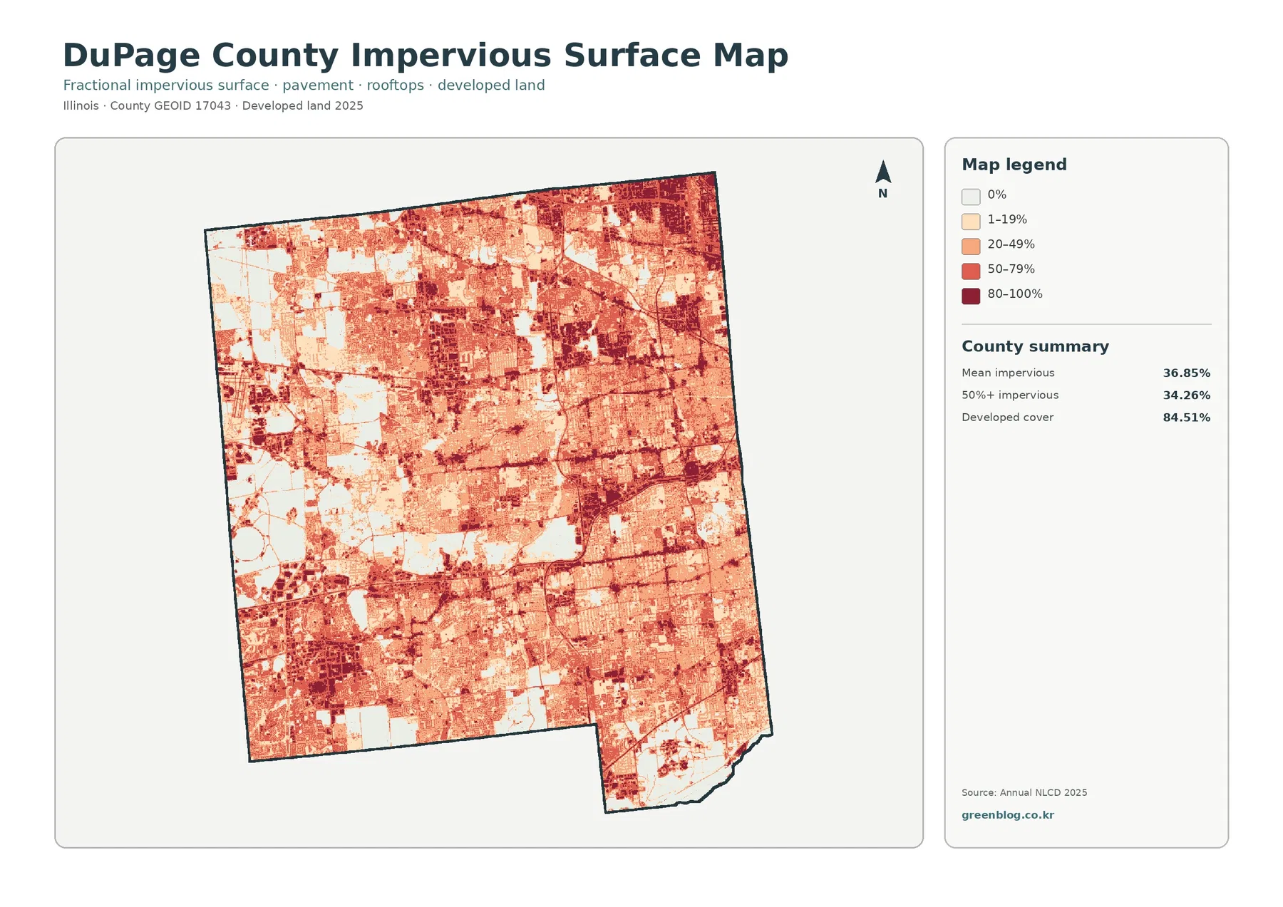
The 2025 summary is dominated by one number: developed land at 84.51%. Forest covers 5.12%, agriculture 3.92%, wetlands 3.38%, and grassland 1.10%. The companion forest-and-farmland map also reports water at 1.03% and shrubland at 0.83%. Those smaller classes matter because they form the strongest visual breaks in an otherwise continuous developed background.
Large parts of the center, north, and east appear as nearly continuous developed cover. More agriculture, forest, and wetland colors are visible toward portions of the western edge, southwest, and southeast. The natural classes do not form one uninterrupted block. Instead, they appear as irregular patches and narrow bands surrounded by built cover, which makes their location more important than their countywide percentage alone might suggest.
Developed cover should not be read as the percentage of land occupied only by buildings and pavement. Annual NLCD developed classes can include lower-intensity areas where lawns, trees, and other vegetation are mixed with structures and roads. That is why an 84.51% developed share can coexist with a much lower mean impervious value. The impervious map later in the page separates those two ideas.
Impervious cover reveals how strongly built surfaces vary inside the developed area
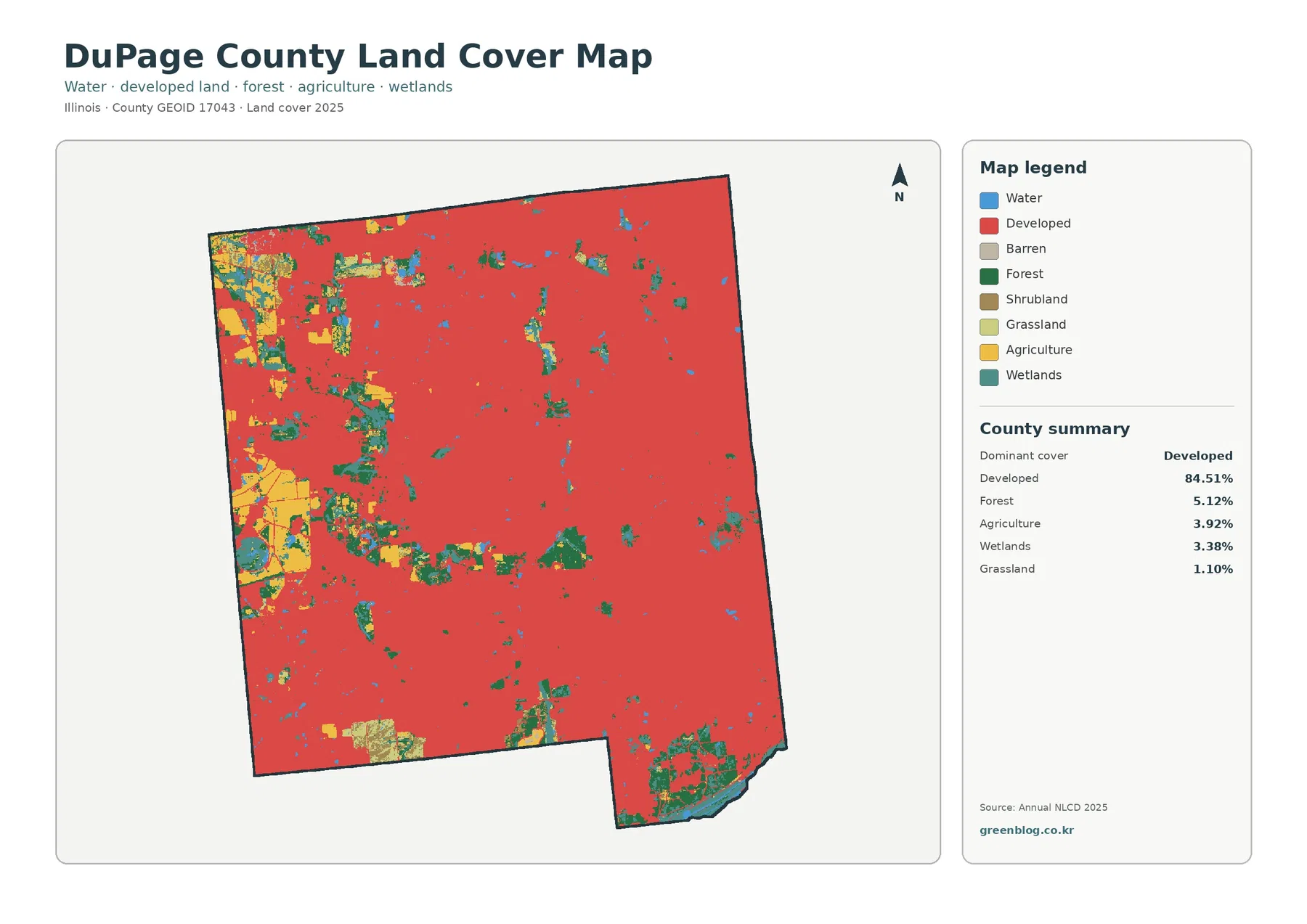
Impervious surface means pavement, rooftops, parking lots, and similar surfaces that allow little direct infiltration. DuPage County has a mean impervious value of 36.85%, and 34.26% of the county is mapped at 50% impervious or higher. These figures describe surface intensity rather than the broader developed class, which covers 84.51% of the county.
The impervious map shows a dense web of medium and high values through much of the county. Darker concentrations are widespread across the north, east, and central portions, while road-like lines connect them through lighter developed areas. Western and southwestern sections contain larger low-impervious spaces, and the larger forest or wetland patches also stand out as light areas against the surrounding built surface.
A county average of 36.85% should not be applied to every neighborhood. Some places contain extensive pavement and roof cover, while parks, yards, preserves, water, and other open surfaces pull the countywide mean downward. Likewise, the 34.26% figure for areas above 50% impervious does not describe flood probability by itself. Rainfall, soils, topography, drainage infrastructure, and stream conditions are separate factors.
The Forest Preserve District of DuPage County explains that impervious surfaces such as parking lots and structures can reduce infiltration and increase runoff, and it uses stormwater practices such as rain gardens, detention basins, and vegetated swales at preserve projects. That local context helps explain why impervious cover is a useful map layer. The map, however, does not identify individual drainage facilities or show whether a particular site has adequate stormwater capacity.
Forest and wetland patches become much easier to follow when developed land is muted
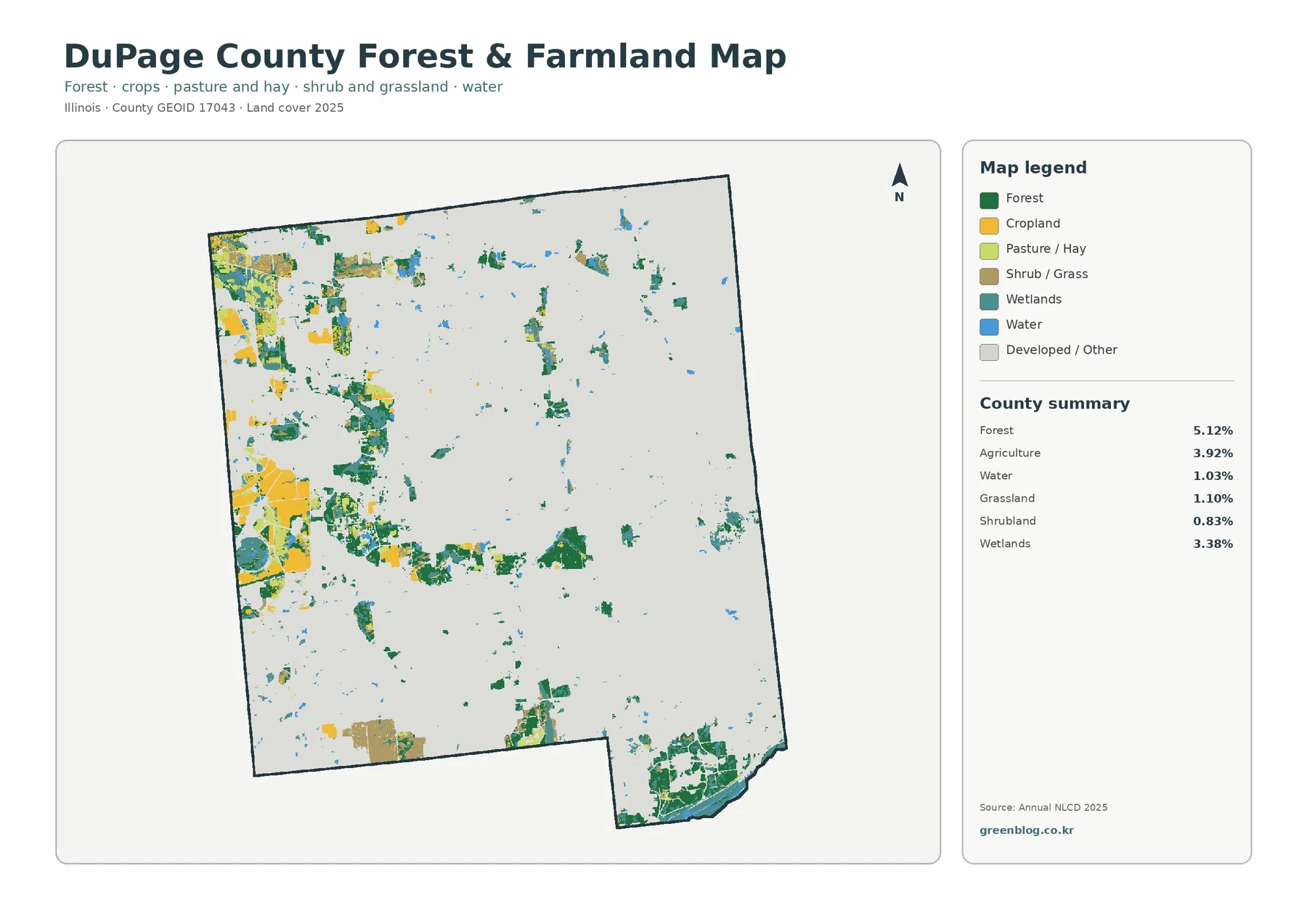
The forest-and-farmland map removes much of the visual weight of developed land and brings the smaller natural classes forward. Forest is the largest of these at 5.12%, followed by agriculture at 3.92% and wetlands at 3.38%. Water covers 1.03%, grassland 1.10%, and shrubland 0.83%. In a highly developed county, these percentages translate into a visible network of green, teal, blue, and yellow areas rather than a single rural block.
The western side contains some of the larger agricultural and forest combinations, while irregular green and wetland strips also extend through west-central and southwestern parts of the county. A larger cluster of forest, wetland, and water appears near the southeastern edge. The central and eastern developed areas contain smaller, more fragmented natural pieces. These patterns are visible on the supplied map without needing to assign a name to every patch.
DuPage County also has a substantial public preserve system. The Forest Preserve District reports roughly 26,000 acres in 60 forest preserves, and its official map lists sites such as Waterfall Glen, Blackwell, Herrick Lake, Springbrook Prairie, and Pratt’s Wayne Woods. Those preserve records provide useful local context for why significant green and wet areas remain inside a heavily developed county, but preserve boundaries and NLCD land-cover classes should not be treated as the same thing.
A preserve can contain forest, wetland, grass, open water, paved access, and buildings at the same time. Conversely, an NLCD forest or wetland cell is not automatically public or protected land. The forest-and-farmland map is best used to locate surface-cover patterns; ownership and management status require the separate preserve or county GIS maps.
Waterways help explain why some green and wet areas form narrow bands
Official Forest Preserve District fishing information names both branches of the DuPage River, Salt Creek, the Des Plaines River, and their tributaries among the waters found in or along preserve lands. The land-cover map does not label these waterways, but that official information helps place the blue water and teal wetland patterns in a real county context. Narrow natural strips should be described cautiously unless a stream name can be verified from a separate map.
On the supplied land-cover views, some forest and wetland cells follow elongated, irregular shapes rather than the straight-edged blocks typical of developed or agricultural land. That geometry is useful when comparing riparian or wetland-associated cover with the surrounding urban surface. It does not prove a specific ecological function, water-quality condition, or floodplain boundary. Those questions need dedicated environmental and hydrologic data.
This distinction is especially important in DuPage County because small natural corridors can appear visually prominent even though their countywide percentages are modest. A 3.38% wetland share, for example, tells how much area was classified as wetland, while the map shows where those cells are concentrated and whether they form isolated patches or connected-looking bands. Both pieces of information are useful, but neither substitutes for a legally mapped wetland boundary.
The 1985–2025 map marks widespread differences, but not every colored cell is a confirmed land-use event
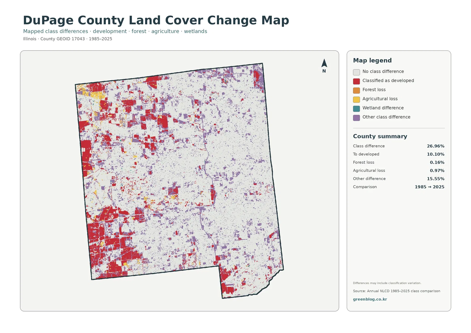
The class-change map compares the 1985 and 2025 land-cover classifications at the same locations. A total of 26.96% of the county is mapped with a class difference. Areas classified as changed to developed account for 10.10%, agricultural loss for 0.97%, forest loss for 0.16%, and other class differences for 15.55%. The unchanged background remains the largest single category, but colored change cells are far more widespread here than in many largely agricultural counties.
Red areas representing change to developed are especially noticeable in the west, northwest, and southwest, with smaller pieces scattered elsewhere. Those locations are useful starting points for comparing past and present classification, particularly when viewed beside the current land-cover and impervious maps. They should not be read as construction dates or parcel-level development records.
The 15.55% mapped as other class difference deserves particular attention. The map itself warns that differences may include classification variation, so a small purple patch should not automatically be described as a physical land-use conversion. Larger contiguous patterns, repeated evidence across multiple maps, historical aerial imagery, and local records provide a stronger basis for interpretation than a single changed pixel.
Forest loss at 0.16% and agricultural loss at 0.97% are also endpoint comparisons. They do not describe every transition that occurred during the forty-year period. A location may have changed more than once between 1985 and 2025 and still end with a class similar to its starting point. Use this map to identify where a closer time-series review may be worthwhile rather than as a complete development history.
Each of the four maps answers a different practical question
Start with the general land-cover map when the goal is to understand the county at a glance. It makes the 84.51% developed share immediately visible while also showing where the largest forest, agricultural, wetland, and water areas break through that background. This is usually the clearest first map for a presentation or county comparison.
Switch to the forest-and-farmland view when the smaller natural classes are the focus. By pushing developed and other areas into a light background, it becomes easier to trace forest and wetland pieces that would otherwise be visually overwhelmed. For built-surface intensity, the impervious map is more informative because it separates very low, moderate, and very high fractions within areas that may all be classified as developed.
Use the 1985–2025 map only when the question involves change. It does not replace the current map because it emphasizes different-class locations rather than the full present-day cover. A useful workflow is to find a prominent red or purple change area, then return to the current and impervious maps to see what type of surface occupies that location now.
Printing, classroom use, and county comparisons work best when the legend stays attached
For classroom or presentation use, the four-map sequence can move from current land cover to natural-cover detail, then to impervious intensity, and finally to long-term class differences. That order separates three ideas that are often confused: whether a place is developed, how much of its surface is impervious, and whether its classification differs from 1985. DuPage County is a useful example because all three measures are substantial but not numerically interchangeable.
When comparing counties, keep the metrics consistent. DuPage County has 84.51% developed cover, 5.12% forest, 36.85% mean impervious surface, and 26.96% mapped class difference from 1985 to 2025. Compare those figures with the same fields in another county rather than mixing them with zoning acreage, population density, or parcel data. Map shape matters too: a county with the same forest percentage could have one large forest block instead of many smaller patches.
Keep the legend and county outline visible when printing. Small wetland, forest, and low-impervious areas can disappear if the page is reduced too far, while extreme enlargement can make individual 30-meter cells look more precise than they are. A full-county print paired with a digital zoom view usually preserves both context and detail without implying parcel-level accuracy.
Annual NLCD is a 30-meter classification, so parcel-level conclusions need other data
USGS describes Annual NLCD as a raster product derived from Landsat imagery at 30-meter resolution. Each cell represents the predominant mapped surface within that grid area. Small buildings, narrow streams, road edges, yards, and mixed surfaces can therefore be simplified into a single class or fractional value. The map is designed for consistent regional patterns rather than cadastral precision.
That limitation matters in a fragmented suburban landscape. A narrow wooded strip may be generalized, a small wetland may blend with adjacent cover, and a developed cell may contain substantial vegetation. Impervious percentage helps add detail, but it still remains a 30-meter product. Do not use these maps to determine property boundaries, wetland jurisdiction, zoning, ownership, or construction eligibility.
The 2025 maps also represent a specific mapping year. New development or restoration after that date will not appear until a later dataset is used, and the 1985–2025 comparison does not display every intermediate year. Current aerial imagery, DuPage County GIS resources, Forest Preserve District maps, and site-level records are better sources when a decision depends on the latest condition of a specific place.
Frequently Asked Questions
Does 84.51% developed land mean that 84.51% of DuPage County is covered by buildings and pavement?
No. The 84.51% figure is the share classified as developed land in the 2025 Annual NLCD map, which can include lower-intensity developed areas with lawns and trees. Mean impervious surface is 36.85%, so the developed class and the fraction physically covered by pavement or rooftops are different measures.
Which map is best for finding the remaining forest and wetland areas in DuPage County?
The forest-and-farmland map is the simplest view because developed and other land is muted. It makes forest at 5.12%, wetlands at 3.38%, agriculture at 3.92%, and water at 1.03% easier to locate. Use the Forest Preserve District map separately when you need actual preserve boundaries or names.
Is the 26.96% shown on the 1985–2025 change map all confirmed physical land change?
No. It is the area where the two endpoint classifications differ. The summary includes 10.10% changed to developed, 0.97% agricultural loss, 0.16% forest loss, and 15.55% other class difference. Small changes may include classification variation, so aerial imagery or local records should be checked for site-specific conclusions.
Sources and reference material
- MRLC Annual NLCD Data – official access to Annual NLCD land-cover products.
- USGS Annual NLCD Collection 1.2 Land Cover – explains the 2025 release, 30-meter resolution, and land-cover classes.
- Forest Preserve District of DuPage County – information on the county forest preserve system and protected lands.
- Forest Preserve District – Land Preservation – local context on prairies, woodlands, wetlands, and land protection.
- Forest Preserve District – Fishing and Waterways – official information on DuPage River branches, Salt Creek, Des Plaines River, and preserve waters.
- U.S. Census Bureau TIGER/Line Shapefiles – official county-boundary source.
Map File Information
The four original JPG maps are packaged in one ZIP for comparing 2025 land cover, forest and farmland, impervious surface, and mapped 1985–2025 class differences in DuPage County.
- Included Versions: land cover, forest & farmland, impervious & developed land, and 1985–2025 land cover change
- File Type: ZIP containing four JPG files
- Intended Use: printing, classroom material, presentations, and county-to-county land-cover comparison
Related Maps
- Adams County Illinois Land Cover Map
- Alexander County Illinois Land Cover Map
- Bond County Illinois Land Cover Map
Green Map creates custom-edited map images using open geographic data sources such as geoBoundaries, Natural Earth, OpenStreetMap, and government open data.
These maps are edited visual materials, not raw data files, and are provided for education, documents, presentations, and graphic reference.